I make type tell stories
Book Design · Typography · Editorial Design
I turn texts, ideas, and cultural narratives into expressive visual experiences — from experimental book layouts to typographic projects. I’m open to collaborations with designers, studios, and creative teams who value thoughtful concepts and distinctive visual solutions.
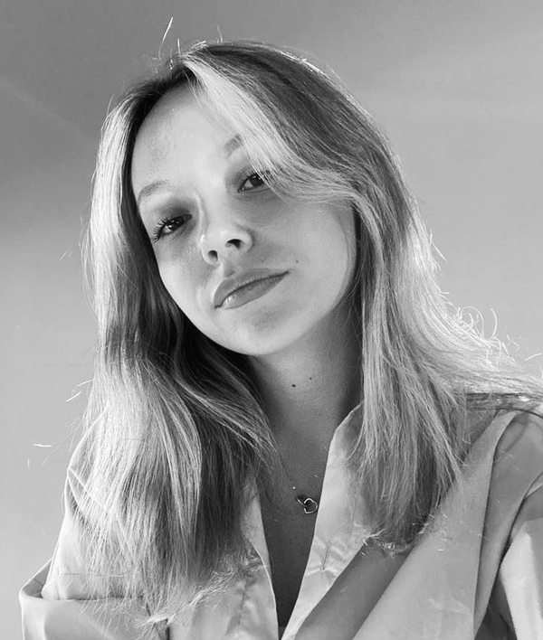
Hi, I’m Darya Salnikova
I’m a graphic designer specialising in book design, typography, and editorial design.I explore how typography can shape narratives, guide attention, and turn complex ideas into expressive visual experiences. I’m drawn to unconventional concepts, experimentation, and collaborations that challenge familiar approaches to design.I’m always open to learning, experimenting, and collaborating with other creatives.
01 / BOOK DESIGN
THE NEW WAVE: A PORTRAIT OF YOUTH
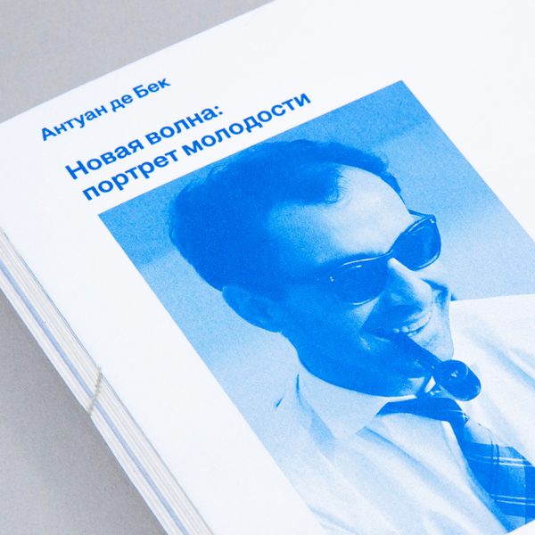
How can one book present the French New Wave from different perspectives?
The edition is built on the principle of two parallel reading lines. The first is the main text by Antoine de Baecque, which sets the historical, cultural, and analytical context of the New Wave. The second is interviews with directors, critics, and participants in the movement, which allow us to see the Nouvelle Vague not only from the perspective of a researcher, but also from within the cinematic environment itself.
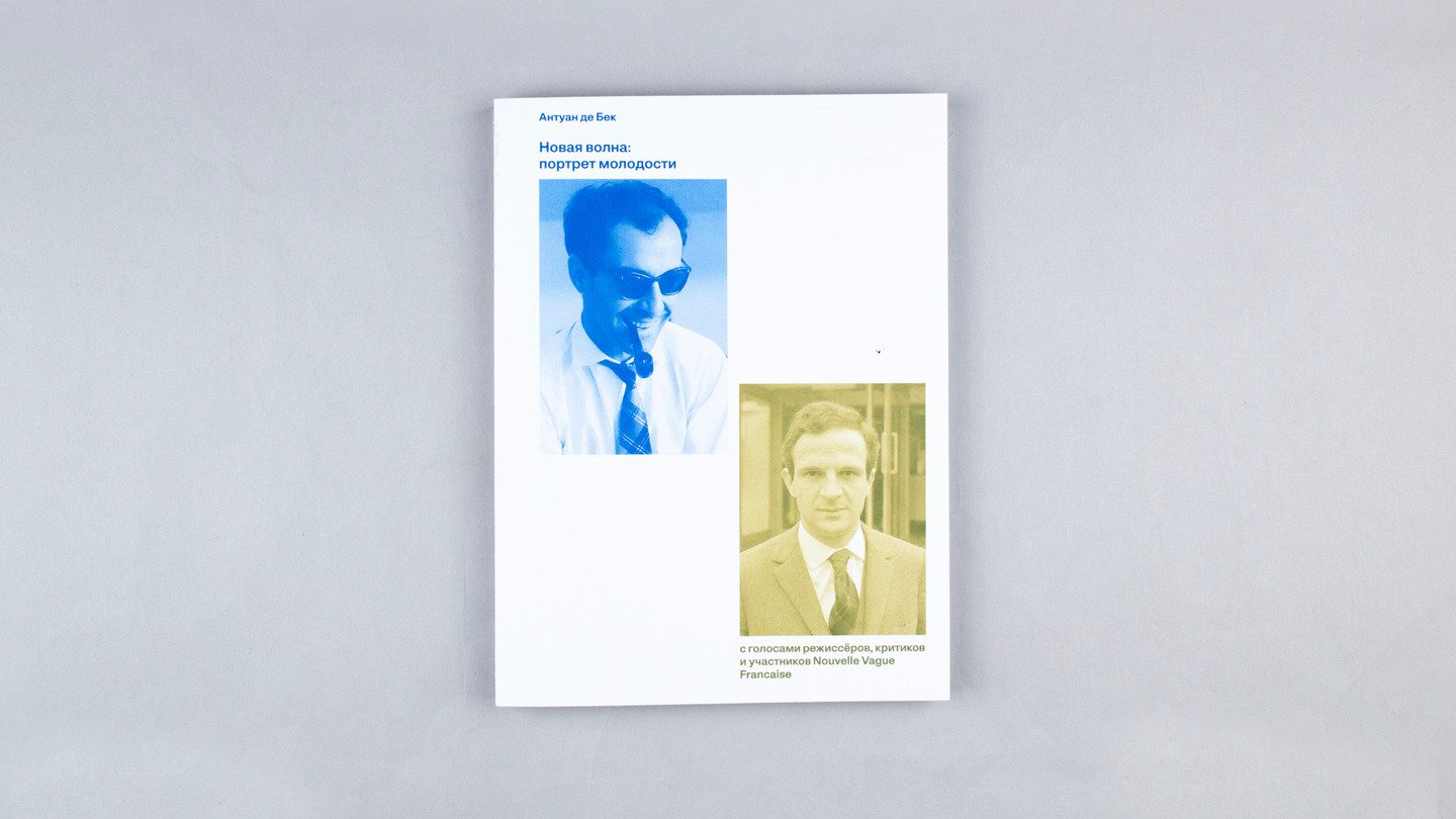
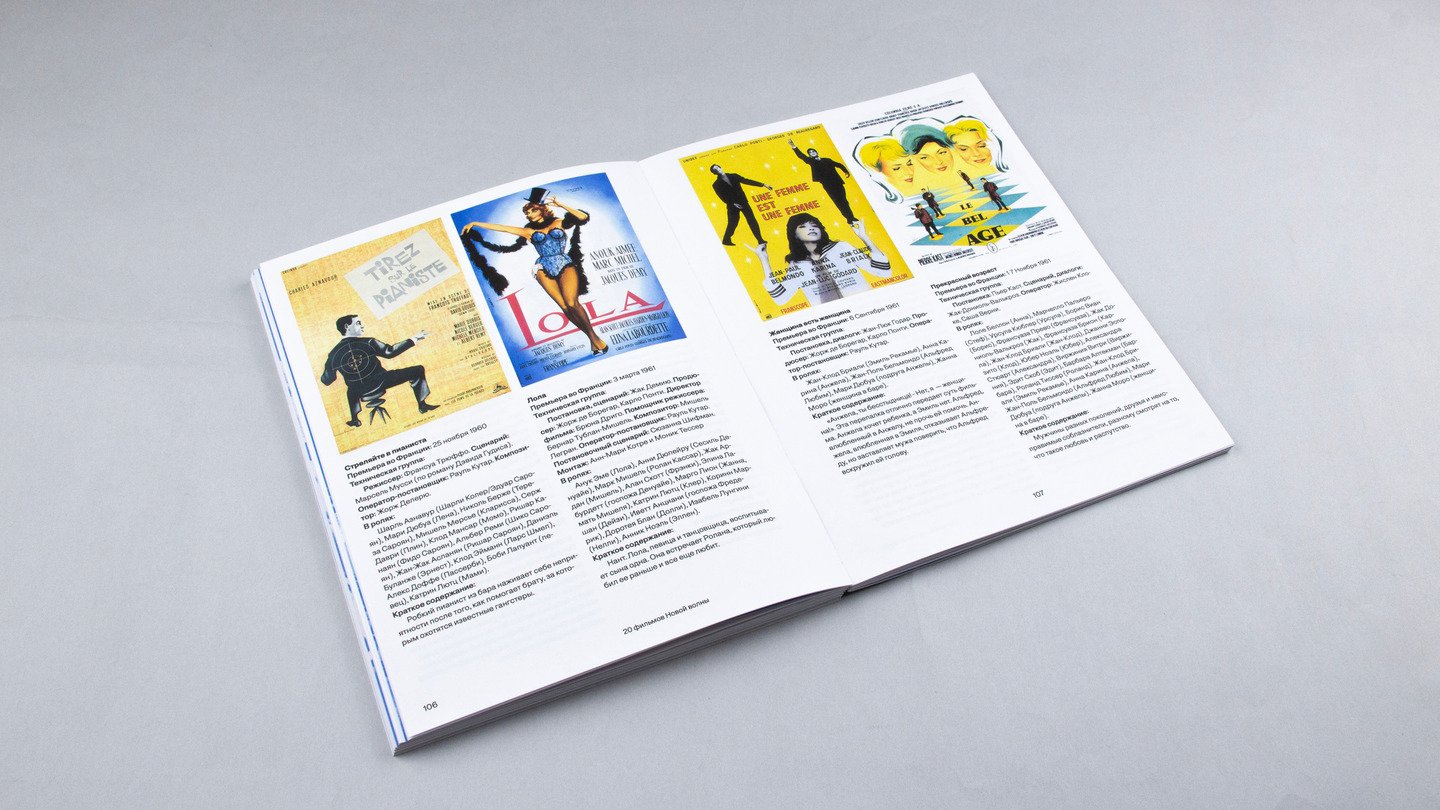
I designed a system that allows two narratives to coexist within a single publication.The main text is set in blue, while the interviews appear in brown. Each narrative has its own navigation system, including asymmetrical page numbers and running headers.Interviews begin when their subjects are first mentioned in the main text, creating connections between the historical narrative and personal perspectives.
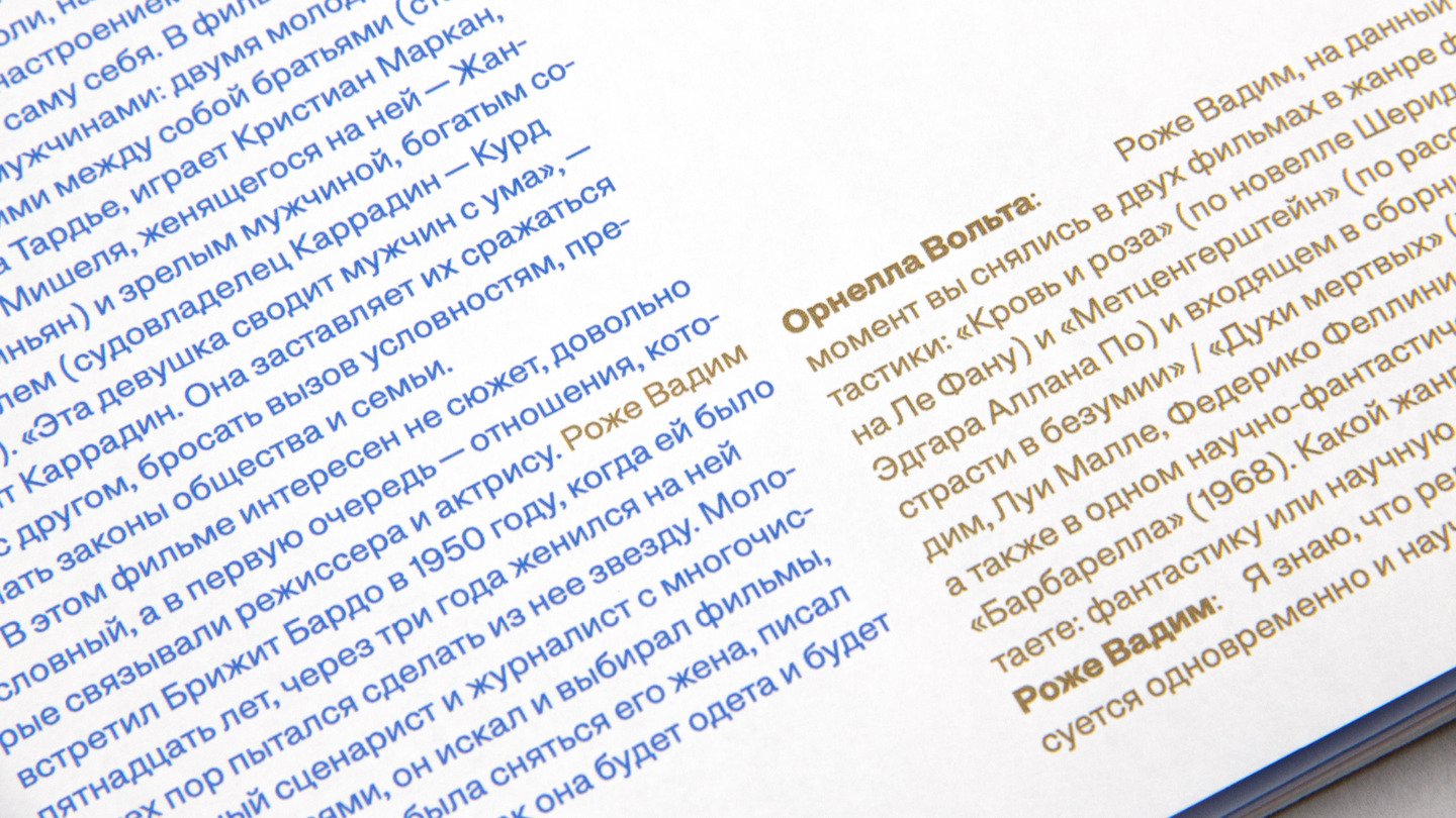
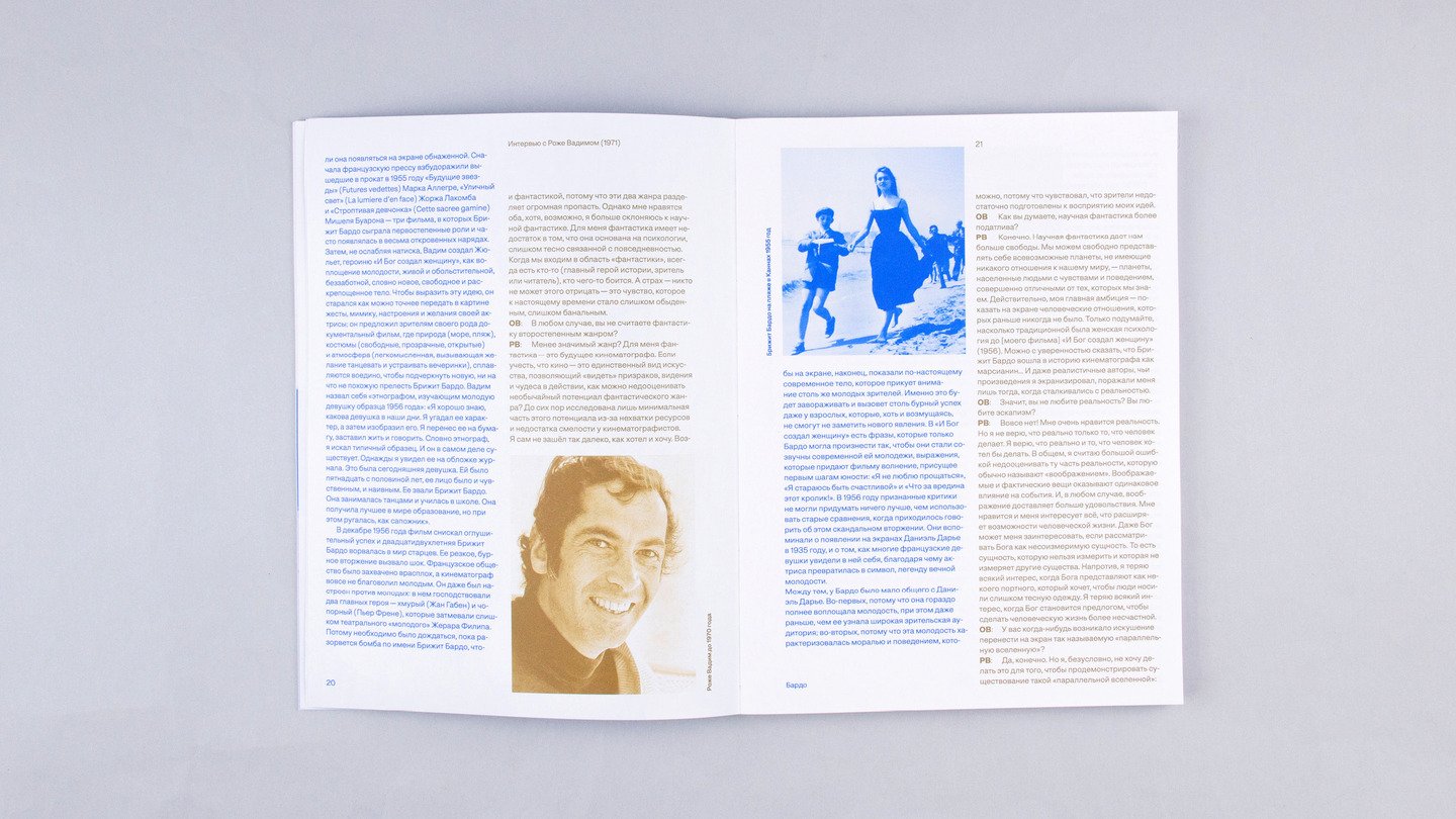
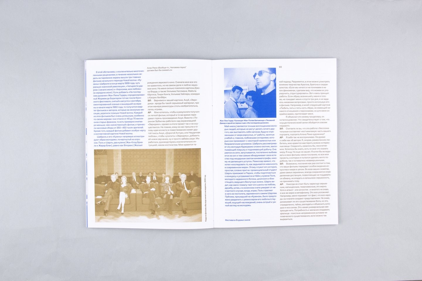
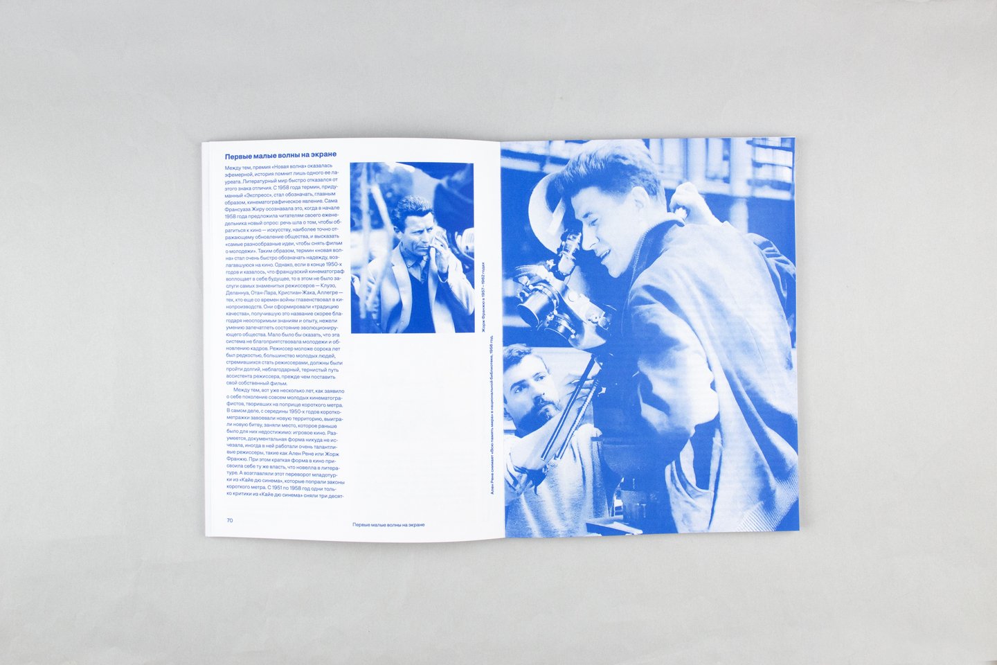
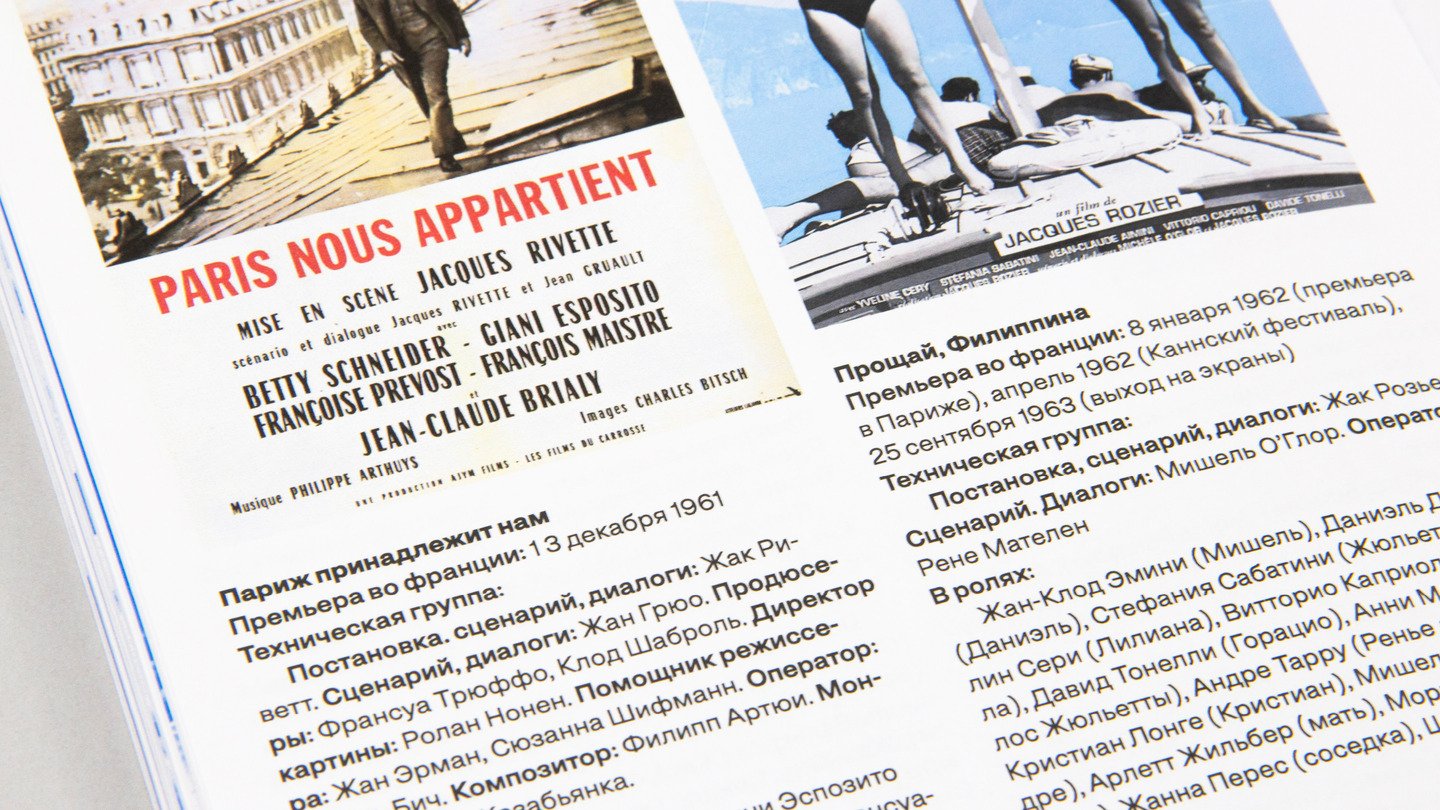
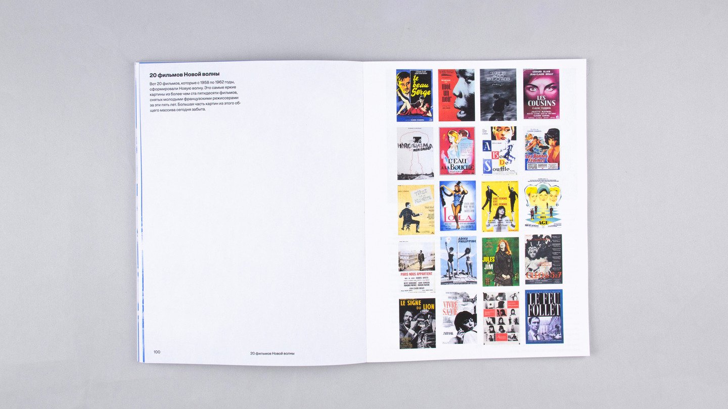
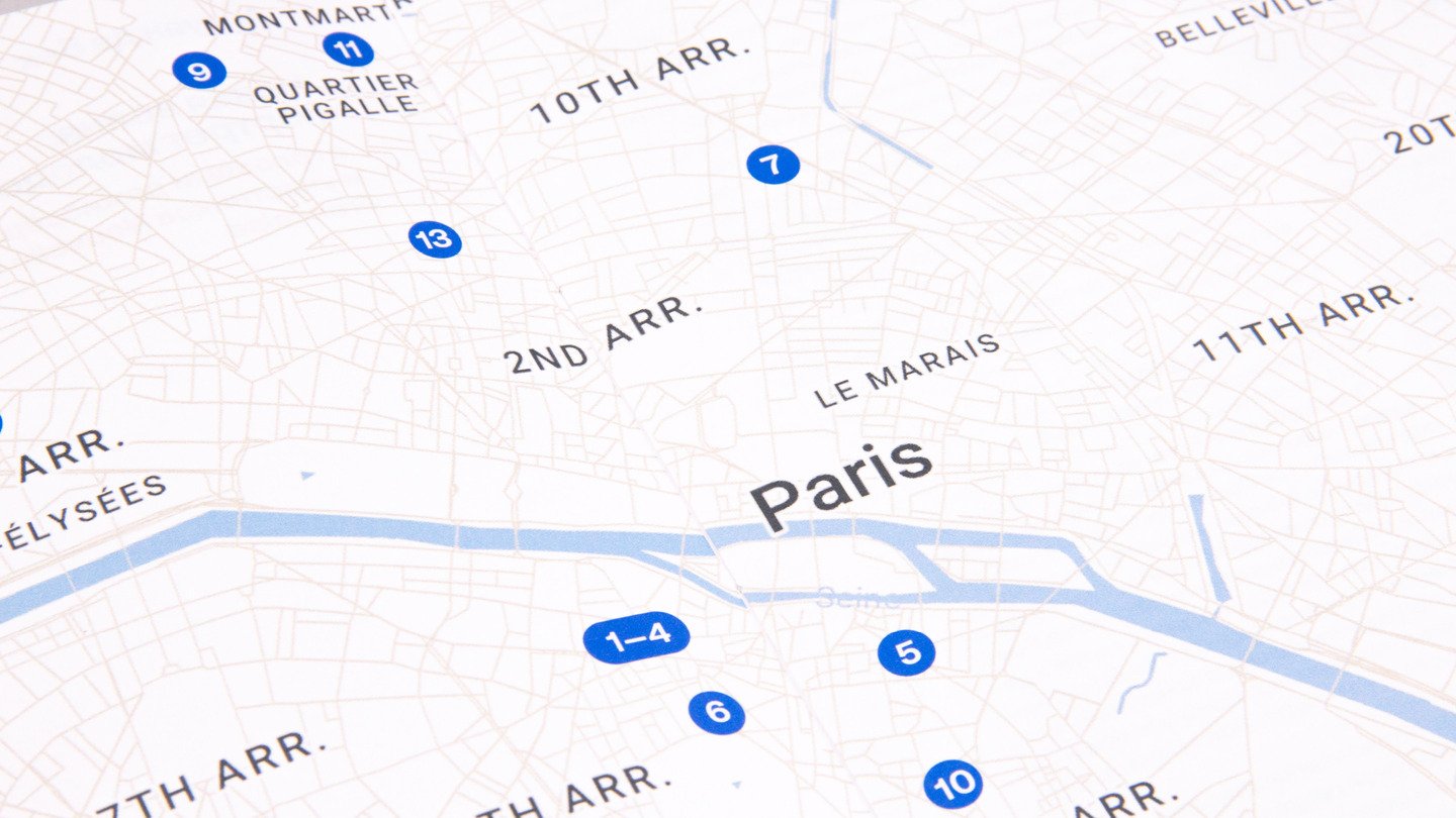
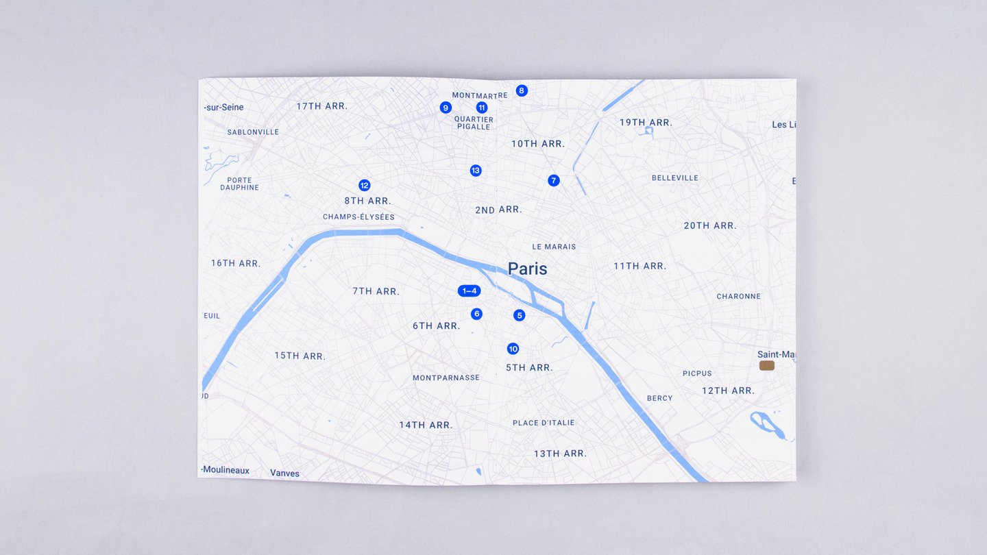
A dedicated chapter shifts the typography to black, drawing attention to posters of iconic New Wave films.The book also includes a map-guide to Paris in the 1950s and 1960s, connecting the history of the movement to the places where it unfolded.Together, these elements turn the publication into a layered exploration of cinema, its people, and its cultural context.
02 / BOOK DESIGN
The play / КОНЕЦ ИГРЫ
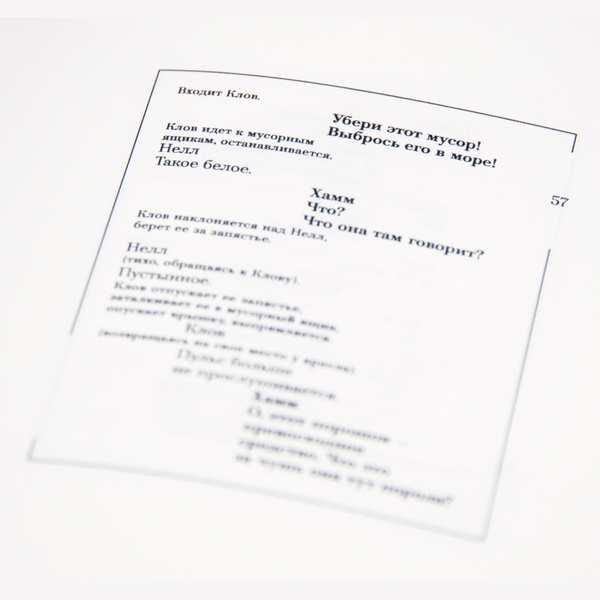
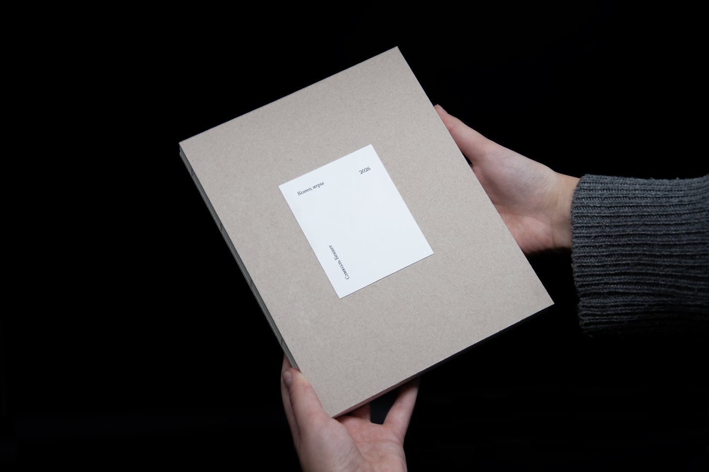
«Конец игры» is an absurdist play set in a confined, almost empty room.I approached the book as a typographic interpretation of the play, using the page layout to reflect the characters' movements, relationships, and sense of confinement.
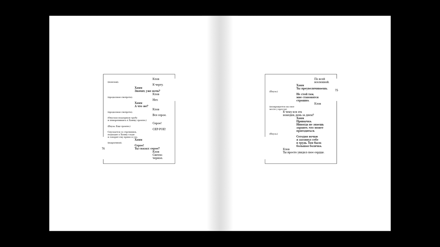
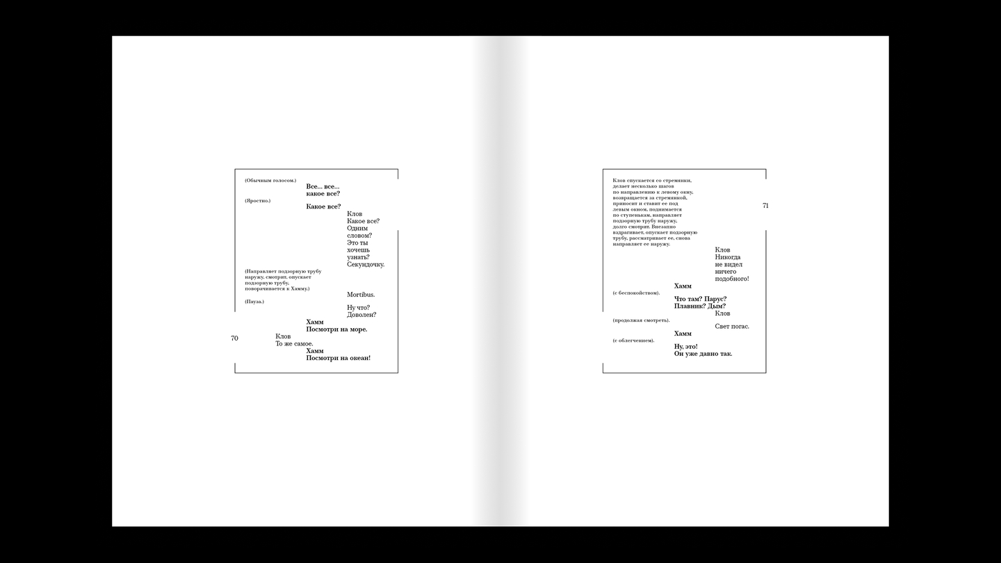
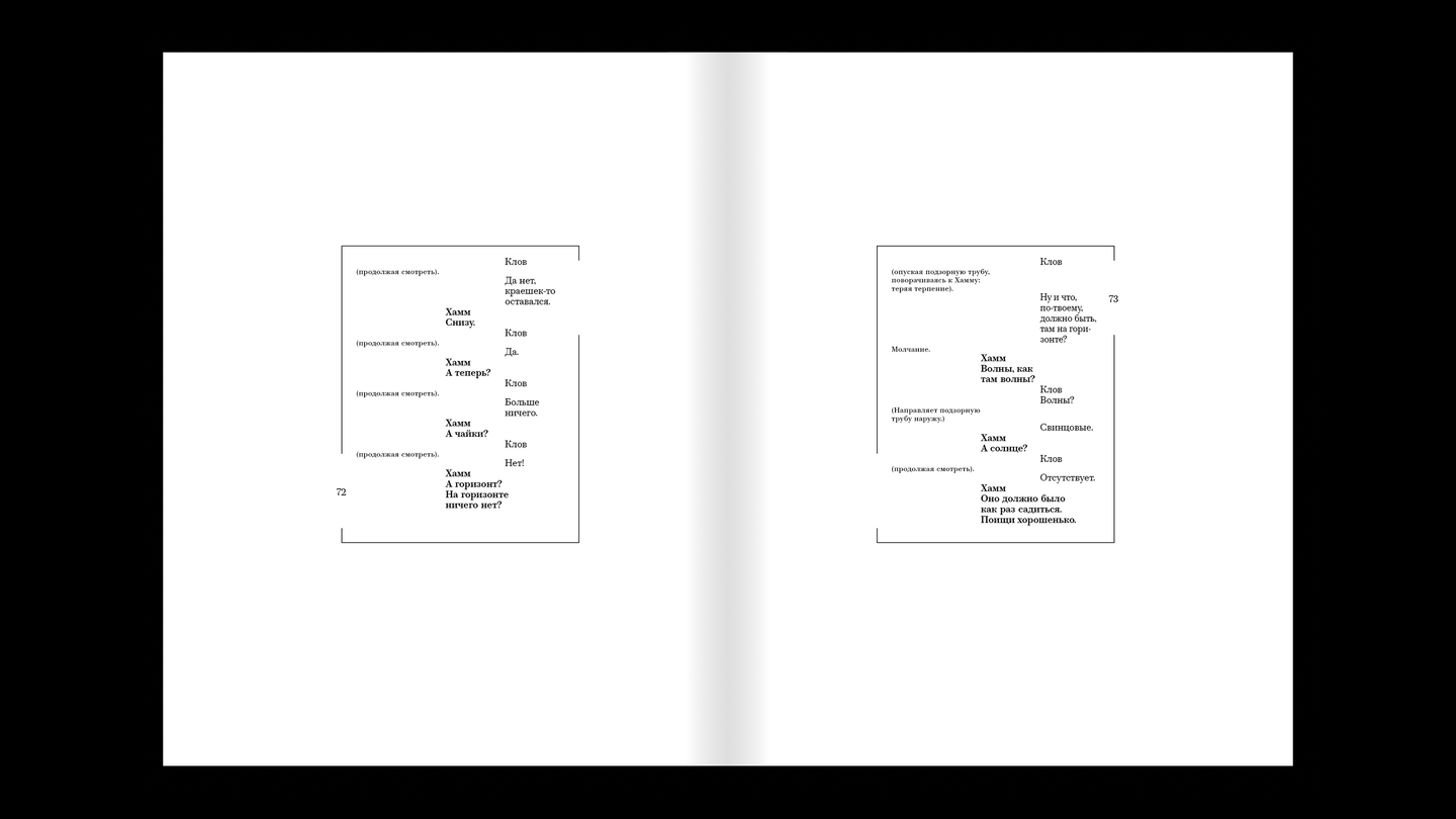
Layout principles
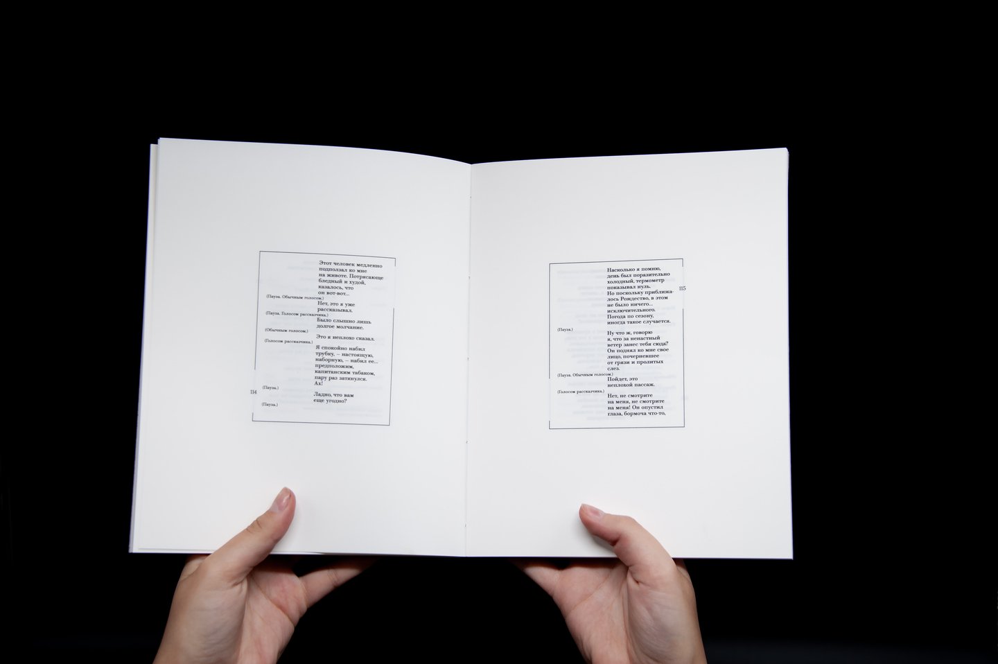
The position of each character is reflected in the layout. Hamm’s usual position is the center of the room → his lines in this position will be placed in the center of the page. As he moves, the lines will move as well.The same applies to Clov, but he moves much more frequently throughout the play, which makes the movements more dynamic.Nagg’s and Nell’s lines will be positioned statically at the edges of the page.The play also conveys tension due to the characters’ restraint, which is why the leading is deliberately reduced.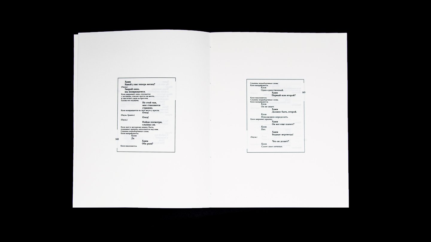
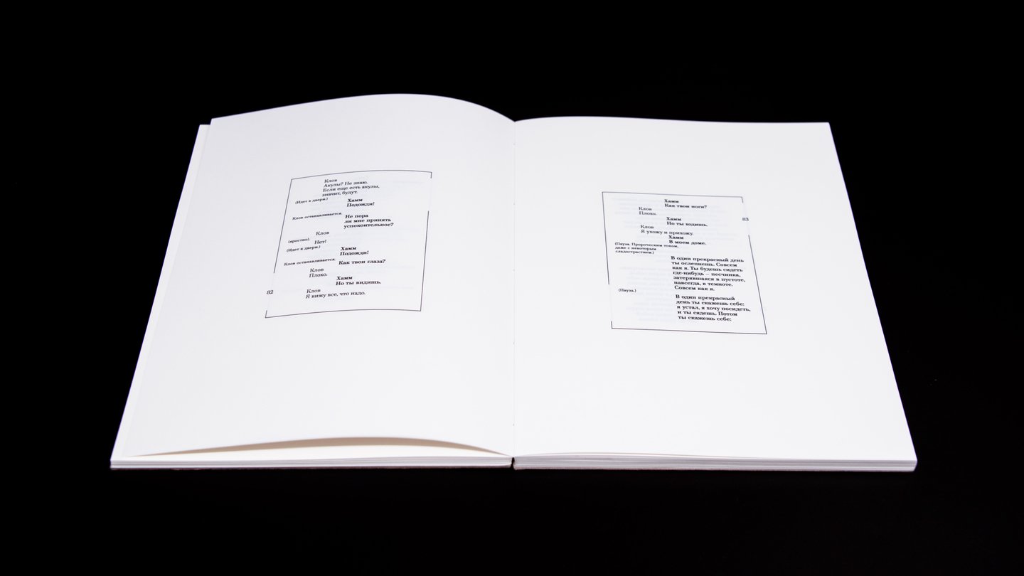
The action takes place in a small, empty semi‑basement room in a post‑apocalyptic wasteland, where there are only 2 windows. This is what determines the large margins and the border around the type area. Both windows are also marked on the border around the type area — the characters interact with them in one way or another during the play.
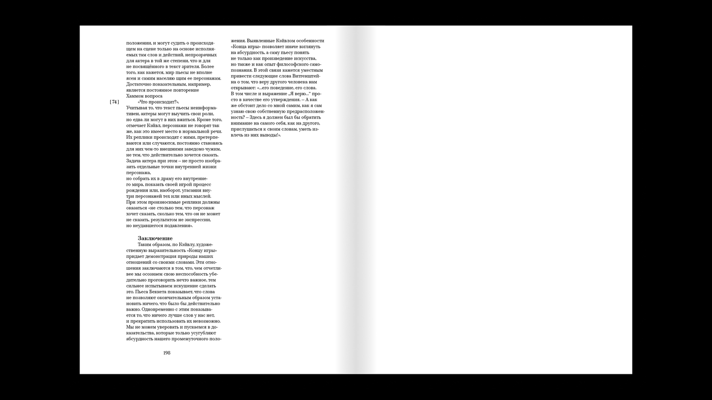
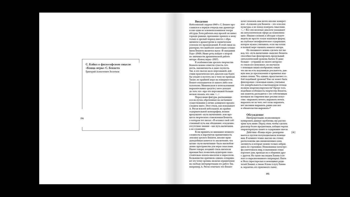
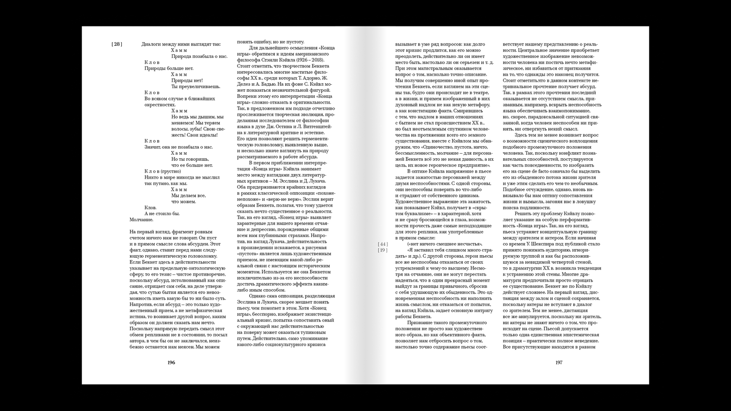
After the main text, there are 2 reviews that help to better understand the concept of the play. They are also needed to fully illustrate the dimensions of the typesetting area. From the main part of the play, it transitions to a two‑column format; the column numbers on the vertical axes drop down, and all the white spaces are filled with text
03 / EXHIBITION CATALOGUE
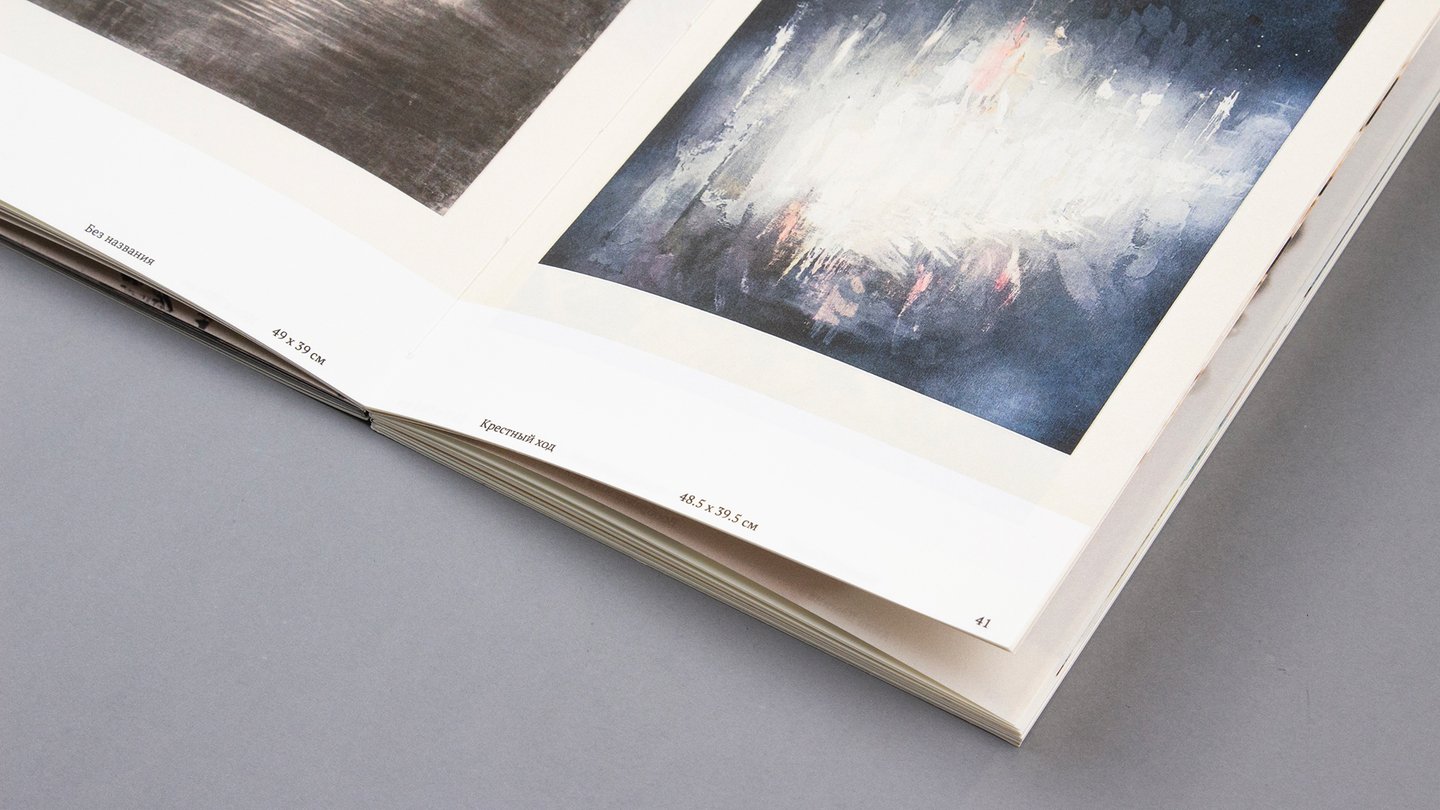
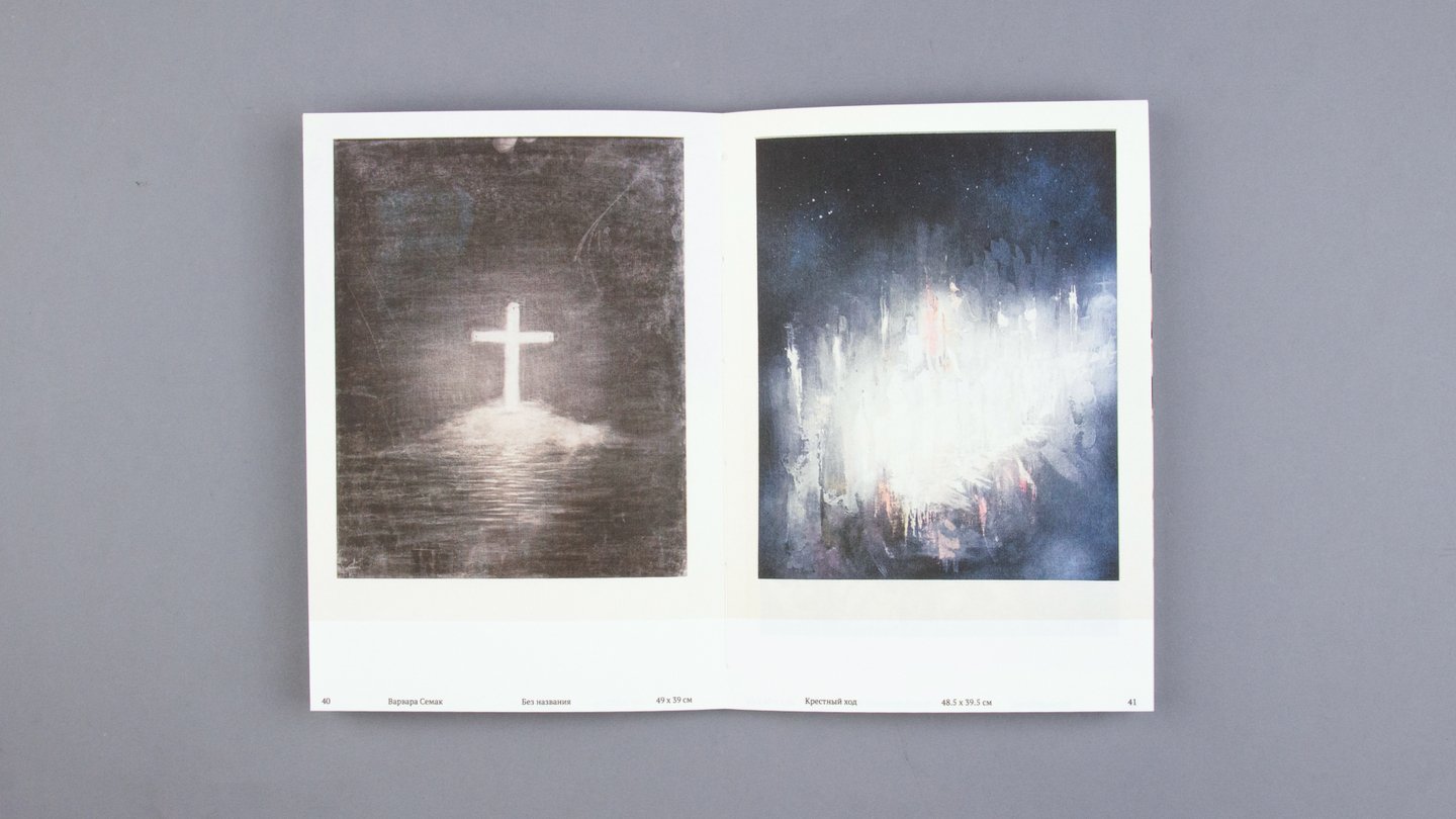
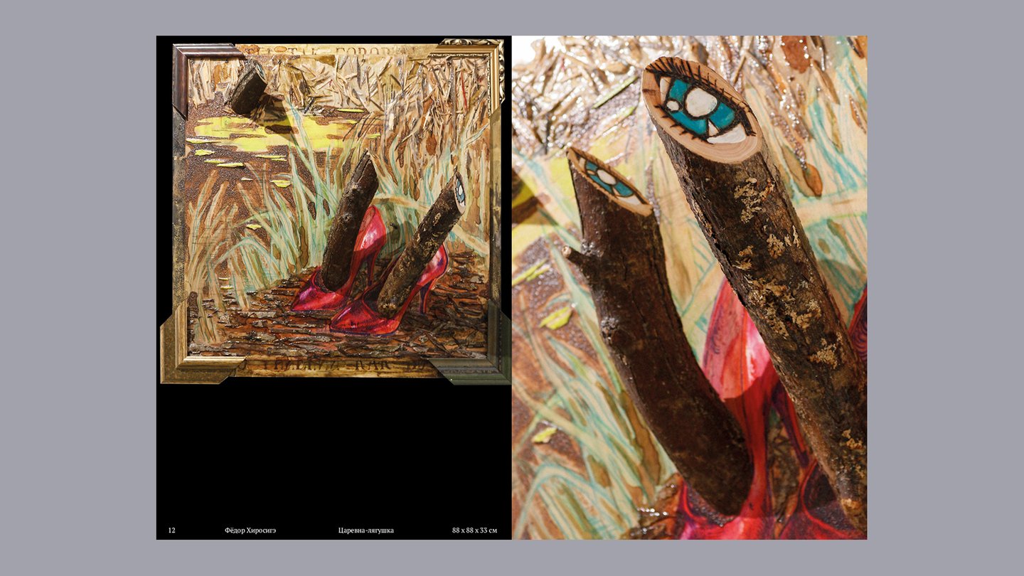
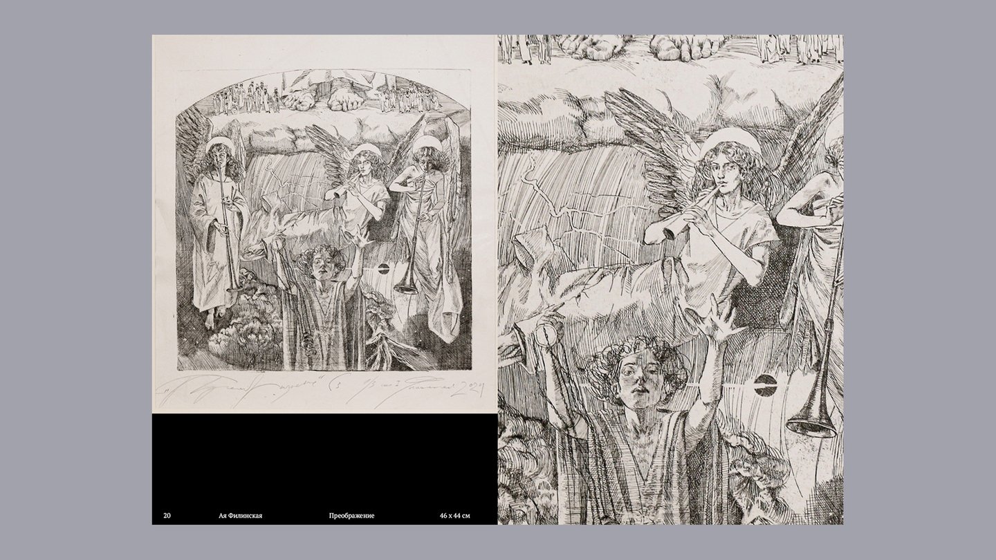
ПРОБУЖДЕНИЕ
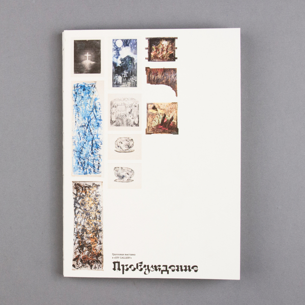
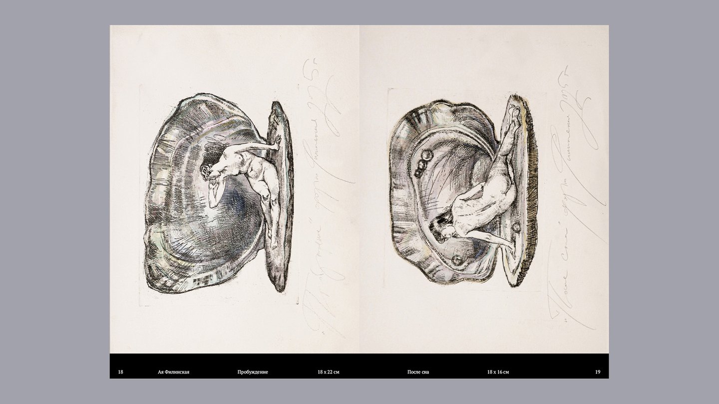
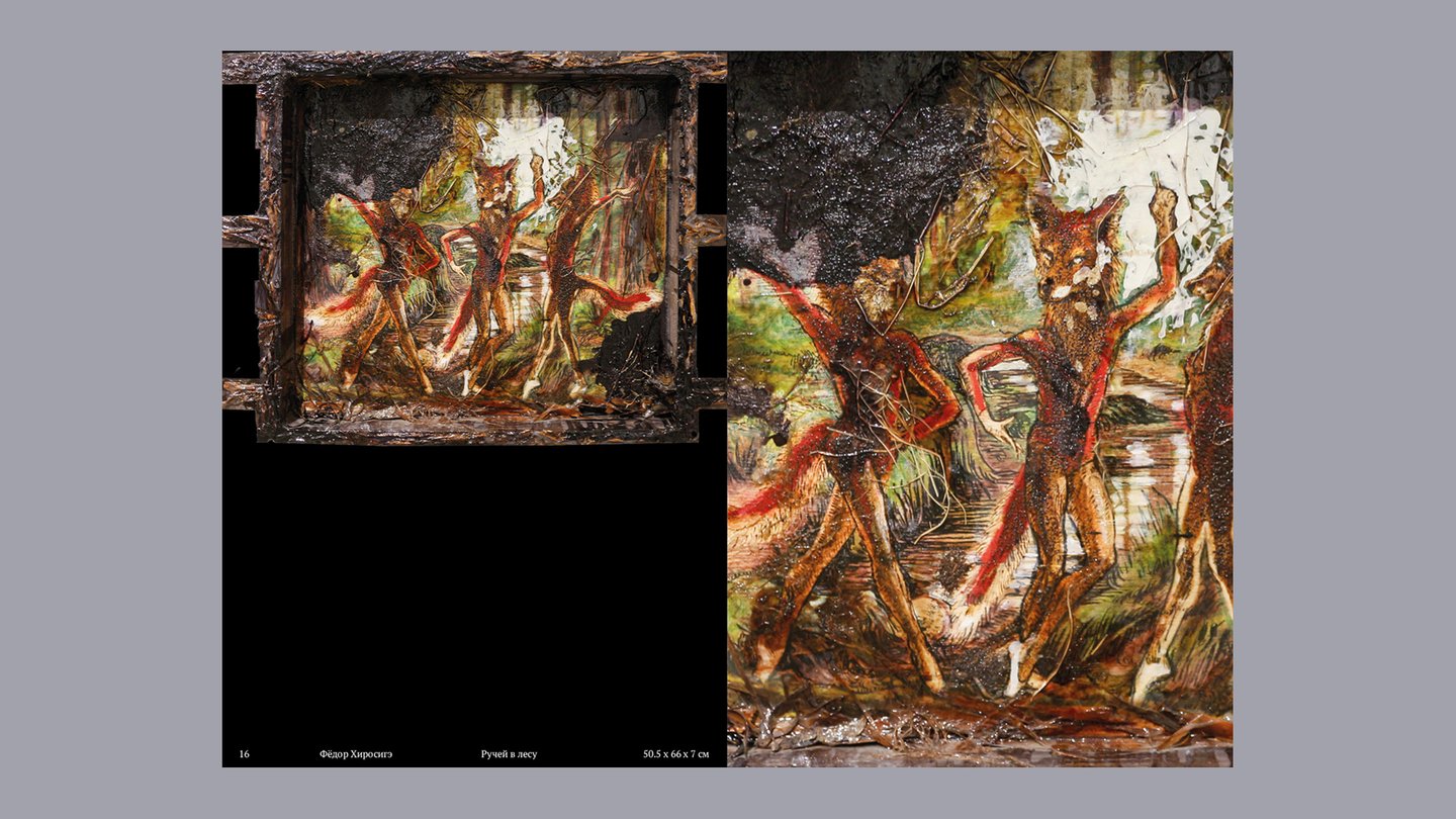
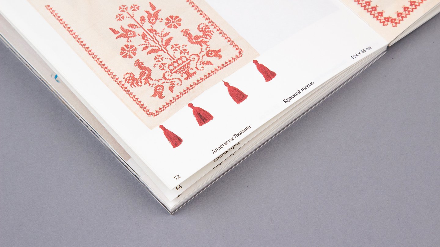
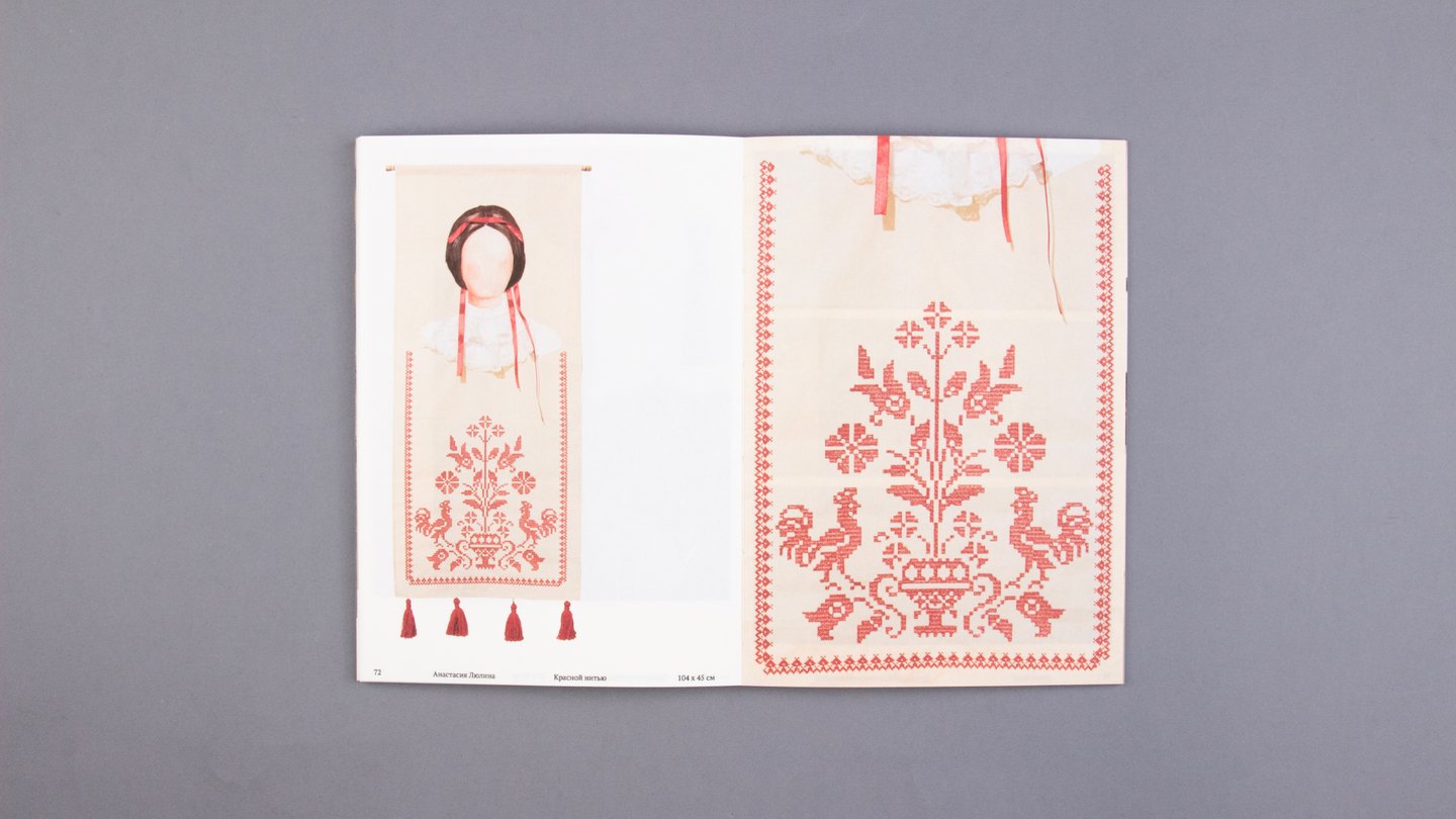
From October 30, 2025, to January 20, 2026, the «Пробуждение» exhibition is being held at the «JOY GALLERY».The exhibition’s visual narrative is structured in accordance with the morphology of a Russian folk tale. I translated the exhibition’s journey from darkness to light into a linear sequence, turning the publication into an extension of the exhibition experience.