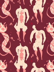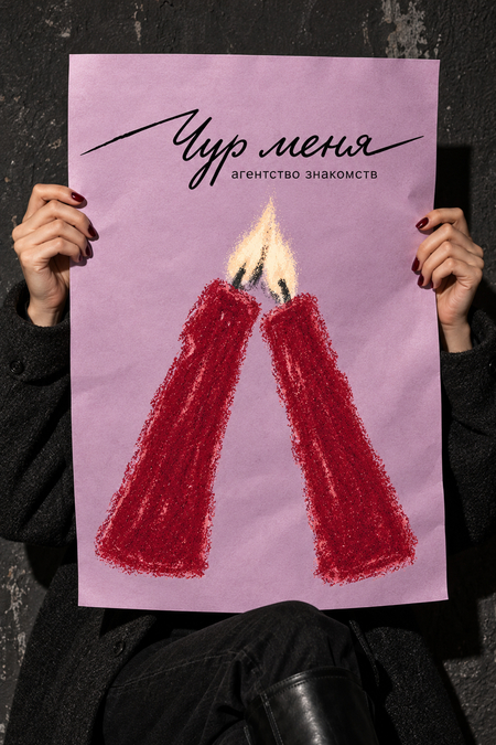
Before rebranding, «Chur Menya!» was a dating agency specializing in establishing romantic connections between humans and mythical beings.

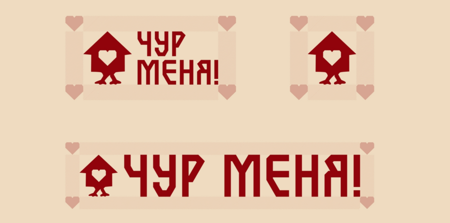
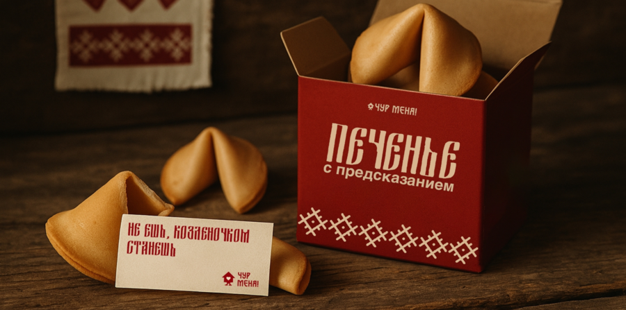
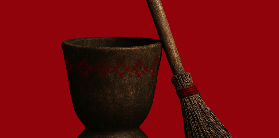
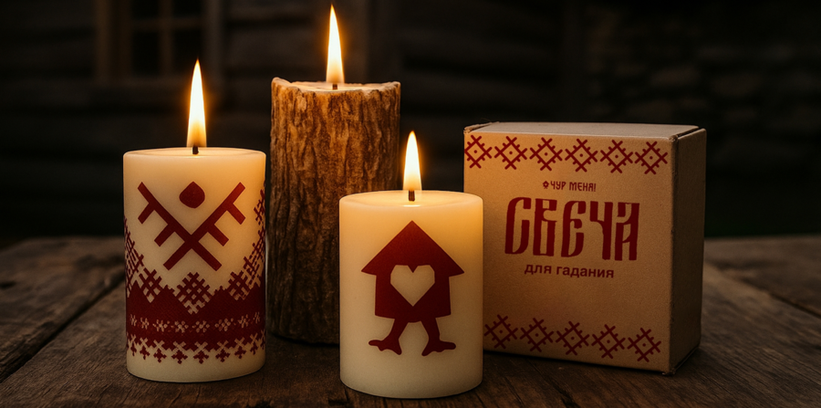
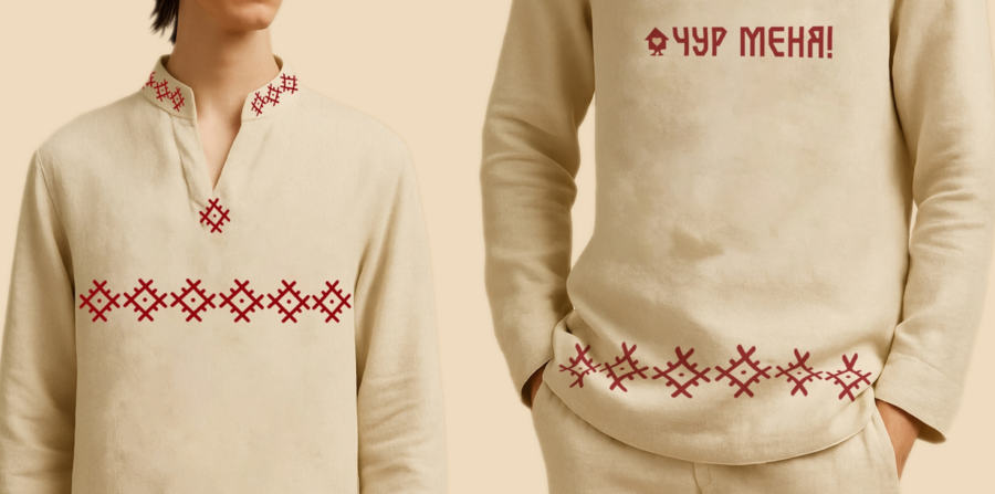
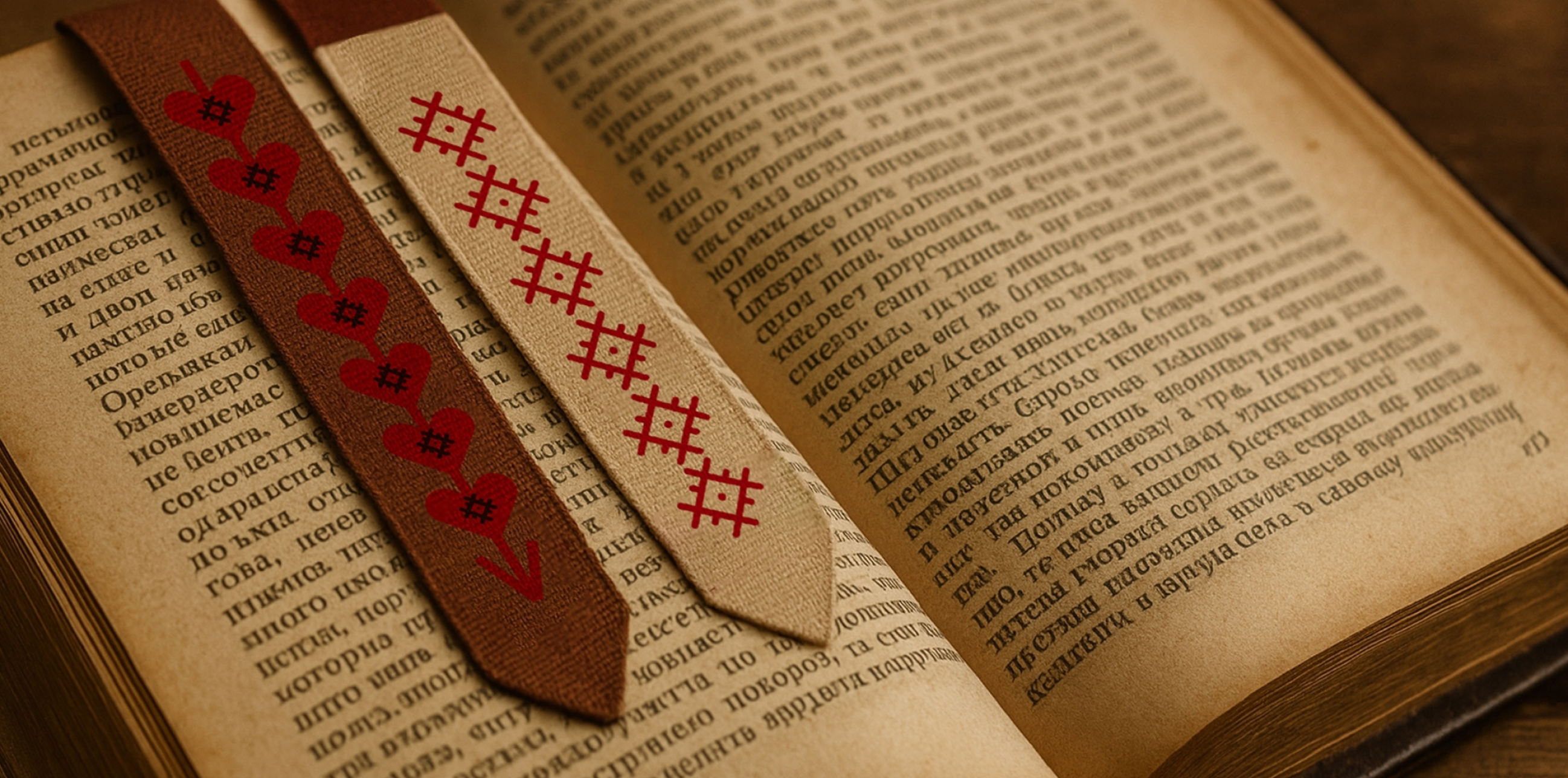
Following the rebranding

After rebranding, «Chur Menya» became a dating agency for ordinary people. The core of the project is first meetings, awkwardness, mutual interest, and gradual closeness. The former mystical atmosphere is preserved in the visual style.
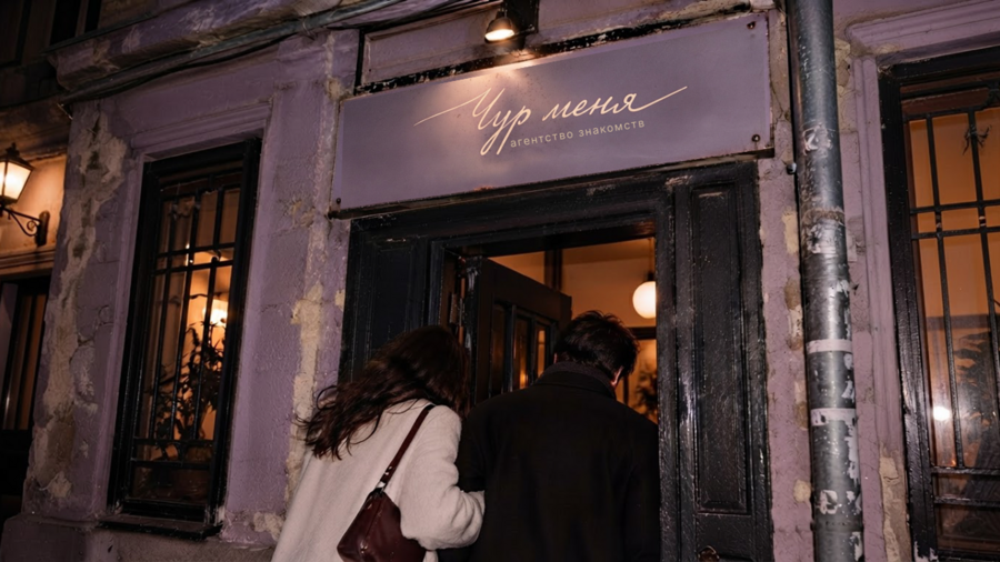
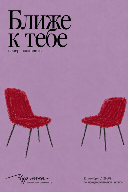
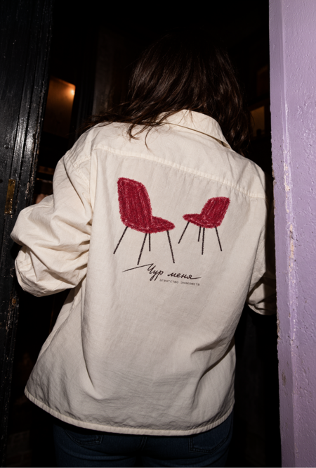
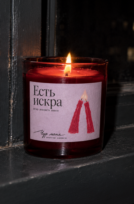
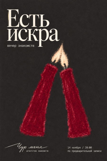
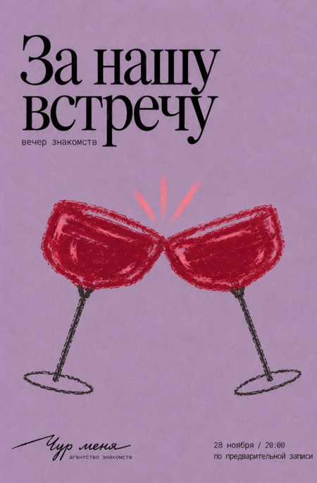
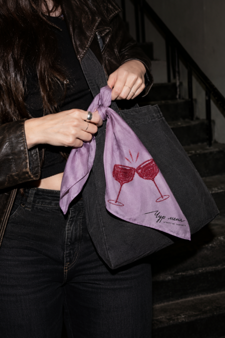
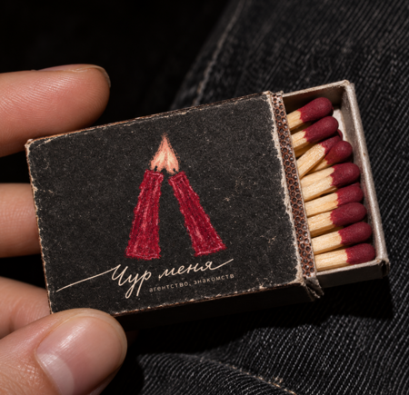
The identity blends an underground aesthetic, a subtle touch of melancholy, and the warmth of hand-drawn illustration. The uneven, handwritten logo and chalk illustrations convey an immediacy of connection—getting to know someone doesn’t have to be perfect to be meaningful.
Icebreakers
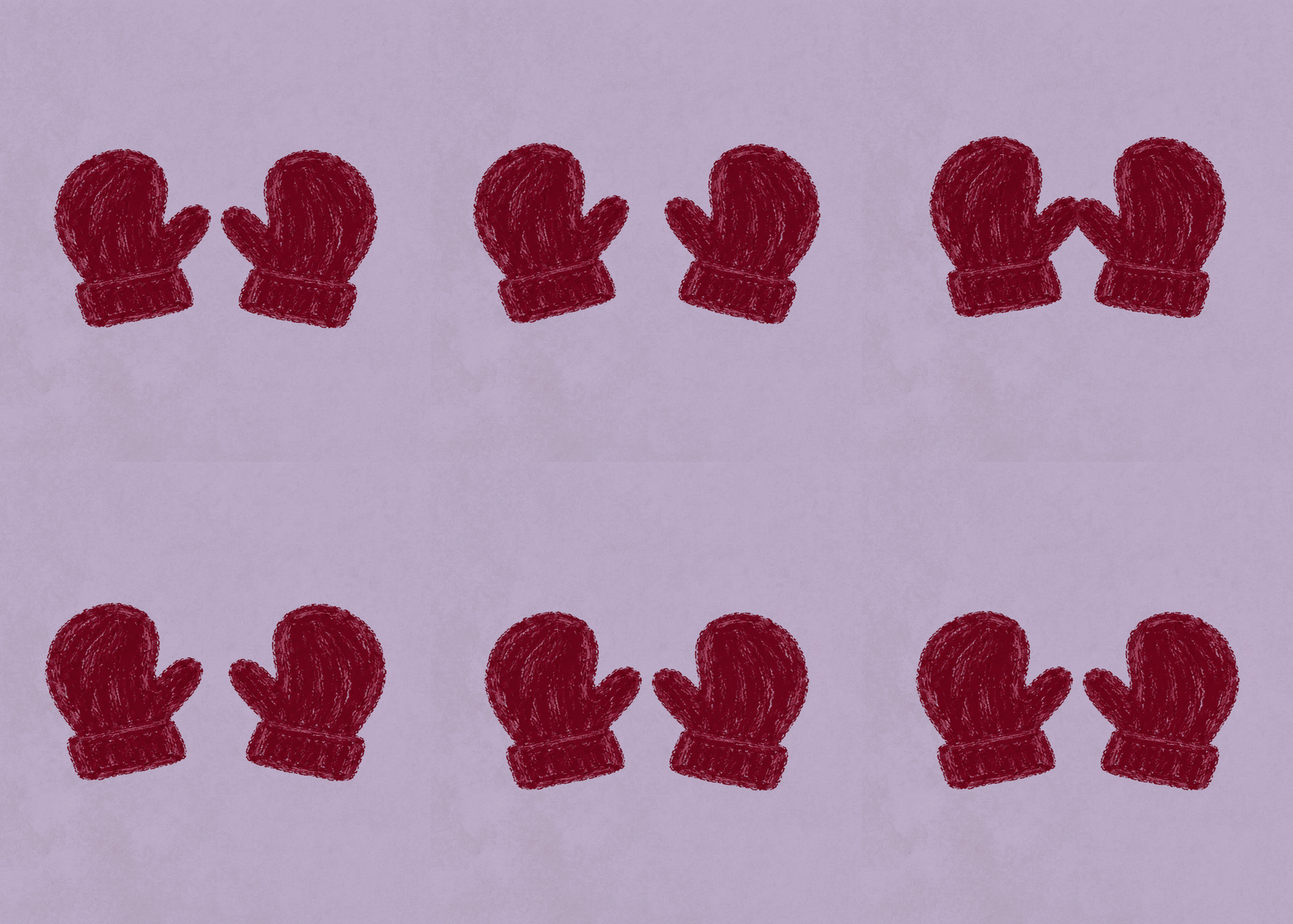
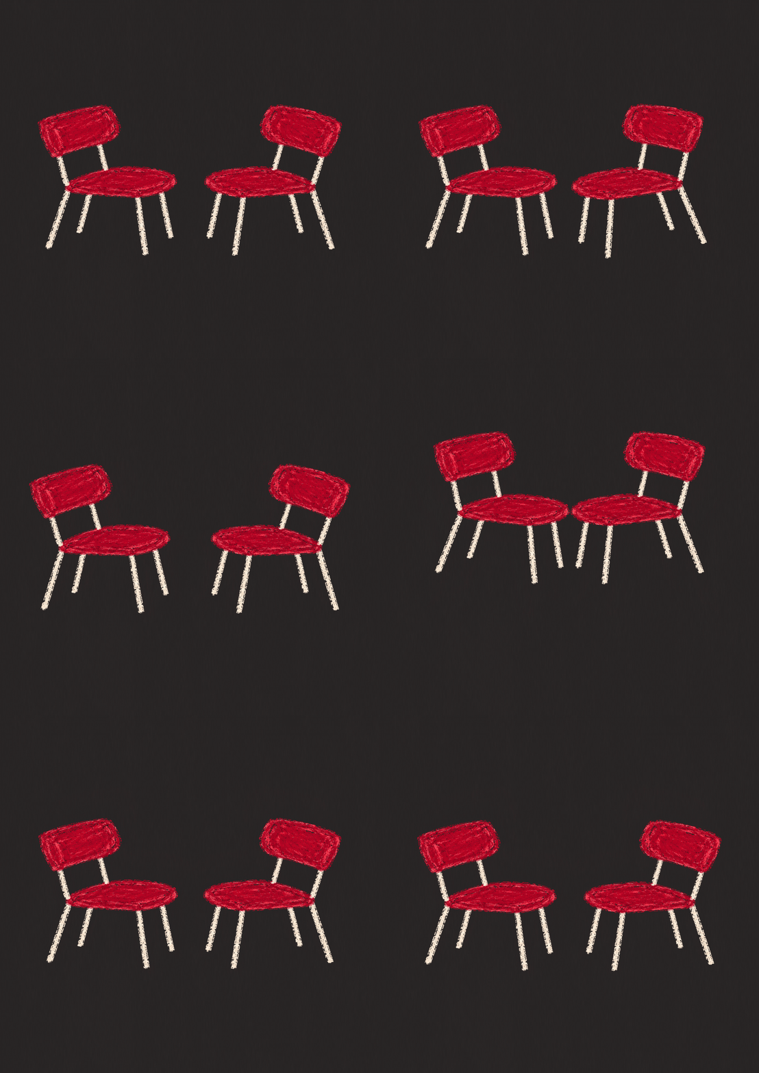
The primary graphic approach uses paired objects: candles, chairs, cups, and glasses. They convey intimacy through everyday scenarios—a conversation at the table, an evening together, or waiting for another person. Bordeaux-colored illustrations stand out against lilac and dark backgrounds, while large, antique typography and a strict grid on the posters are combined with the messy texture of chalk.
Mitts — 1 keywiz
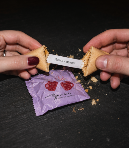
The concept is continued by facilitators who help initiate interaction: the «Getting Closer» game, task cards, and fortune cookies. The signature style becomes an intrinsic part of the introductory experience.
Chairs — 2 case studies
Pads — 3 Case Studies