Rebranding and developing a curriculum project into a startup. The Pet Emotional Wellness Studio.
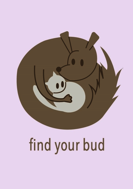
The initial project, Buddy’s Paw (2025), focused on the psychological support of animals. It already featured recognizable characters, a logo, graphic imagery, and the first manifestations of the brand style. Project on the old portfolio:
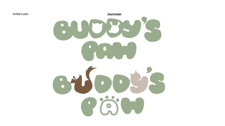
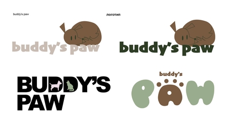
As part of the redesign, the initial concept evolved: Buddy’s Paw transformed into a studio dedicated to animal emotional well-being, complete with its own product line. The signature characters and the idea of support have been retained, while the system of carriers has been updated.
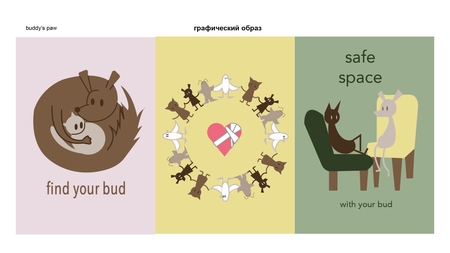
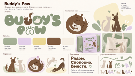
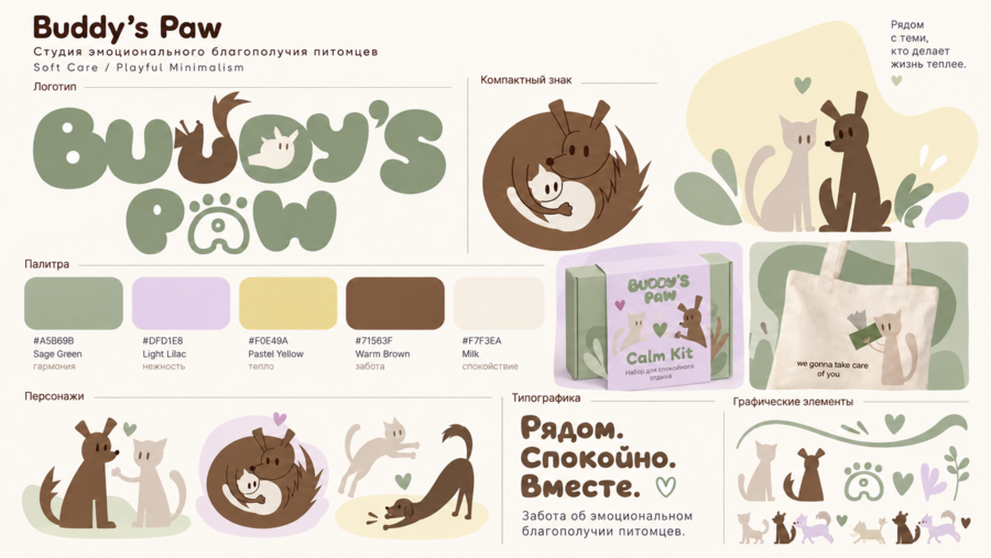
Soft Care / Playful Minimalism. This signature system combines a rounded logo, a compact mark, illustrations of a cat and a dog, organic shapes, and five colors: sage, lilac, pastel yellow, warm brown, and milky white.
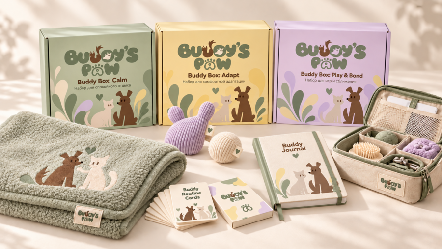
Three sets cater to different interaction scenarios with the pet: Calm—for peaceful relaxation; Adapt—for comfortable integration; and Play & Bond—for shared play and bonding. A unified packaging design brings the entire assortment together into one line.
Relaxation Kit: soft textiles, a toy, and cards with recommendations. An open box and a light-colored cat help showcase the product and convey a sense of care.
Home Use Scenario: A pet rests on a sage mat next to a soft toy. This illustrates how the product integrates into everyday living spaces.
Enrollment Kit for Comfortable Adaptation: an organizer containing grooming items and toys is shown next to the signature yellow box. The cat interacts with the kit in a calm, home environment.
Enrollment for games and bonding: the shared interaction between a person and a pet becomes the central theme. The lilac packaging, toy, and cards form a unified product narrative.
The packaging for Calm, Adapt, and Play & Bond adheres to a unified grid: the logo, names, characters, and graphic motifs maintain consistent roles. Color helps to differentiate the product within the line.
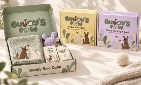
The open Calm reveals the contents of the set, while the closed Adapt and Play & Bond demonstrate the external design system. The signature materials support a sense of a thoughtfully curated customer experience.
Collection for People: a pale yellow T-shirt featuring characters, a sage green sweatshirt with a paw print emblem, and a milk-colored T-shirt with the Buddy’s Paw logo. The brand’s signature colors are used across the entire line.
The line of pet apparel mirrors the signature system: a sage green hoodie featuring a paw print, a milky white t-shirt with the logo, and a yellow t-shirt with animal illustrations.
Realistic lifestyle shots showcase how the brand’s insignia appears on humans and pets. The repetition of the paw print logo unites the two apparel items into a cohesive collection.
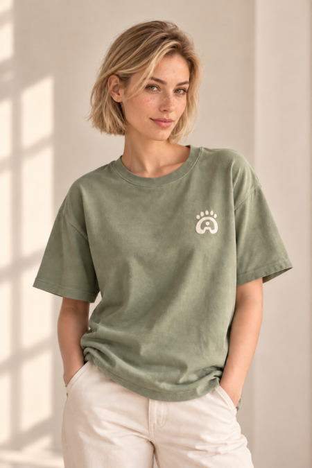
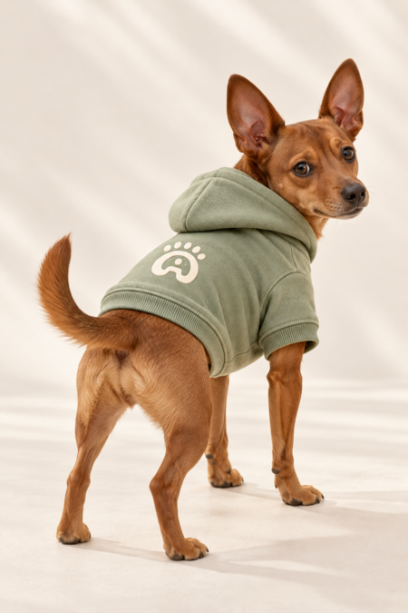
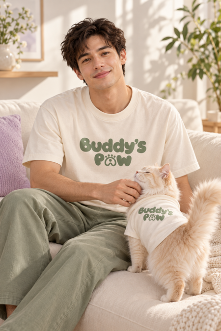
The milky t-shirt with a large logo and the cat attire illustrate the idea of shared symbols of care. The brand’s colors and soft style work effectively in portrait advertising.
The bright studio integrates a waiting area, a consultation space, a reception desk, and a display case featuring Buddy Box products. The brand identity is brought into the interior through signage, packaging, color palette, and graphics.
The second angle captures the tranquil atmosphere of the space: natural materials, soft resting beds, plants, natural light, and individual relaxation areas for the animals.
Nearby. Calmly. Together.
Three support packages for pet emotional well-being: Calm, Adapt, and Play & Bond.
Consultations · Adaptation · Games.
Gentle support for pets and their people.
Buddy’s Paw Collection.