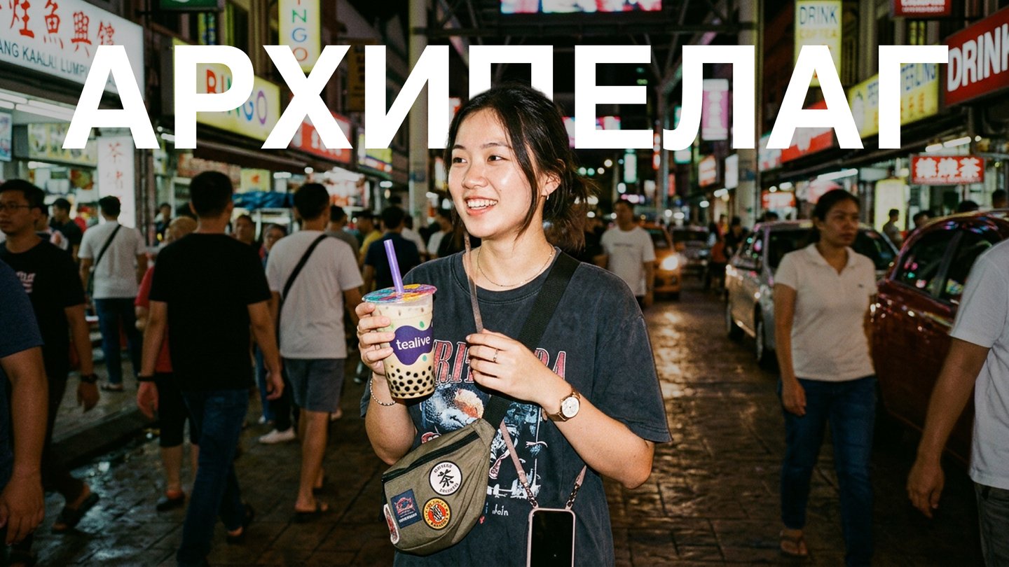
архипелаг
Цифровое исследовательское медиа о визуальной культуре, пространственном восприятии и поэтике повсед
Archipelago — a media platform exploring how an external environment alters a designer’s perspective.
Media objective
To establish an international research platform for a «slow and mindful gaze» on the environment.
Media allows the reader to slow down, reduce information overload, and learn to find inspiration in the micro-details of everyday life, silence, textures, and the local design of various cultures.
Future Media Topics
Segment: Visual research, environmental design, art direction, and Slow Living.
Niche Topic: Sensory adaptation and the exploration of local identity through the lens of material culture, analog photography, and tropical minimalism (using material from Bandung and Southeast Asia with scalability in mind).
Conceptual Focus: Moving away from tourist gloss and dry guidebooks. The media functions as a visual journal and research zine, investigating how unfamiliar environments, silence, light, and architectural fragments alter the designer’s perception.
Key Vectors and Content Pillars:Materiality and Textures: Documenting the urban environment, street typography, textiles, the gaps between concrete and tropical greenery, and the interplay of light and shadow in an equatorial climate.Phenomenology of Silence: Seeking moments of deceleration, pause, and visual repose within the dynamic and noisy Asian megacity.Sensory Adaptation: Analyzing how language barriers, humid air, novel sounds, and architectural scales transform the perception of form, color, and composition.Optical Transfer: Developing a universal method of observation (slow seeing) that remains applicable to studying any other city or culture.
Competitive Analysis
Direct Competitors

Telegram channels such as «Bali News/Indonesia LIVE» or Telegram channels run by exchange students.
Essence: Daily life blogs focused on practical assistance (visas, housing search, cafes, general logistics).
Weaknesses: Chaotic presentation, lack of art direction, casual phone photos without a cohesive visual language, and no underlying research or design focus.
Indirect Competitors
(Independent publications focusing on design, architecture, and visual culture)
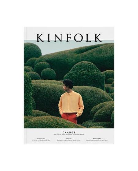
Kinfolk: An International Giant in the Slow Living Niche.
Pros: Impeccable Swiss typesetting, high aesthetic quality.Weaknesses: Static nature, sterility, detachment from real local life (glossy «interior» idealism).
Strelka Mag: Media on urbanism, architecture, and environmental design.
Strengths: Deep analytical foundation, systemic approach.Weaknesses: Focus on large-scale architectural and social structures, rather than quiet sensory adaptation, optics, and the poetics of micro-details.
Cabinet de l’Art: An independent art publication on visual culture and art.
Strengths: In-depth articles on the gallery scene and design.Weaknesses: Conventional restaurant and exhibition criticism; the absence of a living, cinematic photo-diary format at the intersection of research practice and street documentary.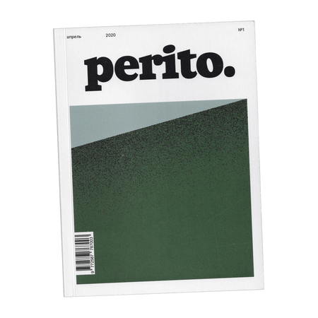
Perito Mag: Media on culture, geography, and mindful travel.
Pros: Vibrant Tone of Voice, rejection of standard, cliché tourism.
Cons: General-scope journalistic format; the media is not designed as a niche visual tool specifically for designers and art directors.
Potential Competitors
(Local independent zine communities and art galleries in Southeast Asia and Europe)

Independent Asian Print Zine Communities
Core Concept: Tactile print publications in runs of 50–100 copies.Weaknesses: Poor digitization, non-existent or irregular distribution through networks, and insularity within a narrow local community.Comparative Matrix by Criteria (6 Key Axes):
Conclusions and Market Insights
The niche of «Visual Studies of Everyday Life» is open: There is a vast gap between chaotic lifestyle blogs and overly academic or glossy magazines.
Lack of a Defined Methodology: No media currently offers designers and creators a ready-made framework (Slow Seeing)—a method for investigating another person’s environment and transforming the sensory experience of adaptation into a professional project.Differentiation through Visual Direction: «Archipelago» occupies a position at the intersection of film documentary (vibrant, breathing Asia with steam rising from food, contrasting light, and flash) and rigorous graphic design (structure, grid, high-quality typography).
User Scenarios and Distribution Channels
The user journey progresses from a rapid visual impulse to deep reading and comprehension:
1. Discovery Level: Channel for Attraction and First Contact
Platforms: Instagram*, Pinterest, TikTok, Reels / Shorts.User Scenario: The user scrolls through their feed seeking visual inspiration and stumbles upon aesthetically contrasting, «quiet» content—something that stands out vividly against the backdrop of aggressive marketing and bright stock photography.
Formats and Visuals:
Short-form Video (miniDV / VHS / Lo-Fi): Cinematic clips, 5–15 seconds in length, featuring analog texture, noise, and soft lighting.Flash Photography Cards: Macro shots utilizing harsh, direct light.Pinterest Moodboards: Thematic grid collections (e.g., «Light and Shadow, ” „Tropical Brutalism, ” „Local Graphic Code“).Function and Conversion: To generate an immediate aesthetic resonance („I connect with this aesthetic“) and redirect the focused attention via a multi-link to the main Telegram channel.2. Core Level: Primary Retention and Community Platform
Platform: Telegram channel.User Scenario: A subscriber enters the channel during a daily break (while having coffee in the morning or in the evening) to slow down, read a meditative text, and immerse themselves in an atmosphere of inquiry.
Formats and Content Structure:
Analytical Micro-Essays: An examination of how spatial environment, silence, humid climate, and local daily life transform a designer’s thinking.Analog Photo Diaries: Series of 35 mm film shots accompanied by brief authorial exposition and a detailed compositional analysis.
Audio Notes and Ambient Essays: Recordings of environmental sounds—the noise of tropical rain, the hum of a night market, street sounds—combined with vocal reflection.
Visual Code Analysis: A section dedicated to observations of typography on storefronts, color on facades, and the packaging design of artisanal producers.
Function: To cultivate a loyal core audience (creators, designers, architects), maintain engagement through a deep Tone of Voice, and create a sense of «personal presence.»