Project Concept
Music charts are a collective portrait of taste. What millions of people listened to in each specific year composes a history not only of music but also of culture—shifting generations, moods, and recording technologies.
I found it interesting to tackle this as a design problem: to translate something as intangible as the sound of an era into the visual language of color and form. This challenge—making visible what is usually only heard—is what led to the choice of this theme.
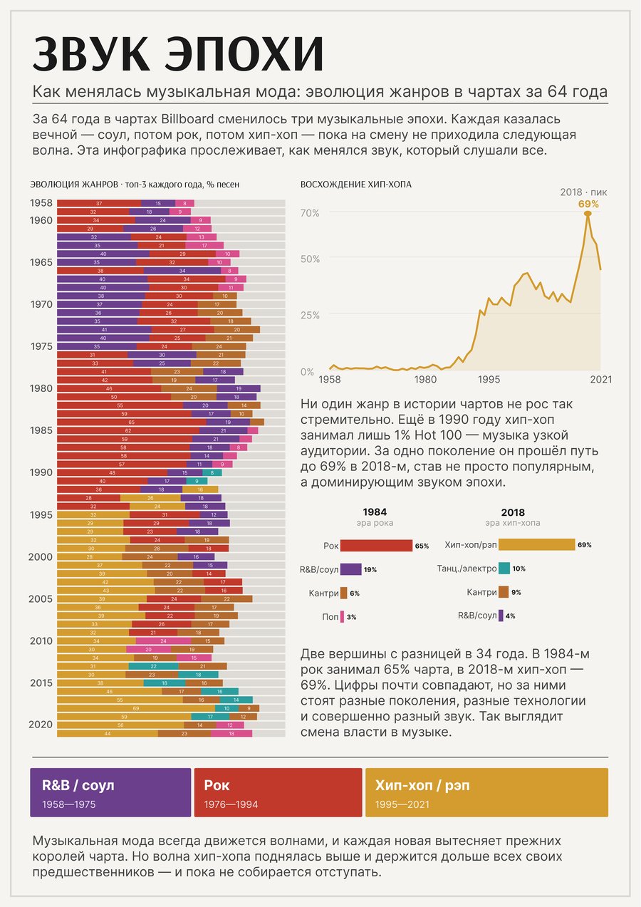
The main discovery the data reveals is the dramatic shifts in musical dominance. R&B and Soul ruled in the 1960s and early 1970s. Rock took over the late 70s and all of the 80s, peaking at 65% of all chart songs in 1984. Starting in the mid-1990s, the unstoppable rise of hip-hop began: from a negligible 1% in 1990 to 69% in 2018. Hip-hop didn’t just become popular—it has dominated the charts longer and more powerfully than any genre before it.
Infographic Goal — to illustrate that the history of popular music is cyclical and dramatic, and that this history can be read directly from open data.
Cultural-Analytical Value of the Project: the viewer perceives a pattern they typically miss when listening to individual songs—that musical trends move in large waves, and each generation exists within its own wave. This helps foster a different perspective on one’s own tastes, as well as on the music listened to by younger or older people.
Source Data and Origin
Data Source: The «Billboard Hot 100 Audio Features» dataset (by Sean Miller), published on Kaggle. The dataset combines the official Billboard Hot 100 charts with genre and audio classification data from the Spotify Web API.
Link: https://www.kaggle.com/datasets/thedevastator/billboard-hot-100-audio-features Open-access mirror (TidyTuesday project, rfordatascience): https://github.com/rfordatascience/tidytuesday/tree/master/data/2021/2021-09-14
Dataset Composition: Two linked files from a single source—weekly charts (song rankings) and audio features, including genres (the spotify_genre column). The files are joined using the key «song + artist.»
Poster
Mockups
The Creation Process
Unlike many projects where data must be gathered from disparate sources, this entire project is built around a single dataset. This is a methodological advantage: the data is internally consistent.
The dataset consists of two files from one source: Billboard charts (song, artist, week, position) and Spotify metadata (the same song with its genres). I merged them using the «song + artist» key, determining the year of each song’s first chart appearance and its genres.
Since Spotify assigns several specific genres to each song (e.g., «east coast hip hop, ” „pop rap, ” „southern hip hop“), I grouped them into seven broad families: pop, rock, hip hop/rap, R&B/soul, country, dance/electronic, and other. This grouping was based on keywords within the genre names. Songs without a specified genre (8.7%) were excluded from the proportion calculations. Next, for each year, I calculated the percentage share of each genre family among all songs that year and determined the dominant genre.
Tools Used
Data Processing: Python (CSV parsing, file merging, genre grouping, percentage calculation). Alternatively, the same operations could be performed in Google Sheets, but due to the volume (354 thousand chart rows), programmatic processing was preferred.
AI Tools: Claude was used for searching and verifying the dataset, designing the processing pipeline, and final text editing.
Design: Figma — final poster and cover layout. Photoshop — mockup creation.