This is a digital portfolio of a designer who traverses different realities in search of unique practices.
I worry about becoming entrenched in my own viewpoints or accustomed ways of life, which makes it difficult to see the world from a new perspective and grow.My work covers two areas: research and practice. As a researcher, I explore alternative modes of existence in the world—especially within the digital realm. As a designer, I create projects that encourage people to reflect on the current state of affairs and step beyond the familiar.I can’t be serious all the time, though—so in my spare time, I’m also an aspiring jewelry maker!Join me, and I’ll show you my creations.
Third-Person Effect
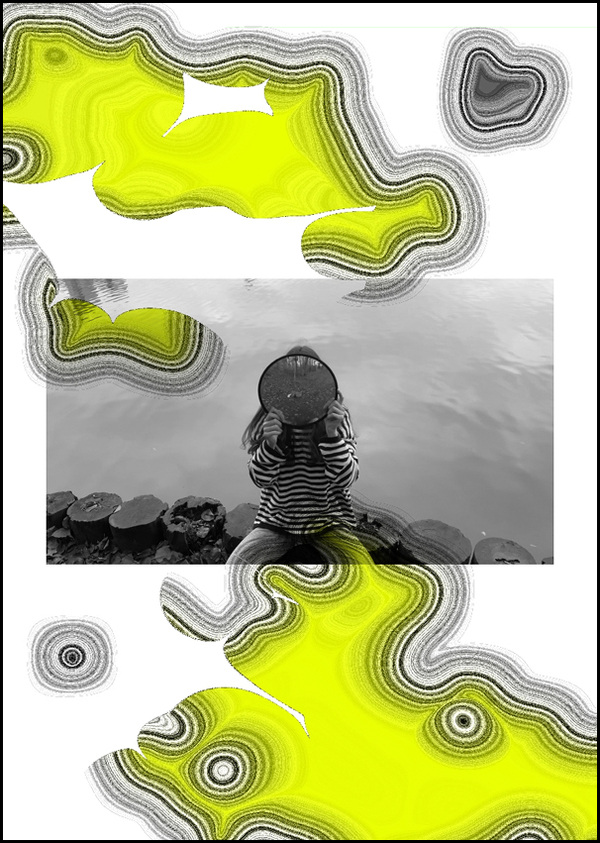
In my third year of university, we were tasked with creating an explainer video. As a group, we focused on the theme of «cognitive biases.» Each student chose one from a long list and presented it from a specific angle.
I became interested in the «third-person effect”—a phenomenon where a person believes that advertising, news, propaganda, or other forms of information have a stronger impact on those around them than on themselves. In my view, however, one should never underestimate the fact that all information is „colored“ by certain perspectives and inevitably influences us, whether explicitly or implicitly.
This project encouraged me to reflect on the boundaries of my own „information bubble“—what gets in there and how that shapes me.
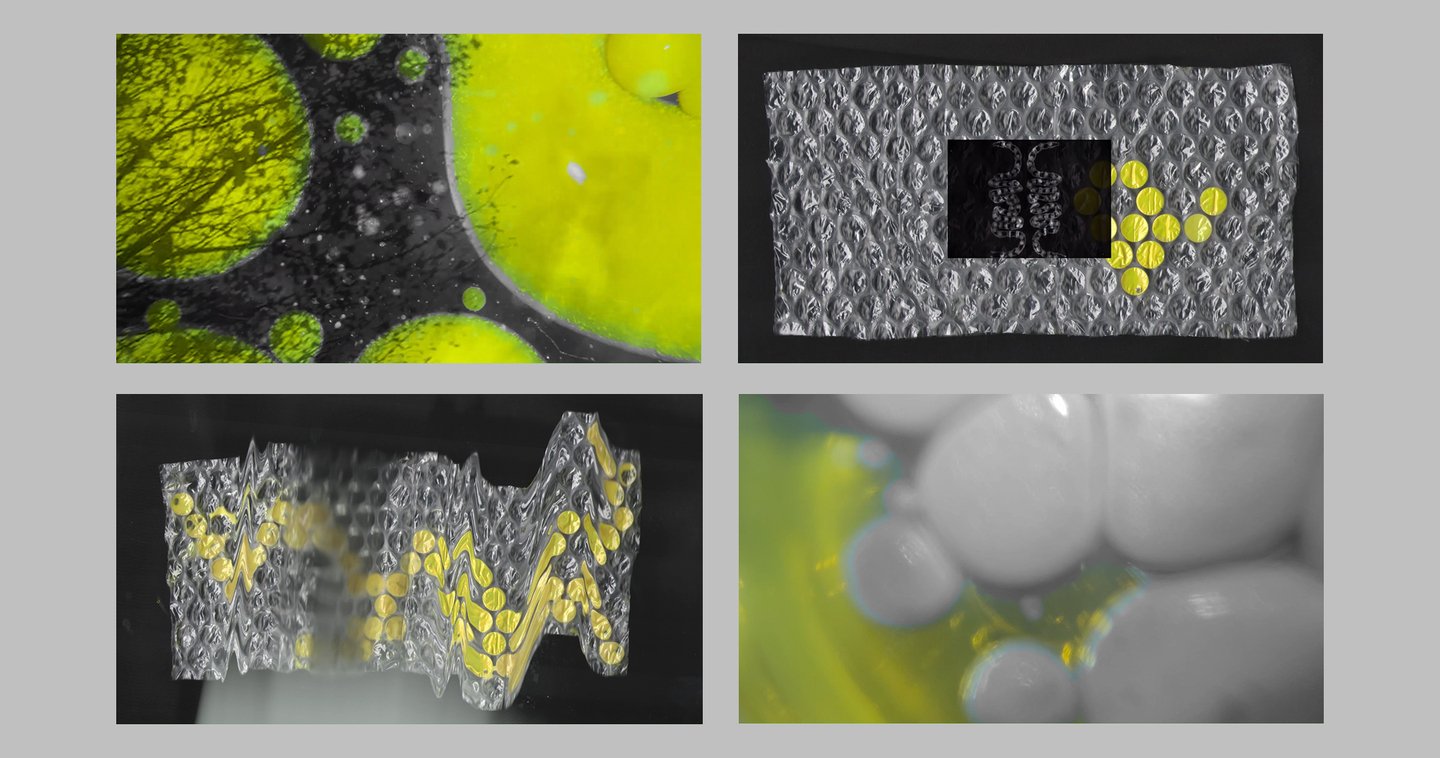
The visuals in the explainer are inspired by protective fields—barriers that separate a familiar internal environment from a hostile external one. These fields, however, are prone to deformation and distortion: gaps can emerge, allowing unwanted elements to slip through.In Russian culture, the color yellow is associated with both madness («yellow house» is an expression referring to an insane asylum) and untruthful information («yellow press»).The video incorporates my own footage and archival materials. The graphics were created using TouchDesigner. These elements are layered and blended together, symbolizing a viscous information environment in which it is difficult to distinguish one thing from another.
Manual
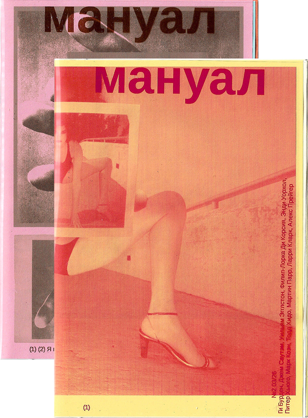
Manual is a magazine created by Ulyana Danilevskaya and me that explores the phenomena of postmodern society—a reality we must coexist with, whether we like it or not. One might choose to tolerate this reality or fight against it. Our approach is simply to pose questions and cultivate new ground for reflecting on things that, at first glance, seem to have already been analyzed from every possible angle. In search of fresh perspectives, we turn to the work of artists we admire.
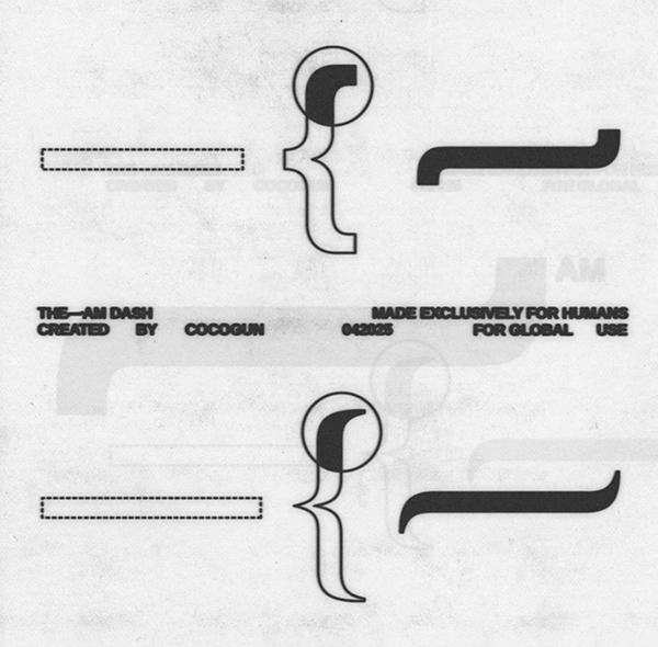
A key principle of media is the manual curation of content. We stand in opposition to algorithmic recommendation feeds, offering instead a selection of material curated by actual human beings. This commitment to a handpicked approach is reflected in the publication’s primary typeface—Areal—a reimagining of Arial in which the standard em-dash, which has become associated with AI-generated content, is replaced by a custom «am-dash.» The symbol itself draws its name from the English verb «am"—to be, to exist.
Areal font and this picture are created by Cocogun.
Each issue focuses on a single phenomenon, illustrating its various aspects through a specific category of visual material. The magazine is produced in A5 format and bound with an elastic band. Every sheet within the publication functions in two ways: as a complete, individual piece and as a distinct page. This method of assembly maximizes the encounters between different works—combining visual rhymes across individual sheets, specific pages, two-page spreads, or even across all sheets of the same format or color. Furthermore, the issues are untitled—the first page, which also serves as the cover, features a manifesto work that acts as a title without words.
Title: Manual Format: 130×185 mm Cover: Lomond film Paper: Arkana 80 g/m² Font: Areal
Broadcast
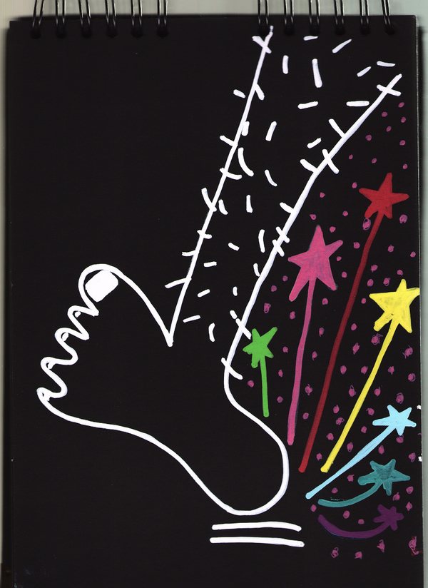
«Peredacha» is a video project focused on learning poetry through the use of mnemonic techniques—or, more broadly, on developing associative thinking.
Externalization — the practice of storing knowledge on external (typically digital) media to reduce cognitive load — is gaining increasing popularity. Research shows that while externalization can, in some instances, enhance productivity, it often has a negative impact on human cognitive functions.
Cover Design Prompt: Frame the theme as a narrative of movement, search, or change.
Formulate the theme as the beginning of a journey or a story of transformation, rather than as a static concept. Statements involving motion, challenge, or exploration work particularly well. The cover must promise evolution, not just present facts.
Step 2. Hero
Представить героя, с которым можно соотнестись
Show the character specifically—through a situation, motivation, and initial conditions. It is important to create a possibility for identification—similarity in role, task, or state. The clearer the starting point, the stronger the perceived change will be.
Step 3. Testing
Провести героя через трудности, решения и внутренние повороты
Show the process not as a smooth progression, but as a sequence of calls and choices. Include doubts, errors, and tension—they amplify empathy. Do not rush this section too much: engagement is born from inhabiting difficulty.
Step 4. Transformation
Показать, как изменился герой — в понимании, подходе или состоянии