Disclaimer! Some mentioned resources belong to Meta, a company recognized as extremist in the Russian Federation.
CONCEPT
Gen Z became the first generation in history to have free access to the internet from childhood. We grew up holding our parents' phones, or hanging out in computer clubs (depending on the Gen Z member’s age), immersed in endless shooters, runners, and racing games. And social media, of course, became an important part of our lives from a very early teenage age. So much so that we often dive into social media so deeply that we forget about real life.
«SOCIAL MEDIA KILLED ROMANCE» — a popular slogan among U.S. Gen Z members who feel that due to the saturation of social platforms, real life is gradually losing its color.
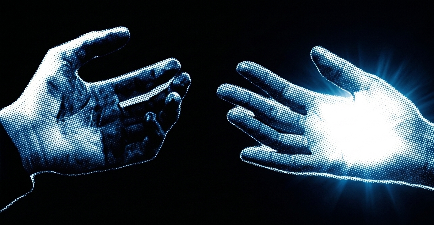
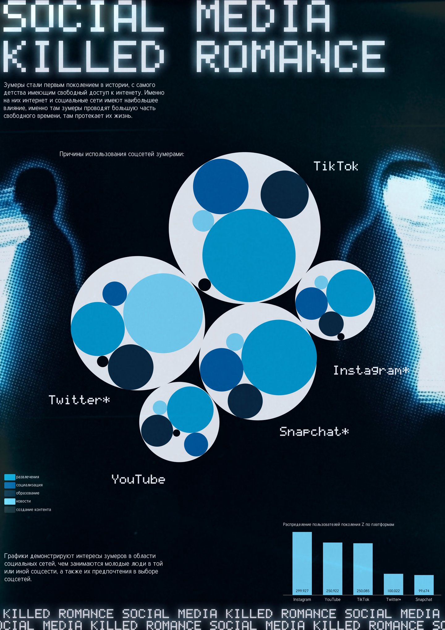
The central idea of the project is to investigate and understand precisely how Zoomers spend their time across different social media platforms, and subsequently to visualize these findings through infographics. The practical value of this project lies in its relevance and visual impact: the infographics help the viewer grasp the core patterns of Generation Z’s digital behavior in just 30 seconds, prompting reflection on their own habits.
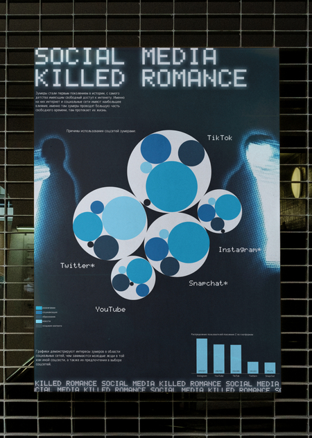
[POSTER]
[HOLDERS]
[PROJECT WORK]
For the project, the Gen-Z Social Media Usage Dataset from Kaggle was used. This dataset is synthetic and created for educational purposes.
The first, central chart (Circular Packing Chart) was constructed in Google Colab using Python code and customized in Figma.
Before beginning work in Google Colab, the libraries circlify, pandas, matplotlib, and numpy were installed. The Gen-Z Social Media Usage dataset (1 million rows) was uploaded via files.upload () and read into a DataFrame. The shape, the first few rows, and the column names were printed for verification.
Next, using groupby, the data is grouped by platforms and intended uses. Two tables are generated: platform_totals (the total number of users per platform—which determines the size of the large circles) and platform_purpose (the breakdown by purpose—which dictates the content inside each circle).
In the next phase, the circlify library calculated the coordinates and radii for each large circular platform so that they would not overlap and would fill the space. The for loop rendered two levels: the large circular platforms (outlines with names in the center) and the small circular targets inside them. The small circles are positioned along the circumference using sine and cosine, and their size is normalized relative to the largest platform target. If a circle is large enough, a shortened caption is added to it. The chart was saved as a PNG and imported into Figma.
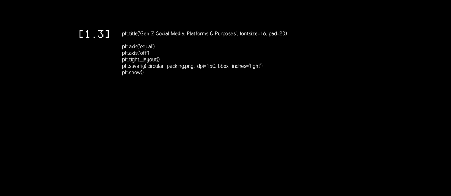
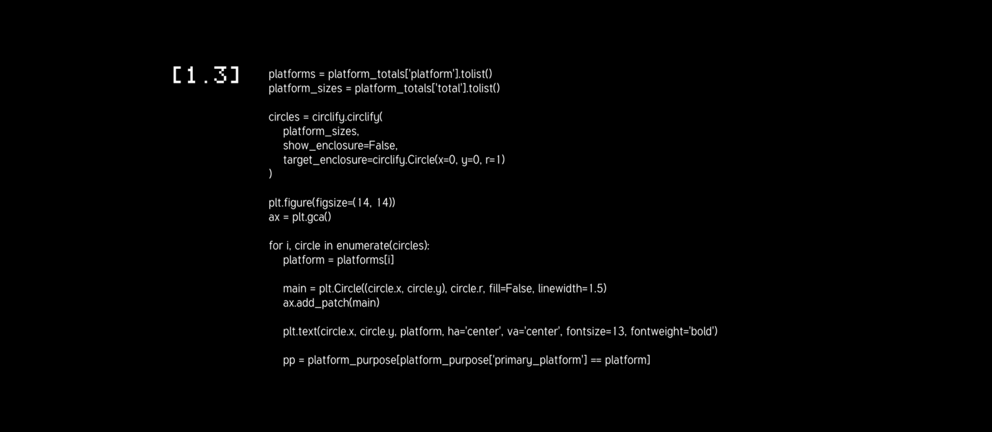
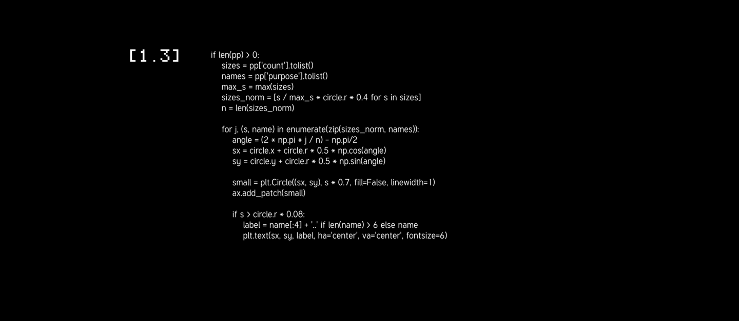
Finally, the schedule was refined and customized in Figma: color fills were added to the circles, platform icons, a legend, and a title.
The second, supplementary chart (Bar Chart) was also built in Google Colab using Python code and customized in Figma.
In the initial phase, the number of rows in the dataset corresponding to each platform was calculated using the value_counts () method.
In the next step, a bar chart was constructed based on the gathered data. Each bar displays its numerical value, formatted with commas as thousands separators. Axis labels (Platform, Number of Users), a title, a grid, and rotated labels have been set up. The chart was saved and imported into Figma.
The chart was refined and customized in Figma.
Resources mentioned belong to Meta, which is recognized as an extremist organization in the Russian Federation.