Idea and Concept
The idea behind this project is to visualize data regarding the ratio of potential Hogwarts students categorized by blood status and compare this ratio across different Houses and throughout Hogwarts as a whole.
Because I am interested in the Harry Potter universe and considering my field of study, I decided to combine these two aspects and create a project based on them. The project is about the Hogwarts students (specifically, their blood status); its infographic could aid in developing add-ons for the game «Hogwarts Legacy,» particularly concerning NPC students. The theme of wizard blood purity is often raised in the Harry Potter universe, and I believe this could make the game environment feel more «alive» for players and fans of this franchise.
Production pipeline and data processing methodology.
For my project, I decided to repurpose a previous course project as the theme and data source. The data for creating the infographic was taken from the Kaggle website. The information in the table did not pertain to the characters described in the books, but rather to fictional students; however, this does not hinder the use of this data to create characters in the game.
To process the data, I wrote code that was intended to generate the required charts based on information taken from a table. The first part of the code handles loading the table containing data for 1,000 fictional Hogwarts students from the Harry Potter universe, and the rest is dedicated to visualizing the graphs. To make the information easier to navigate, I selected two suitable chart types: pie and bar charts.
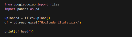
Code screenshot for data processing
Next, I checked the student-to-faculty ratio for each department to understand how accurate the data was across the different faculties. The chart, generated from the written code and the uploaded data table, showed that the number of students in each department was almost identical.
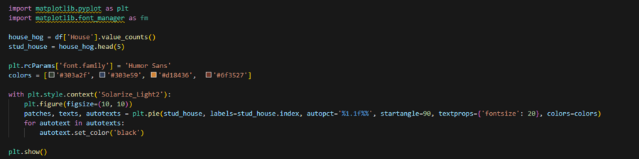
Code screenshot for data visualization
Percentage breakdown of students across different departments
After that, I began working on a theme related to the blood status of the students. This check showed the ratio of students with different blood purities across all of Hogwarts, not within a single house. This was done to understand what percentage of students of this blood status was assigned to each house.
It turned out that the difference between the number of students with different blood purities was as small as the difference in the number of students in each house.
Code screenshot for data visualization
Percentage distribution of students by blood status
Since the next task involved comparing students of different blood statuses within the same faculty, rather than across the entire institution as before, I decided to use a more visually clear bar chart. This format made it easier to compare the data both within the faculty and against other groups.
Code screenshot for data visualization
Ratio of students across different departments and bloodline statuses
After the written code analyzed the table and generated the charts, I moved on to the poster’s design. I decided to use the primary colors of each department—green, red, yellow, and blue—to maintain the association with the respective departments; this was intended to simplify navigation between the charts and connect to the Harry Potter universe itself.
To avoid repeating the two pie charts in the design, I represented the number of students of different blood types with human figure icons. By using a different color for these icons, I essentially merged this graph with the information and turned it into a «legend» for the bar chart, allowing the viewer to understand which bar corresponds to which blood type. This eliminated the need to label the bars individually or occupy space with a separate legend for the bar chart.
Final Poster
First, I divided the poster itself into blocks to decide where and what content would go, and then I began transferring all the data and preparing the text for the poster. The final step was finding and styling the mockups.
Poster Mockup
Poster Mockup
Poster Mockup