
Concept
Advertising today is a powerful tool for promoting various brands, although in our current age of virtual abundance and advanced technology, capturing a customer’s attention has become increasingly difficult. The endless stream of content, clicks, and notifications makes it harder than ever to attract and retain human attention. Trends shift daily, which underscores the necessity of building a clear and trustworthy dialogue between a brand and its consumer using accessible language. To achieve this, one must master working with different types of advertising.
The visual research examines nine distinct techniques of advertising communication: product advertising, advertising generators, Ogilvy headlines, absurd elements, words and symbols, metaphor, shock advertising, extreme consequences, and storytelling. For each, specific characteristics are identified and their impact on the viewer is analyzed.
The hypothesis of this visual research is that despite the apparent chaos and fragmentation of the media landscape, there exist enduring, time-tested advertising techniques that remain the foundation for creating effective communication. When properly adapted to the contemporary context, these techniques enable a brand to cut through the noise and establish the correct connection with the consumer. If used consistently, this approach will help refine the brand’s objective essence and role, define the core target audience, and pinpoint the most distinctive idea of the advertisement.
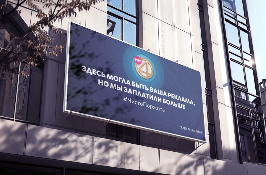
TNT4 Channel Ad «#PureLaugh», 2018
As part of the course, we studied various strategies. Beyond researching techniques, the task involved independently creating an advertising campaign for a fictitious brand, drawing upon the tactics we had learned. For this, the chosen product was teleportation bracelets.
The study consists of two main parts: In the first part, nine techniques are sequentially presented. These sections first review examples of advertising campaigns from various brands, followed by an analysis of each strategy and the sketching of a personal advertising poster or banner. Image sources, articles, and other informational materials were selected based on the necessary context. Information was gathered from brand and advertising agency websites, as well as from serendipitous discoveries in television and out-of-home advertising. In the second part of the study, the most convincing and relevant promotion tactic for the brand concept is selected based on the preceding analysis. In the final presentation, what is shown are not just sketches, but fully developed versions of the advertising campaign—demonstrating how theoretical understanding of these techniques transforms into a cohesive and effective visual communication.
The research aims not only to master theoretical material but also to apply it in practice, illustrating how classic advertising techniques continue to live and evolve, remaining key to engaging consumers in the digital age.
About the Brand
The issue of misplaced items in the context of ever-accelerating time is becoming increasingly relevant. People increasingly do not want to spend time going back and forth or making unnecessary movements. Furthermore, sometimes one wishes an item from another room would simply appear nearby, without interrupting tasks or relaxation on the sofa.
The teleportation bracelets, PortaLink, solve this problem, allowing users never to worry again about forgotten or currently inaccessible items. Everything is literally at hand.
The logo design is minimalist and concise, much like the product itself—simple and elegant. This communication style is clear and easily understood.
The brand’s main goal is to save time and to assist people with disabilities. The product is relevant for people of almost all ages.
Product Advertising
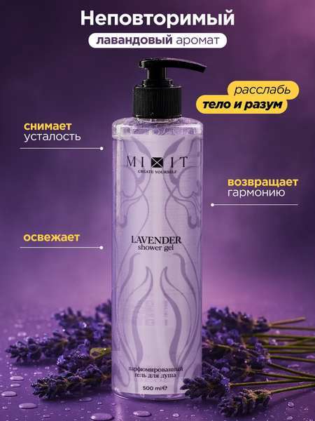
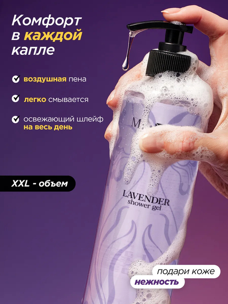
Wildberries Product Card Advertising by Mixit, 2025
Product advertising is the most common and familiar form of advertising, incorporating a standard set of tools: a product image, its name, a brief description of its benefits, and a concise slogan. This is a quite simple technique that allows a thought to be conveyed quickly and clearly to the buyer; due to its accessibility, this type of advertising is encountered most frequently.
Nowadays, the primary source of product advertising is product listings on marketplaces. Since the seller needs to present the product quickly and clearly, without spending much money on advertising, while also showcasing the product’s qualities, the choice falls on product advertising. Unfortunately, because of this, many products look uniform, and this technique does not always benefit the brand.
Product Advertisement for the Chudo Kids Product Line, 2015
Product advertising is often television-based. For instance, consider the advertisement for «Chudo Detki,» which showcases the product line and includes a call to action: «Try 'Chudo' for kids soon.» This campaign uses a play on words, where «Chudo» functions both as the brand name and a description of the product quality. The language is simple and clear for both children and adults, and it is presented in a rhyming format.
A more interesting example is the Adoptable advertisement, where the brand essentially runs product advertising for animals. They use images of pets from local shelters and supplement them with a slogan and a brief description. This unconventional approach for such a brand makes the advertisement unique, unlike other product advertisements in the same category.
Adoptable Advertising Campaign «Adoptable. By Pedigree.», 2025
In the product advertisement for PortaLink, the product was demonstrated in an ephemeral style, seemingly existing outside the space between the portals. A short, concise slogan was adopted to highlight the convenience of using the bracelets. The transfer of the bracelet is framed as an act of mutual aid and connection. There is also a subtle reference to Michelangelo’s frescoes.
Product advertising sketch for PortaLink
2. Ad Builder

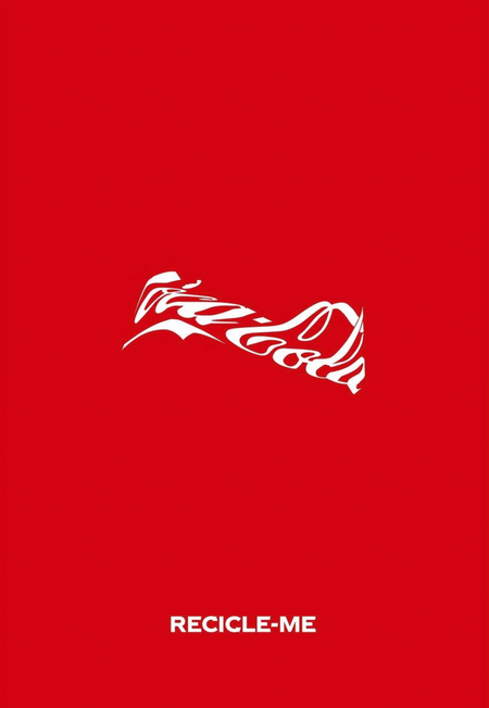
Coca-Cola «Recycle Me» Advertising Campaign, 2025
The next concept is a promotional design tool, whose main feature is the text form acting as the active subject of the poster. Typography defines the character of the advertisement—this is understandable, given that this technique evolved from the Constructivist works of Vladimir Mayakovsky and Alexander Rodchenko.
Coca-Cola employs the use of negative space, but here, there is also a play with the text’s form. The soda bottle has such an iconic shape that the brand only needs to place the text in the correct proportions and slightly curve it, and the viewer immediately perceives the bottle even though it is not physically present. Following this, an even more intriguing solution is presented, one that calls for recycling. The lettering transforms and compresses, mimicking the curved bottle that needs to be taken for recycling.
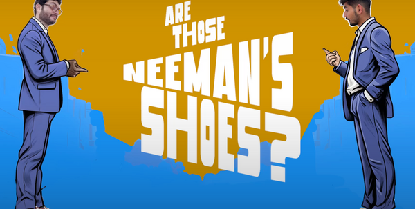

Neeman’s Promotional Video, 2024
The advertising idea, addressing the public concern about phone tracking while others fear it, flips the situation to the brand’s advantage. Their concept is to shout on the street, «Are these Nimbus sneakers?» so that passersby’s phones register the phrase and serve targeted ads to users. For visualization, the brand proposes using text in motion—rapid phrases and thoughts—thereby replicating elements of a billboard structure.
Designer Matthew Barber proposed a rebranding concept for Ikea, presenting in his advertising posters the idea of assembling one’s home piece by piece, much like furniture items are assembled from words and sentences. In this concept, the literal content is less important; instead, the words featuring various furniture pieces are collected and pieced together.
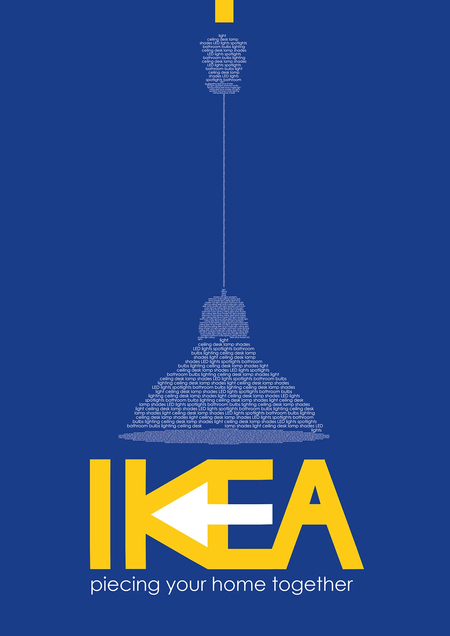

Matthew Barber, Ikea rebranding concept, 2014
In the PortaLink brand sketch, typography is applied like a wave around the product itself, where the main text is deciphered between the bracelets, and the remaining space dissolves into noise, conveying the idea that distance and space are not as important.
Sketch for the PortaLink Ad Builder
3. Ogilvy Titles
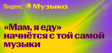
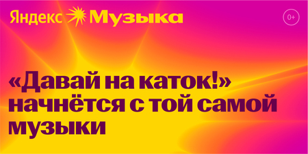
Yandex Music Advertising Campaign, 2023
Ogilvy ushered in the era of clever headlines that engage in an informal dialogue with the consumer—literally «getting into the consumer’s head.» The idea is that headlines voice the user’s thoughts about the brand. The quotes and phrases refer not to the product itself, but to the experience derived from using the product, aiming to connect with the audience’s emotions.
Yandex utilizes emotionally charged phrases, which are often ambitious and point to a connection with their service. The consumer immediately makes this connection on a subconscious level. Therefore, music offers the user a similar emotional experience.
Advertising posters for KFC «Bucket Bangers,» 2020
Sid Lee Paris compiled a playlist featuring lyrics that mentioned KFC, which subsequently evolved into an advertising campaign using song quotes alongside brand mentions. The posters feature headlines that convey the mood of the campaign and how people perceive it.
The LUKOIL advertising posters are designed in the format of quotes from company employees’ interviews, prioritizing the brand’s social dimension. The company is fundamentally about people and social responsibility. The quote format fosters trust in the viewer. This example is more serious, but no less compelling.

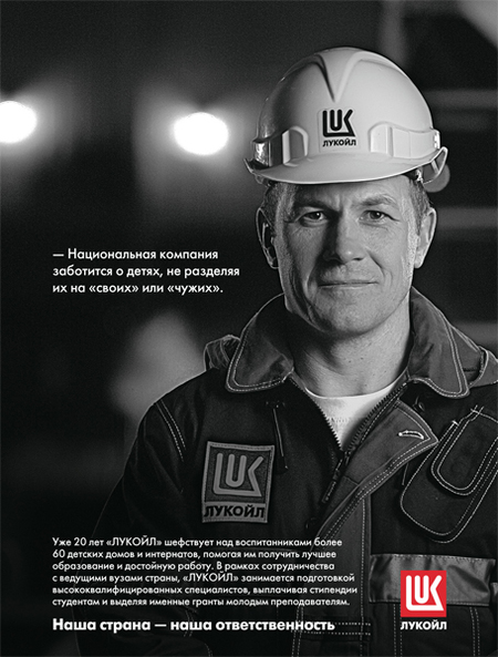
LUKOIL Advertising Campaign, 2012