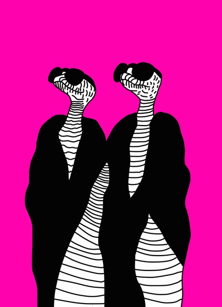
My name is Stanislava Utkina. I completed the Bachelor’s program in Animation and Illustration at the HSE Art and Design School and wish to continue my studies in the Master’s program in Communication Design: Foundational Level. During my studies, I realized that I am interested not only in creating original illustrations and animations but also in working on broader visual communication challenges.
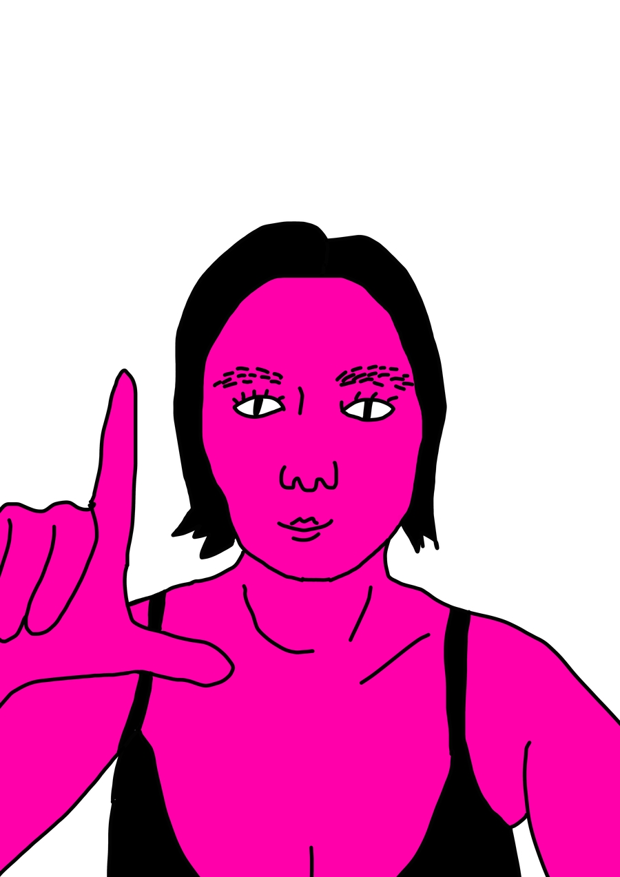
This is Me
My professional interests gradually shifted toward developing visual systems, where illustration becomes part of a cohesive identity and helps to shape a recognizable brand image.
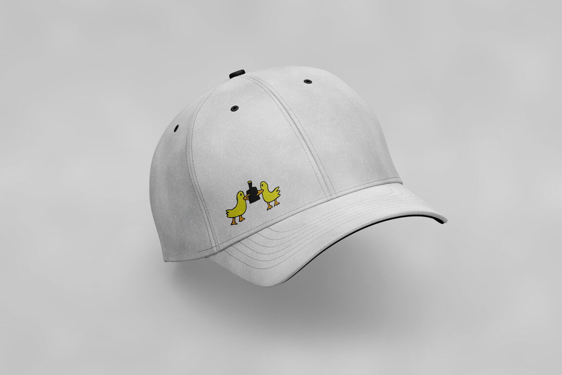
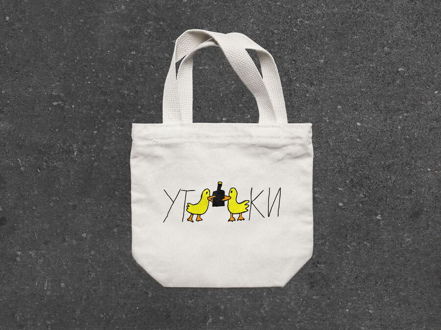
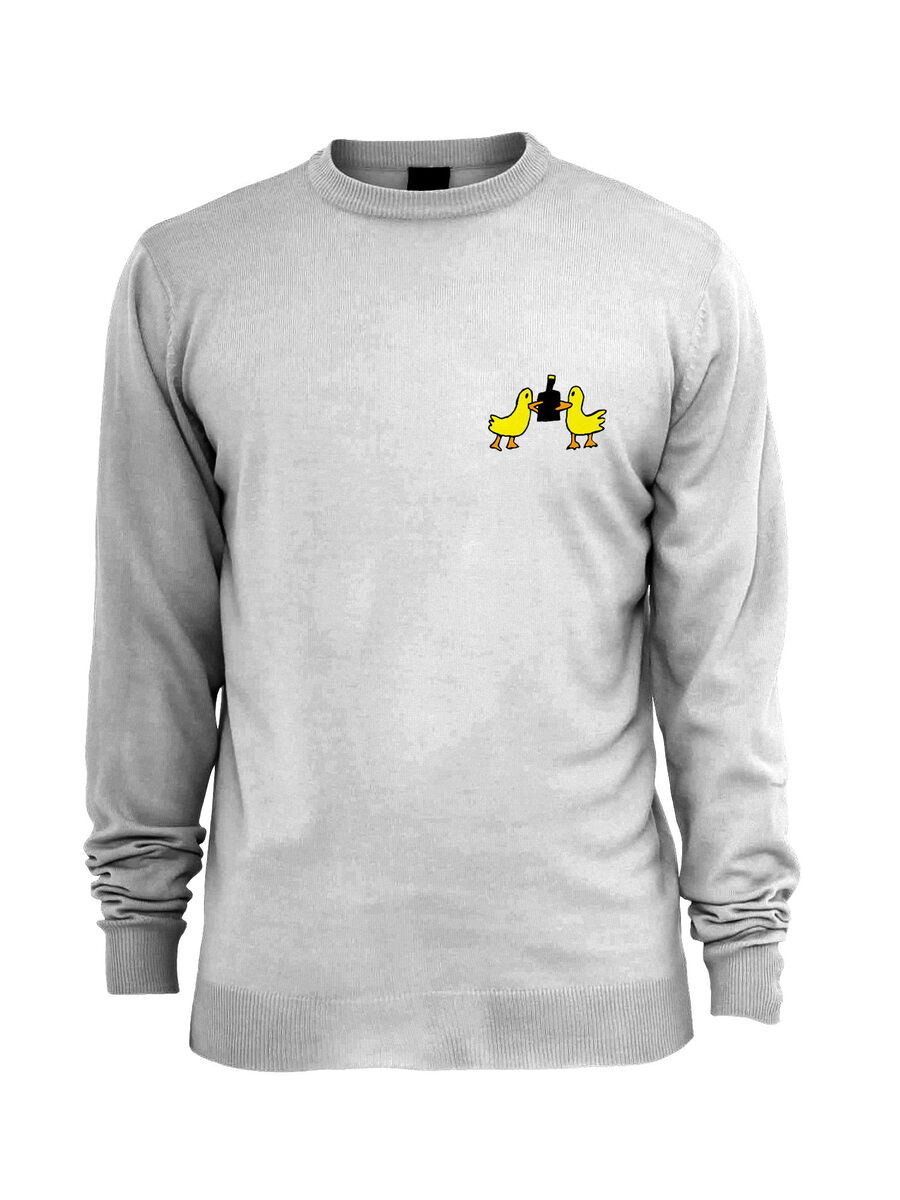
Merchandise for the «Ducks» cider brand
Studying the Bachelor’s program in Animation and Illustration at HSE Art and Design School allowed me to build a strong artistic and design foundation. During my studies, I learned to work with illustration not only as a standalone artistic statement but also as a tool for visual communication. Working on original projects, illustration series, and short-form animation helped me master the entire cycle of creating a visual work—from researching a topic and developing a concept to final execution and project presentation.
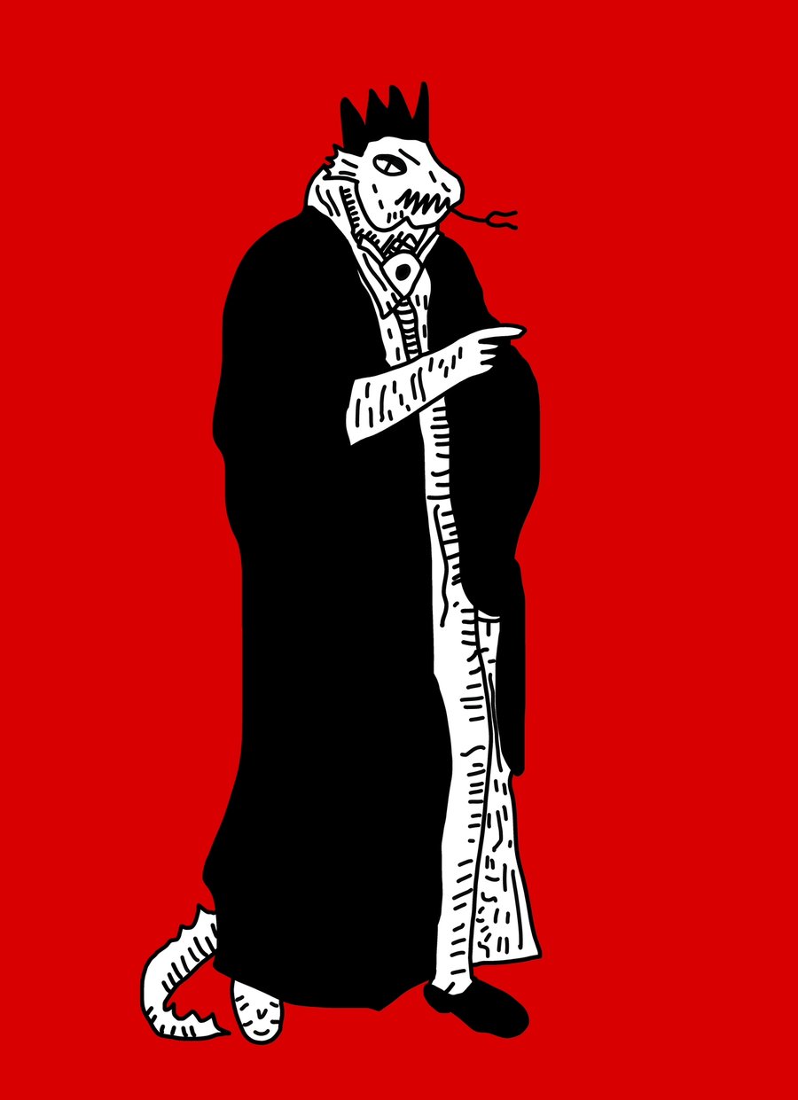
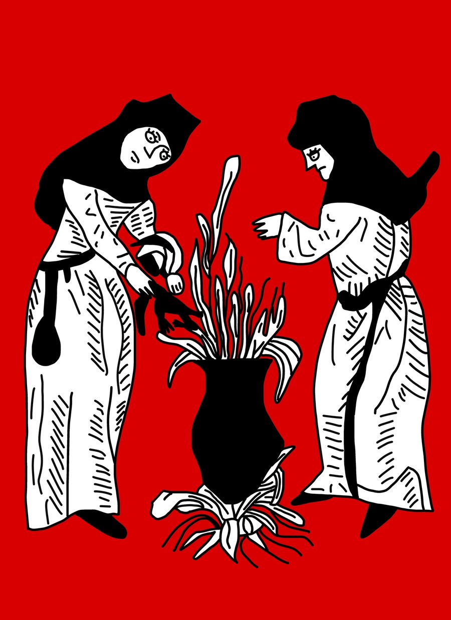
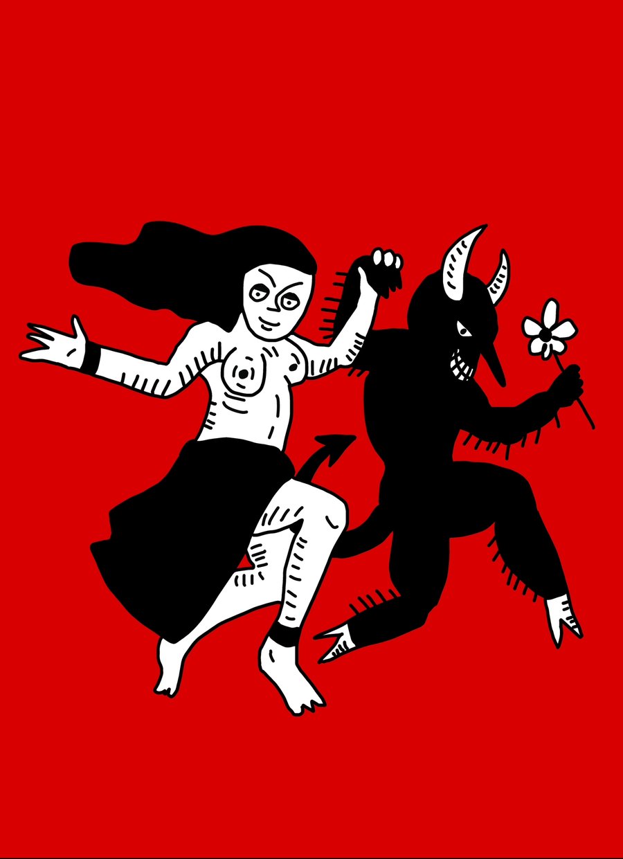
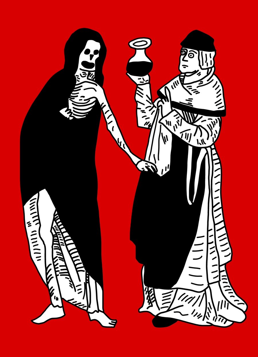
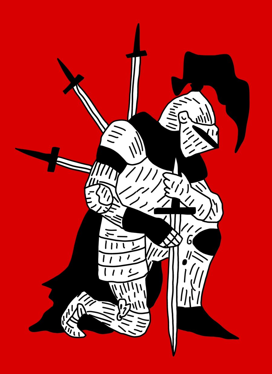
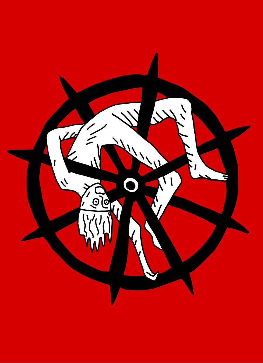
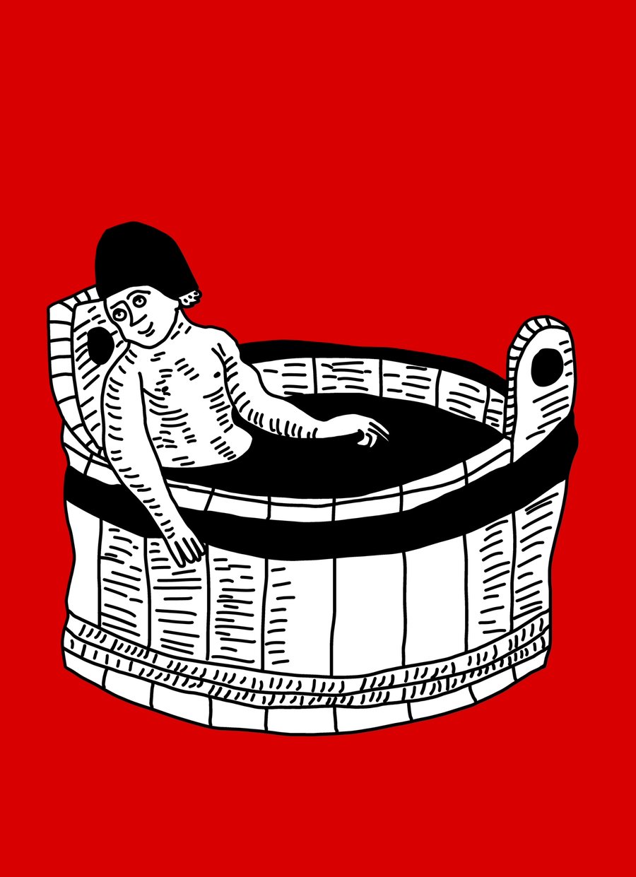
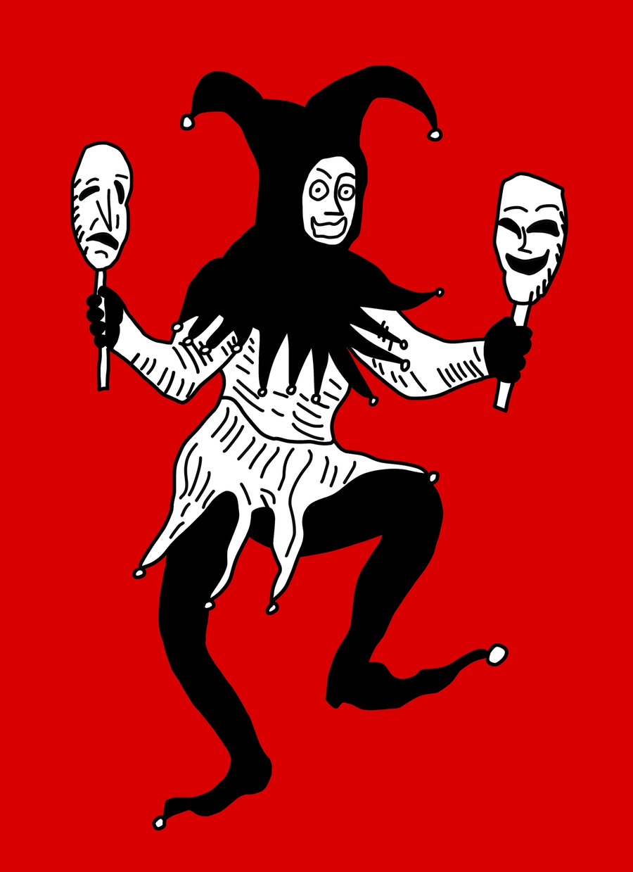
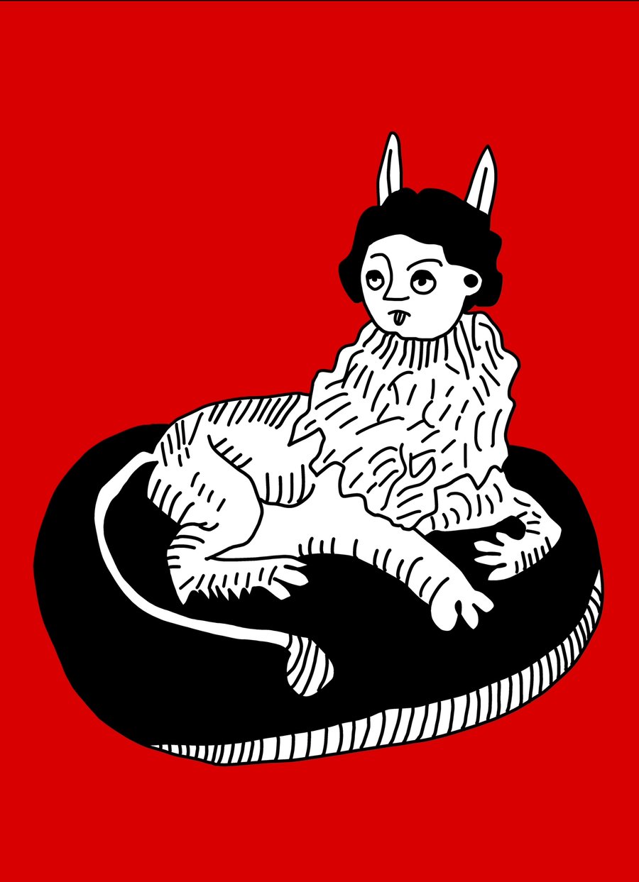
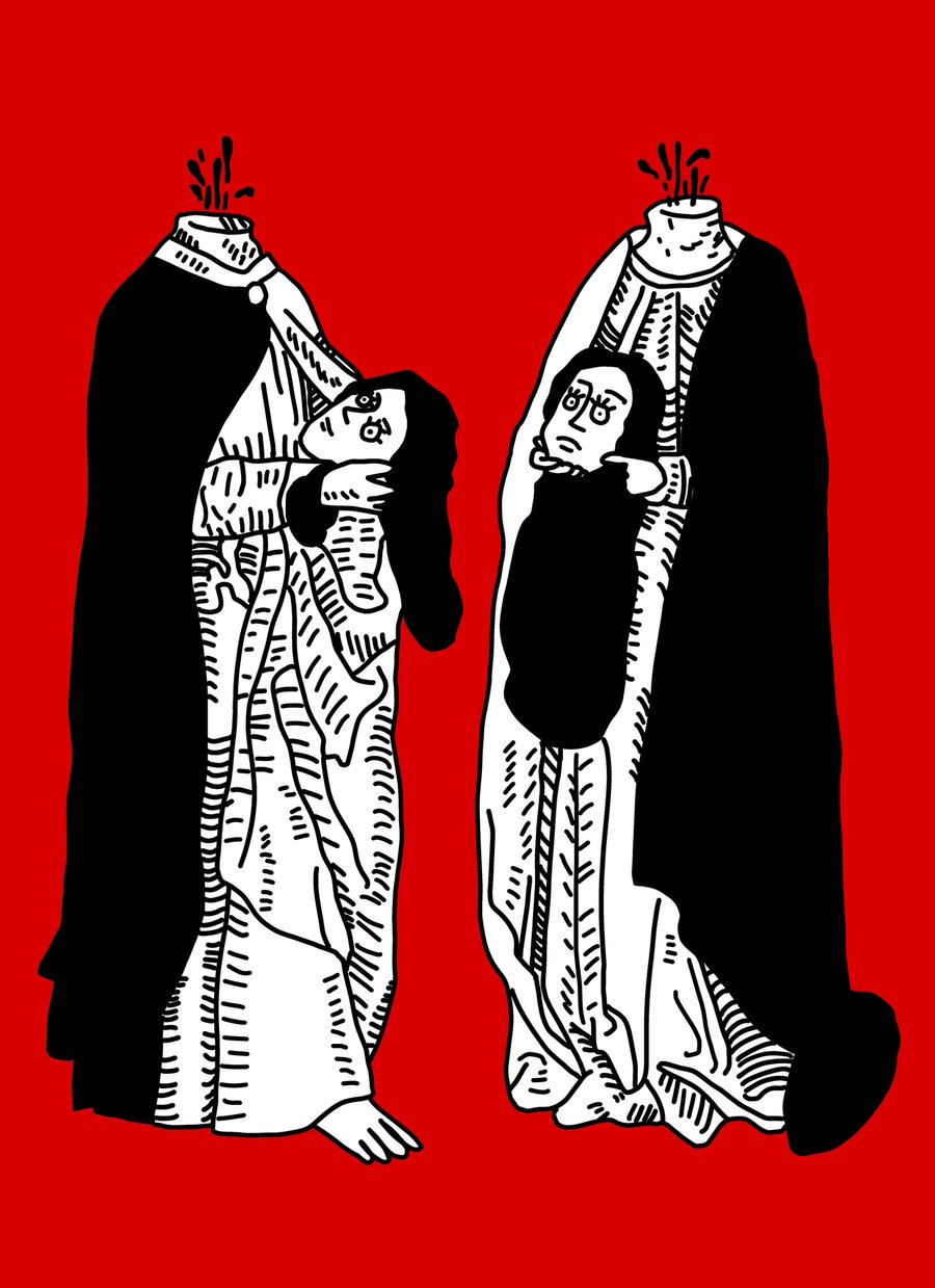
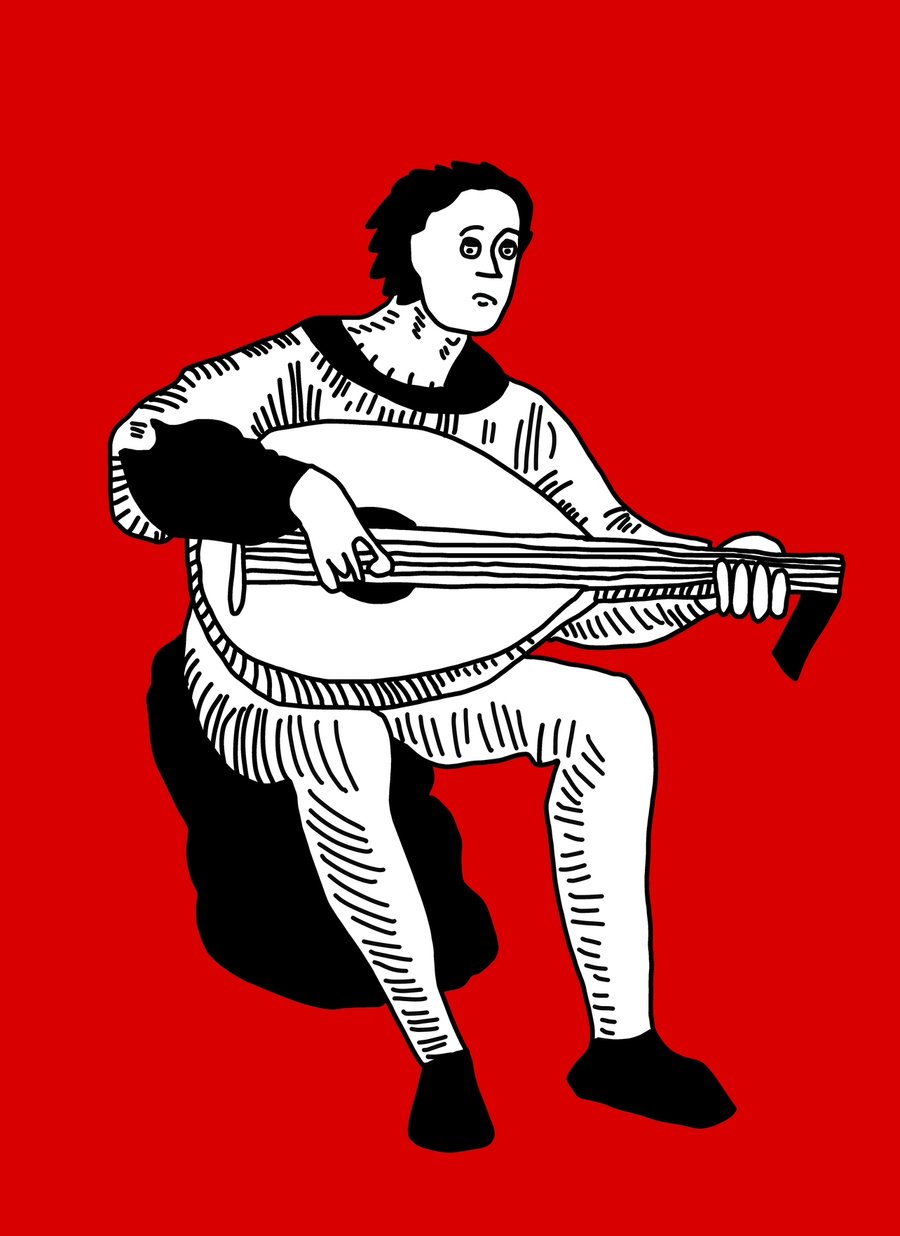
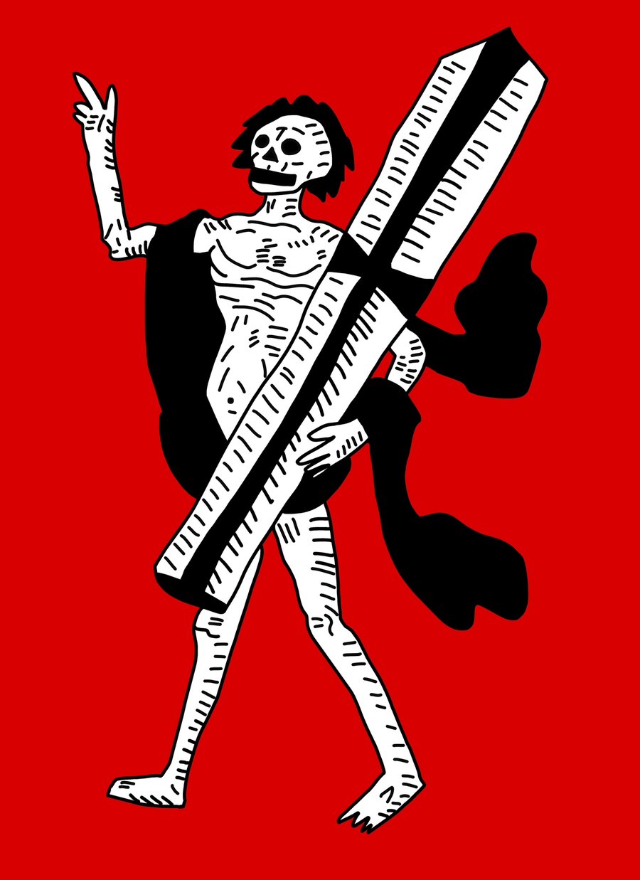
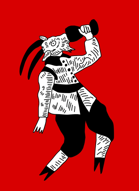
Series of illustrative postcards for a medieval festival in Obidusha
The presented postcards transport us to the distant era of the Middle Ages, filled with caricatured characters that convey the grim and grotesque nature of that time.
Beyond developing artistic skills, the Bachelor’s program taught me how to think in a design-oriented way. Each project demanded building a composition, analyzing the target audience, working with color, typography, rhythm, and narrative, and discovering an expressive visual language capable of operating consistently across various mediums—from print graphics to animation and digital formats.
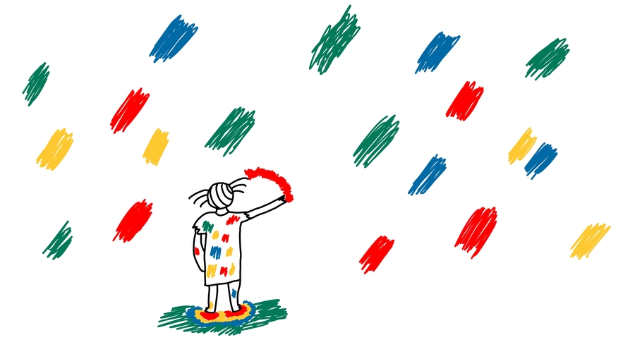
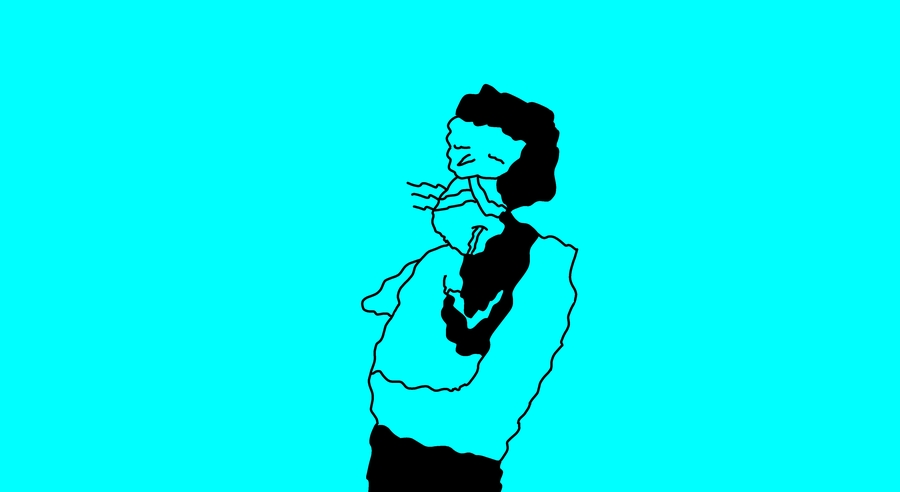
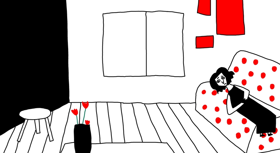
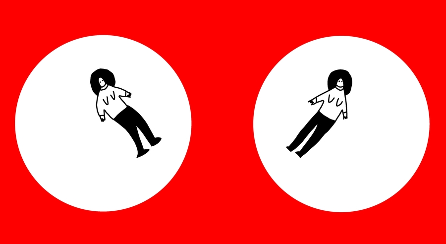
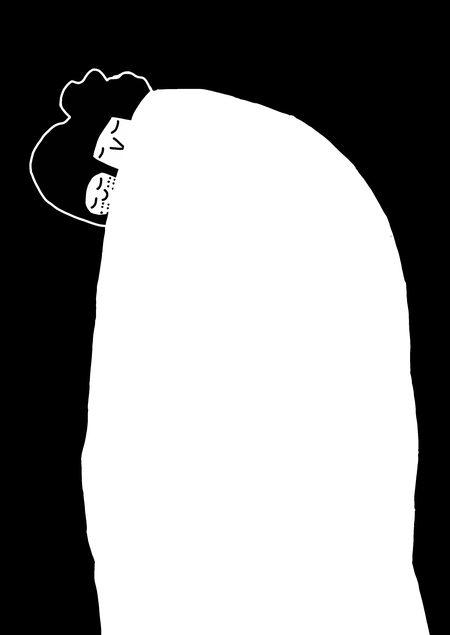
Stills from the graduate film, «Mama»
GIF from the diploma short film «Mom»
A still from the graduation animated film, «Mom»
«Mama» is my thesis film about the complex relationship between a mother and a daughter. Despite all the difficulties and contradictions, relationships like this are not the end of the world—they are simply one of the stages that can help bring people closer and foster a deeper understanding of one another. In the animation, I utilized a black-and-white palette with color accents because, in my opinion, this approach best conveyed my concept and organically emphasized the work’s minimalist and naive style. I would also like to note that my film was shown at Sphere in Gorky Park.
While working on both academic and personal projects, I realized that communication design most fully aligns with my professional interests. I am interested not only in creating expressive illustrations but also in designing cohesive visual systems where every graphic detail contributes to a unified brand communication. I want to learn how to develop brand identity systems where the illustration is not a decorative element, but a complete carrier of meaning that shapes the brand’s character and makes it recognizable.
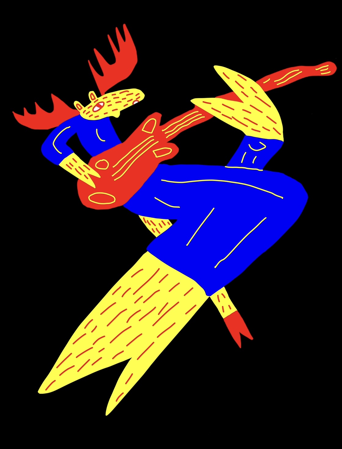
Clockwork Moose-Guitarist for Fruit Sour
The images feature moose for a craft beer line that has decided to form their own rock band.
Pensive Moose-Keyboarder for Stout
Admittance to the Master’s program in «Communication Design. Foundational Level» feels like the logical next step in my professional development. I aim to gain a comprehensive understanding of the knowledge and practical skills necessary to design complete visual identity systems—working with branding, typography, packaging, and various communication formats. Crucially, I want to develop a designer’s mindset that allows me to make well-grounded visual decisions based on audience needs.
The knowledge gained during my Bachelor’s program provides me with a solid foundation for further study. In the Master’s program, I aim not only to deepen my technical skills with contemporary tools but also to learn how to integrate my own illustrative practice into complex design projects, where imagery becomes part of a unified communication strategy.
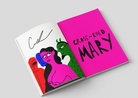
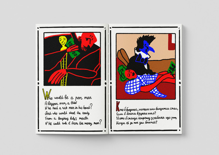
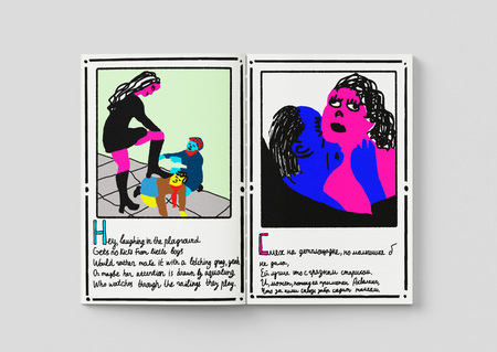
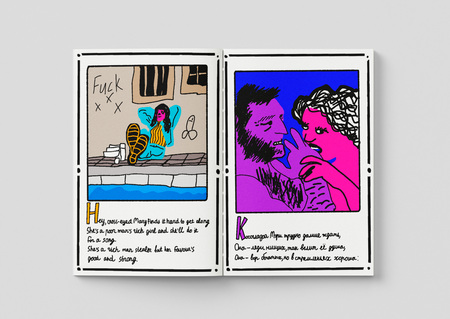
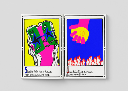
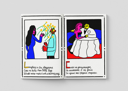
The images display a 16-panel book illustrating the lyrics of the song «Cross-Eyed Mary» by Jethro Tull. The song tells the story of a cross-eyed schoolgirl named Mary who led a rather controversial lifestyle.
I am interested in the projects from the Dewynters studio, where illustration is regularly used as a full element of corporate identities alongside typography, color, and modular structure. This approach confirms that contemporary identity design can be simultaneously expressive, conceptually coherent, and flexible. I aim to develop precisely in this direction—creating brands where original illustration does not exist separately from the design but becomes an organic part of it.