
In 2025, I attended the «A Day at Peterburg University» event. As part of the Media Communications program, our team was tasked with developing the visual identity for an educational application—including designing the mascot, determining its look, and strategizing how to promote the app.

By the end of the event, our mascot looked like this—an idea proposed by my teammate. However, I couldn’t shake the feeling that it was faceless, and that the text wouldn’t be legible when the image was scaled down to an app icon size on a phone; therefore, I believe user communication would not have been effective.
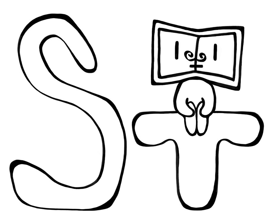
Therefore, I decided to approach the mascot and application icon redesign from a communication design perspective. I made the image more minimalistic and simple. The mascot’s head is now an open book, which reflects our application’s focus on education. Most importantly, it now has a face—slightly pensive and quite concise—which will help build a friendly and relaxed atmosphere with the user. Furthermore, if we plan to promote the application in the future (by creating our own merchandise, stickers, or advertising posts, etc.), the mascot needs to be recognizable and memorable. Thus, the updated icon becomes not just an illustration, but a medium through which the application communicates with the user.