Concept
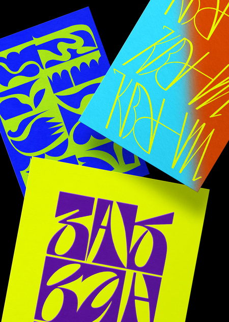
As part of the course, I was required to develop stylized lettering for a series of postcards and a book cover.
For inspiration, I drew from the HSE Art and Design Kids School project on quantum physics, «Zakvantilos»: I borrowed the color palette, the context for the inscriptions, and the relatively unrefined typography of the words.
The presented series of four postcards and the book cover proved to be an excellent addition to the existing project.
Greeting Card 1:

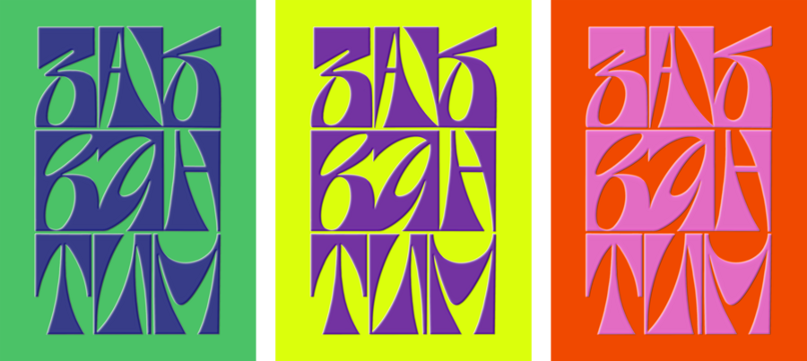
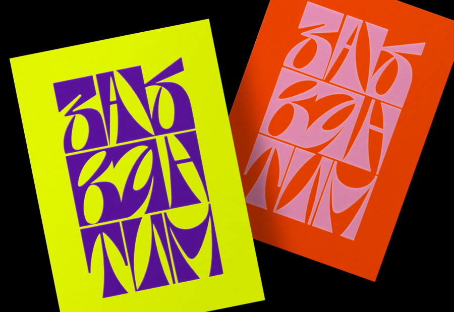
The «Zakvantim» lettering directly references the concept of a book on quantum mechanics, where the world of physics and chemistry coexists with the exuberance of electronic music and absurd dance.
Greeting Card 2:
What’s important to know about the tech scene? Appreciate the uniqueness in every detail, enjoy the unity in the flow of dance, and just ride the wave!
Card 3:
When we talk about the world of physics, we recall pale textbooks and endless, monotonous notes.
I decided to borrow a Cyrillic handwritten font familiar to all school students and adapt it to expressive typefaces and stylish phrases.
Card 4:
Card 5:
Physics and chemistry are not just about the quantum chaos within universes, but also about external order, regularity, the continuous connection, and the repeatability of elements.