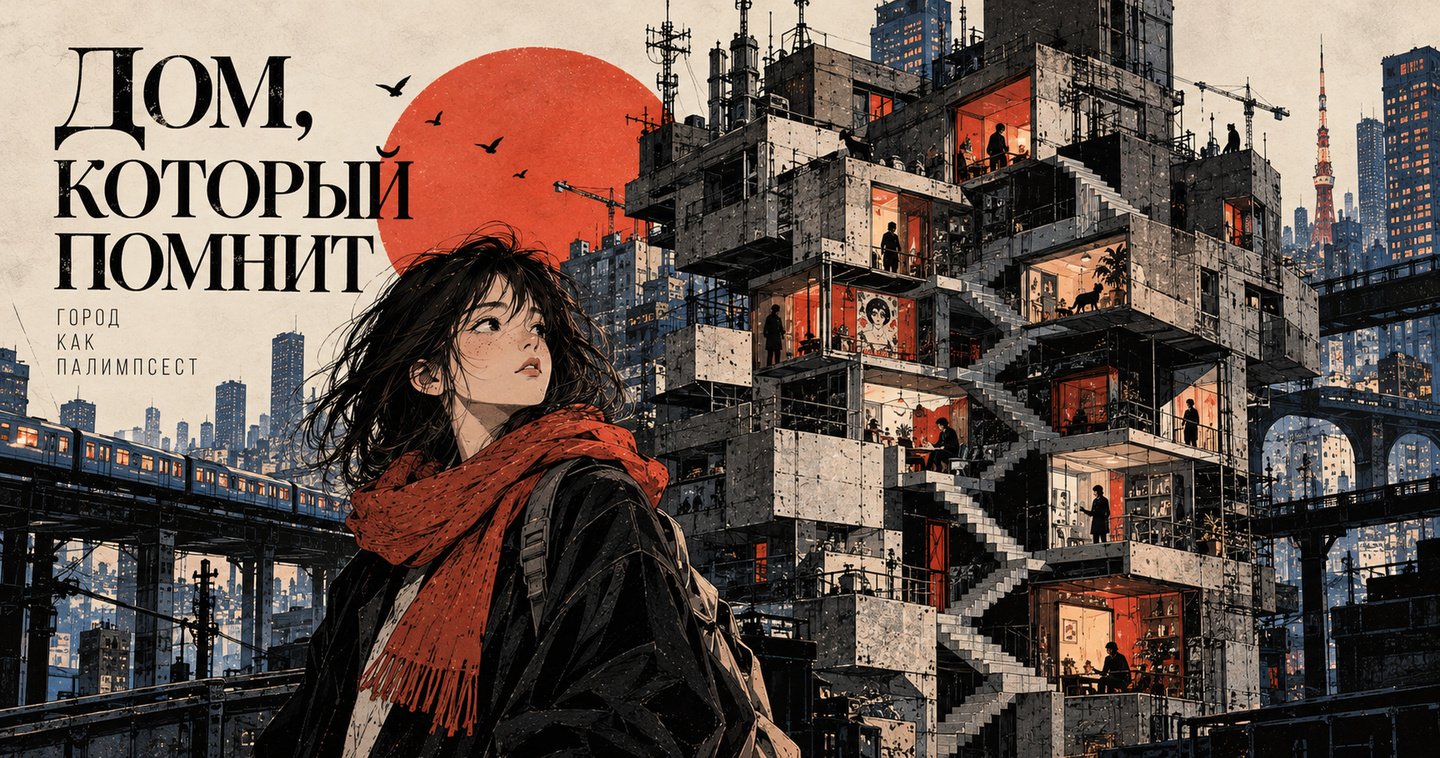
«Quiet Floor»
Genre: visual novel / magical realism / urban fantasy
Tagline: A story about a house that remembers more than its inhabitants.
Problem and Relevance
Problem:
The Russian book market lacks original graphic novels that explore urban memory, loneliness, and coming-of-age without excessive melodrama or retro stylization.
Relevance:
— growing interest in graphic novels and «smart» visual reading;
— scarcity of authorial commentary on the contemporary city;
— demand for publications that function both as a book and as an object.
Niche: A graphic novel for readers aged 16–30 who appreciate architecture, silence, and layered narrative.
Visual Exploration and Concept
— the city as a palimpsest: an accumulation of eras, traces, and sounds;
— a visual metaphor—a floor that does not appear on the blueprint;
— references: Soviet Modernism, 1970s Japanese graphic art, contemporary European comics.
Concept:
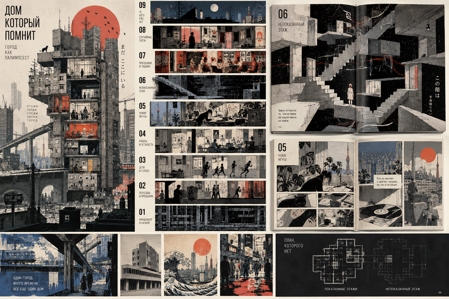
The book is structured like a building: each spread is a floor, and each floor is a fragment of someone else’s memory.
The reader moves from bottom to top and gradually understands that the house itself is the protagonist.
Architecture and Book Grid
Parameters:
— format: 210×297 mm;
— volume: 120 pages;
— binding: hardback, sewn;
— paper: matte, 150 g/m²;
— printing: 4+4 + Pantone.
Structure:
— 3 parts, 9 chapters;
— 12-column modular grid;
— typography: grotesque for the «house voice, ” serif for the „character voice“;
— rhythm: alternation between dense and airy spreads.
Characters
— Marina, 17 years old — sees what is hidden;
— The House — an anthropomorphic image that changes from chapter to chapter;
— Secondary residents — collective portraits of eras
settings
— entrance hall, staircase, attic, apartment No. 13, well courtyard.
Pipeline
— Sketches and storyboarding;
— Digital painting and textures;
— Generative elements for backgrounds (prompt engineering, Midjourney chains + manual refinement);
— Consistency control via a character and scene library.
Key Turns
3–4 accent spreads:A staircase that ascends into infinity.Apartment No. 13—a room assembled from other people’s belongings.The attic—a meeting point for all transient layers.Finale: the house observes the city.
Cover
Cover: — Hardcover; — Foil stamping; — Spot UV varnish on window areas; — Pantone 2758C + black.
Dust Jacket: — Vellum wrap featuring an architectural plan; — Reveals the «true» facade upon removal.
Prepress: — 3 mm bleed; — File preparation in CMYK + Pantone; — Trap and overprint verification.
Positioning and Distribution
Analogues:
— «Builders» / «Here» by Richard McGuire;
— «City of Sin» (in terms of atmosphere);
— European graphic novels about the city.
Differentiation:
— the Russian context;
— architectural dramaturgy;
— AR and the digital layer.
Promotion: — Collaborating with publishing houses (partner briefs); — AI marketing: generating cards, book trailers, and lookbooks; — Presenting at book fairs.
My thing