
About Lucid
This project involved developing a communication and visual identity strategy for Lucid, an online educational platform focused on the humanities. The primary objective was to move beyond the «entertaining–educating» model and craft a brand that translates the values of depth, awareness, and intellectual clarity through the metaphors of light, space, and the inner journey.
The starting point for developing the platform’s visual and conceptual narrative was the English word «lucid,» which I chose myself. From that point forward, I consulted with DeepSeek on everything else.
The name Lucid, which translates to «bright, clear, ” as well as „sane, ” reflects the essence of the platform: clear thinking illuminated by the light of art. The visual language is built on this metaphor—it is an atmosphere of light and intellectual space, a journey through the amazing inner worlds that the humanities reveal.
1. The Role of Communication Theory in Design ->
The concept of design, particularly within the realms of product development and brand growth, is a predominantly communicative act. It engages in a continuous process of encoding intentions into tangible symbols, which are subsequently decoded by consumers.
Cybernetic communication theory, pioneered by scholars such as Norbert Wiener and advanced by Gregory Bateson, provides a conceptual framework for analyzing this dynamic. This paradigm shifts our understanding of communication from a simple exchange of messages to the complex, systemic processes of information interchange, feedback, and adaptability to new variables within a given environment.
In this context, a product or brand functions not as a passive receiver but as an active participant within a broader socio-cultural system that signals and then receives feedback from its users and the market.

promotional materials
The principles of cybernetics—such as concepts like feedback loops, requisite variety, and homeostasis—offer practical methodologies for designing adaptive and resonant user experiences. By viewing design through this lens, we can strategically model how form, function, and brand semantics are interpreted, how they guide consumer behavior, and how they must be altered based on systemic response.
This presentation will showcase the application of these theoretical constructs, demonstrating how cybernetic principles can guide the development of a coherent brand identity and product ecosystem strategically modeled to its environment.
2. Lucid for a General Audience ->
Have you ever felt that the world of knowledge has become too noisy? Overwhelming? Superficial? Lacking nuance?
Welcome to Lucid—an online platform dedicated to the humanities. Here, art, philosophy, psychology, and history are not just subjects to be learned, but landscapes to be explored from within.
We believe that true knowledge is born from insight, and insight arises in the delicate quiet of a peaceful mind.
This is precisely what Lucid is designed for—to provide a space of light and serenity where your thoughts can wander freely.
For those who find it vital not merely to learn something new, but to feel a connection, to see the beauty of thought, to embark on a continuous journey toward clarity.
Visualization of the platform interface
Lucid deliberately moves beyond the «edutainment» model. Here, insight is not a product to be delivered, but a natural result of deep presence.
Our approach is built on respect—for the subject, and for your taste and intelligence. Aesthetics serves as our guide for attention.
We focus through a narrow but deep lens, moving past superficial overviews like «Greek Philosophy in 10 Minutes.»
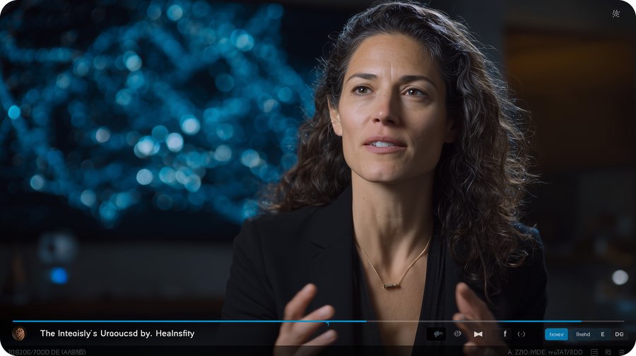
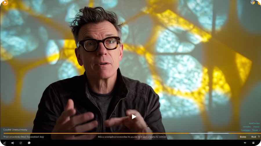
Screenshots from video lectures
Reflection is facilitated through curated «assignments”—open-ended prompts for internal dialogue, not tests. You respond in your own form—an essay, a voice note, a collage. We do not assign grades—instead, you will receive a thoughtful response from our curators designed to deepen your personal line of thought.
With the author’s consent, selected reflections become part of a shared archive—not as model answers, but as a living map of diverse personal interpretations. This illuminates how a single theme gives rise to a unique „journey“ in each mind, affirming the value of individual insight.
3. Lucid for a Professional Audience ->
Brand Philosophy & Communicative Core
Lucid is positioned not as a mass-market edtech platform, but as a niche service for deep, contemplative learning in the humanities. Our core communicative goal is to move beyond the «edutainment» paradigm and establish a new standard: learning as an aesthetic and intellectual experience of «deep presence.»
The brand’s key metaphor is «Journey Within,» which is realized through the visual semantics of light, space, and refraction. We do not illustrate concepts literally; instead, we create an atmosphere conducive to introspection and insight. The brand’s communication is built upon respect for the subject matter, the audience’s intellect, and the value of personal interpretation.
logo
Visual Identity & Semiotic System
The identity is built as a coherent semiotic system where each element reinforces the central metaphor.
Key Visual & Graphic Motif: The central graphic element is the caustic pattern—the play of light on surfaces, as if refracted through water. This non-literal, abstract motif serves several functions:
a) It acts as a universal visual metaphor for insight, clarity, and the genesis of thought.
b) It creates a recognizable and proprietary graphic code that can be adapted to any medium.
c) It establishes an emotional tone—serene, focused, slightly melancholic, and intellectual.
promotional materials
Touchpoints & Brand Experience
The visual system is consistently implemented across all touchpoints, transforming the user journey into a cohesive aesthetic experience.
Digital Platform (Web & App): The interface is maximally minimalist and airy. Key visual elements include caustic light patterns used as textural backgrounds, dividers, or in loading animations. Video player interfaces, course thumbnails, and lecturer backdrops maintain a unified color and light atmosphere. The goal is to eliminate digital noise and create a «clean screen» for thought.



promotional materials
Content Strategy: Each lecture or course is accompanied by a unique visual cover—not an illustration of the plot, but an atmospheric image-metaphor generated by a neural network based on a detailed literary prompt. This ensures stylistic unity and deep thematic integration of visuals with the content.
promotional materials
Merchandise & Physical Media: Merchandise items are conceived as art objects and tools for ritual. For example, a crystal cube that projects caustic patterns, a bookmark with a crystal, or a candle in a raw quartz form. These are not typical logo carriers, but tangible embodiments of the brand metaphor, extending the experience of «light and clarity» into the physical world.
Communication Tone: The verbal style is reflective, respectful, and subtly poetic. It avoids colloquialisms, hype, and clickbait. The brand engages the audience as an equal, trusting their taste and intelligence.