Concept
The topic of water consumption was chosen due to its relevance. Most people do not consider the actual volume of resource consumption until they see concrete figures. The project’s concept is to transform statistics into a visual story of an ordinary person’s day.
The goal of the infographic is to inform the user about hidden water waste in daily life through visual representation.
The project contributes to developing ecological awareness: by understanding where the main losses occur, a person can easily adjust their habits and help the planet.
Pipeline
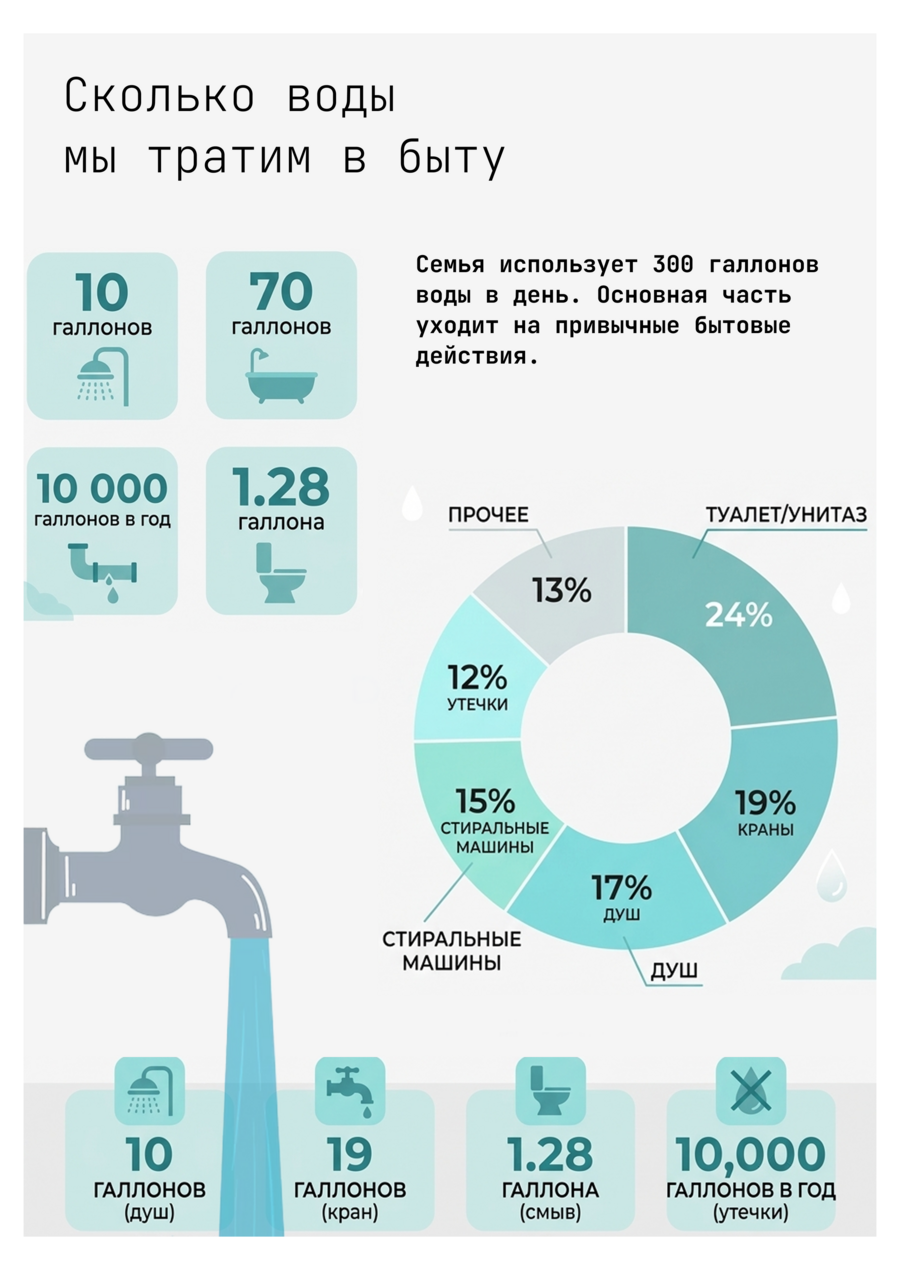
The creation process began with data processing: five of the most contrasting domestic scenarios were selected from a large EPA report. The first step was designing the grid and the poster’s composition to maintain balance between text and graphics. The second step involved assembling the mockup in the Figma.com graphic editor. The third step was integrating the finished infographics into mockups to demonstrate the final poster. Recraft.ai was used to generate the mockups. The fourth step was compiling the long-form article.
Source Data
All quantitative metrics are drawn from the official reports of the U.S. Environmental Protection Agency (EPA) as part of the WaterSense program. The primary data source is the Statistics and Facts section at https://www.epa.gov/watersense/statistics-and-facts. Additional data regarding average procedure times (e.g., 8 minutes for a shower) is sourced from statistical studies on household habits, also available on that same resource.