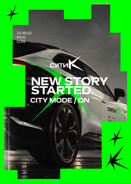
ONE MACHINE. MANY LIVES.
Одна машина — разные люди, маршруты и истории. СИТИK превращает смену поездок в визуальный язык.
CITY remains. I change.
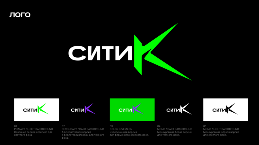
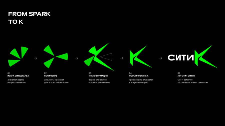
CITIK—an experimental direction from CityDrive aimed at the next generation of users. The core of the identity is the familiar brand spark, which takes on a new state and becomes integrated into the letter «K.»
«CITIK» maintains a connection with the parent brand, and the evolving «K» becomes a symbol of movement, a new route, and a new story.
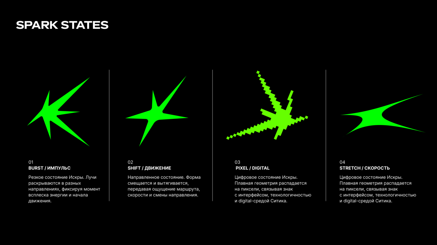
Attach Card The Spark becomes a living element of the CITIK identity. It does not exist in one fixed form—it changes, stretches, accelerates, and transitions from fluid geometry to digital.
Each state conveys a new impulse and a new motion scenario. Just as one machine becomes part of a new story each time, one Spark assumes a new state every time.
The palette is grounded in black and white, with a neon green serving as a particularly vibrant accent—the primary color marker for CITIK and a direct link to the CityDrive visual code. Pink and violet emerge as secondary states of the system: they appear in the graphics, digital communications, and Spark transformations, lending the identity greater variability and emotional resonance.
The CITIK typography is built on the contrast between large, emotive statements and calm, functional text. The display typeface functions as a standalone graphic element: it scales, breaks conventional composition, and sets the rhythm of communication. A more neutral typeface is responsible for the interface, navigation, and informational messages.
The CITIK graphic system is built around the mutable Spark. It does not exist as a static decorative mark but constantly interacts with the carrier—it changes scale, breaks out of the frame, intersects with typography and imagery, repeats, and fixes discrete moments of the journey. Five simple principles—Scale, Crop, Interact, Repeat, and Moment—allow the identity to retain its recognizability.
In the vehicle wrap, Iskra extends beyond the sign and becomes part of the body itself. Its rays stretch in the direction of movement, emphasizing the car’s dynamism and creating a sense of momentum even when static.
The base color of the body is maintained on over 50% of the surface, while the acid-green graphic functions as a vibrant accent, making the CITIK instantly recognizable in the urban flow. The logo is placed separately from the large Iskra graphic, linking the experimental identity to the brand while preserving legibility from various angles.
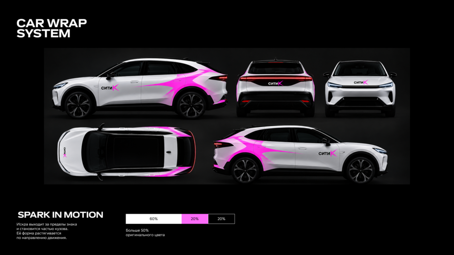
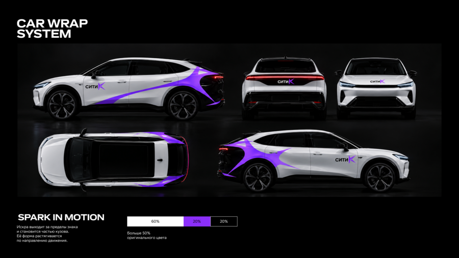
In addition to the main acid-green, Iskra can shift into supplementary color states—purple and pink. These extend the visual language of CITIK and allow for the creation of various decal versions while maintaining a unified principle, geometry, and car recognizability.
Color here becomes another mutable parameter of Iskra: every new trip is a new state. Furthermore, over 50% of the original color will be applied to…
ONE FLEET. MANY STATES.
Каждый автомобиль — новое состояние одной системы
The digital environment continues the CITIK visual language, guiding the user throughout the entire journey—from selecting a vehicle to starting the ride. The Spark becomes part of the interface: it appears in navigation, during unlocking, and in post-start communication.
The scenario is structured as a short sequence of actions—CLICK → UNLOCK → SPARK → GO—transforming the familiar rental process into a part of the brand’s overall story.
CITIK’s photographic style merges vibrant urban moments with the dynamism of the automobile. The foundation consists primarily of monochromatic shots, natural emotions, the nocturnal city, movement, and a touch of documentary aesthetics.
A vivid graphic system is overlaid onto the serene black-and-white photography: the acidic Spark, bold typography, lines, and digital markers. This contrast connects the human and the vehicle.
In outdoor communication, the CITIK identity becomes integrated into the urban environment. The large scale, high contrast, and vibrant Spark allow the brand to be recognized instantly, even within the city’s dense visual landscape.
The photograph captures people, a car, and motion, while the graphics extend beyond the frame, crossing images and connecting different narratives into a single system. Spark functions as a visual impulse.
On social media, CITIK transforms into a chronicle of urban stories. The content centers on real moments of travel—people, routes, car details, and random shots of the city.
The identity adapts to the dynamic format of social media: Iskra changes scale and state, breaks the frame boundaries, and interacts with the photograph.
ONE CAR. MANY STORIES.
VISUAL IDENTITY CONCEPT / 2026