CONCEPT
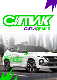
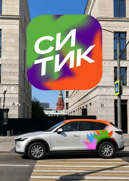
I perceive the visual language of «Citica» as abstract and dynamic, yet simultaneously recognizable and inheritorially linked to CityDrive.My concept is built around the brand’s signature «spark"—a vivid image ideally suited for development and complementary to the service’s young audience. Observing the standard vehicle wrap, I identified a rigorous geometry that can be «played with» to create a memorable and appealing look for «Citica.»
SPARKS «CITYCA»
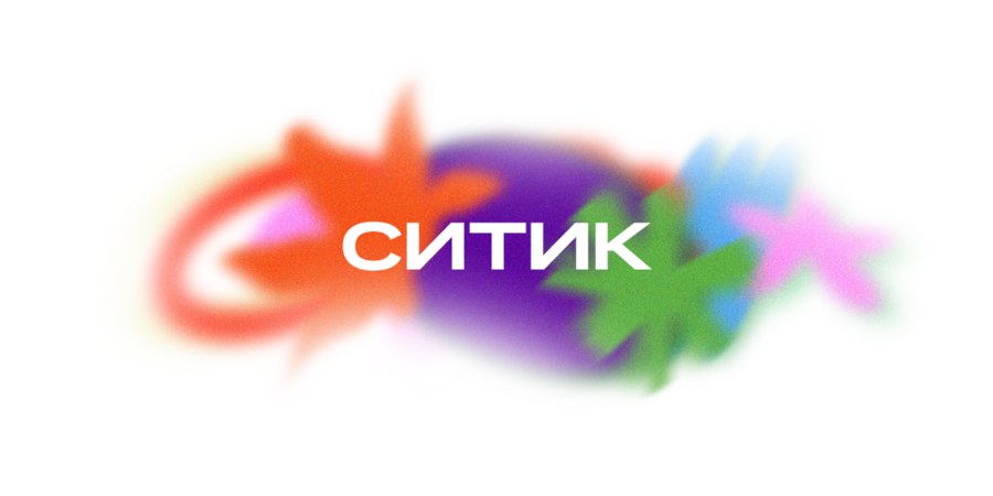
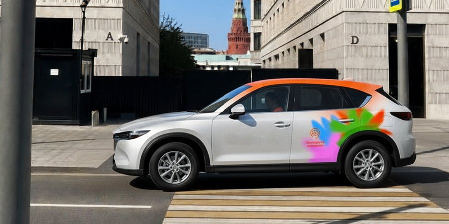
The visual core is built around «sparks"—vibrant graphic elements that coalesce into a unified composition, conveying the brand’s dynamic and open nature.These sparks are positioned above the rear wheel of the car, extending the foundational branding of Citymobil. They appear brighter and fresher while maintaining recognizability within the flow.Furthermore, the sparks will serve as useful assets for developing and scaling the brand’s digital communications.

LOGO CONSISTENCY
For the new «Citica» logo, I chose the same recognizable Citymobil Sans font. Thanks to the use of the corporate typeface, the concise logo pairs perfectly with vivid abstract graphics. This solution looks modern without conflicting with dynamic forms and is equally well-received by both a young, open audience and a more formal one.
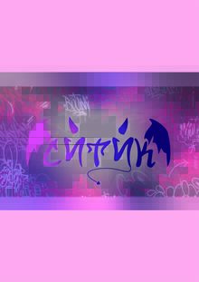
Left: CityDrive logo; right: search for the Cityk logo
The logo works effectively not only when paired with graphic elements but also independently and within a container.
CAR WRAPPING
To achieve a smooth blur effect on elements, you can use UV printing with a white substrate on transparent film. The white layer, with varying degrees of opacity, allows the colors to be applied brightly, without mixing with the car body color.
Option for combining a wordmark and graphic elements