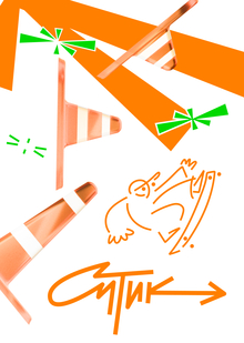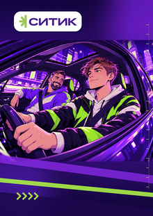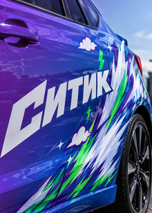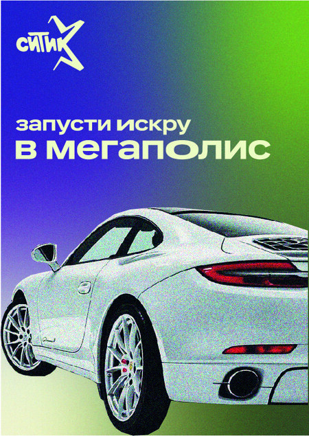
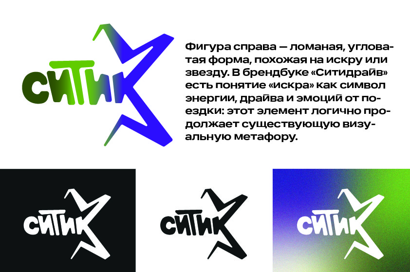
«CityDrive» is an entire ecosystem of urban mobility: car-sharing, car subscription, and the sale of vetted used vehicles. In partnership with the HSE Art and Design School, the company launched the «Ignite the Spark in the Megacity» competition—and issued a challenge to young designers. Participants must create an identity for «Citytic»: an experimental direction created specifically for a young audience. The main objective is to preserve CityDrive’s recognizable DNA while injecting it with new energy—making the style daring, highly visible, and unrestrained. From the logo and graphic code to the actual vehicle wrap and all communication materials—everything must support this fresh, bold image.
Logo
Typography
Color Palette
Graphics
The modular grid of squares and rounded blocks references the «spark» (the key symbol of CityDrive) through rhythmic dynamics and geometry—maintaining semantic continuity when transitioning to the experimental sub-brand, «Citic.»
The variability of the patterns (asymmetrical, centered, sparse) forms a system of visual identifiers: this allows the graphic to scale across different media (cars, applications, merchandise) without losing brand recognition.
The angular forms and pixel aesthetic emphasize the «technological» nature and youthful positioning of «Citic» as a next-generation car-sharing service, while not severing the connection to the main brand.
The contrast between dense and sparse compositions creates a sense of movement and speed—relevant for an urban mobility service.