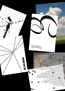
A small corporate identity for the «Vskhody» psychological support sanatorium is built on the idea of natural restoration and growth. The logo was created using the Fet Regular 400 display typeface, whose lettering was intentionally modified to give it a soft, handwritten plasticity. Strict YU Gothic UI is used for the main text, ensuring high readability and professionalism.
Original size 2480x3508
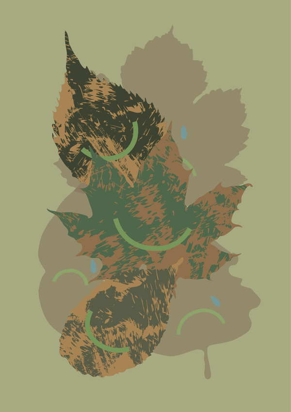
Psychological Support Sanatorium for the Most Diverse «Vskhody» (Sprouts) Leaves
Longread translated automatically
Psychological Support Sanatorium for the Most Diverse «Vskhody» (Sprouts) Leaves
Project created at 19.10.2026