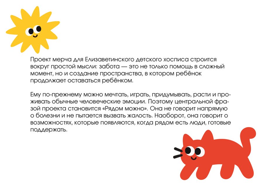
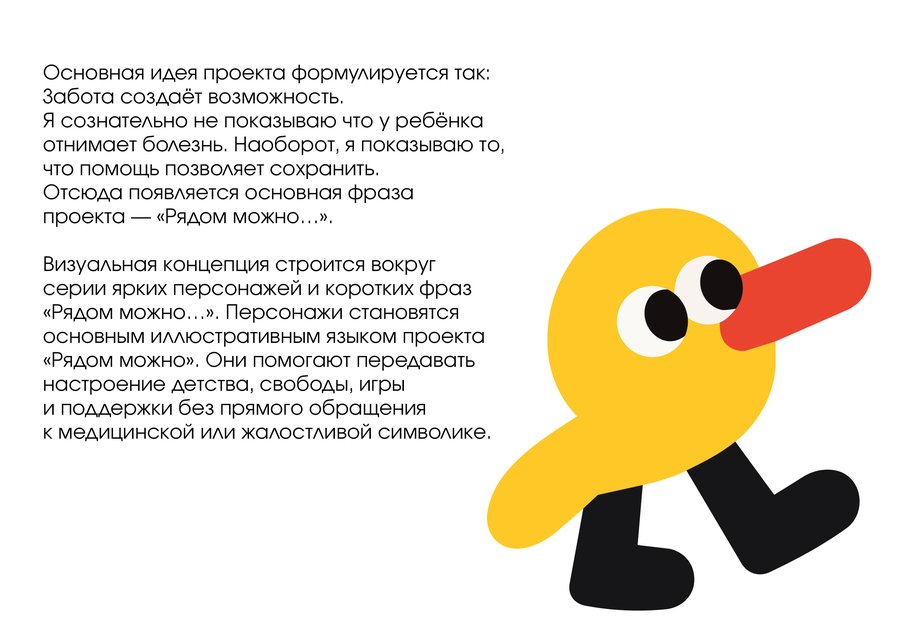
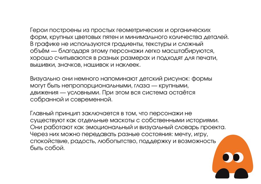
Character System
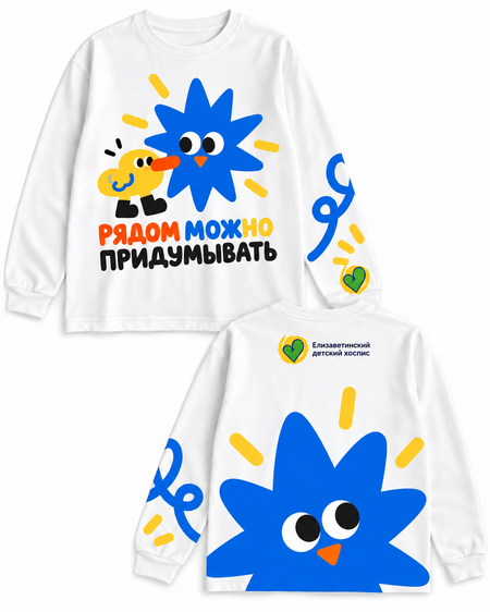
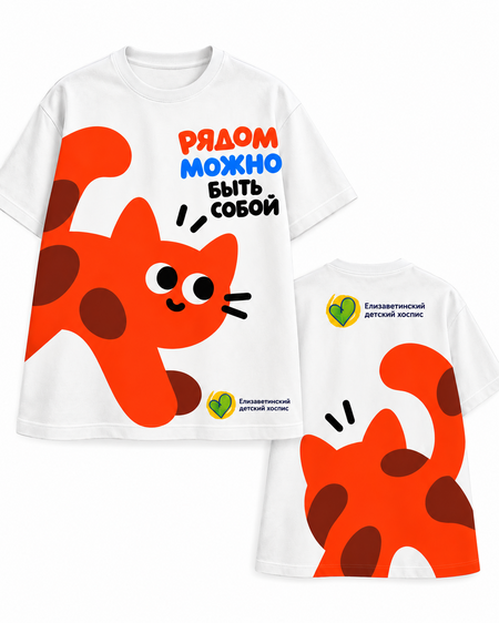
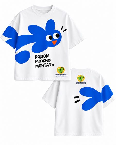
Textiles
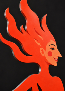
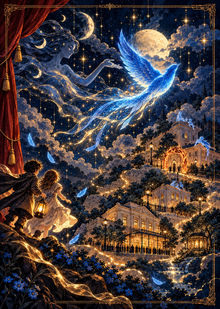
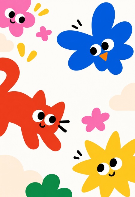
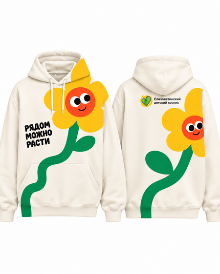
Across various media, the project’s visual system operates on a unified principle: one main phrase, one central character, and a limited number of supplementary elements. This ensures that each object remains distinct yet is easily read as part of a cohesive series.
On textiles, the most expansive and expressive compositions are utilized. The character serves as the primary visual focal point, while the phrase «You can…» clarifies its meaning. The image is not confined to the center of the garment; it can be shifted toward an edge, or placed on the back or sleeve. Consequently, the print is perceived not as a standalone image overlaid on clothing, but as an intrinsic part of its structure.
On shoppers, the composition can also interact with the form of the carrier. The character can be positioned closer to the handles, partially extend beyond the boundaries of the conventional composition, or be structured vertically. The same principle remains: one primary image and one core phrase.
The emblems and patches utilize the system’s most simple and recognizable elements. Due to the small size, the level of detail is reduced, keeping the main focus on the silhouette of the character, symbol, or a short word. This allows readability and recognizability to be maintained even in a small format.
Printed Materials
On the stickers, the system becomes more compact. Here, the characters can be used individually or combined with short phrases such as: «Nearby, ” „Can, ” „Dream, ” „Be yourself.“ Each sticker works independently, but together they form a cohesive set thanks to the shared style, color palette, and character tone.
On postcards, the illustration and text operate more freely. Here, the composition can be slightly richer: combining a character, supplementary graphic elements, and a short message. Nevertheless, the postcards maintain the overall system through a consistent palette, typography, and visual language.
For the roll-ups, the system becomes more restrained and structured. All options are built on a single grid, use a consistent heading scale, and feature the same placement for the logo and information blocks. Only the key phrase and main character change. Because of this, «Be yourself nearby, ” „Dream nearby, ” and „Grow nearby“ are perceived as a unified series.
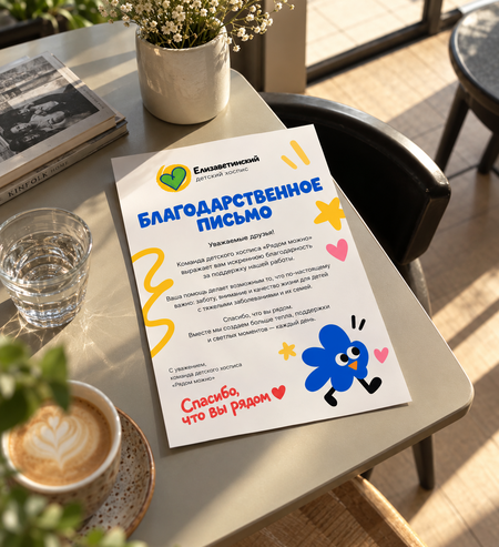
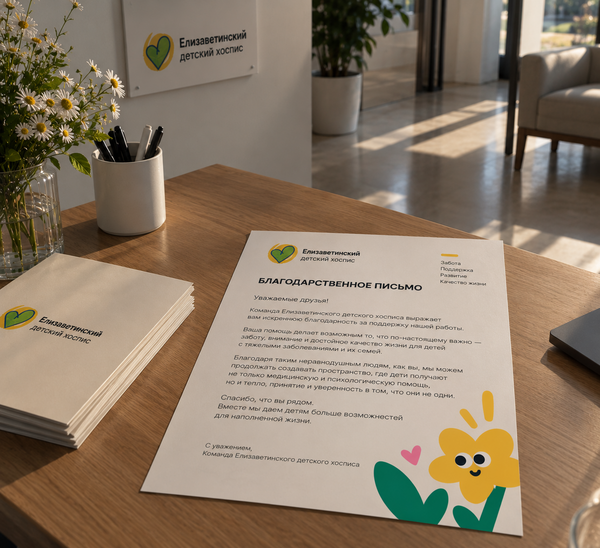
In the thank-you note, the visual language becomes more subdued. The primary focus shifts to the text, and the character serves as a subtle emotional accent. The formula «It’s great to be around» is transformed here into the phrase «Thank you for being near, ” connecting gratitude with the overarching concept of the project. Thus, the system maintains integrity across various formats. The characters, phrases, color, and logo remain consistent elements, while scale, detail quantity, and composition adapt depending on the specific medium.
During the project development process, artificial intelligence was utilized as an auxiliary tool. It was used to create and refine individual character concepts, test their forms, personalities, and potential visual solutions. AI was also employed when developing mockups and visualizing the carriers. With its assistance, the finalized graphic solutions were placed into realistic environments—on clothing, roll-ups, postcards, stickers, patches, and other objects. These images were primarily used to demonstrate how the developed identity could look in real-world application. Thus, artificial intelligence served as a tool for visualization and form exploration, while the concept, project structure, visual system, typography, selection of solutions, and final direction were developed by the author.