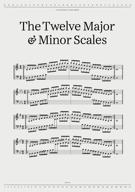
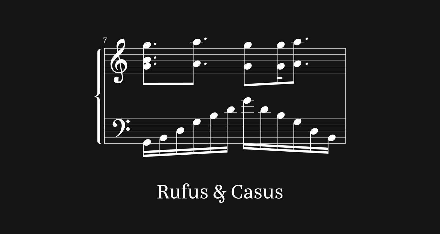
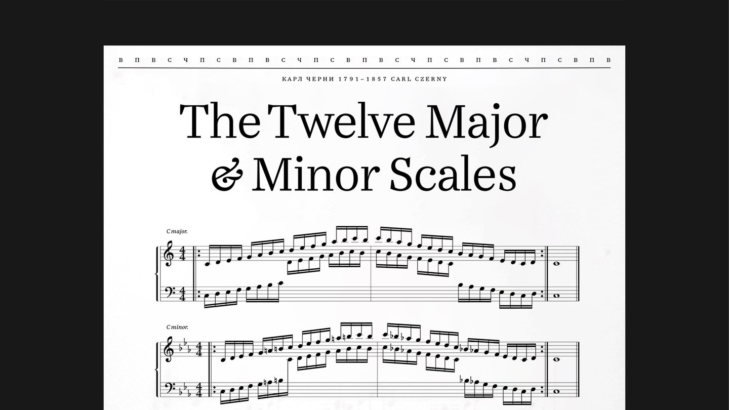
The calendar grid repeats the string of note compositions, having the days of the week as notes on the line.
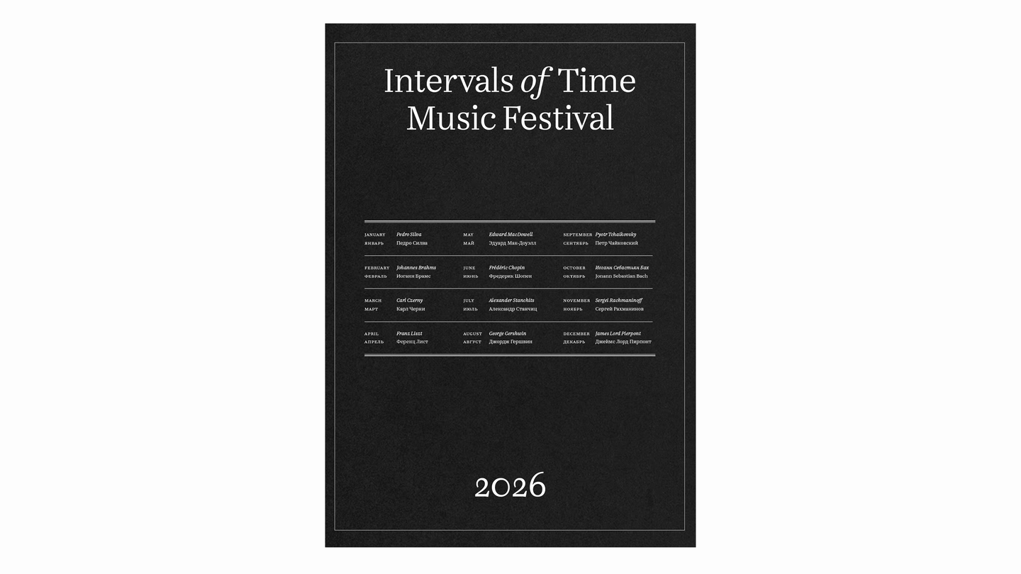
The cover of the calendar is the calendar of the year-round music festival.
Rufus and Casus form a tandem because their shapes, proportions and plastic lines are specifically aligned so that the text and notes look like a single printing system.
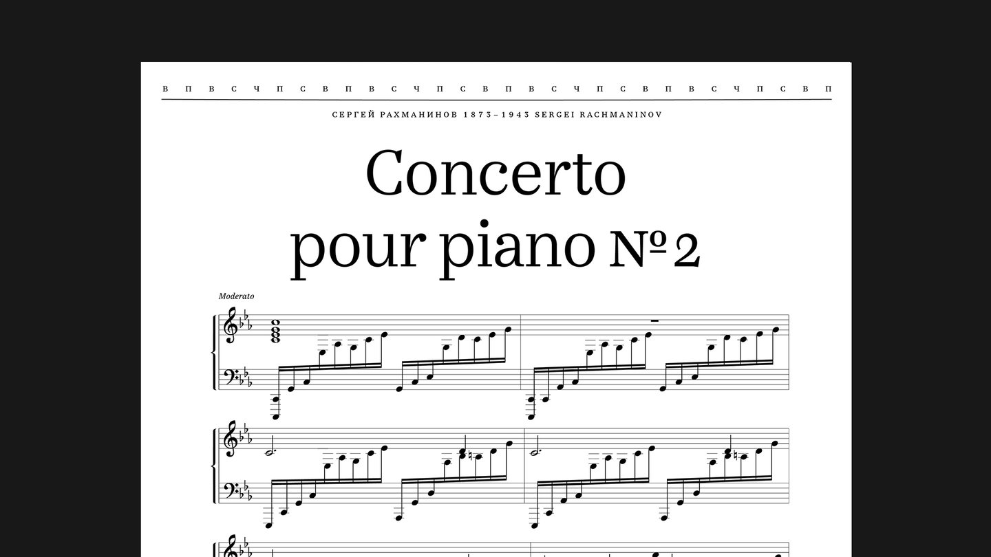
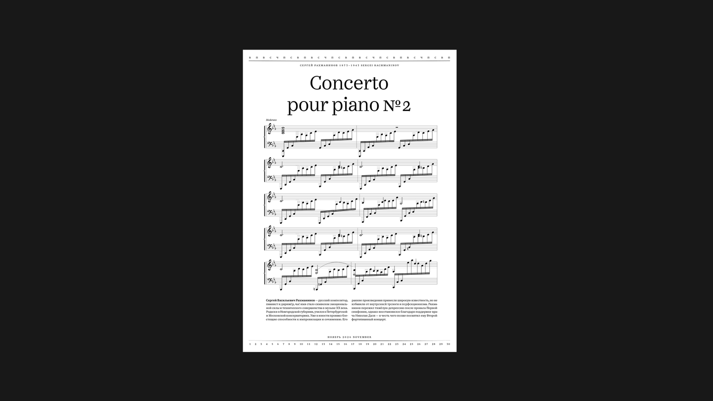
On the one hand, Casus works with confidence as an accent typeface in the headlines, thanks to expressive searches and dynamic terminals, and on the other, remains harmonious in the text.
The numbers of the month are rhythmically lined at the bottom of the page, like notes on the music camp.
On the final page of the calendar, as if to sum up the months spent, the entire set of Rufus symbols was collected.
I thank Eugenia Yukechev for providing the font, Eugenia Grigoriev for the curatorship, Supa Press for printing.