Identity
ROKKI is a project focused on the visual identity and space design for an indoor skate park integrated with a skate shop. It combines a place to ride, a retail store, merchandise, and social areas into one unified system. The project’s goal is to convey the freedom of movement and the informal character of skate culture while maintaining brand succinctness and recognizability. The identity must function across various scales—from a single-visit wristband to interior design and exterior advertising. The core concept is built around movement, freedom, and one’s own rhythm. «ROKKI» is envisioned not only as a training venue but also as a meeting point for people united by a shared interest in skateboarding. The primary visual motif is arches and parallel lines. These evoke trajectories of motion, the curves of ramps, and the rotation of wheels.
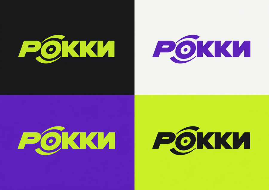
The color palette is built on a combination of deep violet, bright lime, charcoal, and warm white. Violet creates large color accents, lime highlights details and graphic lines, while the neutral tones maintain visual balance.
The color codes were suggested by Perplexity, and the logo was generated in ChatGPT.
Product and Merchandise
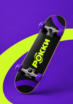
In Perplexity, we consistently developed concepts for one-time visit wristbands, subscriptions, t-shirts, caps, and skateboards. For each medium, the scale of the graphics and the placement of the logo were adapted while maintaining the overall system.
Create an advertising key visual for РОККИ. Concept: «The First Push”—the beginning of movement.
FORMAT Landscape A4 proportions, 297:210. One continuous photographic scene.
REFERENCES Use the attached skateboard product image for its exact shape, components, and artwork. Use the approved key visual only for color and lighting style.
SCENE & COMPOSITION A close, low-angle shot inside a minimal indoor skatepark. Show one rider cropped from mid-thigh down. The skateboard moves from left to right.
The rider’s front foot rests on the grip tape near the front mounting bolts. The rear foot is on the floor beside the board, pushing backward in a natural skating stance. Both legs clearly belong to the same person.
Position the skateboard and legs in the lower-right two-thirds of the frame. Leave the upper-left area uncluttered. Show the entire skateboard without cropping its nose or tail.
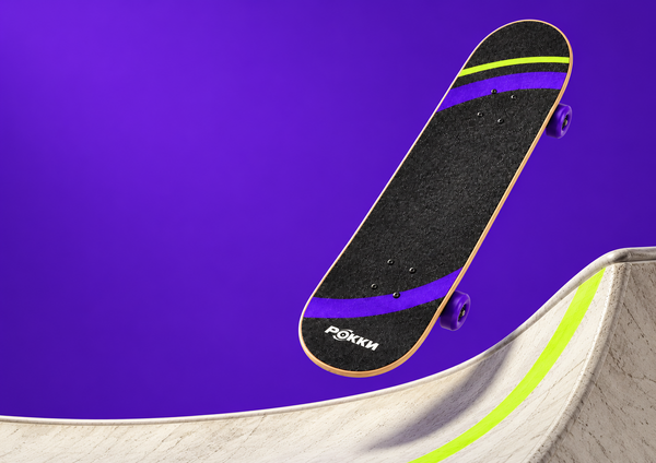
PRODUCT Preserve the reference design: charcoal grip tape with purple arcs, one narrow lime arc near the nose, and a small off-white РОККИ logo near the tail. Purple wheels, silver trucks, natural wood edges. Graphics may be naturally covered by the rider’s shoe. Do not show the underside artwork on the grip tape.
ENVIRONMENT & STYLING Light concrete floor, deep purple wall (#5B21B6), one flat acid-lime floor marking (#C8F31D) leading in the direction of travel. Subtle skatepark geometry in the background. Charcoal straight-leg trousers and plain off-white flat-soled skate shoes; no visible third-party branding.
LIGHTING Controlled directional light from the upper left. Realistic shadows under the wheels and shoes. Keep the skateboard and planted foot sharp. Only a subtle motion blur on the pushing foot.
Photorealistic materials and believable anatomy. No extra limbs, extra boards, floating wheels, text, captions, smoke, sparks, or glowing trails. Use the correct shape of a classic skateboard.
Create a photorealistic studio product photograph of a redesigned РОККИ oversized T-shirt.
FORMAT Landscape A4 proportions, 297:210. One continuous photographic scene. No model, mannequin, or visible hanger.
PRODUCT One charcoal oversized T-shirt #17171A. Boxy silhouette, dropped shoulders, elbow-length sleeves, and a substantial matte cotton texture. Realistic collar, stitching, fabric thickness, and natural folds.
GRAPHIC DESIGN Place one small acid-lime РОККИ logo #C8F31D on the upper chest. Use the attached logo exactly. Preserve the Cyrillic spelling and original proportions.
Across the lower front, place one broad purple arc #5B21B6, offset to one side rather than centered. The arc is cropped by the lower and side edges of the garment.
Add TWO thin, evenly spaced acid-lime curved lines running parallel to one edge of the purple arc. The lines follow the same curvature. Keep them clearly separated from the logo.
The graphic should feel bold but spacious. Leave substantial areas of plain charcoal fabric. No all-over pattern, extra slogans, or invented symbols.
All graphics are matte screen-printed ink, following the fabric folds naturally. They do not glow and are not raised rubber strips.
COMPOSITION Lay the T-shirt front-side up on a broad, low rectangular studio plinth. The entire garment rests on the surface. Arrange the sleeves loosely, with only a few shallow natural folds. Keep the chest logo and main graphic clearly visible.
The plinth is large enough to support the whole shirt. Show all garment edges within the frame. Camera looks down at a moderate angle, close enough to reveal the fabric and print.
STUDIO SET Deep-purple seamless floor and backdrop #5B21B6. The low plinth is a slightly darker shade of purple. Create a brighter violet area behind the product, fading into darker purple toward the outer edges.
A diagonal shaft of light crosses the set. The plinth casts a long, defined, slightly softened shadow across the floor. Keep the garment evenly readable.
LIGHTING Neutral soft key light reveals the charcoal cotton texture. Controlled directional light creates depth in the background. Subtle fill preserves detail in the dark fabric.
Create a premium studio presentation of single-entry wristbands for the indoor skatepark РОККИ.
FORMAT Landscape A4 proportions, 297:210. One continuous photographic scene.
PRODUCT Lightweight, disposable admission wristbands made from matte, subtly fibrous synthetic paper, with an adhesive closure tab. Thin, flexible, and realistically proportioned. Not silicone bracelets, fabric festival bands, or thick plastic rings.
Show THREE wristbands: — one lime wristband closed into a loose oval loop in the foreground; — one charcoal wristband closed into an oval loop, slightly behind it; — one lime wristband lying open across the front, showing the printed strip and adhesive closure end.
The two closed bands stand naturally on their lower edges. The open strip rests on the surface with a gentle curl. Keep every wristband fully visible. Avoid overlaps that hide the main artwork.
BRAND DESIGN Use the attached packaging as the reference for the purple curved bands and their cropping. Adapt this graphic language to the narrow wristband format. Do not invent new symbols or decorative patterns.
LIME VERSION Base #C8F31D. Broad purple arc fragments #5B21B6, cropped by the upper and lower edges. Charcoal РОККИ logo #17171A.
CHARCOAL VERSION Base #17171A. Purple arc fragments #5B21B6. Lime РОККИ logo #C8F31D.
Each wristband has ONE logo in a clear area. Preserve the exact attached Cyrillic logo. Add the small label «РАЗОВЫЙ ВХОД» and a discreet serial number. Use simple, readable typography. Keep the artwork clear of the adhesive closure.
STUDIO SET Deep-purple seamless floor and background #5B21B6. Create depth through lighting: a brighter violet area behind the products and darker purple toward the outer edges.
A controlled diagonal shaft of light crosses the set, with soft ambient fill keeping the charcoal band visible. Cast long, defined but slightly softened shadows toward the lower right. Keep the primary logo areas evenly readable.
PHOTOGRAPHY Close product photography with a slightly elevated camera. Realistic paper texture, thin edges, and natural curvature. All three products remain sharp. Lime ink is bright but does not glow.
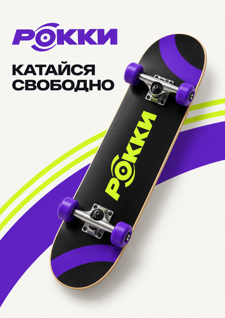
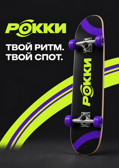
Posters
Space
The next stage involved visualizing the shop, the skating area, resting spots, and navigation. The signature colors and arcs were integrated into the interior design, complemented by concrete, light plywood, and charcoal metal.
Key concepts
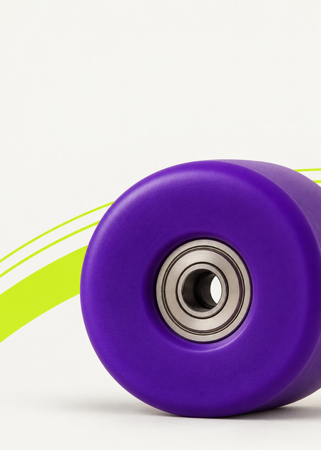
For the campaign, key visuals were created with altered object scaling: a giant skateboard wheel became the central image, while the skateboard and human figure added contrast and dynamism.