Original Project
PRO DANCE CAMP — a dance festival held in the woods that unites three genres: dancehall, contemporary, and krump.
New Startup Concept
As part of developing this project, I am transforming the dance festival into a small startup with its own identity, merchandise, ticketing system, participant packages, and venue design. This allows the project to become more cohesive and recognizable, enabling the brand style to be used not just in advertising, but at every stage of interaction with participants.
New Visual System for PRO DANCE CAMP
The PRO DANCE CAMP identity unifies the logo, brand color palette, typography, and graphic elements into a cohesive visual system. It reflects the energy of the dance festival and is adapted for three genres: Dancehall, Contemporary, and Krump. All elements are utilized across tickets, merchandise, packaging, navigation, and promotional materials, ensuring brand recognition across all mediums.
Signature Products
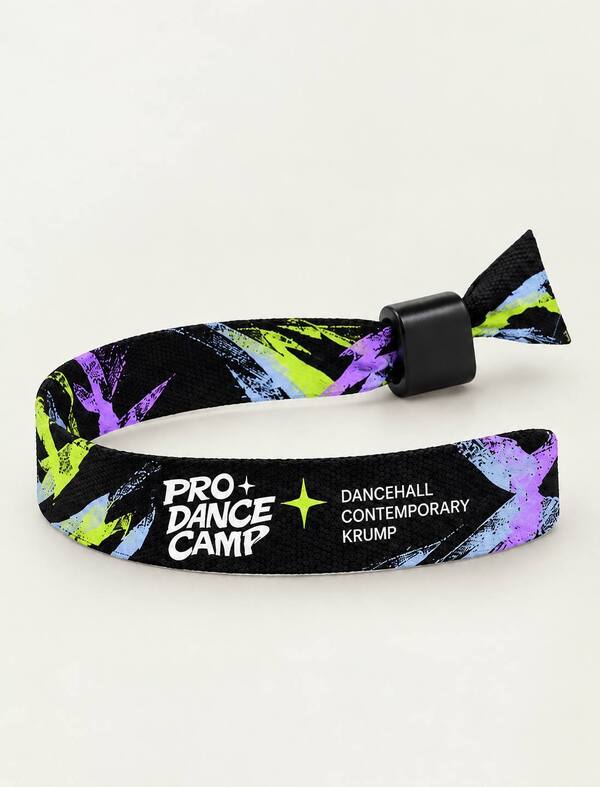
For the PRO DANCE CAMP, a line of branded merchandise has been developed that combines functional items for festival participants with elements of brand visual communication. This includes tickets, badges, wristbands, packaging, and navigation. Every item is designed in a cohesive style that complements the festival’s overall visual landscape.
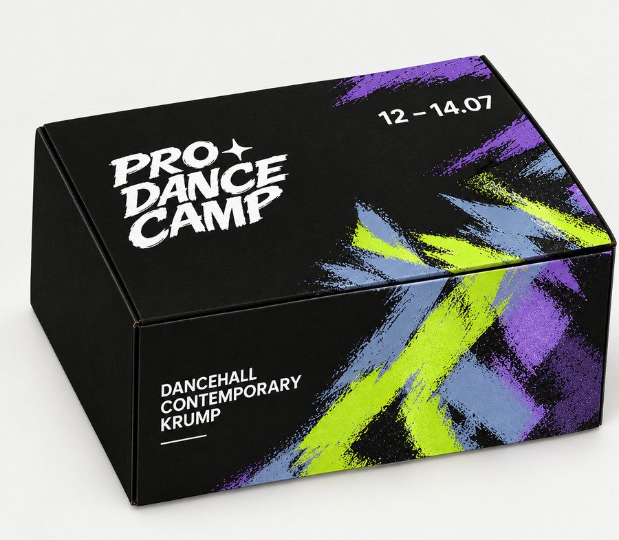
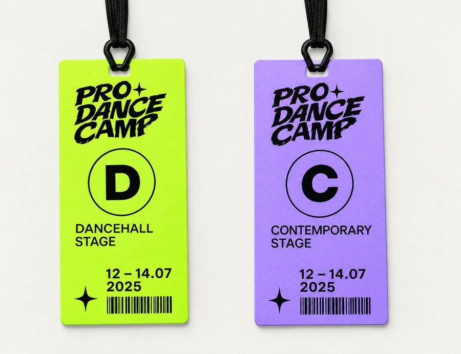
PRO DANCE CAMP Merchandise
PRO DANCE CAMP merchandise continues the visual concept of the festival by transforming the signature graphics into everyday items. The collection includes T-shirts, hoodies, bandanas, and caps. Each piece combines functionality with expressive design, allowing participants to keep memories of the festival and become part of the PRO DANCE CAMP community.
Festival Space
PRO DANCE CAMP merges dance with the natural environment. The festival takes place among the trees, and three distinct venues reflect the character of each discipline: Dancehall, Contemporary, and Krump. Navigation and brand graphics help participants orient themselves across the grounds and connect the various spaces into a single visual system. The festival’s main stage was also designed.
Advertising Campaign
The PRO DANCE CAMP advertising campaign introduces the festival and conveys its atmosphere through signature graphics, expressive typography, and dynamic composition. The main poster forms the first impression of the event, the program introduces participants to the tracks and schedule, and the advertising banner expands the brand’s visual presence. All materials are unified by a single identity system.
Working with AI
In developing PRO DANCE CAMP, I utilized generative artificial intelligence tools to create and evolve the project’s visual concept. The work involved formulating text prompts, generating imagery, refining composition, and editing individual elements. The resulting visuals were adapted to fit the festival’s overall identity and were used in the development of merchandise, promotional materials, and spatial design.
Tools and Models
ChatGPT was used to generate and edit images, develop visual concepts, and refine branding details. Using text prompts, I adjusted the composition, color palette, and individual image elements.
Qwen was employed for working with visual ideas and generating images from text prompts. I refined the descriptions of the desired outcome to bring the images closer to the overall style of PRO DANCE CAMP.
The combination of these two neural networks allowed me to experiment with visual solutions, compare results, and adapt the images to the project’s concept.
Working with a Neural Network
First prompt
Develop a comprehensive identity concept for the PRO DANCE CAMP dance festival. The festival takes place in a forest and features three dance styles: dancehall, contemporary, and krump. Participants move between three venues, engage with diverse styles, and experiment with dancing.On a single presentation sheet, design the following:1. Logo — original, expressive, and modern. Incorporate experimental typography, unconventional letter treatment, dynamism, and a sense of movement. The name PRO DANCE CAMP must remain legible.
2. Graphic System — unique abstract elements inspired by body plasticity, trajectories of movement, rhythm, and the dancer’s interaction with space. The graphics must be recognizable and suitable for use on posters, apparel, packaging, and wayfinding.
3. Color Palette — 4–5 harmoniously matched brand colors, including HEX codes. Avoid obvious natural green-brown combinations. Choose a bold, unconventional palette that merges the energy of underground dance culture with the atmosphere of a forest festival.
4. Typography — propose a pairing of two fonts: an expressive display typeface for headlines and a functional grotesque for body text. Showcase them using the festival name and short informational captions. Visual direction: modern underground, experimental music festival design, independent dance culture, avant-garde typography, bold compositions, expressive contrasts, dynamic forms, and a professional art direction presentation. Important: Do not use the project’s previous identity, the former logo, iridescent textures, or pointillistic graphics. Create an entirely new visual system from scratch. Do not add decorative elements unrelated to the festival concept. Avoid cliché styling and typical corporate branding.
First Generation
Next, I asked the AI to refine each image in the collage using the following prompts:
generation promptUse the attached image as a foundation and create a new version of the layout scheme for three dance camps at the PRO DANCE CAMP festival, set within a forest area.The primary goal is to alter the spatial arrangement of the venues. Do not place all three camps near each other, as shown in the original image. Depict a genuine forest landscape featuring three distinct dance spaces that are separated by varying distances.1. First Camp — DANCEHALL* Color Identification: Acidic Lemon #C9FF2E.
* Located on an open clearing among trees.
* The venue’s design, canopies, flags, and small graphic elements are executed using the lemon color.
* The camp is highly visible from above and easily recognizable.2. Second Camp — CONTEMPORARY* Color Identification: Soft Lilac #B3A4FF.
* Situated on a different clearing, relatively close to the first camp, but with a noticeable separation between them.
* There should be trees, forest trails, and natural wooded areas between the two venues.
* Lilac canopies, flags, and graphic elements emphasize the camp’s affiliation with the contemporary genre.3. Third Camp — KRUMP* Color Identification: Gray-Blue #BFA0B6.
* Located significantly farther from the other two venues, deep within the forest.
* There must be a large expanse of dense woods between this camp and the other two, creating a sense of remoteness and independence for the third venue.
* Gray-blue canopies, flags, and design details make it visually distinct from the others.Spatial CompositionShow the entire area from a high-angle, slightly oblique aerial view, allowing the forest landscape, clearings, and the arrangement of all three camps to be visible simultaneously.The first and second camps should be in the same section of the forest, relatively close to each other, but not adjacent. The third camp should be set apart, noticeably further away, deep within the forest massif. Do not align the venues in a straight line, nor should you make the distances between them uniform.The forest should occupy the majority of the image. Utilize natural clearings, dense clusters of trees, winding trails, and small open spaces. The trails may connect the camps, but they must not transform them into one unified space.