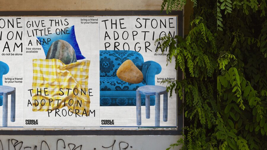
Pebble Garden is a place where stones, weary from the rough treatment of people, can find solace. Here, they are neither kicked, nor thrown, nor touched. Visitors come only to simply be present: to sit among the boulders, to watch the sun slowly warm the granite.
Rebranding
Pebble Garden — a stone garden, a place where one can find tranquility and peace amid nature and ancient hard stones.
At the beginning of the project, I asked ChatGPT-6 to devise a new logo, the primary brand palette, and the typography solution.
Create a brand logo for «Pebble Garden,» a tranquil stone garden where visitors can quietly sit among the stones.
The logo consists of two elements, arranged horizontally on a clean off-white background:
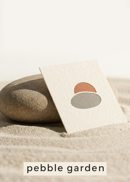
Symbol on the left: a smooth, rounded pebble in warm gray. Behind it, a soft half-circle sun in terracotta rises, appearing like a gentle sunrise behind the pebble. The style should be flat vector, utilizing simple geometric shapes with slightly soft, imperfect edges, and no gradients or outlines.
Wordmark on the right: the text «pebble garden» in lowercase, set in a soft humanist sans-serif typeface, rendered in dark graphite, with medium weight and generous letter spacing.
Style: Minimalist, warm, calming, with a handcrafted feel, and incorporating Japanese-inspired restraint. Use significant negative space around the logo. The composition must be centered, adhering to a flat design aesthetic—no shadows, no textures, and no extraneous embellishments.
Identity Carriers
Create a photorealistic close-up presentation of bespoke admission tickets for Pebble Garden.
FORMAT: Narrow horizontal tickets, approximately 160 × 65 mm, printed on thick, warm-ivory uncoated paper, with a perforated detachable stub on the right.
GRAPHIC DESIGN: Set «pebble garden» in distinctive dark stone-grey soft-serif lettering on the main section. Add a large admission number «024» on the detachable stub. Use precise, small sans-serif labels «ADMIT ONE» and «TAKE YOUR TIME». An oversized muted-terracotta asymmetric color field is cropped by the bottom edge. A thin, open-ended warm-grey contour line crosses from the main ticket onto the stub. Keep the typography readable, the margins deliberate, and the composition asymmetrical. Use the supplied logo small, once. The reverse is terracotta with ivory typography and a cropped contour fragment, not a repeated logo pattern.
PRESENTATION: Show one complete ticket face up and another turned over, slightly offset, on a pale mineral surface. Close, elevated view, realistic perforation, visible paper edges, soft natural daylight. Tickets dominate the frame.
Create a photorealistic editorial presentation of a double-sided A6 invitation card for Pebble Garden.FRONT DESIGN:
Warm ivory heavyweight paper. An oversized, dark stone-gray soft-serif headline, «A LITTLE SPACE, ” arranged in three deliberate lines. A muted terracotta asymmetric field enters from the right edge, interacting with the typography without obscuring the words.
Add one partial open-ended contour line in blind debossing, visible through subtle light and shadow. Place „pebble garden“ in a small, aligned footer. Do not use the logo as the main artwork.BACK DESIGN:
An offset two-column typographic layout featuring the heading „YOU ARE INVITED, ” followed by the short line „An afternoon of slow looking.“ Include small labels—“EXPLORE, ” „OBSERVE, ” „PAUSE”—separated by generous spacing. A narrow terracotta field runs along one edge. Discreetly place the supplied symbol at the bottom.PRESENTATION:
Show two copies, one front and one back, lying side by side with a slight offset. Both designs must be clearly visible. Warm-gray tabletop, soft grazing daylight revealing the paper grain and debossing.
Create a photorealistic presentation of a pocket-sized accordion-fold visitor guide for Pebble Garden.
FORMAT: Four panels, each approximately 80 × 120 mm, printed on warm-ivory uncoated paper. Show one guide unfolded with its interior facing up and a second copy folded to display the cover.
COVER: Large dark stone-grey soft-serif headline «WANDER SLOWLY», small «pebble garden» branding, a cropped muted-terracotta asymmetric field, and a thin open-ended contour line. Clear hierarchy and confident use of negative space.
INTERIOR: Design a coherent schematic garden map across the two central panels. Use pale-grey asymmetric areas for gravel beds, ivory paths, and one terracotta route line connecting three numbered stops. Clearly label them «01 ENTRY», «02 STONE GARDEN», «03 PAUSE». Use the outer panels for a compact typographic introduction headed «FIND YOUR OWN PACE» and a simple map legend. Align all labels to a consistent grid. Keep important text away from fold lines. Use the supplied logo small on the back panel only.
PRESENTATION: Close, elevated tabletop view showing the folded cover and the complete interior map. Realistic accordion folds, subtle paper shadows, natural daylight, pale limestone surface. The printed design is the focal point.
Key Concepts
Create a photorealistic campaign key visual for the brand «pebble garden, ” using the two attached references.REFERENCE PRIORITY:
Use the isolated logo as the strict reference for geometry, silhouette, proportions, and the relationship between its two shapes. Use the photograph of the branded card only as a reference for lighting, natural materials, warm colors, and photographic atmosphere.SCENE:
A large, shallow sculptural relief mounted on a warm ivory lime-plaster wall. The relief reproduces the supplied logo: a wide, subtly irregular horizontal lower oval made from warm grey natural stone, and the smaller upper terracotta shape made from matte, unglazed ceramic. Preserve the curved lower edge of the upper shape. Preserve the narrow curved separation between both shapes, exposing the ivory wall beneath. The two pieces must look custom-cut from the exact logo artwork, not like found pebbles arranged to resemble it. Both pieces are mounted on the same wall plane, featuring subtle thickness and realistic contact shadows.
Minimalist editorial studio landscape photographed from a very low viewpoint. A matte, muted terracotta backdrop fills the upper eighty percent of the frame. A narrow, horizontal strip of fine, pale ivory sand runs along the bottom. One small, low, naturally rounded warm-grey pebble sits near the lower right, casting a long, soft-edged shadow to the left.The terracotta background is richly pigmented, subtly textured, and evenly colored—not orange, not pink. Warm, directional sunlight; realistic sand and stone; strong scale contrast between the small object and the expansive colored field. Landscape 16:9.No sun, no discs, no arches, no stacked stones, no logo, no text, no cards, no additional objects. Keep the upper and left areas completely clear.
Use the attached logo exactly as is; do not redraw or alter it.
A smooth, warm-gray stone rests on pale sand in soft morning sunlight. A thick, cream-colored entrance ticket featuring a blind-embossed version of the attached logo leans against the stone. Shallow depth of field, calm and quiet mood, with ample negative space at the top of the frame for a headline.
Warm, natural light; soft, long shadows; a palette of off-white, sand, terracotta, and warm gray; tactile materials; a minimal composition with generous negative space; photorealistic; subtle 35 mm film grain.
Design a complete branded entrance environment for Pebble Garden, presented as a photorealistic architectural campaign image. This must be an integrated visual identity presentation, not a standalone architectural photograph with a logo overlaid.Create a garden entrance featuring a pale mineral-plaster wall, a narrow view into a stone garden beyond, and a custom freestanding wayfinding panel in the foreground.
Maintain a consistent bespoke design language throughout: elongated, asymmetric shapes with softly worn edges, one end subtly wider than the other, offset inset panels, and shallow, open-ended contour grooves. Avoid perfect capsules or a rounded rectangular modular grid.The wayfinding panel should have an ivory body, a warm-grey inset face, and a muted terracotta inset section. Integrate a clear typographic hierarchy onto its surface: «pebble garden, ” a large „01, ” and smaller „GARDEN ENTRY.“ Use a distinctive soft serif for the brand name and a restrained sans serif for functional information.
Replicate this same asymmetric inset construction in the entrance door handle and in a wall-mounted holder containing printed garden maps. The visible maps must feature matching off-center contour graphics and terracotta color fields.
Create a photorealistic branded seating area within Pebble Garden, expressing the visual identity through furniture construction, signage, typography, and material details.
The main object is a custom, low bench featuring a long, asymmetric plan that gently tapers at one end, constructed from a warm-grey mineral composite. It has a flat, usable seating surface with softly rounded edges. An offset ivory inset runs along part of the seat, while a muted terracotta inset wraps around one end. A shallow, open-ended contour groove follows part of the bench perimeter.
Beside the bench stands a low-angled garden information plaque. Its asymmetric silhouette, inset panel, and partial contour groove clearly belong to the same product family as the bench. Integrate «pebble garden» discreetly into the bench end. The plaque features a large «02, ” the heading „PAUSE, ” and a simple inset route diagram. Include a folded visitor map resting on the seat, utilizing the same contour graphics and ivory, grey, and terracotta color blocking.