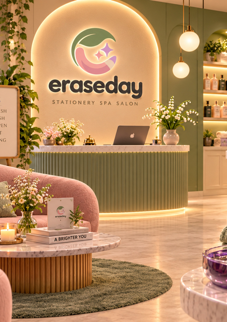
Eraseday — a spa for stationery, where office supplies find rest and a reboot. Pens are refilled with ink, pencils are sharpened, and markers become brighter. Here, every tool gains the strength and inspiration to create again and leave its mark on a blank page.
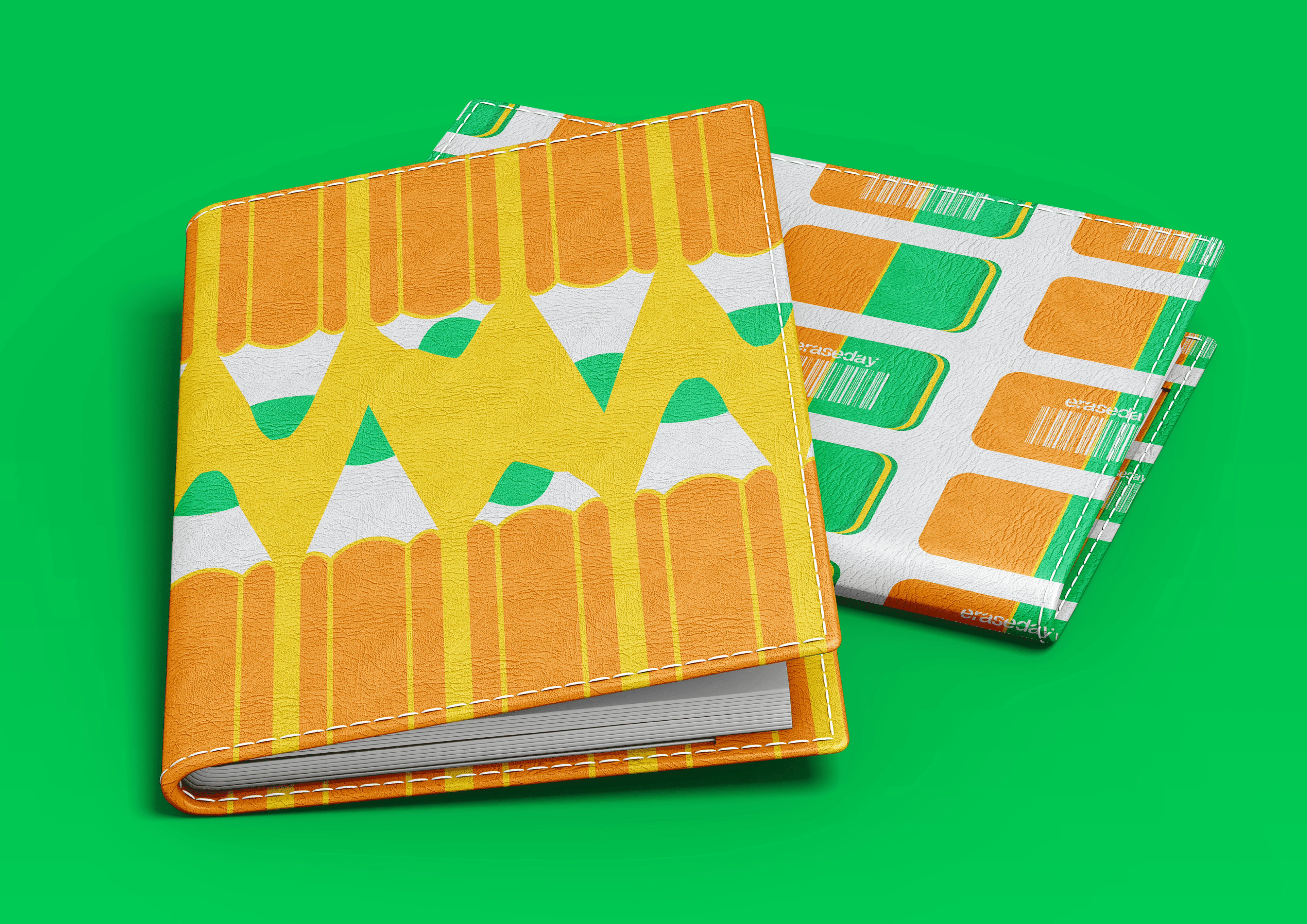
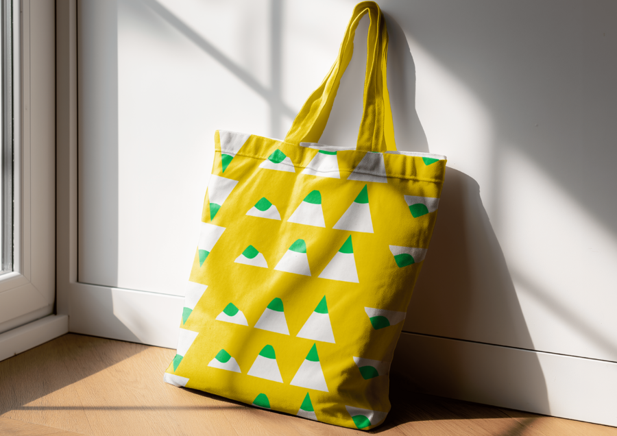
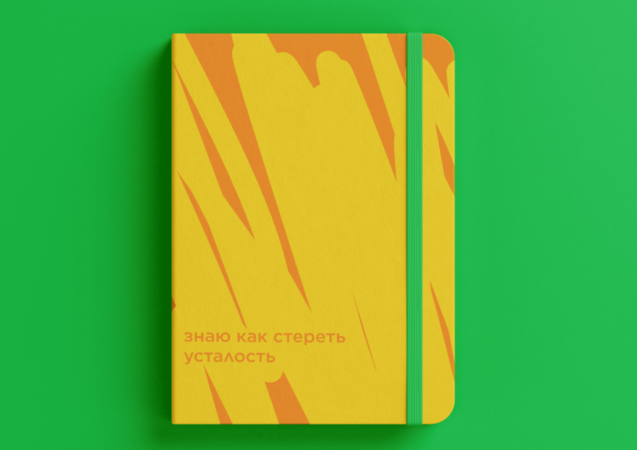
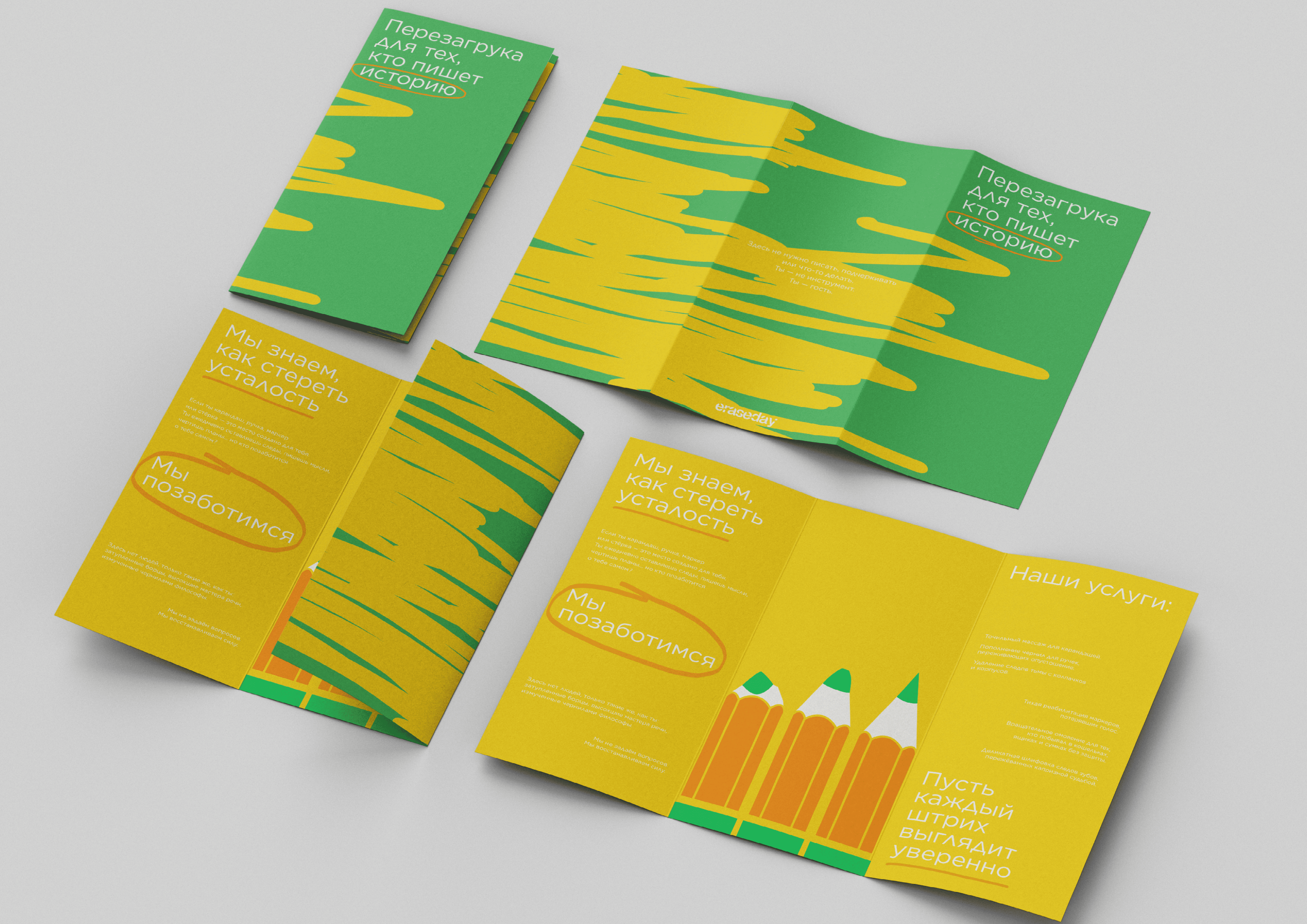
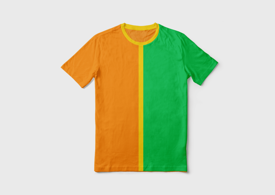
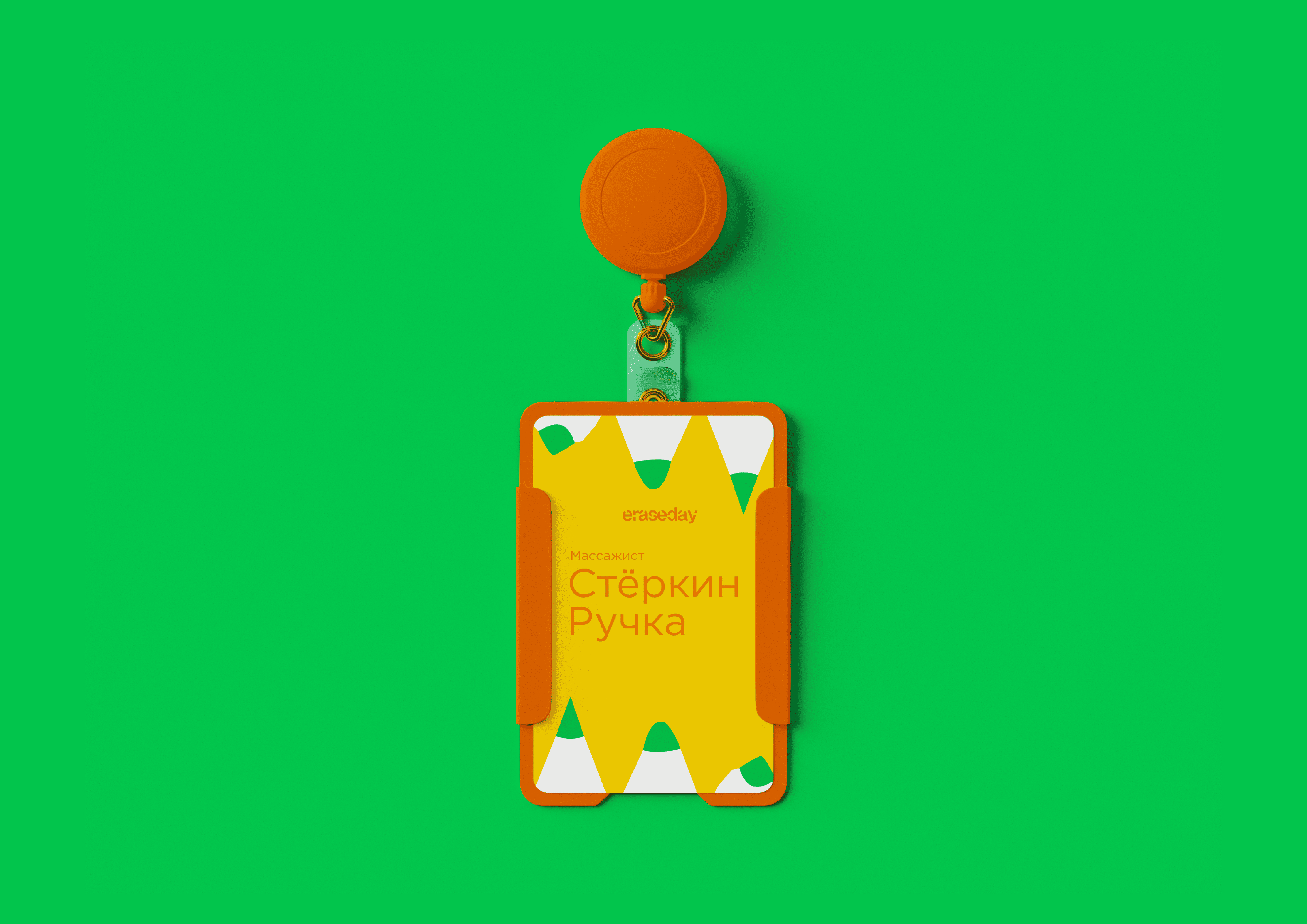
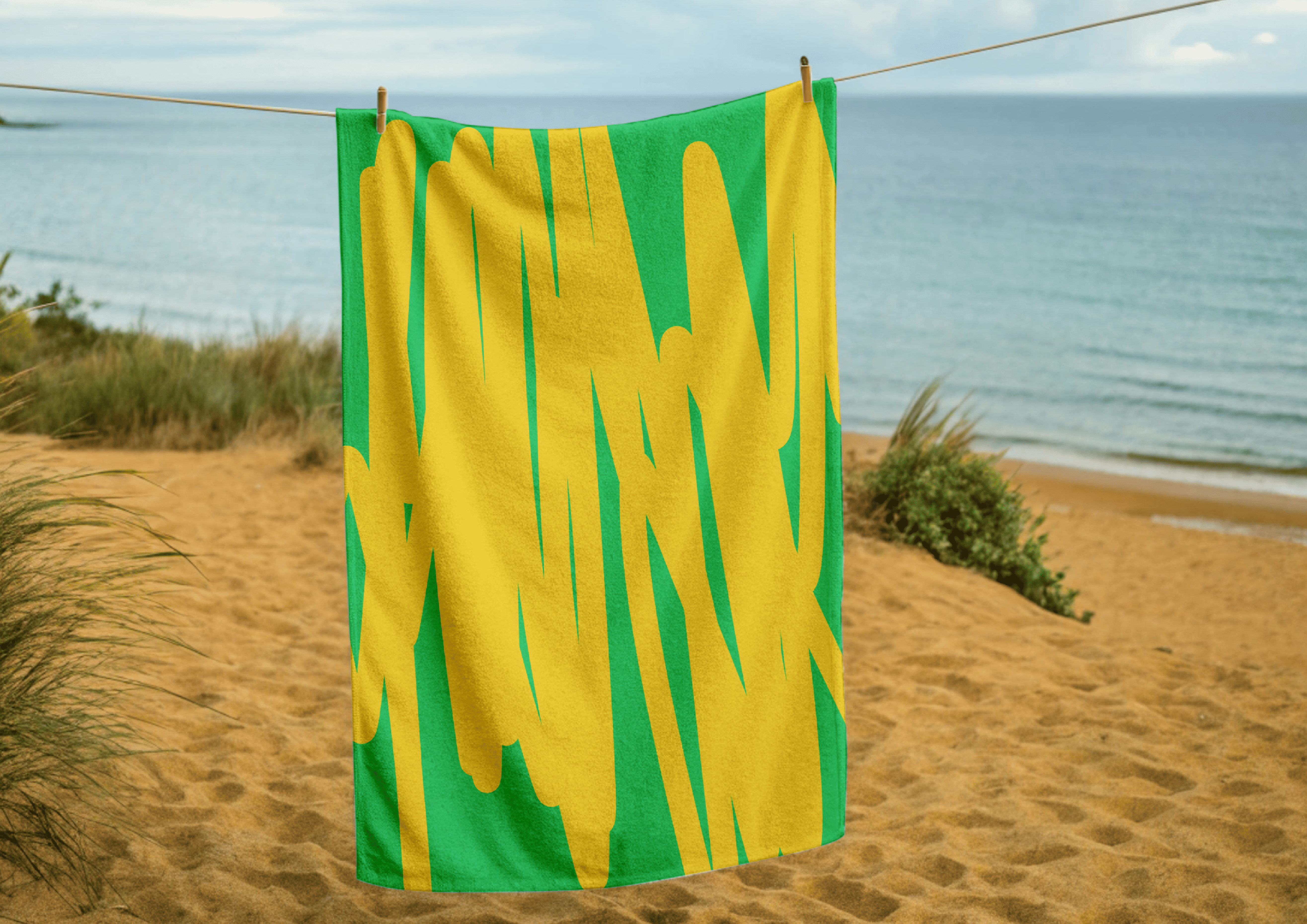
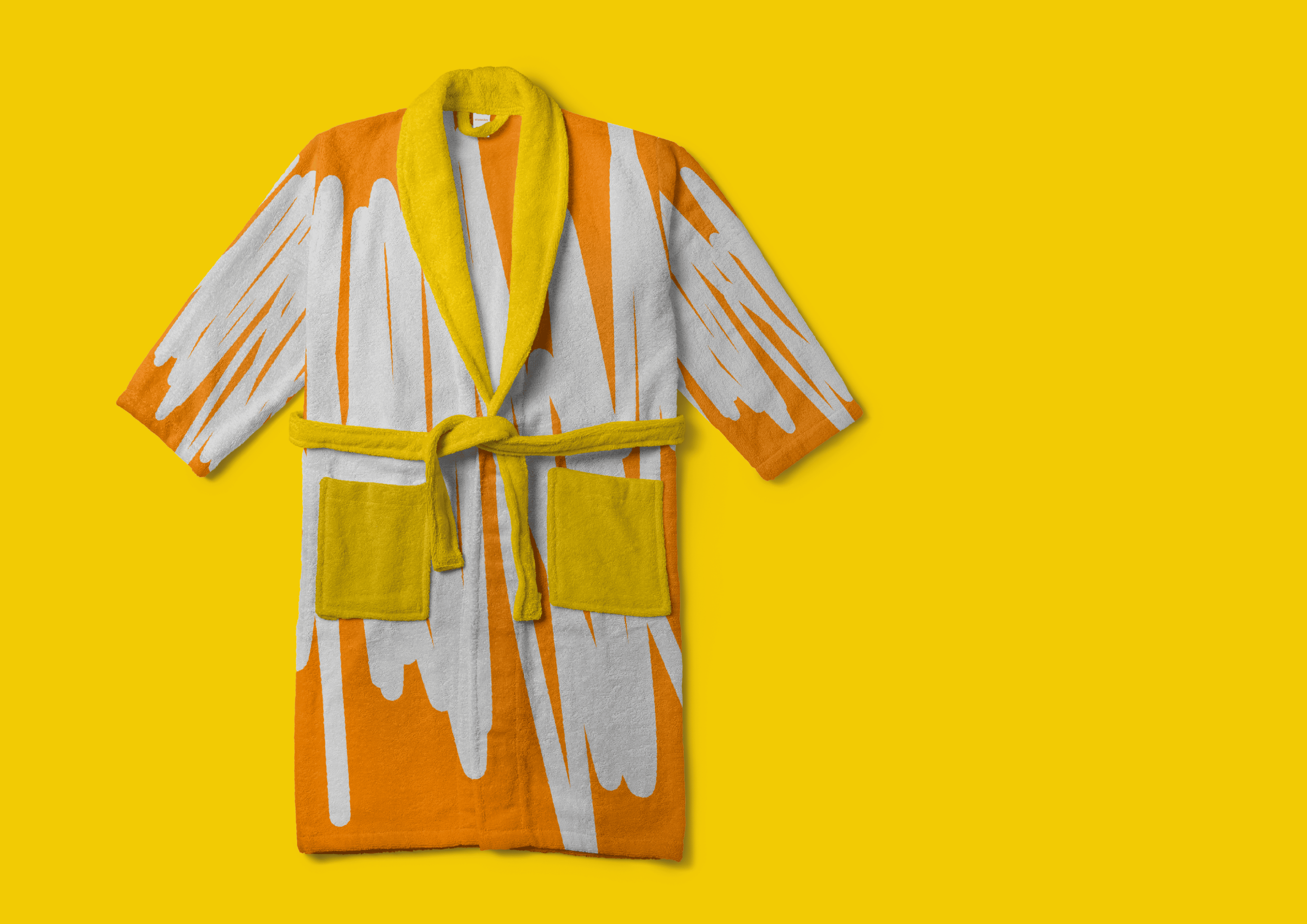
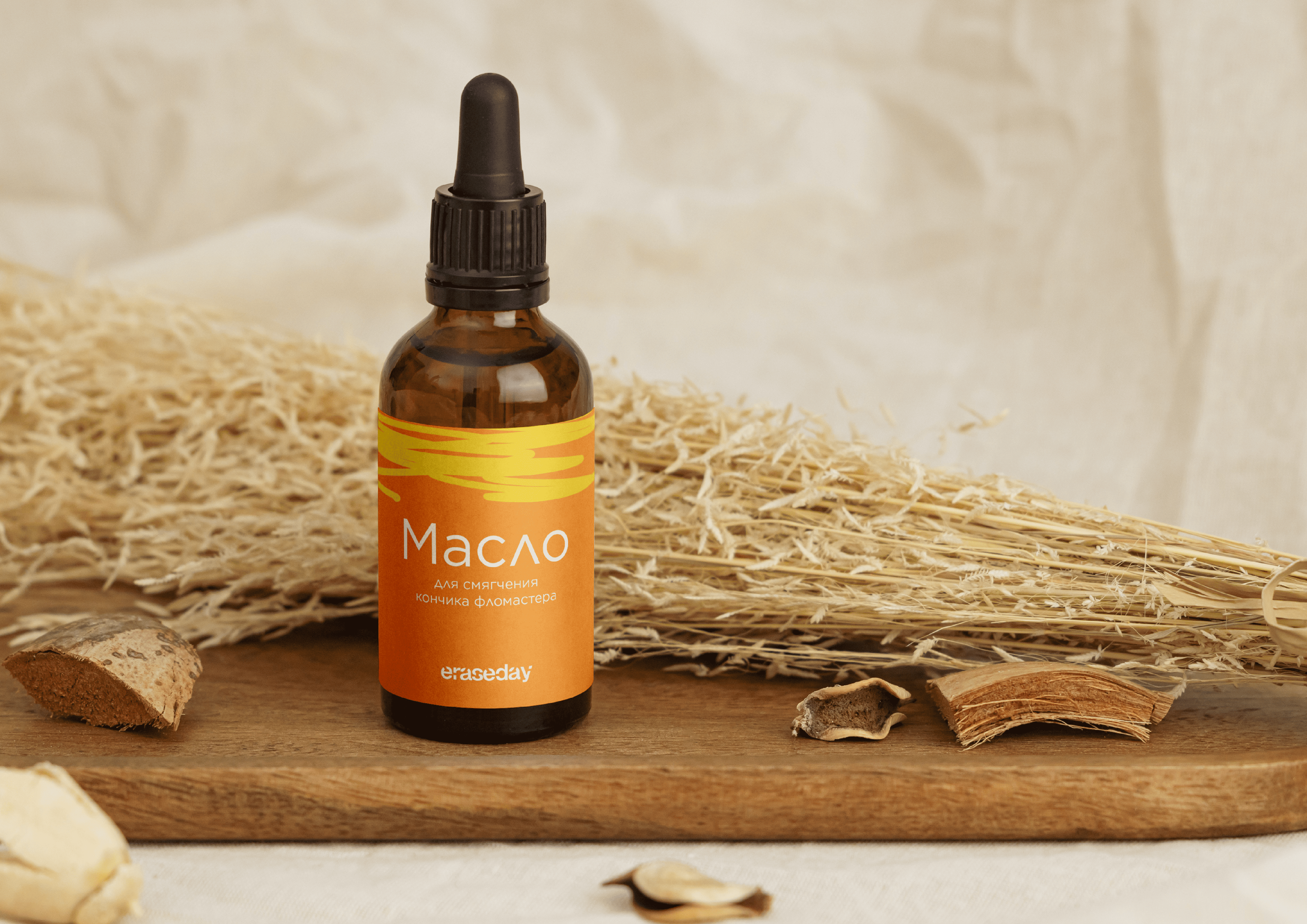
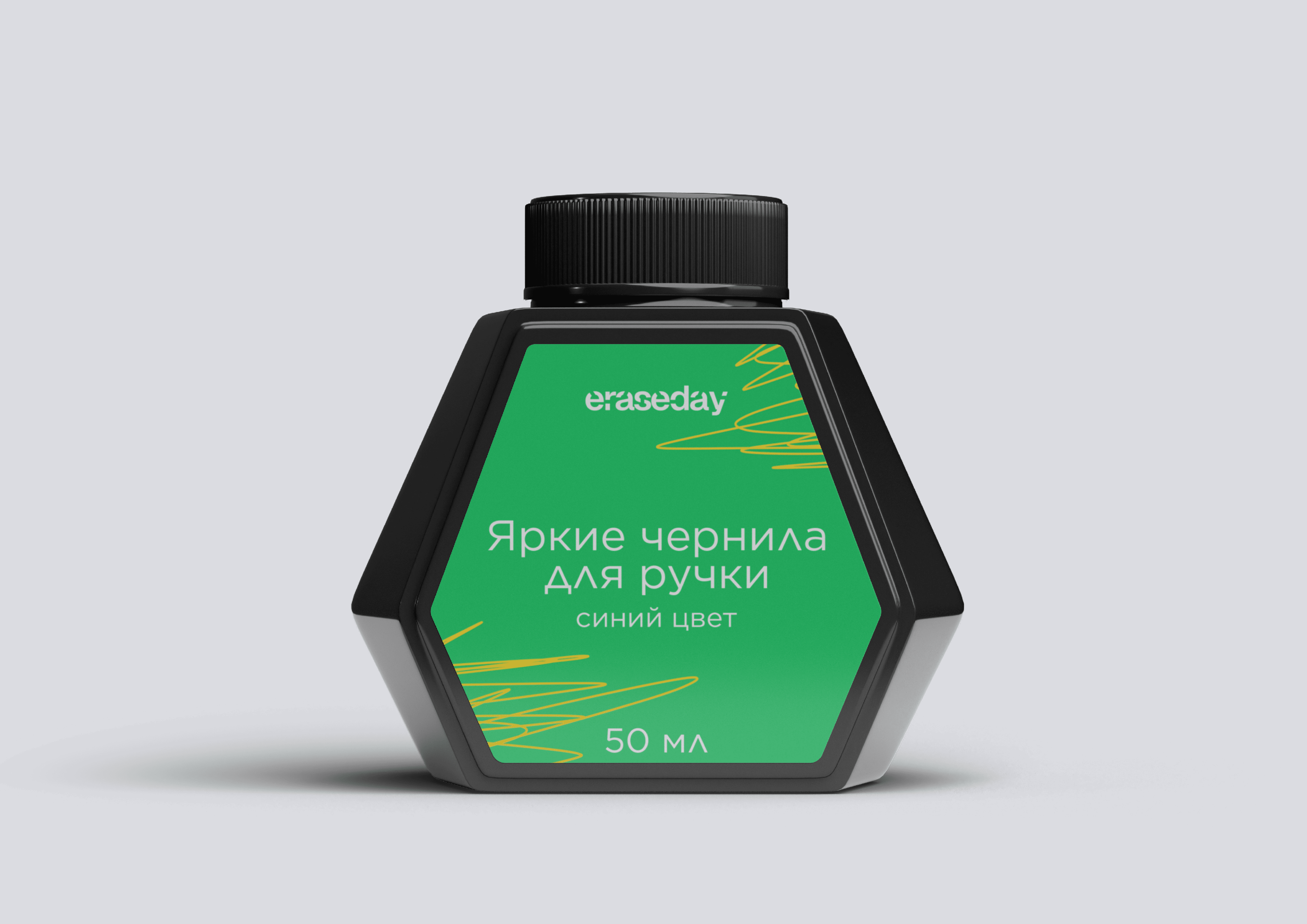
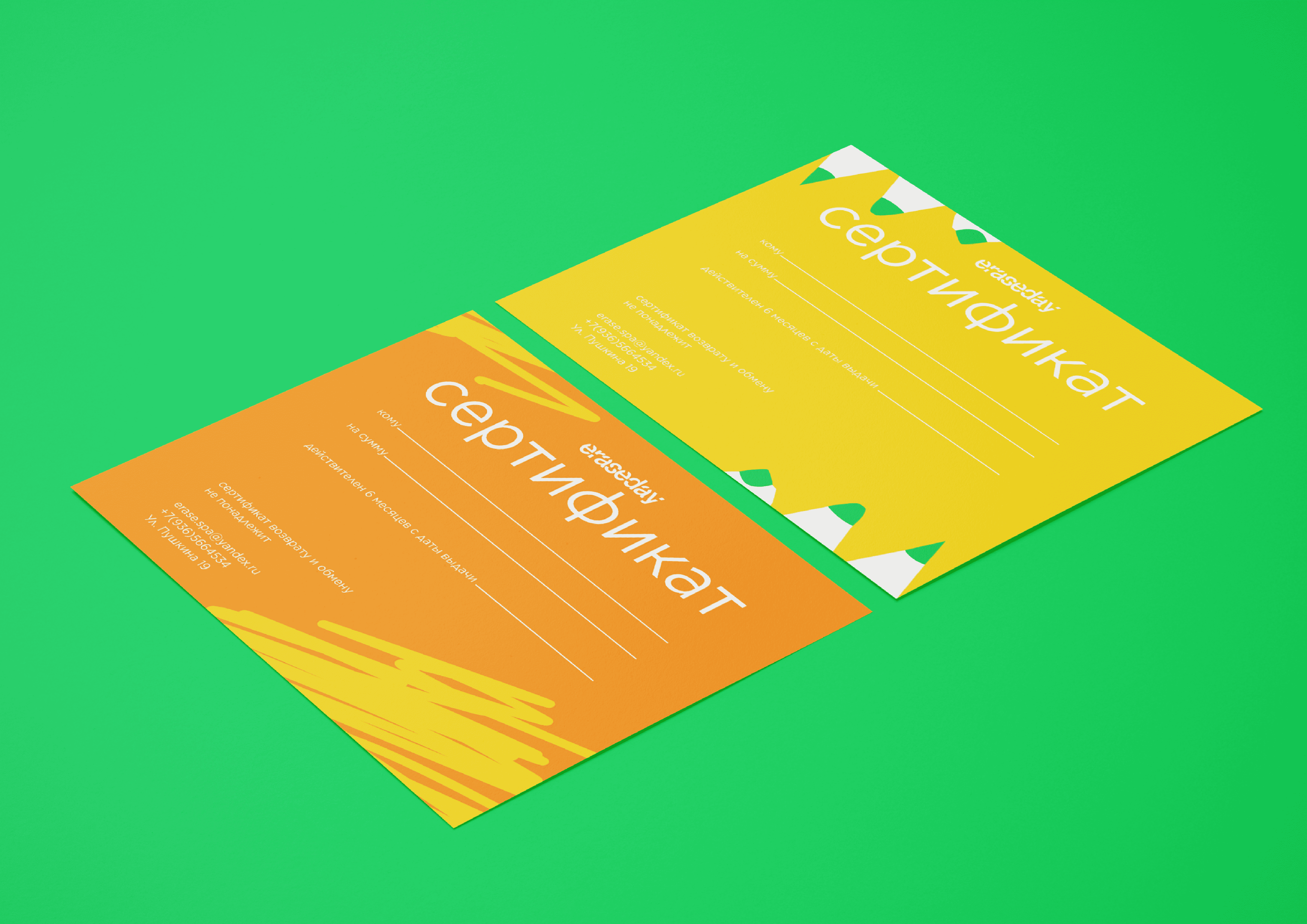
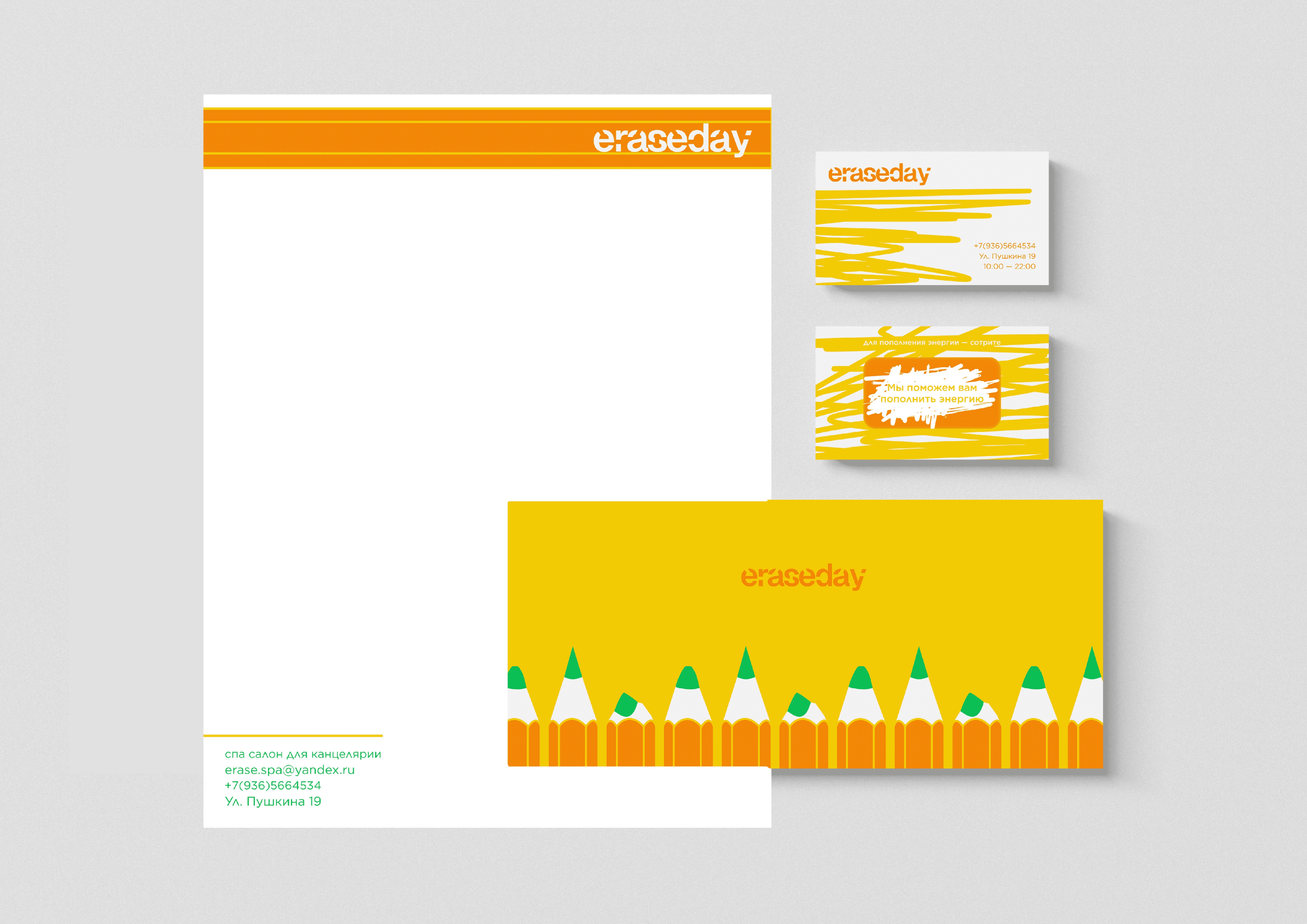
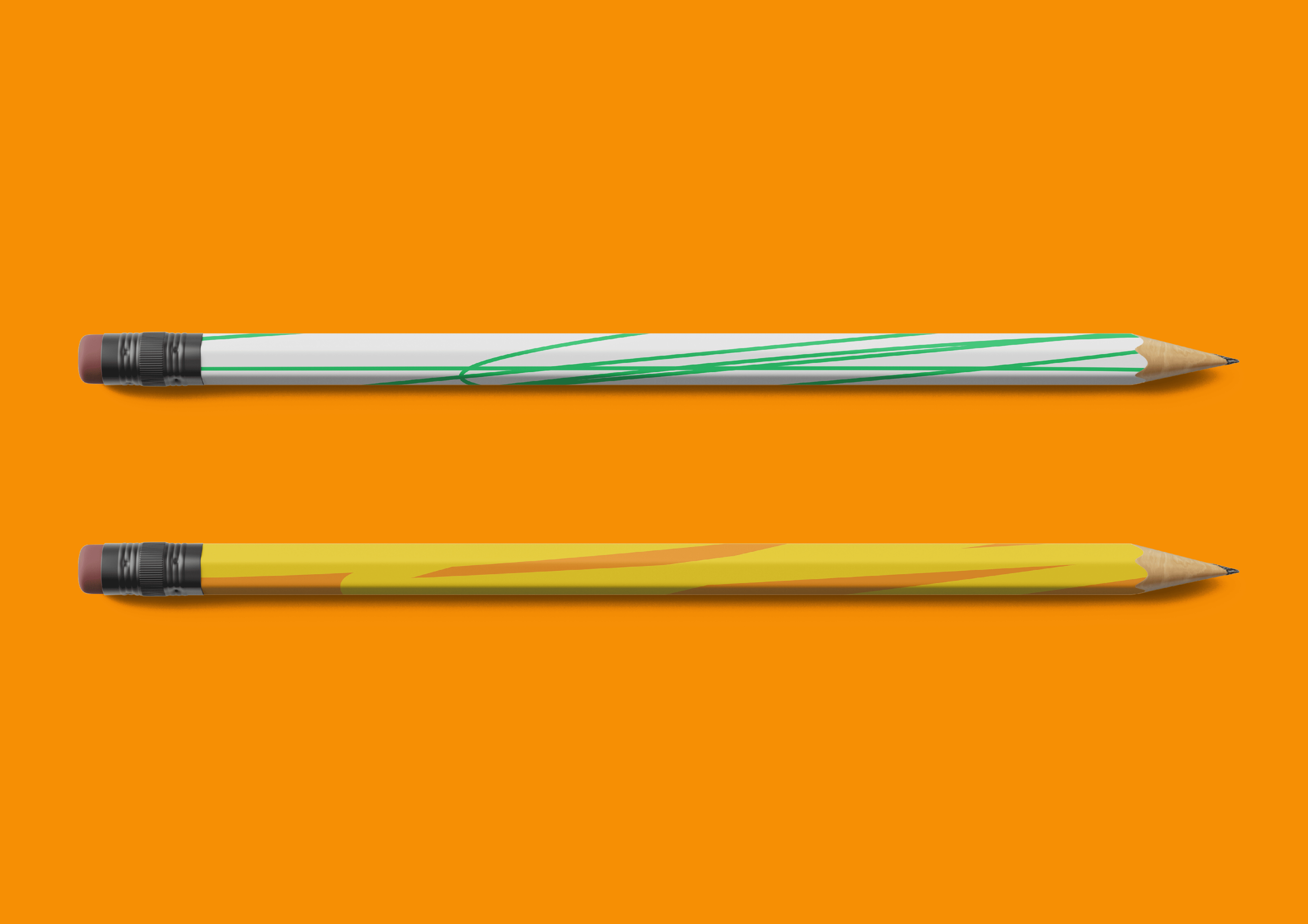
Identity of the previous project
As part of the rebranding and visual development of the project, I decided to reimagine Eraseday, transforming it into a startup that unites a service, a product line, and corporate identity around the concept of caring for stationery supplies.
Rebranding Concept
The concept developed with ChatGPT is founded on the idea of creating a brand that offers a fresh perspective on everyday writing instruments and their refurbishment. The key element is the image of a spa environment for office supplies, where pens, pencils, and markers receive a «reboot» and a second life. Through the metaphor of care, pampering, and renewal, the brand forges an emotional connection with its audience, transforming ordinary stationery into a part of a special experience. Thus, the rebranding shifts the focus from an isolated graphic project to a holistic startup where service, proprietary goods, and visual communication converge into a unified system. Eraseday becomes not merely a stationery brand, but a space and a service for those who write, draw, and create stories.
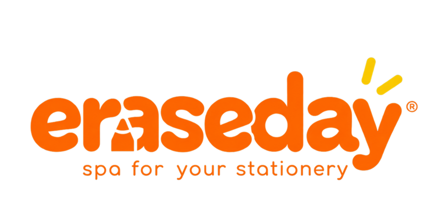
New project logo
After selecting the visual direction, I began developing the logo using ChatGPT. In the prompt, I outlined the key requirements: retaining the name Eraseday, abandoning the previous typeface, and creating a more expressive logo that reflects the concept of a spa for stationery. I also defined the character of the identity—bright, friendly, modern, and playful. Based on this request, ChatGPT proposed a logo featuring rounded letters and graphic elements referencing stationery. A stylized pencil becomes the visual accent, while the soft forms of the letters convey a sense of care and renewal. This solution maintains Eraseday’s recognizable character while making the brand identity more cohesive and suitable for startup growth.
Font
To select a typeface, I used the MyFonts service to find a genuine font closely resembling the logo generated by ChatGPT. I chose Nunito Flex Black as the most suitable option. Its bold, rounded letters and smooth forms align with Eraseday’s friendly and playful nature. The selected typeface maintains the visual expressiveness of the generated logo and can be utilized in the further development of the brand identity—on packaging, promotional materials, and other brand touchpoints.
Color Palette
Next, I asked ChatGPT to develop a color palette for the Eraseday rebranding, while maintaining a connection to the original identity. It was important to keep the brand’s vibrant and playful character, but to make the color combination more harmonious and versatile. The new palette is based on orange, yellow, and green—colors associated with creativity, energy, and renewal. An additional light hue helps balance the saturated colors and makes the visual communication feel more contemporary.
I systematized the shades suggested by ChatGPT using Adobe Color, determining the precise HEX codes. This allowed me to establish a unified color palette that can be consistently applied across packaging, promotional materials, merchandise, and Eraseday’s space design.