Technical Specification
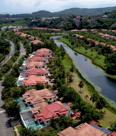
Location: Thailand, Phuket, Bang Tao area (Boat Avenue)
This choice is based on analysis from Knight Frank Thailand’s real estate market data and Phuket Immigration demographic trends:
- High concentration of Russian-speaking expats accustomed to a high level of service.
- The island’s highest average spending, with an audience willing to pay for concept, atmosphere, and community, rather than just for food.
- A lack of modern, conceptual projects incorporating a Slavic cultural code within a 15 km radius.
Venue Type
Community café, featuring a lounge, bar, and event space
Target Audience
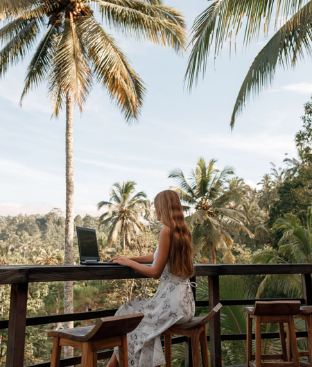
- Core audience — Russian expats looking for an aesthetic space for networking, working, and relaxing.
- Secondary — Foreign tourists open to contemporary culinary and cultural concepts.
SWOT Analysis
Strengths
- The concept stands out against the backdrop of typical Thai cafes and lofts in Phuket.
- The contrast between tropical elements and Slavic motifs creates high viral potential.
Weaknesses
- A single space can create an echoing effect
- Solution: using sound-absorbing materials
Opportunities
- The café may sell ceramics and merchandise
- The event zone will attract additional traffic
Threats
- Local contractors may not understand the specifics of carving or ornamentation
Solution: replacing handwork with milling, importing decorative elements from the Russian Federation - High humidity is detrimental to some materials
Solution: treating the wood with water-repellent preservatives
Stylistics
The core concept of this project fuses the aesthetics of the tropics with recognizable motifs of Russian culture. This synthesis creates a unique atmosphere—a place where exotic elements feel intimately cozy, and familiar things take on a new, sun-drenched quality.
Moodboard
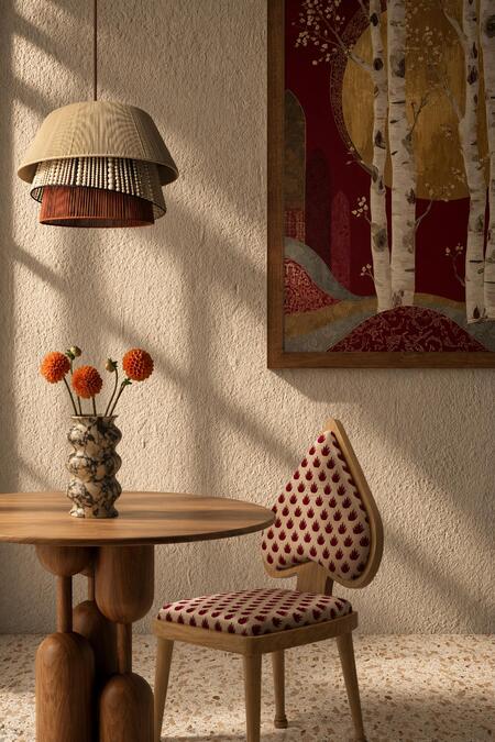
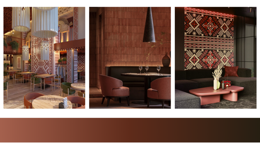
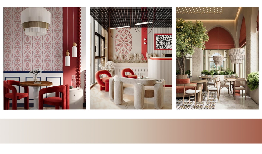
The project’s color palette draws inspiration from cultural heritage, refracted through a contemporary lens. It is based on iconic illustrations by Ivan Bilibin from Russian fairy tales, complemented by the works of modern Russian artists.
Colors
The atmosphere of the space evolves as the visitor moves deeper into the venue:
The initial references illustrate a light, airy, and dynamic area. Bright, neutral tones, natural materials, and abundant diffused light dominate here. Vibrant color accents against a neutral backdrop create an energetic and welcoming mood, inviting entry.
The next slide demonstrates a smooth transition to a warmer, more intimate setting. The color palette becomes deeper and richer, and the lighting—more focused and subdued—shifts the focus to tactile materials. This creates private and cozy zones.
References
The material board embodies the project’s core concept—the union of textures and cultures. It combines wood, glossy tile reminiscent of traditional ceramic mosaics, modern terrazzo flecked with the palette’s primary colors, soft textured textile, relief plaster, and matte metal.
Materials Board
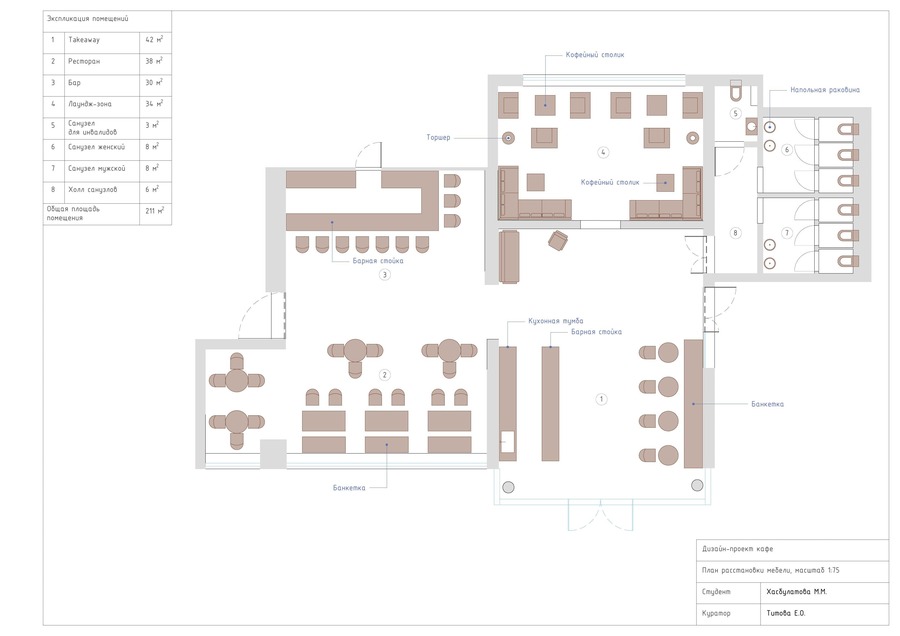
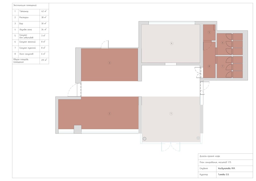
Zoning
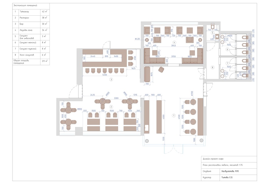
① Entrance Area and Takeaway
- Bright, dynamic zone
- Display case with desserts, quick drink ordering
- Customers picking up beverages to go do not cross the main halls
② Restaurant Area
- A more isolated space
- Ability to transform furniture and create visual separation during events
③ Bar
- Cozy, dim room without direct sunlight
- More intimate, evening atmosphere, ideal for dates
④ Lounge Area
- Light, warm space with a large window
- Flooded with diffused light through linen curtains
- Soft, enveloping furniture
- For long conversations and comfortable laptop work
⑤–⑧ Restrooms
- Isolated from customer areas by a buffer space
Collages
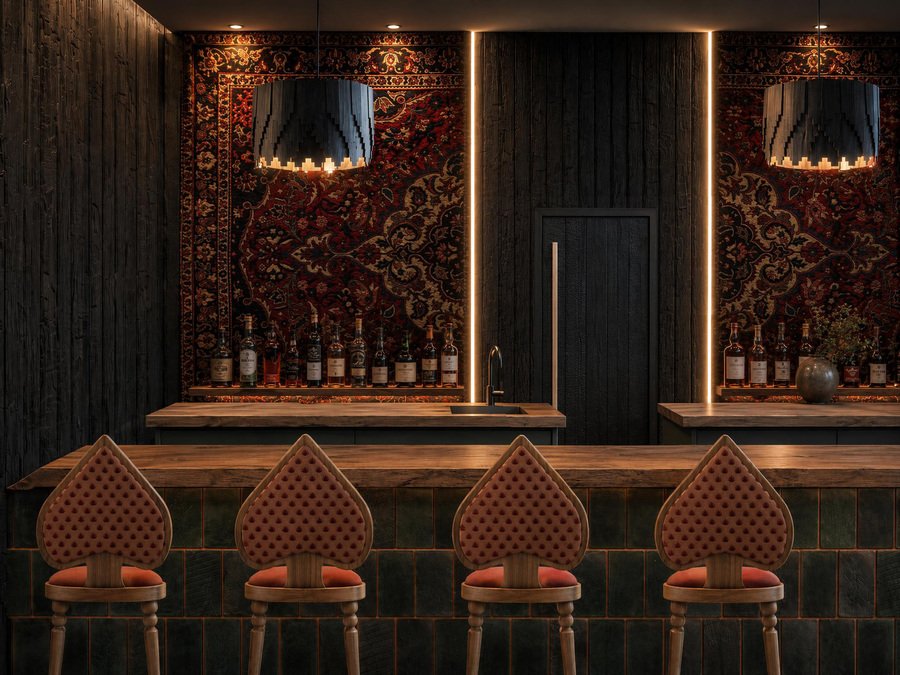
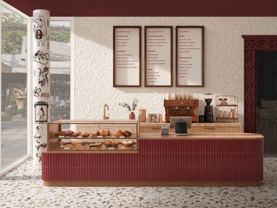
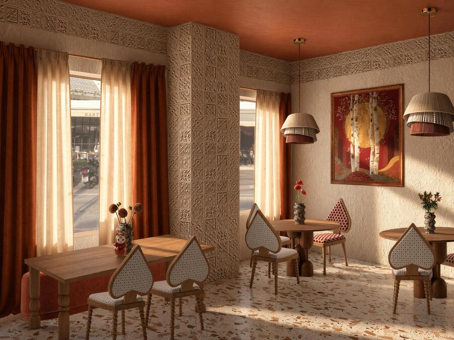
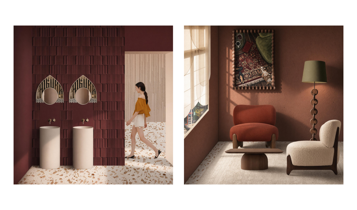
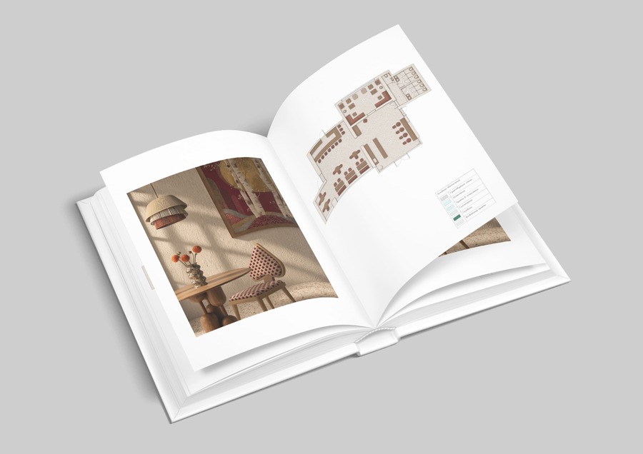
Images have been processed by a neural network to add realistic lighting
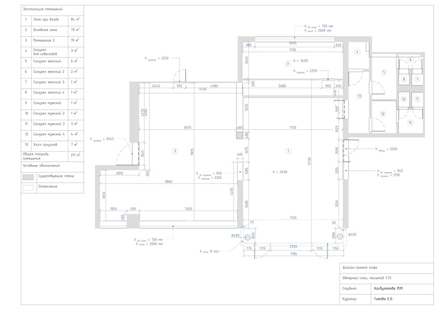
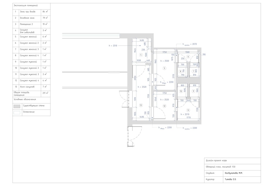
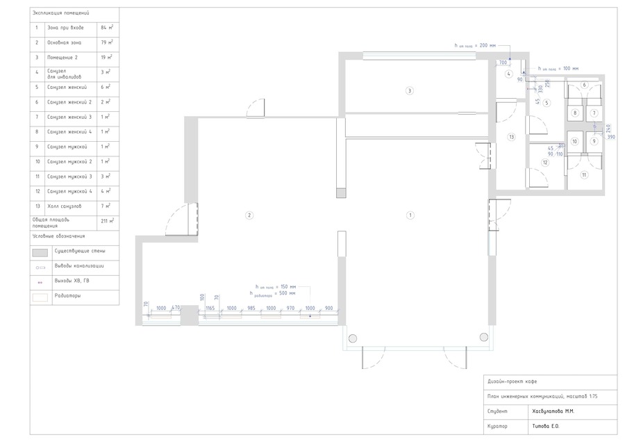
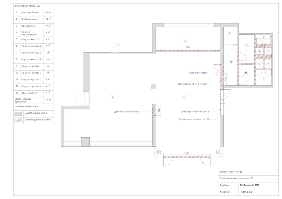
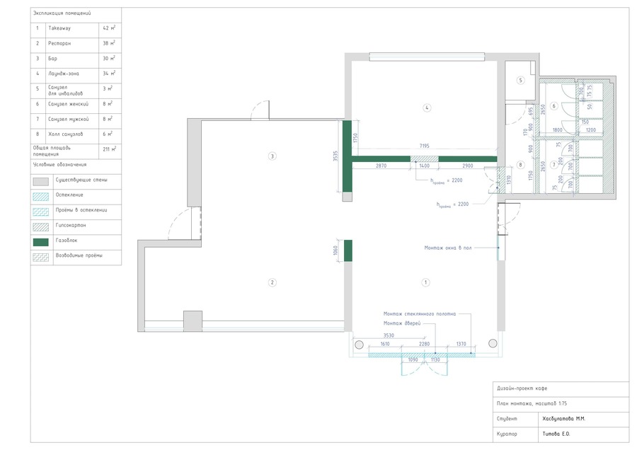
Blueprints