
Concept
Like many others, I was intrigued by the paradox of stroke: how a disease with immediate onset can be the result of long-term processes that often go unnoticed. I wanted to uncover what truly lies behind dry medical statistics and common perceptions. My goal was to discern which risk factors are widespread myths and which represent a harsh reality. Therefore, I delved into data analysis.
For this project, I used the Healthcare Dataset Stroke Data (5,110 records). This isn’t just a spreadsheet; it’s a cross-section of real medical records, encompassing both clinical indicators (such as glucose levels and BMI) and social factors (such as marital status, housing type, and profession).
Why these specific data points?
Stroke is often perceived as a sudden catastrophe, but data allows us to view it as a cumulative result. It was important to test hypotheses: does «office drone» culture truly pose less risk than manual labor? And is excess weight always a death sentence? This project is an attempt to move beyond superficial judgments toward measurable and verifiable facts.
Please provide the Russian text you would like me to translate.
Visualization Styling
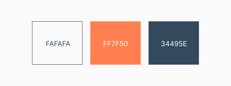
Since the standard Python charts look too technical, I developed a style based on Scandinavian minimalism:
For the background, I chose: #FAFAFA. This is a light shade that creates a feeling of «airiness» and neutrality.
As for the primary colors, I used:
Calm Indigo (#34495E) to indicate the normal range.
Soft Coral (#FF7F50) to highlight risk zones.
This palette avoids the «visual shouting» characteristic of pure red, yet it clearly emphasizes problem areas.
Visual Strategy
For my project, I abandoned primitive pie charts. This kind of task requires tools that demonstrate density and distribution: KDE Plot (for age), Boxen Plot (for outliers), and Heatmap (for correlations).
Process Flow
The data was «dirty»: 4% of records lacked a body mass index. Simply deleting them would have meant losing part of the picture, so I used median imputation (filling in missing values with a typical average). For clarity, I wrote code to translate all categorical labels (Gender, Work Type) into Russian.
To complete the project, I uploaded and analyzed the structure of the CSV data file.
After loading the data, I identified the main stages of the analysis:
- I plotted the distribution of patients to assess the balance of the data across the target variable.
- I analyzed the distribution by age group.
- I determined the ranking of professions by risk level.
- I identified key patterns influencing the likelihood of stroke.
- I investigated the impact of smoking status on metabolic indicators.
- On the final graph, I summarized the study’s main findings.
For each stage, I visualized the graphs upon which I based my conclusions.
Analysis Results
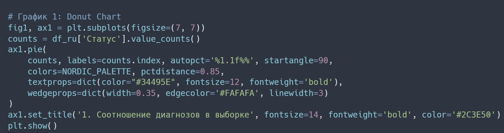
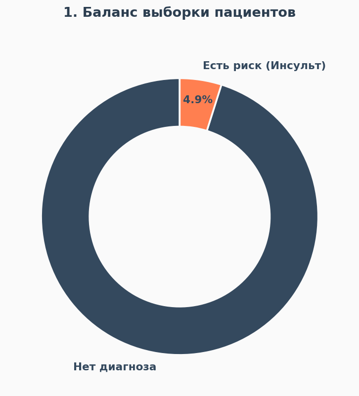
The first thing that caught my eye was the data imbalance. The pie chart shows that stroke cases make up less than 5% of the entire sample.
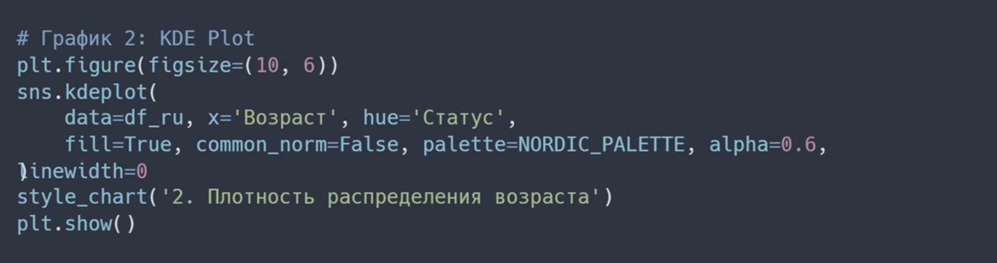
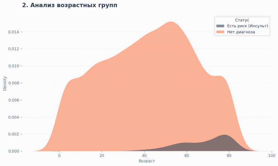
Conversely, the density graph reveals not only an obvious peak in risk after age 55, but also a concerning «tail» in the 40–45 age range. This signals that monitoring needs to begin earlier.
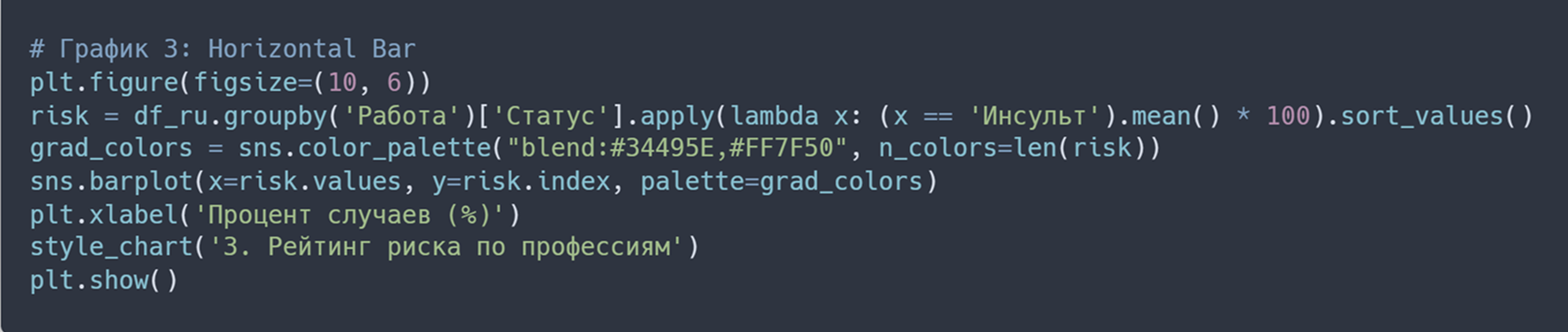
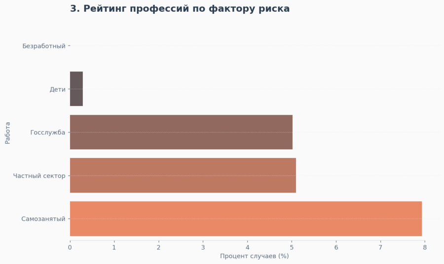
Then I decided to analyze professions, where I found that freelancers and self-employed individuals are more prone to illness than employees in private companies. The lack of a standardized schedule and stress are likely stronger risk factors than sedentary office work.
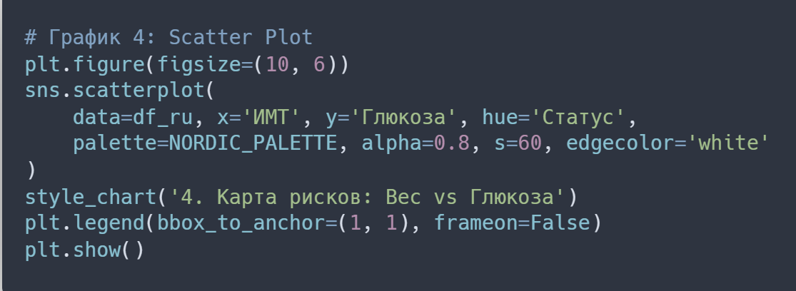
The scatter plot shattered the stereotype. We see many patients with a normal weight but who suffered a stroke. Their common denominator is a glucose level above 200. This proves that blood sugar is a much more accurate danger marker than the number on a scale.

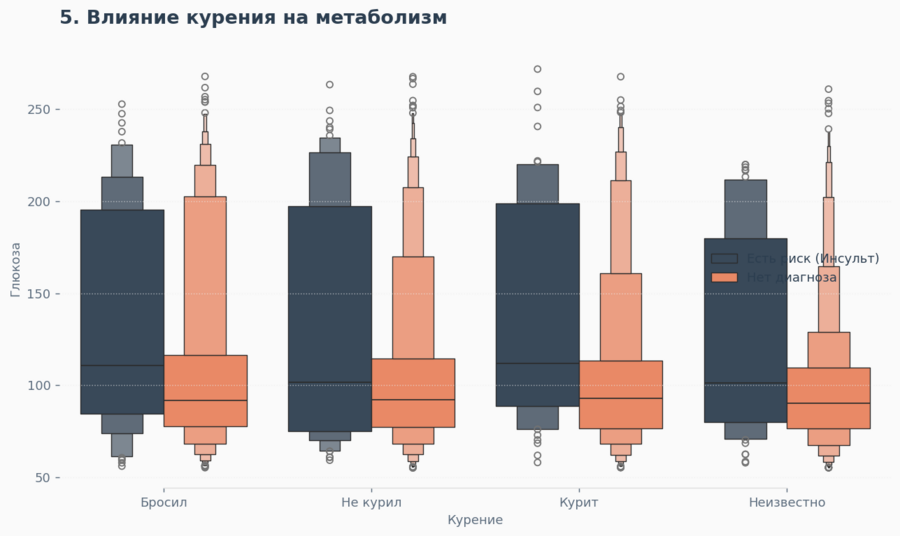
In this graph, I investigated the «tails» of the distribution. Interestingly, the risk group (stroke) showed a higher median glucose level across all categories—both for smokers and those who quit. This suggests that high blood sugar is a more universal marker of pathology than smoking status alone.

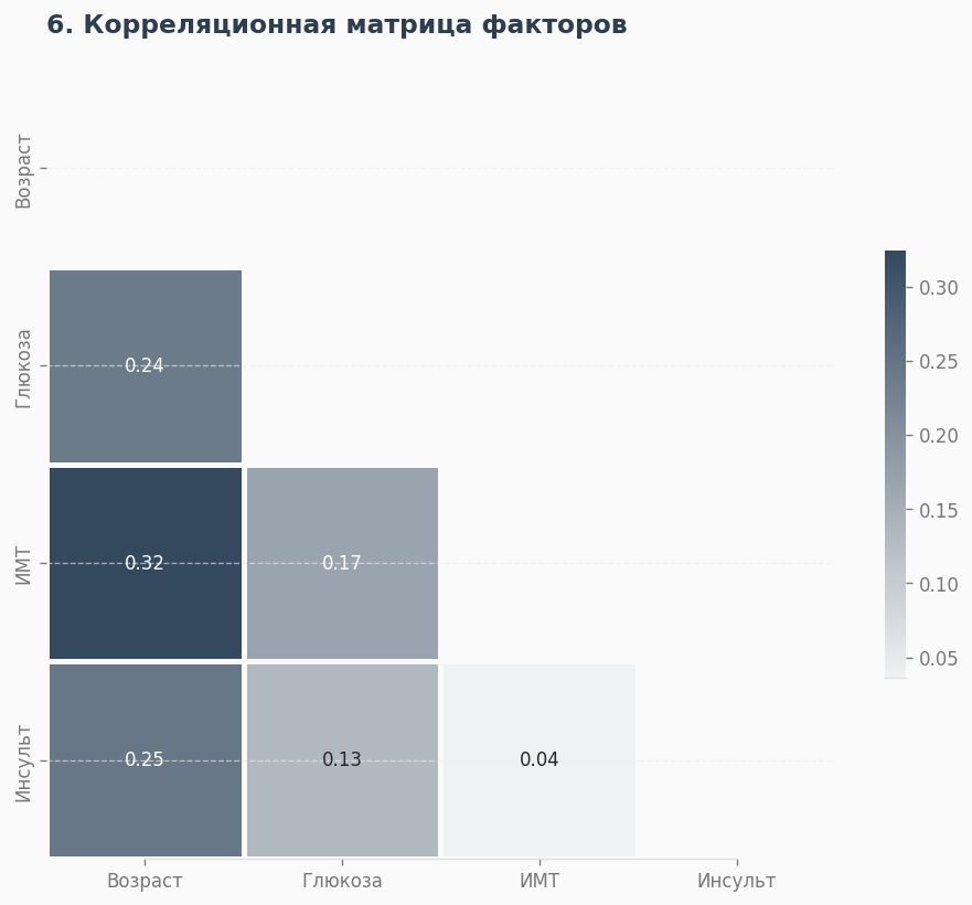
The thermal map provides a summary. The strongest correlation (coefficient 0.25) is between age and stroke. Glucose level is second, but BMI (weight) has a much lower correlation. The data confirmed the hypothesis: age and sugar are two primary pillars of diagnosis.

Result
When I started this project, I expected to find obvious truths—things like «old age and excess weight are the main enemies.» But the data told a different story—a much more complex and unexpected one—and that forced me to completely reevaluate my perspectives.
We are accustomed to being primarily afraid of the number on the scale, but the analysis showed that high blood sugar operates more subtly, and often more dangerously, affecting even those who appear perfectly slender externally. We often romanticize freelancing as a path to freedom and health, but the statistics unequivocally indicate that the self-employed, especially amid instability, burn out and face risks more frequently than office workers protected by employment contracts.
Thus, the data turned the perspective on its head—shifting from obvious, almost mundane fears to hidden, systemic risks that we talk about far less often.
Neural Networks
In working on this project, I utilized the DeepSeek-V3 neural network (link: chat.deepseek.com).
To be honest, working with the matplotlib library can sometimes feel like torture—you have to remember dozens of parameters just to remove a border or recolor a grid. I decided to delegate this technical routine to AI.