Block 1. Postcards
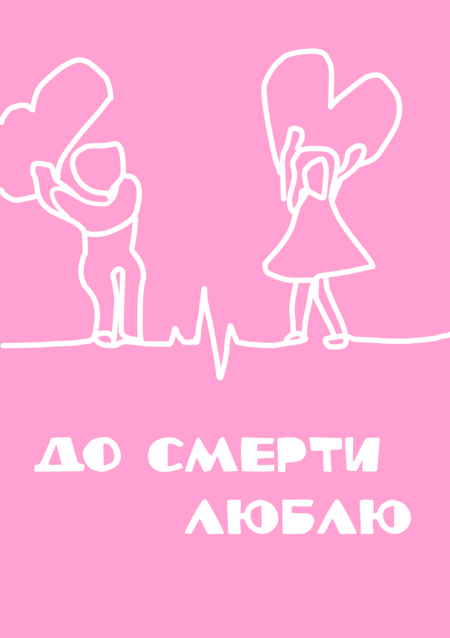
The first postcard (for Valentine’s Day, anniversaries, and other significant relationship dates) was drawn in a freehand, single-line style, conveying the warmth and literal «attachment» between two lovers.
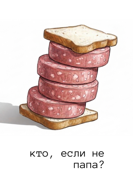
The second postcard is dedicated to Father’s Day. It is minimalist, humorous, and attention-grabbing (who doesn’t love a sausage sandwich?). The illustration was processed using the Gemini neural network.
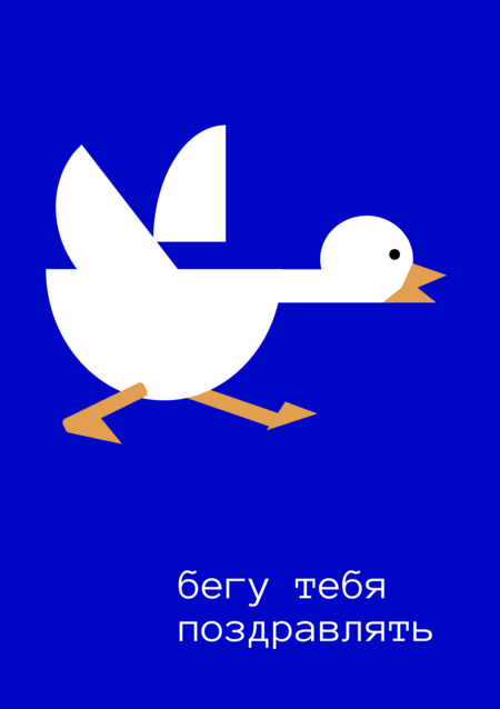
The third postcard is fun, informal, and universally appealing—it would suit any celebration. It was created using geometric shapes.
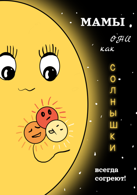
The fourth postcard, the brightest of all, combines geometric shapes with freehand drawing and is dedicated to Mother’s Day.
Block 2. Album Covers
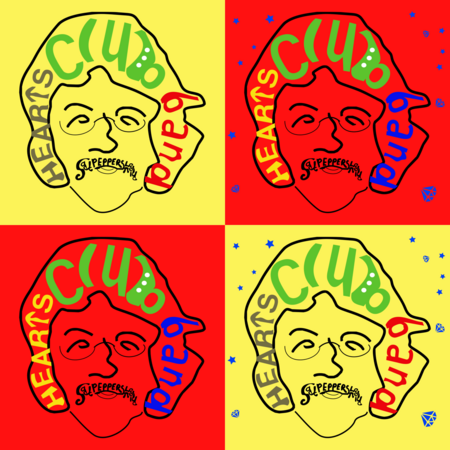
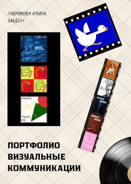
The album cover for The Beatles' Sgt. Pepper’s Lonely Hearts Club Band (1967) is executed in a vibrant and expressive style, consistent with the band’s groundbreaking approach, which embraced experimentation and discovery. The portrait of the man is a kind of «melting pot» of each Beatle’s features, illustrating how much they managed to coalesce into a unified media persona. The thirteen diamonds reference «Lucy In The Sky With Diamonds» and symbolize the number of tracks on the album.
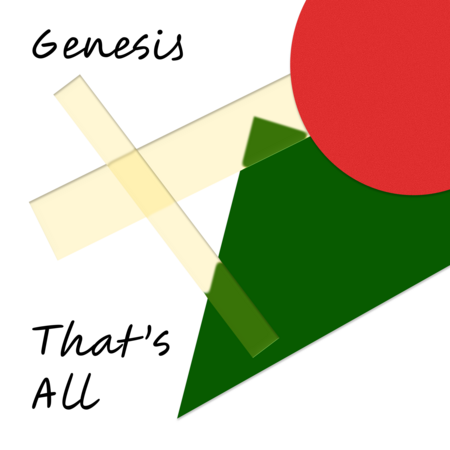
The second cover was created for Genesis’s single That’s All (1983). The inability of the lyrical characters to reconcile or find a compromise is expressed through bright, sharp geometric shapes and their intersections.
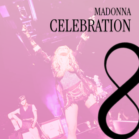
The collection of Madonna’s best hits, Celebration (2009), in itself signified a form of culmination and the «immortalization» of her most popular songs. Therefore, the album cover features a photograph from the Celebration tour, where the singer is «basking in the rays of glory,» alongside the infinity symbol, which in a vertical orientation evokes the contours of the female body (and physicality has always been a vital element of Madonna’s persona).
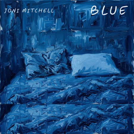
The album Blue by Joni Mitchell (1971) was created during a very «turbulent» time in her life—when she was ending one relationship while simultaneously experiencing a new infatuation. The rumpled bed, made for two yet featuring a single untouched pillow, conveys the sincerity and «vulnerability» of the album’s lyrics and music. The illustration was created using the Gemini neural network.
Block 3. Movie Posters

An energetic, stylized illustration featuring a dog and a golden ball captures the wild humor and mischievous spirit of Guy Ritchie’s crime comedy, «Snatch» (2000). The plot references a dog named Bulldog that swallows a priceless diamond, around which the chaos revolves. The retro design and vibrant colors emphasize the film’s dynamism and British flavor. The Gemini neural network was used to process the image.
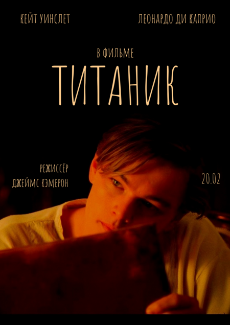
A minimalist poster for the film «Titanic» (1997), featuring a close-up of a young Leonardo DiCaprio, places the romantic subplot and the personal drama of the characters at the center of the narrative. The warm light on Jack’s face against a deep black background conveys the intimacy of the moment before the inevitable disaster.

The collage of live footage conveys the atmosphere of genuine friendship and the light French humor of the film «1+1» (2011), while simultaneously reflecting the collision of two completely different worlds, which is at the heart of the plot. The genuine smiles of the characters from the original poster are preserved; they set a vital and heartfelt tone for the story.
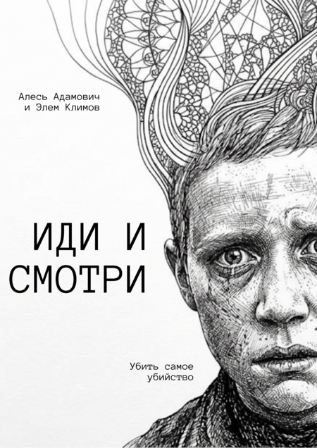
The monochrome graphic illustration, with its detailed cross-hatching, underscores the tragedy and weight of the war drama «Come and See» (1985). The face of the main character, Flory, etched with surreal scar-like patterns, reminds us of a ruthlessly trampled childhood and deep psychological trauma. The boy’s highly recognizable gaze conveys the entire horror and pain of a person confronted by absolute evil. The Gemini neural network was used to process this frame.
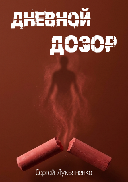
Block 4. Book Series Covers



The cover series for Sergey Lukyanenko’s first four «Watchmen» novels is rendered in a unified minimalist style that captures the atmosphere of urban mystical fantasy. The design employs deep colors and a fantastic, enigmatic font—Discharge Pro—with a glitch effect. Each book features an illustration of its key symbol: a flashlight reflects the nocturnal work of the Light, chalk alludes to the intrigues of the Dark, an hourglass visualizes the very dimension of Twilight, and a compass symbolizes the final journey in the search for ancient secrets. The images were created using the Gemini neural network.