HI, I’M KSENIIA.
I’m a graphic designer working across visual identity, packaging, typography, and editorial design.I believe that good design begins with understanding people. I explore how ideas, functionality, and visual expression can come together to create meaningful experiences for brands and their audiences.DESIGN WITH PEOPLE IN MIND.
MY PRINCIPLES
01 / PEOPLE FIRST
Not just aesthetics, but experience.
I consider how people interact with design, focusing on accessibility, usability, and meaningful communication.
BESIDE — packaging tested with real user
02 / IDEAS INTO EXPERIENCES
Not just objects, but stories.
I turn concepts into engaging visual experiences that invite people to explore, discover, and interact.
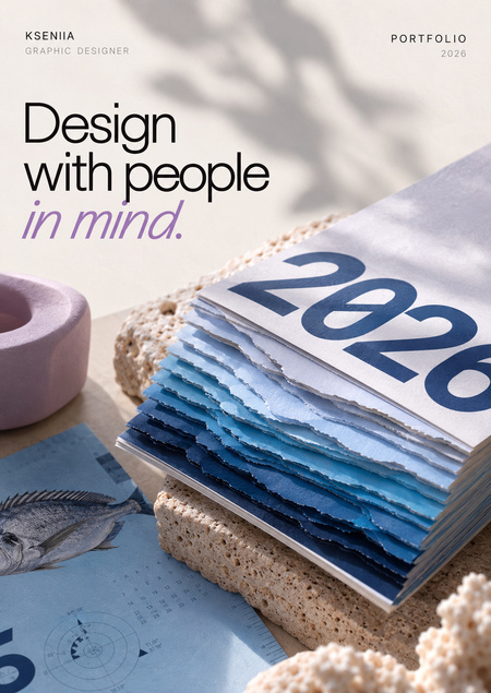
DEPTH CALENDAR — a journey through the ocean
03 / MEANING INTO FORM
Not just visuals, but systems.
I translate brand values into distinctive visual languages built on clear ideas and consistent design principles.
STOIK — a typeface built around stability and individuality
SELECTED WORKS
THREE PROJECTS / THREE APPROACHES / ONE DESIGN PHILOSOPHY
BESIDE
Packaging designed around people.
More than just packaging.
The challenge was to design packaging for an adaptive drinking cup while preserving BESIDE’s recognizable visual identity.The solution had to be easy to open for people with limited mobility, protect the plastic product, support both shelf and hanging display, and remain affordable to produce.Simple to use. Thoughtful by design.
The concept is based on a compact, cake-shaped cardboard structure with two distinctive tabs.The packaging combines a recognizable silhouette with practical functions, bringing together accessibility, product protection, and retail presentation.From constraints to form.
The development process focused on finding a balance between structural simplicity, usability, and visual consistency.I explored how the packaging could accommodate the product, remain convenient to handle, and support different retail display scenarios without unnecessary complexity.Designed for people. Tested with people.
The packaging prototype was tested with real users to explore how people interact with its structure.This stage helped bring the design beyond visual assumptions and into a practical, human-centered context.One package. Multiple needs.
The final design brings together a distinctive cardboard structure, BESIDE’s visual identity, and the practical requirements of an adaptive product.It offers a considered approach to packaging, where usability, presentation, protection, and production constraints inform the design.DEPTH CALENDAR
Every day, a little deeper.
A desk calendar created as a corporate gift for the partners of Lodki Piter.Instead of simply displaying dates, it invites the viewer on a gradual journey into the ocean, revealing new depths, marine life, and discoveries with every page.What if time could have depth?
The challenge was to create a memorable corporate gift that people would want to interact with throughout the year.The solution was to connect the passage of time with the experience of descending underwater.The challenge was to design a corporate gift that would remain engaging beyond the moment it was received.I developed a calendar where each new day represents a step deeper into the ocean. As the pages change, the colors become darker, and the viewer discovers marine species associated with different underwater environments.
A visual journey below the surface.
Color, paper layers, and shifting contours work together to create the feeling of descending through the ocean.
The calendar uses a gradual shift from light blue to deep navy to visualize increasing ocean depth.The layered paper edges create a changing relief inspired by underwater topography. Each page introduces a marine species, combining illustration with concise scientific information.Together, these elements transform a functional calendar into a tactile editorial experience.
One page. One discovery.
Turning a page becomes a small daily ritual — a new date, a new species, and a new depth to explore.
Each page offers a new reason to pause and explore.Alongside the date, the viewer encounters an underwater inhabitant and a selection of facts about its size, lifespan, and environment.The calendar encourages curiosity through a simple, repeatable interaction: turning the page.