hello! i’m lidia tolkacheva, a product designer with over 1.5 years of experience
I design digital products that make complex tasks easier to understand and complete. My work brings together user research, clear navigation, prototyping, and collaboration with development teams.
Commercial experience in product and visual design.
I currently work at Autotracker.group, designing interfaces for a fleet monitoring platform and the everyday workflows of its operators. I created landing pages, visual communications, and presentation materials.From research to implementation.
I explore user needs, design key scenarios, build interactive prototypes, and support the team as interfaces are developed.I’m studying Design at HSE University
I’m studying Design at HSE University and am interested in building digital services that people use every day.delo — a furniture restoration app
[CONTEXT]
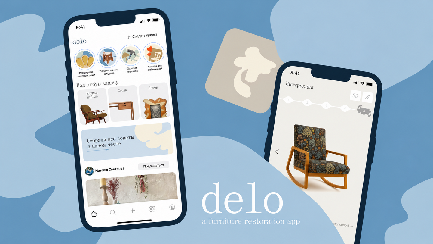
delo is a student concept for a mobile app that helps people redesign and restore furniture. It brings inspiration, practical guidance, and an AI assistant into one experience.I worked in a team of three. My responsibilities included user research and UX/UI design. I focused on the core journey—from describing an item and exploring a possible redesign to following restoration instructions—and contributed to the community and saved-content sections.[PROBLEM]
Our team interviewed four people about their experiences with restoration. A recurring difficulty was knowing where to start: people lacked a clear sequence of steps and had to piece together advice from scattered sources. They were also concerned about cost and the time they might spend without knowing what the finished item would look like.At the same time, participants valued making things by hand and finding inspiration in other people’s work. This shaped our design question: How might we help someone feel confident about the result, understand the work ahead, and stay supported throughout the process?[SOLUTION]
We designed a guided journey that takes the user from an initial idea to a practical plan:1. Describe the item. In a conversation with the AI assistant, the user explains what they want to restore and how they would like it to look. Suggested answers help them express their preferences.2. Preview the result. The concept presents a rotatable 3D model of the proposed redesign, so the user can explore it before starting work.3. Get a step-by-step plan. After approving the preview, the user receives instructions with an estimated time and a list of tools for each stage.4. Work with guidance. Visual prompts support each step, and the user can ask the AI assistant for clarification. We removed the tab bar from this part of the flow to help them focus on the task.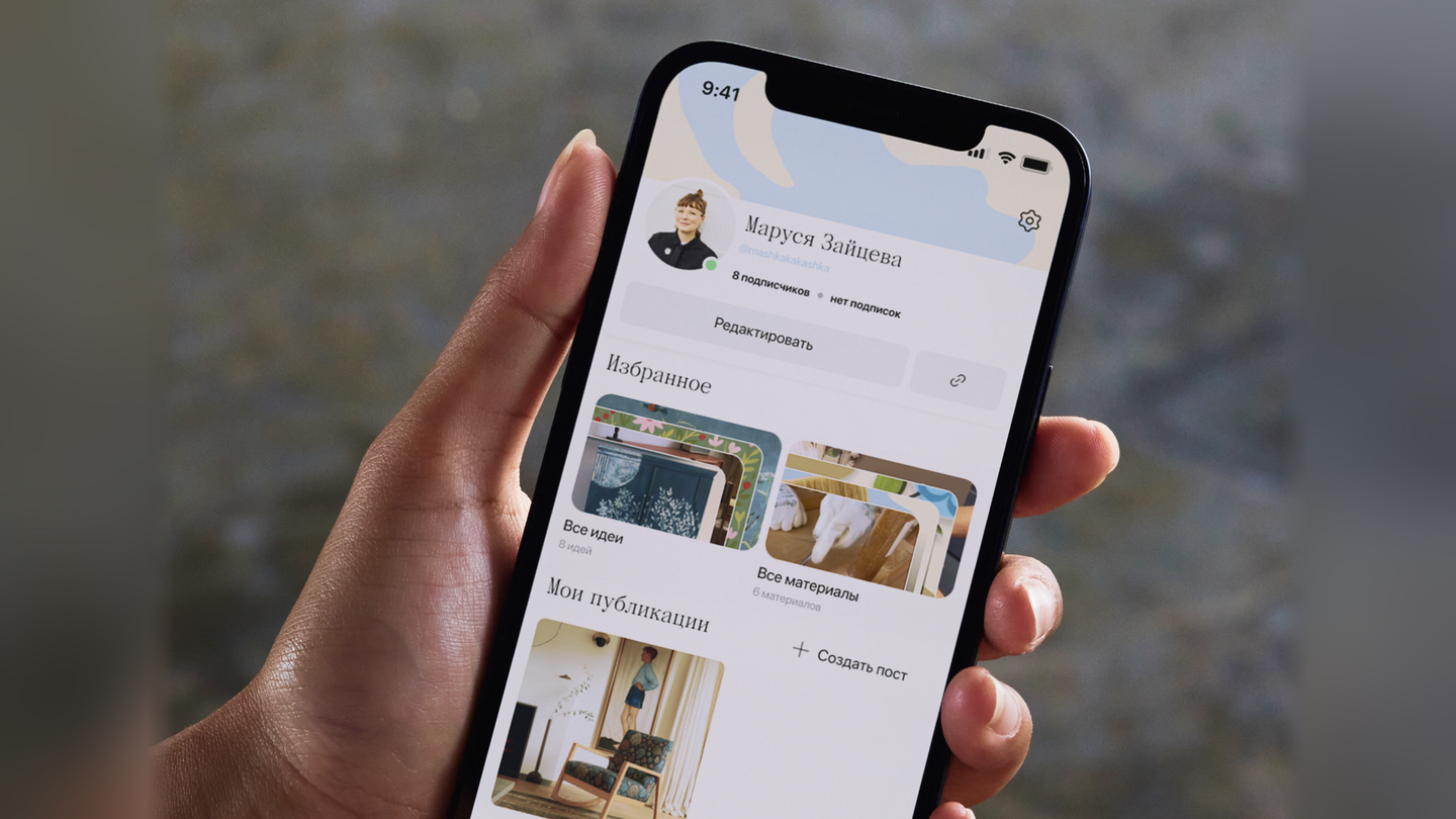
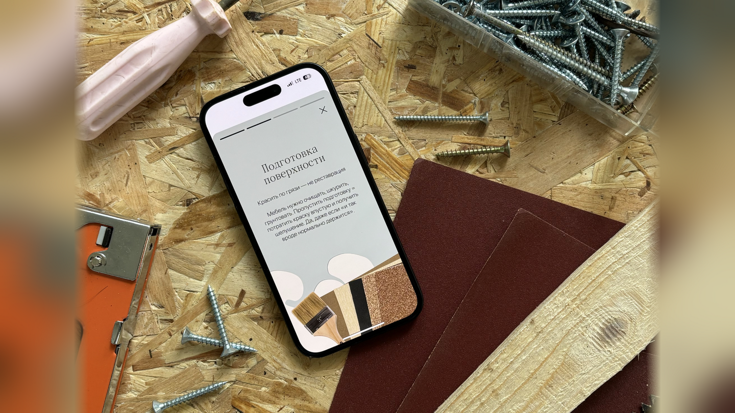
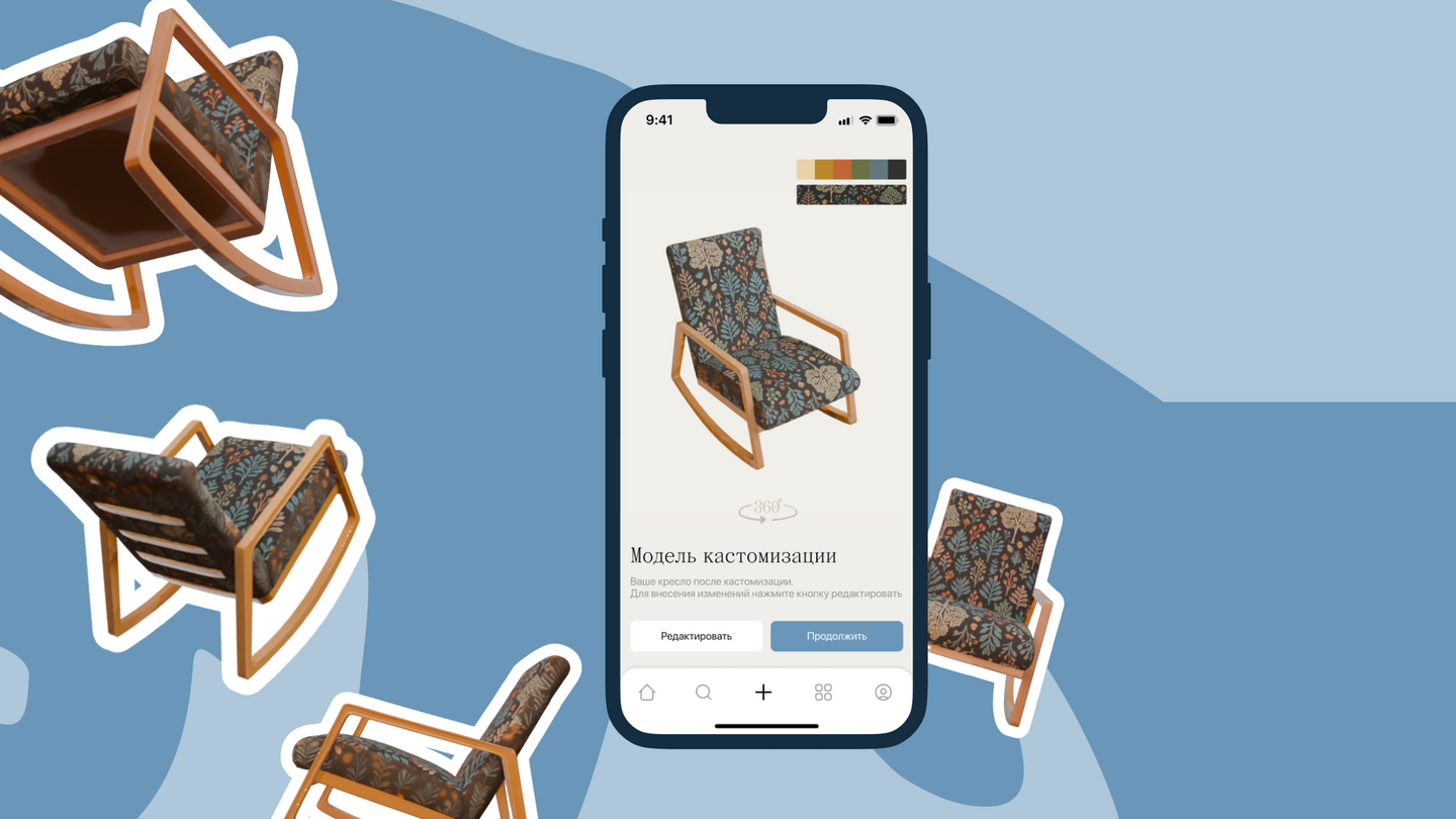
We also designed a community space for discovering other people’s projects. Posts show before-and-after images, customization details, and tools; users can save ideas and build a personal shopping list. Articles, videos, and short guides offer additional help, while the profile gives users a place to share their own work.The team brought these three main scenarios—AI-guided customization, finding inspiration, and sharing a project—together in a design system and an interactive Figma prototype.
sovmestno — a collaboration platform for venues and creators
[CONTEXT]
Sovmestno is a student concept for a web service that helps venues and creators find partners for collaborations. The goal was to make it easier for people with ideas, skills, and spaces to connect and work together.I worked in a team of three. My responsibilities included audience and competitor research, UX/UI design, and the design of filters, user profiles, and internal pages.[PROBLEM]
Finding a collaboration partner can be slow and unclear. Creators may struggle to find a suitable venue when they have an idea, while venue owners may have limited ways to discover creators who could bring something new to their space.We interviewed three creators and one business owner. Creators wanted opportunities to carry out ideas and add real collaborations to their portfolios. Venue owners wanted to stand out from competitors and attract visitors during quieter periods.This led to our design question: How might we help both sides find a relevant partner, understand whether they are a good fit, and start collaborating?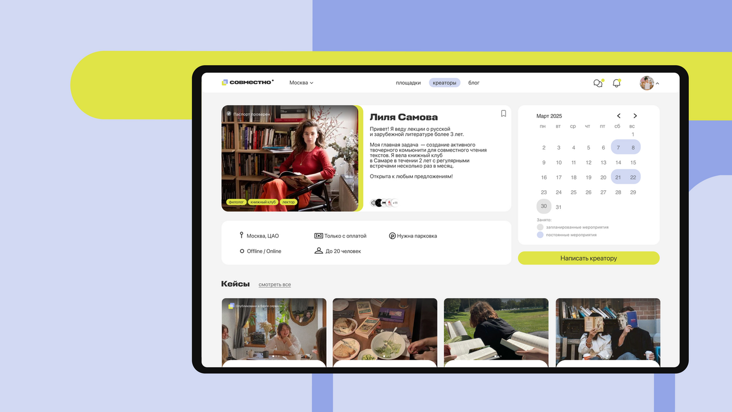
[SOLUTION]
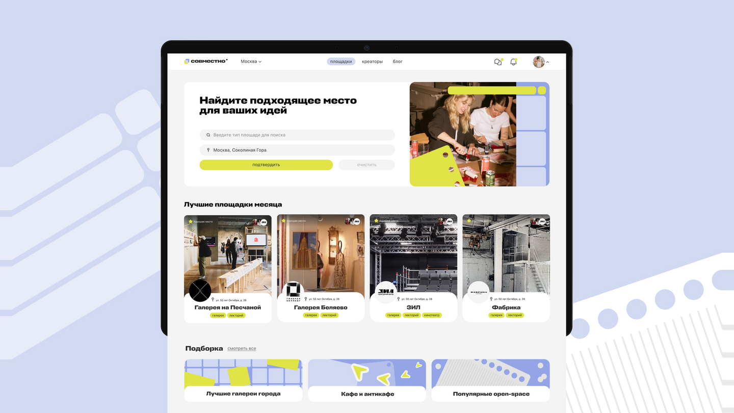
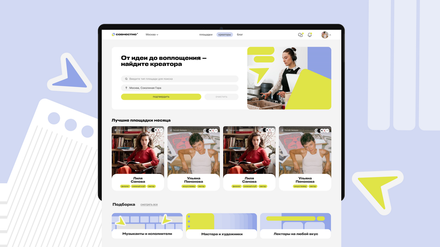
We designed a service that brings discovery, evaluation, and outreach into one place: — Find a partner. Separate catalogs let users browse creators and venues. Search, themed selections, a map, and advanced filters help narrow the options. — Understand the fit. Catalog cards show areas of work, previous collaborations, and trust markers. Creator pages bring together a short introduction, working conditions, cases, and event photos. — Start a collaboration. Registered users can create and edit their profiles, add work, and send collaboration proposals directly to other members. — Learn from other projects. A blog presents articles and selected collaboration cases, giving users examples of what they could create together.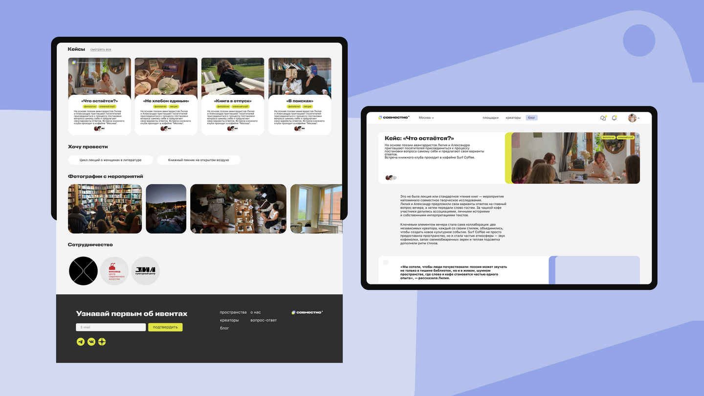
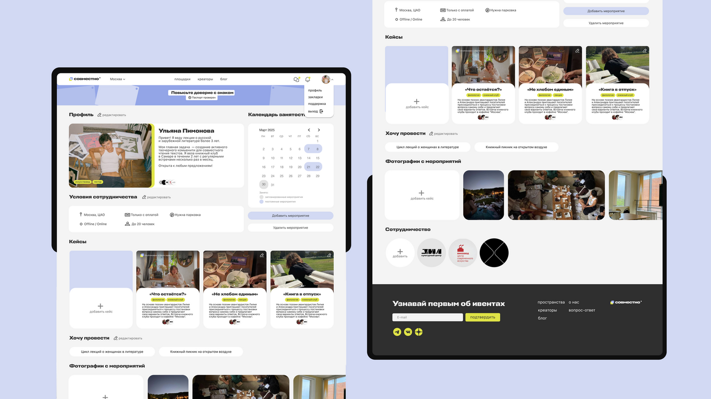
My main design challenge was organizing detailed profiles and filters without making the interface feel overwhelming. The resulting concept gives both creators and venues a clearer path from finding each other to proposing a project.
split the bill — a feature concept for a banking app
[CONTEXT]
Split the Bill is a concept for a service within a banking app. It helps a group settle a restaurant bill based on what each person ordered.I designed the experience for two roles: the organizer, who pays the full bill, and the participant, who selects and pays their share. To understand the existing process, I conducted three short interviews with people who regularly split bills at cafés and restaurants.[PROBLEM]
People often divide a bill using a receipt, calculator, messages, and separate bank transfers. The organizer has to work out each amount, explain the calculation, track repayments, and sometimes remind friends to pay. Participants may be unsure which items they are paying for.The challenge was to make the process quick, transparent, and easy to track, while reducing the awkwardness of asking people for money.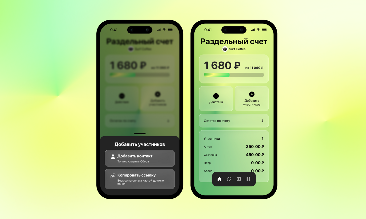
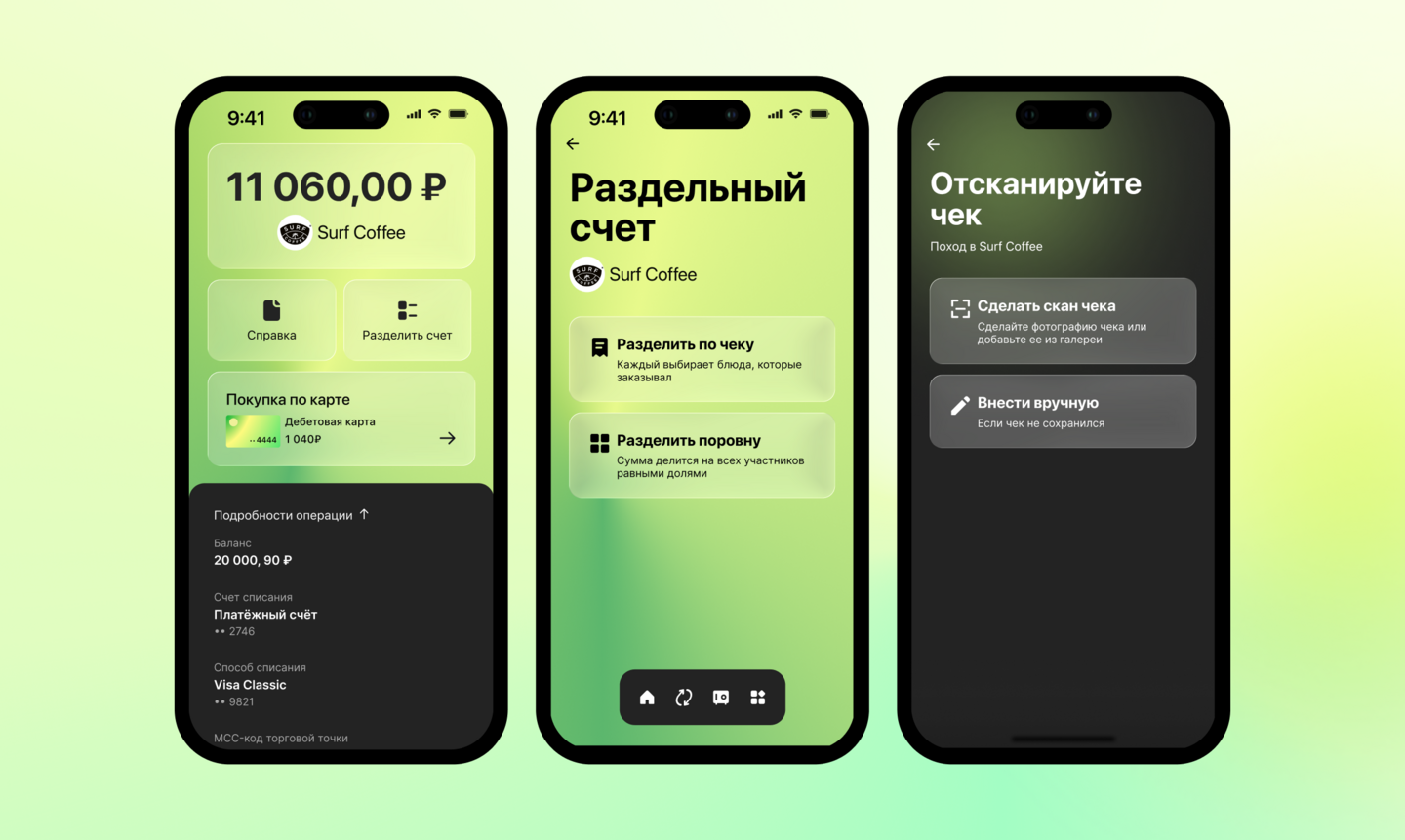
[SOLUTION]
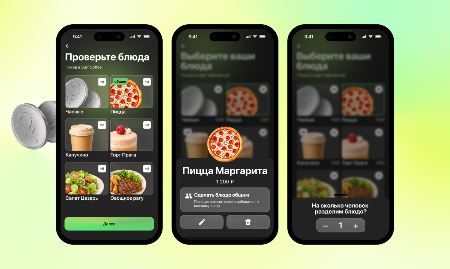
I designed two connected flows that take the group from a paid restaurant transaction to a settled bill: — Start from the transaction. The organizer sees a «Split the bill» action alongside the payment’s amount and restaurant details. — Scan and check the receipt. The app identifies the items; the organizer can correct recognition errors and mark shared dishes. Participants then choose their own items, so the organizer does not have to assign every order. — Choose a fair split. The group can divide the bill by item or equally. Shared dishes can be split into portions, with available and claimed portions shown to prevent duplicate payment. — Review and pay. Each participant sees their selected items and a total that updates as they make choices. A payment link also supports someone who does not use the same bank. — Track repayments. The organizer sees how much has been returned, what remains outstanding, and each participant’s status, reducing the need for manual follow-up.looking for a product designer? let’s talk)
You’ve seen how I approach user needs, complex workflows, and design decisions. I’d love to hear about the product your team is building.I’m open to product design opportunities where I can work with a team to create clear, useful digital experiences. If my approach feels like a fit, let’s get in touch.Lidia Tolkacheva Product Designer