Project Concept
Megadeth’s 1999 album, Risk, is one of the band’s most misunderstood, least accepted, and underrated releases, both by fans and critics. In the late 1990s, most bands on the metal scene moved toward a heavier sound; however, Megadeth decided to do the opposite, creating an experimental release inspired by 70s rock, disco, and less heavy, more melodic genres. The result is an album that sounds highly unusual—even strange—when set against the backdrop of their previous work.
«We wanted to be our own people, to think for ourselves, and to make our own decisions, and a lot of times it cost us. When we started the record, we had some pretty precise plans for certain songs and styles; we had to go back and research and listen to records from the 70s—disco records, Fleetwood Mac records—we listened to all kinds of stuff that we wouldn’t normally put on our cards and listen to.» (from «Megadeth — The Making of RISK»)
In this project, I want to interpret the album Risk and demonstrate why it merits attention—it has been undeservedly overlooked.
Using data analysis and programming, I performed an analysis of the entire album’s lyrics. This allowed me to reveal the album’s central themes, explore the topics it touches upon, and show that its sound quality is exceptionally high and sincere, not crafted merely for radio popularity. Therefore, it cannot be classified as a failed, generic, or «pop» album.
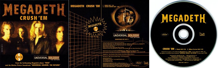
Single Cover: «Crush 'em»
Single cover for «Breadline»
For the design of this piece, I utilized a color palette drawn from the album cover (using Adobe Color), and for data visualization, I employed several chart types: a network graph, pie chart, word cloud, heatmap, and bar chart. I coded this project in Google Colab.
At the beginning, you can view a word cloud where the most frequently used words are highlighted, and the size of the word corresponds to its frequency of use.
This chart shows that the lyrics involve a great deal of self-reflection alongside direct address to the listener, as personal pronouns are used extensively—the lyrical protagonist in the album is largely connected to the author, and most of the texts are inspired by personal experiences and reflections on life at the time of writing the album. The lyrical protagonist experiences a great deal of negation and a desire to be heard. Furthermore, it can be concluded that the lyricism is emotional, and it is written deeply and sincerely. This connects to the nature of the theme development and, consequently, the album’s concept, which is reflected in both the title and the lyrics.
For clarity, I made a bar chart based on word frequency.
Bar chart of the most frequently used words
The album was written in the late 1990s, and its concept reflects that background. From the diagrams, we can see that the main themes explored in the album are instability, uncertainty, dependency issues, and lack of control—themes that culminate near the end and connect with the subject of time and a philosophical view of its irreversibility, the inability to influence it, and the realization that nothing is eternal.
Nowhere, no one, nothing
Dancing on the breadline
He forgot, and he has nothing
The drum beats for me, louder every day
The cadence tells me that soon I’ll meet my judgment day…
(«Wanderlust»)
Time chasing time creeps up behind
I can’t run forever, and time waits for no one
Waits for no one
Not even me
(«Time: The Beginning»)
Statistically analyzing the words reveals that the album carries a somber thematic atmosphere, evidenced by the adjectives and rhetorical devices used. This imbues the work with depth and contrast against the brightness and melodic quality of the musical concept.
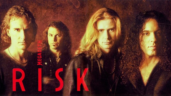
Group composition at the time of album production
To help better understand the album’s structure, I created a word association graph and a heat map showing the usage of the most frequent words in each song.
Diagram of the Most Used Words
I also created a pie chart illustrating the word count in each song, which shows that each one has a well-developed core concept.
pie chart
Release Cover Designs