Почему это так выглядит? Контент план
01. Media Concept
«Why does it look like this?”—an educational media outlet focusing on design and the visual environment that surrounds us every day.
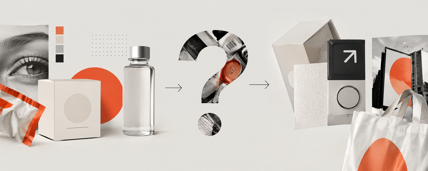
We constantly see packaging, signage, interfaces, logos, advertising, and urban navigation, but we rarely stop to wonder why they look the way they do. Why are discounts often marked in red? Why do high-end brands utilize so much white space? Why can brands within the same category look entirely different?
Media explores these common visual solutions and explains the design, cultural, historical, and psychological reasons behind them. Each article begins with an observation or a question, then deconstructs the subject through color, form, typography, composition, symbols, and context.
Project Goal — to teach the reader to notice visual techniques, understand how they function, and perceive their surroundings more consciously.Core Principle: not just to showcase interesting design, but to explain why it looks the way it does.
02. Six-Month Thematic Plan
Platforms: Telegram — the main platform for publications and analyses
Instagram* — visual cards and short videos
YouTube — more detailed video breakdowns.
Instagram* is owned by Meta, which has been recognized as extremist in the Russian Federation
Main Sections:Why This Way? — analysis of a specific visual solution
Visual Language — recurring colors, shapes, symbols, and typefaces
Comparison — how different visual solutions alter perception
Design Around Us — an exploration of objects and the urban environment
Myth or Pattern? — testing common assumptions about design
The plan is designed for six months of consistent work. The plan involves two main publications per week—one in-depth analysis and one short-form piece. This results in approximately 48–52 publications over six months, not counting additional Stories and short videos.
Month 1. Color and Perception
Introduction to media through the most recognizable visual techniques.— Why are discounts often marked in red?
— Why are pharmacy packages often white?
— How does color influence product perception?
— Why do eco-friendly brands often use green?
— Comparison: one product in three color variations.
Month 2. Typography and Composition
How text size and element placement direct attention.— Why is the price larger than other text on a tag?
— How does typography shape a brand’s character?
— Why do premium brands use ample white space?
— How do we determine what to read first?
— Comparison: one phrase in three different fonts.
Month 3. Branding and Visual Codes
How brands build recognition and differentiate themselves.— Why do banks often choose minimalist design?
— Why do different brands within the same category look similar?
— How does cosmetic packaging create a sense of premium quality?
— What does a logo communicate about a brand before the name is even read?
— A comparison of the visual language of the mass market versus the premium segment.
Month 4. Interfaces and the Digital Environment
Familiar screen elements and the logic behind their design.— Why does a button look like a button?
— Why is the play icon a triangle?
— How does color highlight the primary action on the screen?
— Why do applications use uniform iconography?
— Interface breakdown: what does the user notice first?
Month 5. City and Navigation
How design helps us navigate space.— Why do road signs have different shapes?
— How is visual navigation in the subway system organized?
— Why do store signs vary so much?
— How does typography affect the readability of directional signs?
— Photo analysis: what visual messages do we encounter on a single street?
Month 6. Visual Habits and Stereotypes
Synthesizing knowledge and developing independent observation.
— Why is Wi-Fi represented by that specific symbol? — Why is minimalism associated with modernity? — Why do some packages seem more eco-friendly? — Myth or pattern: can product quality be determined by its packaging? — Final analysis: five visual techniques we have learned to notice.
03. Ten Content Samples
Sample 1. Why do luxury brands use minimalism?
Long video · YouTube
Series: «Comparison»
Duration: 5–7 minutes
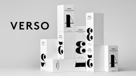
Topic: How visual design impacts brand perception.Video concept: To explore why minimalist packaging, a concise logo, and ample white space are often associated with the premium segment. Using examples of packaging, typography, and branding, the video will demonstrate what techniques create this impression and why minimalism alone does not guarantee the perception of a high-end product.
Scenario:00:00–00:40. Introduction
Shot: two packages of the same product—one bright and one minimalist.
Text: Why does one product seem expensive while another seems ordinary, even before we check the price? Let’s explore how design influences our perception.00:40–01:40. Color and Element Density
Shot: a comparison of bright versus restrained packaging.
Text: Bright colors and bold typography help grab attention. Minimalist design, conversely, creates a calm impression and highlights specific details. However, vibrancy doesn’t automatically equal high quality, nor does minimalism. It’s about effective execution.01:40–02:40. White Space
Shot: a package with a lot of text versus a package with minimal graphics.
Text: White space helps separate elements and guide the viewer’s attention. When there is less information, the logo and brand name become more prominent. The key isn’t just leaving empty space; it’s about strategically organizing the composition.02:40–03:40. Typography
Shot: the same product name rendered in three different typefaces.
Text: Typeface defines a brand’s character. Some fonts might evoke tradition, while others suggest modernity or technological advancement. Therefore, font choice significantly impacts how the consumer perceives the product.03:40–04:50. Why Brands Resemble Each Other
Shot: packaging from several cosmetic or perfume brands.
Text: Brands within the same category often utilize similar colors, shapes, and fonts because they are catering to established consumer expectations. This similarity aids in category recognition but makes standing out among competitors more difficult.04:50–06:00. Is Minimalism Always Best?
Shot: examples of successful minimalist and rich/vibrant packaging.
Text: Minimalism doesn’t guarantee quality, and it isn’t suited for every product. The most crucial factor is that the design aligns with the brand’s objective—it must highlight key information and be immediately comprehensible to the buyer.06:00–06:20. Conclusion
Shot: a re-comparison of the two packages, focusing on color, typography, and composition.
Text: The next time a product appears high-end, pause and notice the color palette, the typography, and the use of white space. This will help you understand which visual decisions are shaping that impression.Shot Examples: package comparisons, close-ups of details, composition diagrams, showcasing different typefaces, and curating brands within the same category.
Example 2. Why are pharmaceutical packages often white?
Carousel · Instagram*
Feature: «Visual Code»
Post summary: Analyzing how color, typography, and information layout help form the recognizable identity of a medical product.Example text:
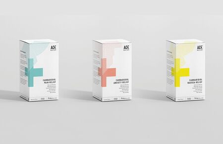
White is frequently found on medicine packaging. It creates a neutral background that allows the drug’s name, dosage, and other essential information to be easily readable.
Color accents help differentiate product lines, while typography and grid structure organize the information. Moreover, the design depends on the drug’s category, brand, and labeling requirements (there is no universal design for all medications).
Visual Solution: three packages with different color accents; highlighting the name, dosage, and additional markings.
Example 3. Why do expensive brands use a lot of white space?