The topic of a «proper» diet and lifestyle in general is riddled with countless myths, contradictory advice, and marketing promises. Few people bother to look into it—many assume they already know everything.
I wanted to approach this problem objectively—through the lens of real-world data concerning the nutrition, lifestyle, and health of everyday people.
Infographic Goal
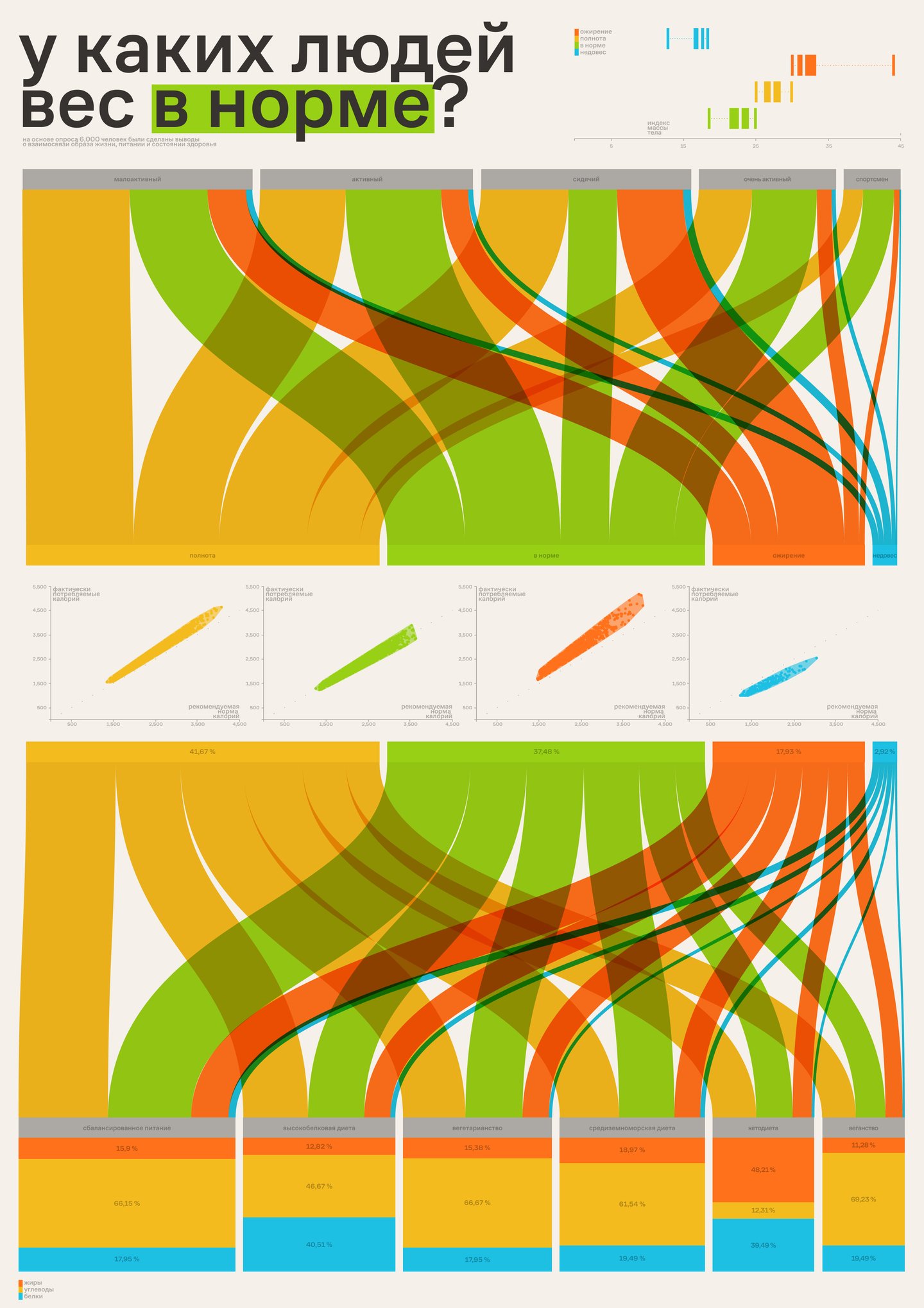
To visualize the key patterns connecting dietary habits, physical activity, diet type, and health status (based on BMI), helping the viewer quickly assess which habits are statistically linked to maintaining a healthy weight and which contribute to the risk of obesity.
Benefits of Infographics
This type of visualization can be helpful for dietitians, fitness trainers, health and safety instructors, and anyone seeking to make more conscious decisions about their nutrition.
Infographics also raise people’s awareness about the workings of key patterns—such as the relationship between physical activity, diet, and health—which are often not immediately obvious.
Infographics provide clear, data-driven answers to the following questions:
- How is overeating/undereating related to BMI? Or is everything truly individual?
- What level of activity is most common among healthy people? And must an active lifestyle always equate to a healthy body?
- Is there a link between diet type (keto, vegan, high-protein, etc.) and excess weight? And are carbohydrates and fats truly enemies of health?
Source Data
Dataset sourced from Kaggle: «Healthy Diet and Calorie Intake» (author: aliyasaly1231). The CSV file contained over 6,000 records detailing individuals with varying activity levels, dietary types, macronutrient and water consumption, as well as calculated BMI and clinical health statuses (Healthy, Overweight, Obese, Underweight).
I decided to use the «Healthy Diet and Calorie Intake» dataset because it contains not only anthropometric indicators (BMI calculation) but also detailed information on actual consumption of calories, proteins, fats, and carbohydrates, as well as levels of physical activity and diet types. This allows for the establishment of connections between behavioral factors and objective health status.
Production Pipeline
- Data filtering and aggregation, as well as strategizing how to visualize information from the dataset (This was done with the aid of Deepseek: I asked it to describe all the data within the dataset, constructed a logical flow to highlight the most valuable data, and then used Deepseek to identify the optimal chart types for visualizing this flow).
- Visualization in RawGraphs (I uploaded the dataset file in CSV format, selected and configured the chart types, and exported the visuals as SVG for subsequent editing).
- Composition and styling in Figma (All exported charts were imported into Figma: I adjusted the titles, annotations, arrows, color palettes, etc., and manually entered several calculations).
The result is an informative poster that visually demonstrates how diet and activity relate to health, based on real data and modern analysis tools.