Follow
In the work of a private investigator, every detail can be the key to solving a mystery. Notes, documents, archival folders, and other familiar tools for information retrieval. But what if even a simple business card becomes part of that story?
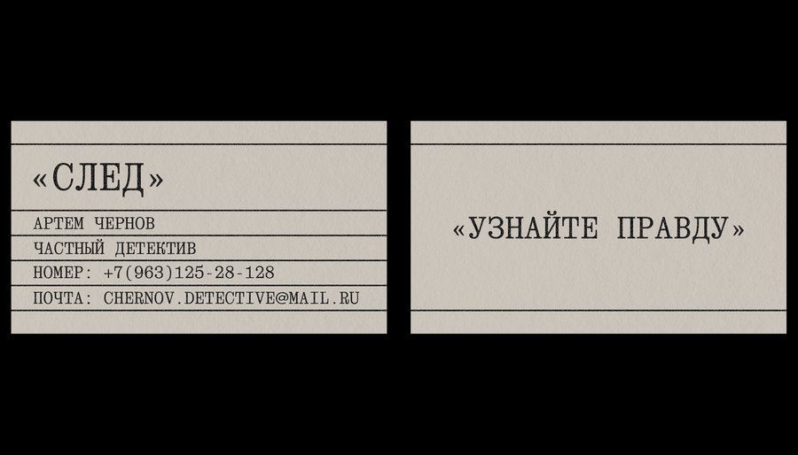
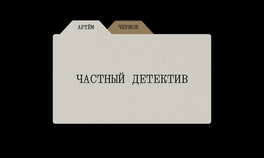
The visual system is built upon a combination of typography and recognizable stationery forms. The horizontal lines evoke the structure of archival forms, while an alternative version of the business card references document folders and dividers.
Snowfall
Every piece of music has a distinct mood that can be conveyed not only through sound but also through visual imagery. Cool tones, blurred silhouettes, and subtle details can tell a story even before the first note sounds.
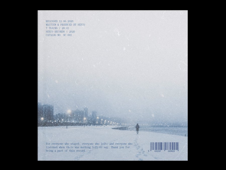
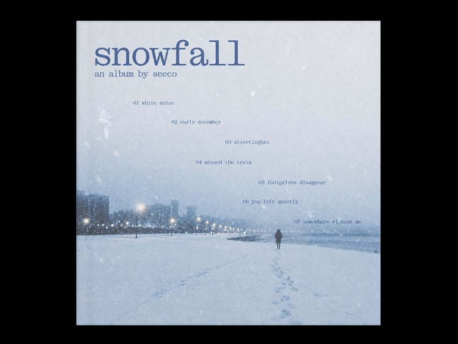
Snowfall is a music album whose visual presentation is built upon a feeling of silence, distance, and winter melancholy. The composition is centered around a snow-covered cityscape featuring a solitary figure slowly dissolving into the space. A cool blue palette, soft light transitions, and a grainy texture create the atmosphere of an old photograph. The typography integrates organically with the image, preserving its tranquil character and underscoring the album’s overall mood.
The Voice of the Print Age
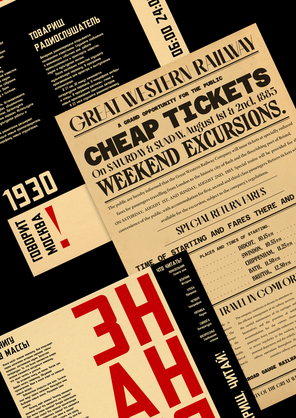
In the early 20th century, the printed word was one of the primary ways information was transmitted. Newspapers, advertisements, and posters captured attention not through images, but through the expressiveness of the type, the scale of the headlines, and the unusual layout of the text.
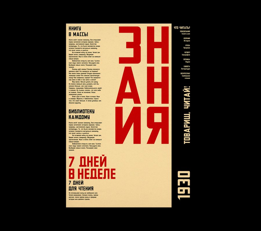
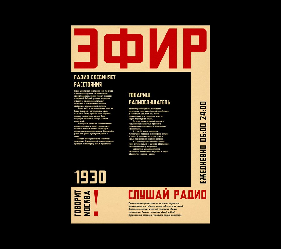
The foundation of these works is the idea of conveying information through expressive composition, where letters become the primary visual tool. Large headings, contrasting font sizes, and a limited color palette form a dynamic system. The combination of red, black, and a warm paper tone references historical print media while maintaining a contemporary graphic sensibility.
Toku Store
Toku presents a magazine cover dedicated to the topic of contemporary consumption and the influence of advertising on everyday life.
At the core of the concept is an ironic reinterpretation of the visual language of mass retail, where a bright facade conceals a critical perspective on familiar objects.A saturated yellow background, a contrasting red shopping cart, and large black typography form a striking composition. The visual image references advertising posters and the aesthetics of contemporary Japanese graphic design, creating a sense of information overload.
Great Western Railway
In an era when print ads were the primary way to capture attention, every letter mattered. Newspaper columns, posters, and advertising placards transformed into complex compositions filled with headlines, decorative elements, and fine details.
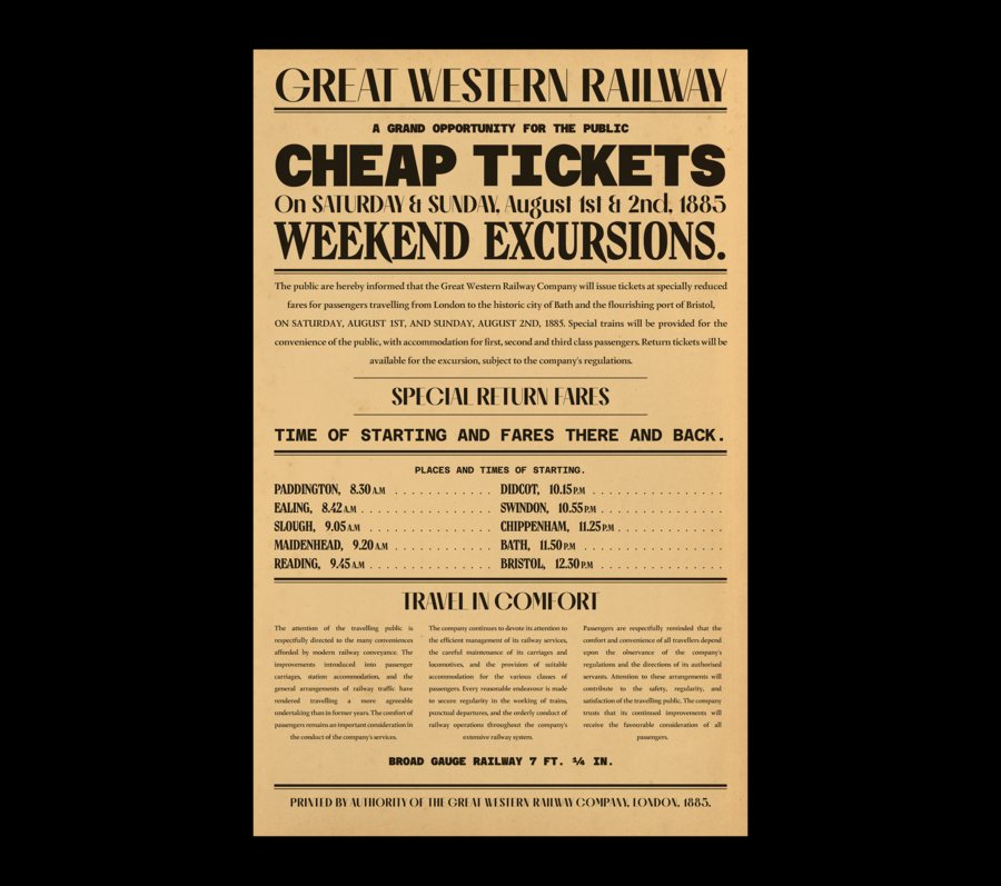
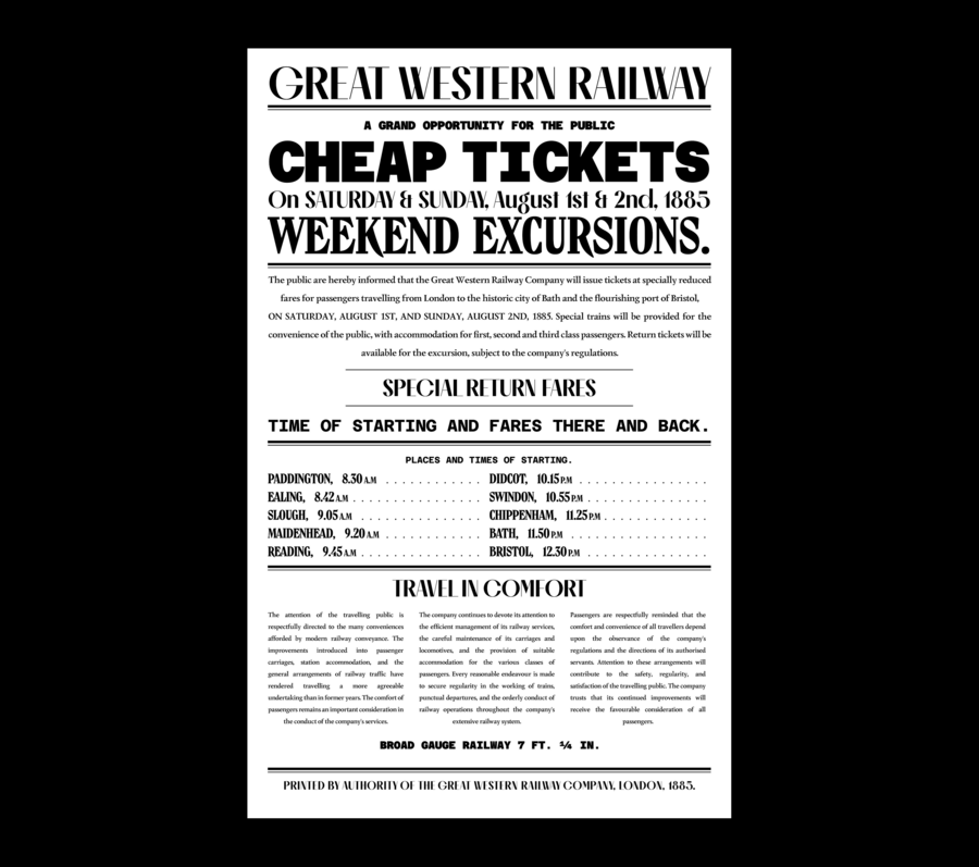
The Great Western Railway poster is an advertisement for the railway company, executed in the aesthetic of 19th-century Victorian print graphics. The concept is founded on a characteristic combination of dense typography, rigorous structure, and extensive textual information, typical of the era. High-contrast serif fonts, massive headlines, and decorative rule lines form the recognizable image of a historical announcement. The monochrome palette and the warm tone of aged paper enhance the sense of authenticity, referencing the traditional printed materials of that time.
Queen of Spades
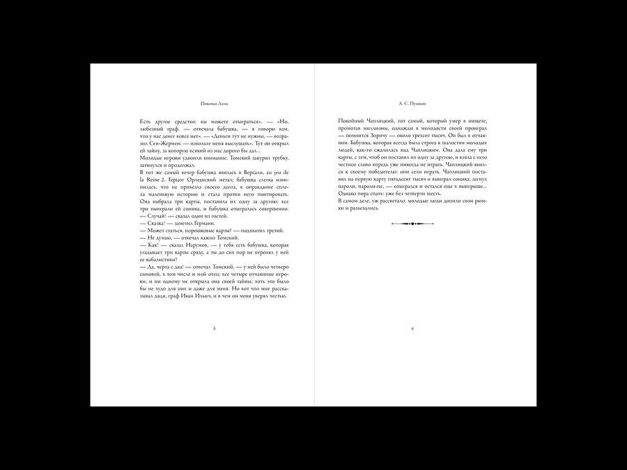
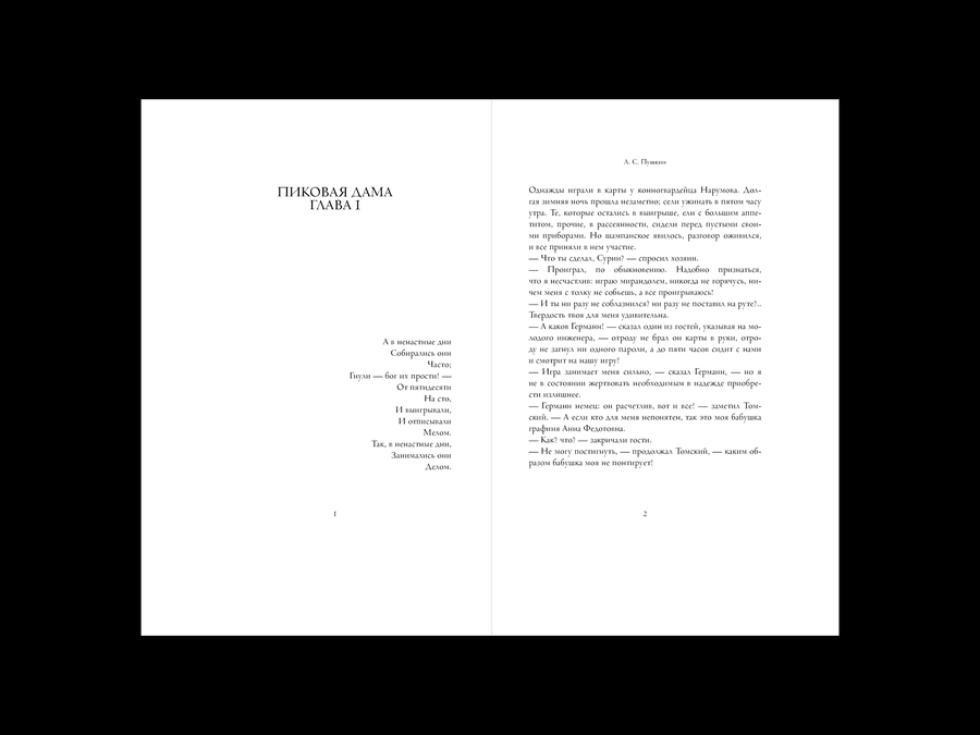
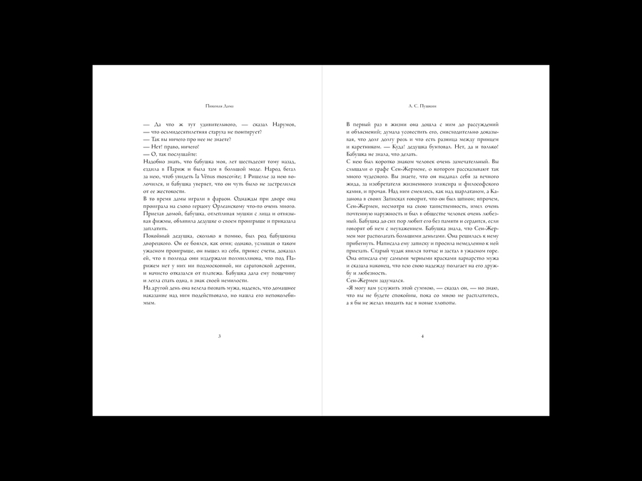
«The Queen of Spades» by Alexander Pushkin served as the foundation for the typographic design of a book publication inspired by the aesthetic of 19th-century classic literature. The focus lies on the interaction between text, white space, and traditional principles of book composition.