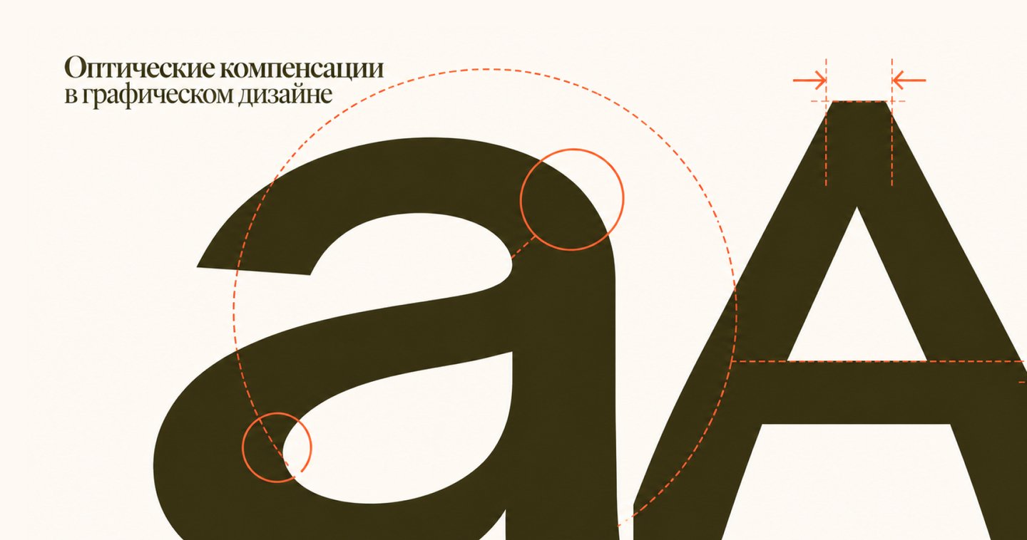
An educational explainer on why geometric precision does not always align with visual perception. Using examples from typography, logos, and graphic elements, the project explains how subtle changes in form, proportion, weight, and spacing help achieve visual balance and harmony.
Optical Corrections in Graphic Design
We are accustomed to believing that precision is the foundation of good design. Straight lines, equal spacing, and symmetrical shapes seem like a guarantee of a harmonious composition.
However, human vision works differently. Sometimes geometrically perfect objects look disproportionate, and elements with identical parameters are perceived differently.
To achieve visual balance, designers intentionally alter the size, thickness, and placement of elements.
Why can imperfect geometry sometimes look more visually correct than perfect geometry?
Visual: Large letters and geometric shapes overlaid on a measuring grid. Areas where the form extends beyond mathematical boundaries are highlighted in red.
The Same or Different?
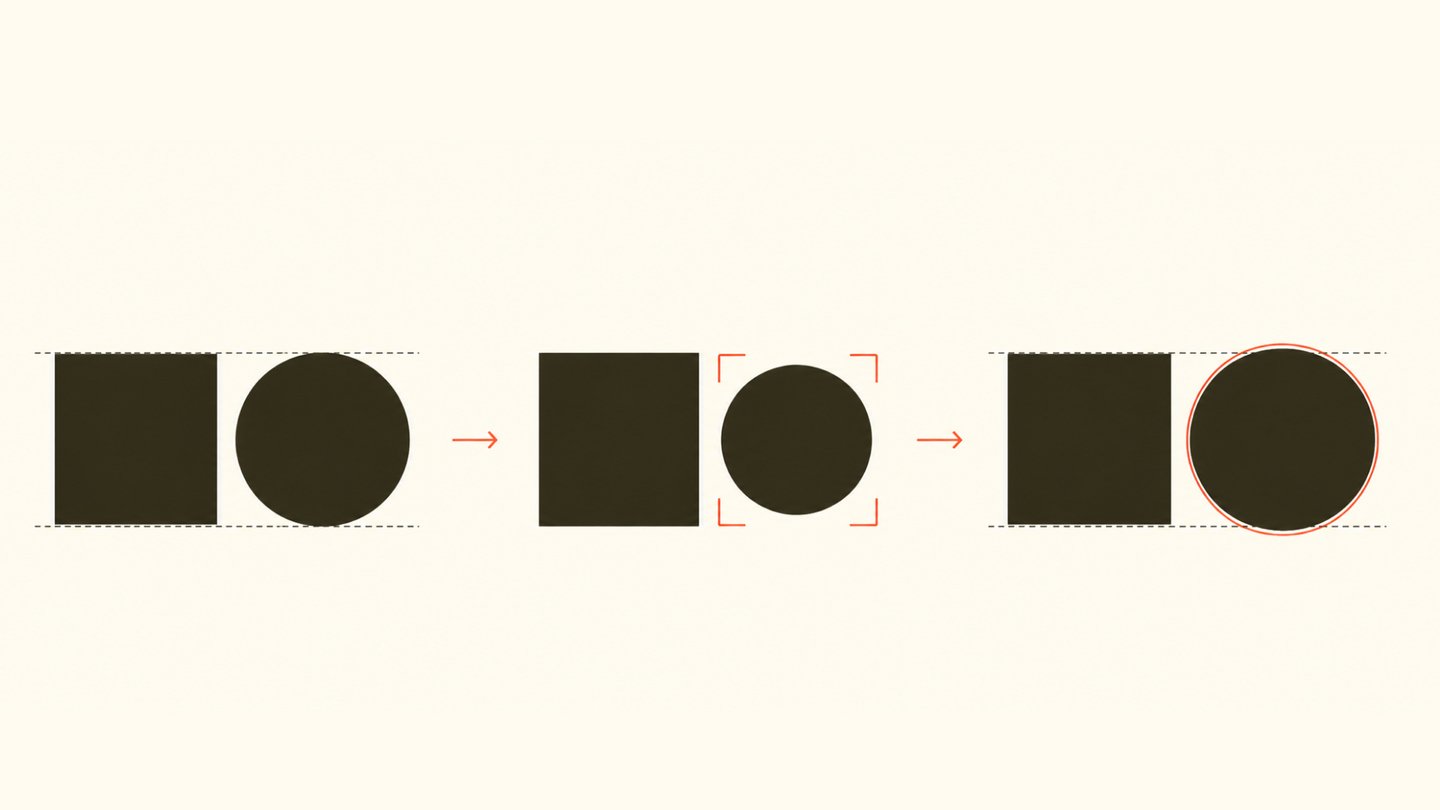
Imagine a square and a circle of the same height. Mathematically, their vertical dimensions are identical. However, when compared, the circle might appear slightly smaller or less substantial.
This occurs because the visual system assesses more than just an object’s height and width. Perception is influenced by its contour, area, mass distribution, and surrounding space.
The square fills the corners of its bounding box, whereas the circle touches it at only four points. Because of this, the shapes interact with their surrounding space differently.
Identical size does not necessarily mean an identical visual impact.
Visual: A square and a circle of equal height on a shared grid. Then, the circle is slightly enlarged to illustrate the principle of optical equalization.
Geometry ≠ Perception
Geometric precision is based on measurable parameters: height, width, distances, angles, and coordinates. It allows for the creation of predictable structures and the arrangement of elements within a unified system.However, a person perceives an image as a whole, not as a collection of individual numbers. Contrast, form, line direction, and the distribution of visual mass influence how harmonious the composition appears.This is why optical compensations are used in design—slight modifications to geometrically defined parameters that help resolve visual discrepancies.These adjustments may affect the height of letters, the thickness of strokes, the spacing between elements, and their placement relative to the center.Optical accuracy is achieved not by strictly adhering to numbers, but by accounting for visual perception.Visual: a comparison of two systems—on the left, a measurement grid with precise parameters; on the right, the same composition with highlighted optical corrections.
Why is the letter O taller than the letter H?
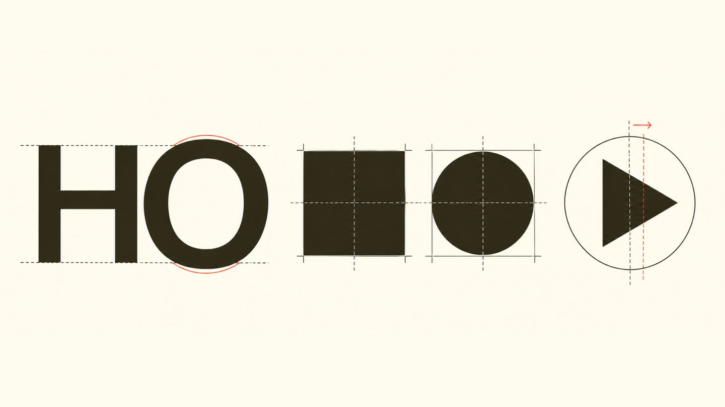
When examining the capital letters H and O in the same typeface, an interesting feature can be noticed: the rounded letter often slightly extends beyond the boundaries of the rectangle.
The straight horizontal strokes of H sit on the x-height and baseline, whereas the upper and lower parts of O may extend beyond them.
This adjustment is called overshoot, or optical extension.
The reason is that the curved shape only touches the horizontal boundaries over small sections. If its height were strictly equal to that of the rectangle, it might appear smaller.
This slight extension compensates for this difference, helping the letters be perceived as equally sized.
A similar principle is applied to letters with sharp points, such as A or V.
For letters to look uniform, their actual physical sizes do not always need to match.
Visual: Large letters H, O, and A. The diagram indicates the baseline, x-height, and areas of optical extension.
Why does the same thickness appear different?
The strokes of letters may have the same geometric thickness yet be perceived unevenly.
For instance, horizontal lines often appear heavier than vertical ones. Diagonal strokes can also create a sensation of varying density depending on their direction and angle of inclination.
Therefore, when designing many typefaces, the thickness of individual elements is adjusted uniquely. Horizontal strokes might be slightly thinner than vertical ones, and diagonals may have their own proportions.
Special attention is paid to the junctions of strokes. At points where several elements intersect, excess visual mass can be formed, causing parts of the letter to appear too dark.
The designer reduces the thickness or alters the shape of the junction while maintaining the uniform saturation of the glyph.
Type uniformity is achieved not through equal thickness, but through an equal sensation of visual weight.
Visual: enlarged letters H, A, and M showing the specified thickness of different strokes. We also separately illustrate the junctions and the difference between geometric and optical construction.
Why do letters need different spacing?
In typography, the spacing between letters affects the text’s rhythm, readability, and visual integrity.At first glance, it seems logical to place all characters at the same distance from each other. However, the shape of each letter creates a different amount of negative space around it.For example, the diagonal elements of the letters A and V allow them to be placed closer together, whereas a pair of vertical strokes requires a different interval.If one relies solely on numerical values, some pairs will look too sparse, while others will appear excessively dense.Kerning is used to solve this issue—it is the individual adjustment of the space between specific character pairs.The goal of kerning is to achieve a uniform visual rhythm and a harmonious distribution of white space between characters.In typography, it is not just the distance between letters that matters, but how the space between them is perceived.Visual: Large letter pairs AV, TA, HO. The negative space between the letters is highlighted with color. We compare the standard and adjusted spacing.
Why isn’t the center always in the middle?
The geometric center of an object is determined by its dimensions and its position relative to defined boundaries. However, the visual center may not coincide with this point.
The perception of balance is influenced by the object’s shape, the direction of its elements, and the distribution of visual mass.
For instance, a triangular play button icon inside a circular button might appear shifted to the left, even if its bounding box is positioned exactly in the center.
This is due to the triangle’s asymmetry: its acute vertex and wide base distribute visual mass unevenly.
To compensate for this effect, the icon is sometimes slightly shifted to the right.
Such adjustments are common in interface icons, logos, and other graphic elements.
The mathematical center is a coordinate. The visual center is the result of perceptual interpretation.
Visual: two circular buttons with a triangle. In one, the icon is geometrically centered; in the other, it is optically centered. We show the axes and the magnitude of the shift.
Where else are optical compensations used?
The principle of optical correction is used far beyond typography. It helps harmonize elements in virtually any graphic system. In logos, designers may adjust the proportions and placement of individual details to achieve even visual weight and overall icon integrity. In pictograms, line thickness, the area of figures, and the placement of elements within the bounding shape are adjusted. This ensures that different symbols appear to be part of a unified system. In poster composition, considerations extend beyond the grid to include the visual mass of imagery, large type, and negative space. Sometimes, to achieve balance, an object must be slightly shifted relative to the geometric center. In all these cases, the objective remains the same: not to abandon precise structure, but to adapt it to the nuances of perception. Geometry helps construct the system; optical adjustments make it visually coherent. Visual: three pairs of comparisons: a logo, a pictogram, and a poster. Changes in form, scale, or placement are indicated in red.
Now, test yourself.
We examined several situations where a mathematically precise construction can create visual imbalance.
Now, try to determine which of the two graphic options looks more harmonious.
Before you are two compositions using the exact same elements. In the first, all objects are strictly placed on a geometric grid. In the second, some parameters were slightly altered: the position, spacing, or size was adjusted.
Try to evaluate both options without guidelines. Which seems more stable? Where is the space distributed more evenly? Which composition feels more balanced?
After comparing them, you can reveal the grid and see that the visually balanced option is not necessarily the mathematically symmetrical one.
Optical compensation is often almost imperceptible, but its absence can significantly affect perception.
Visual: two original graphic marks, options A and B. We then display a measurement grid and highlight the adjustments made.