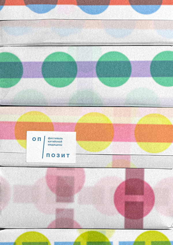
Opposit is a Moscow festival celebrating traditional Chinese medicine, designed for a first introduction to healing practices. It allows attendees to explore alternative approaches to healthcare while immersing themselves in the culture and philosophy of the East.
Original size 2766x1332
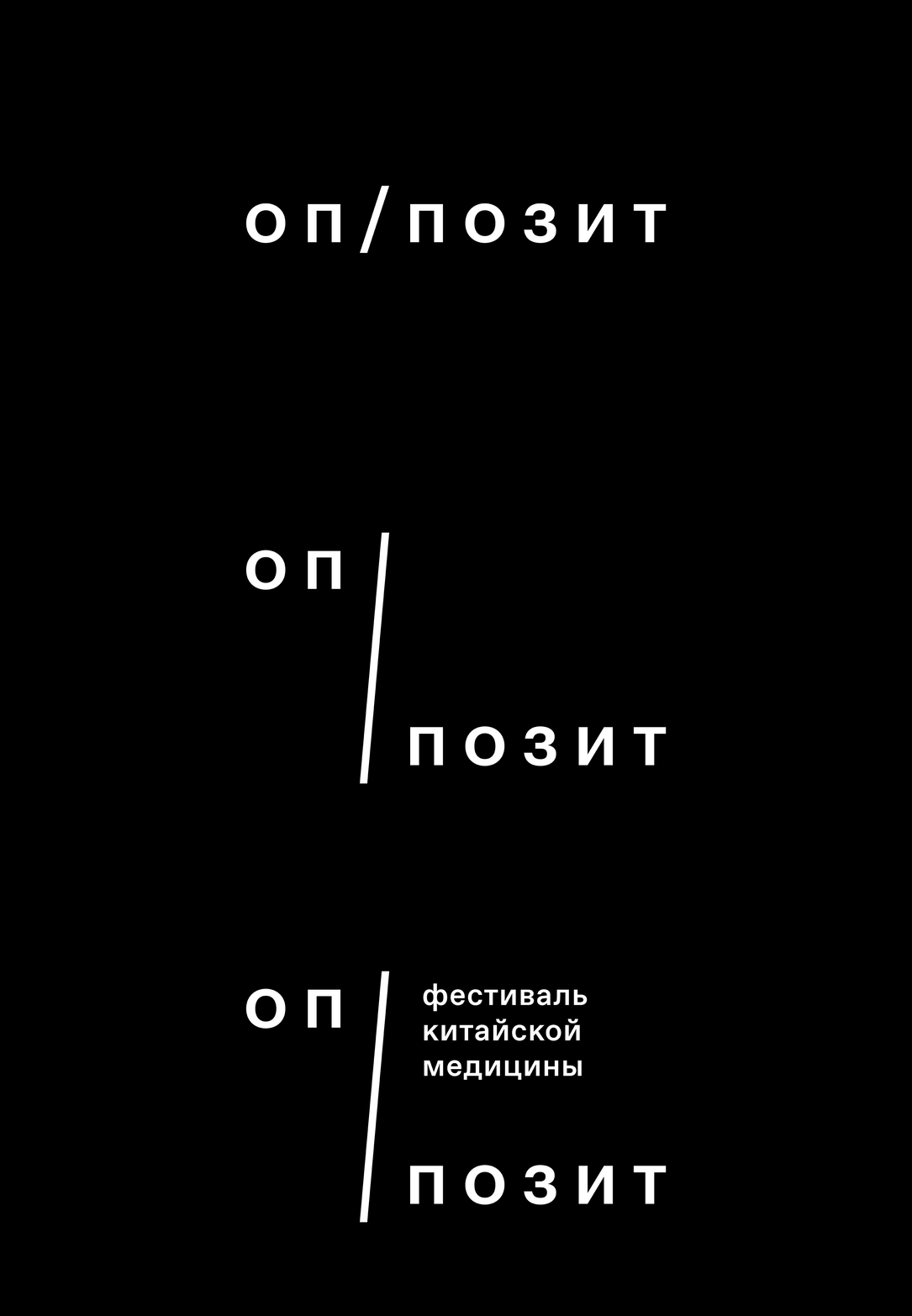
The logo is based on the theme of opposition, which is fundamental to Chinese medical practice. The elongated slash references an acupuncture needle.
The pain points that form the basis of acupuncture charts become the metaphor. This combines the aesthetic of schematic representations with the archaic tradition of remedies.
Original size 3500x2100
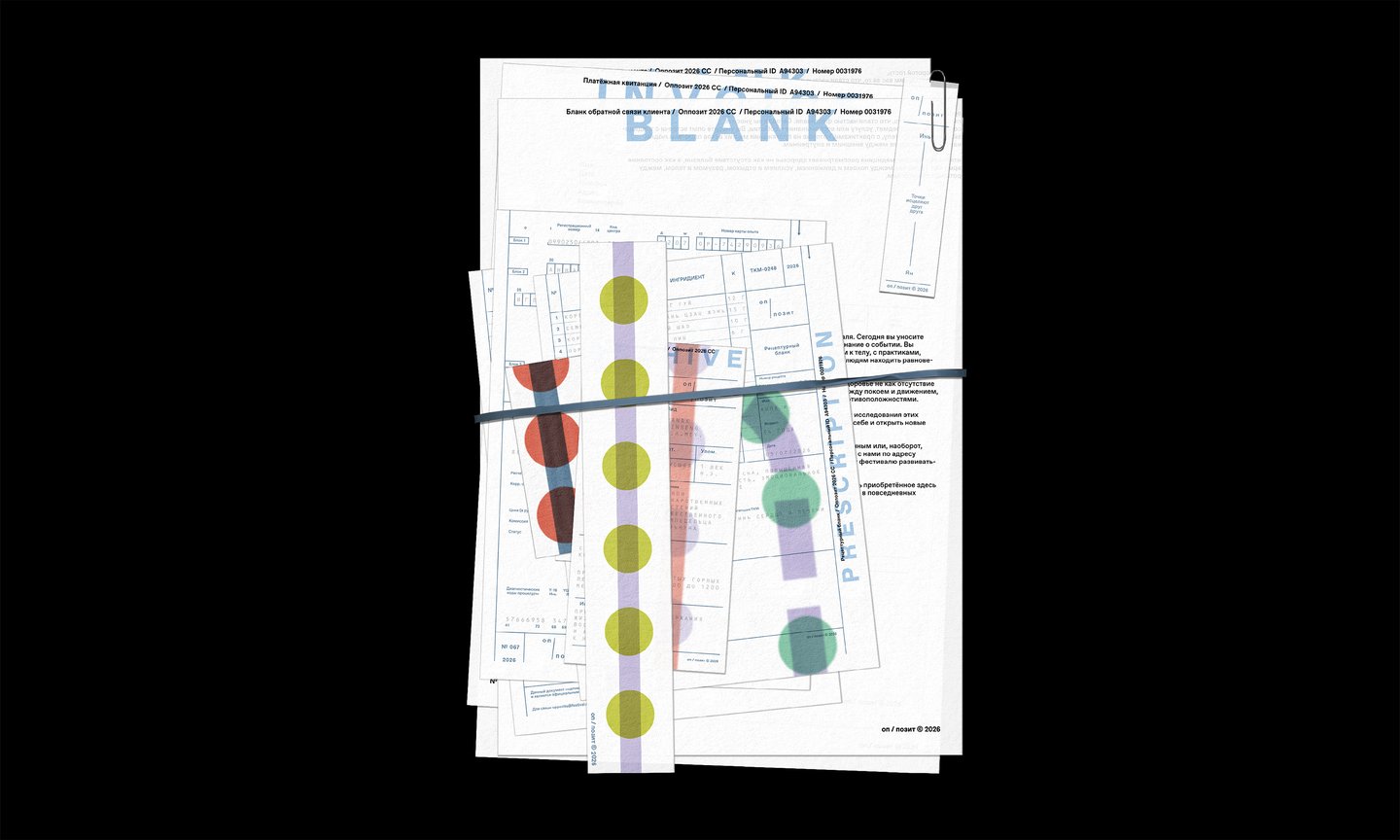
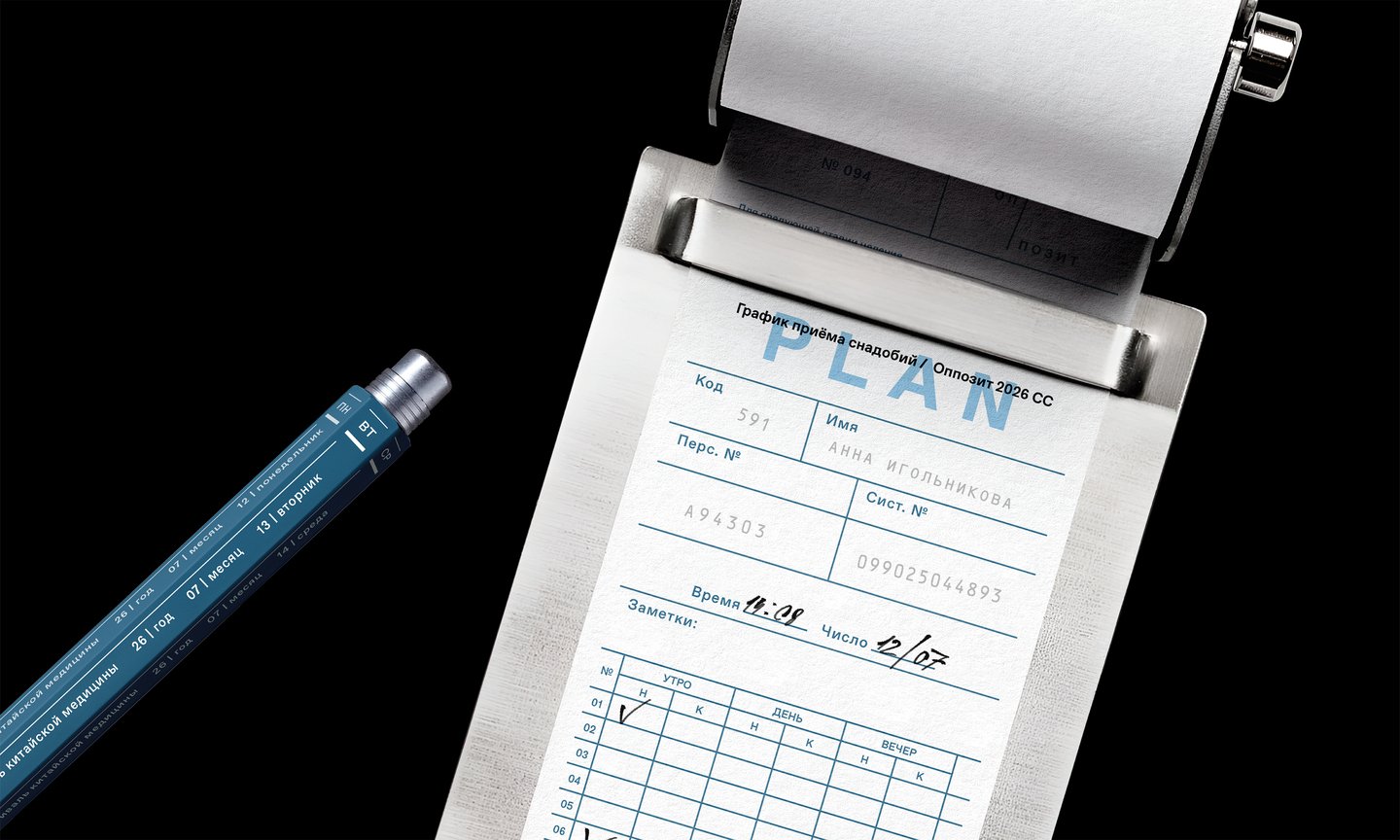
A key detail of the graphic is the scaling of acupuncture lines, which resolve into full diagrams on large-format media.
Original size 3500x2100
Original size 3500x2100
Original size 3500x2100
Original size 3500x2100
Original size 3500x2100
Original size 3500x2100
Original size 3500x2100
Original size 3500x2100
Original size 3500x2100
Original size 3500x2100
Original size 3500x2100
Original size 3500x2100
Original size 3500x2100
Original size 3500x2100
Original size 3500x2100
Original size 3500x2100
Original size 3500x2100
Original size 3500x2100
Original size 3500x2100
Original size 3500x2100
Original size 3500x2100
Original size 3500x2100
Original size 3500x2100