Structure
- Introduction
- History and Origins
- Geometry and Rhythm in Optical Illusions
- The Interaction of Color and Form
- Influence on Emotion and Space
- Detailed Visual Analysis of Examples
- Conclusion
- Sources
Introduction
«Optical illusions—a challenge to established perception, the truth in visual deception.»
Op art (optical art) is an artistic movement that utilizes visual effects and geometric patterns to create an illusion of movement and depth on a flat surface. This movement arose in the 1960s and is characterized by repeating forms, contrasting colors, and precise mathematical structures that engage the viewer’s perception. The goal of this study is to analyze the visual mechanisms of op art, understand how they impact the viewer, and explore their effect on the perception of space and emotion.
«A work of art comes to life only when a painting is before a person’s eyes and begins to live within their perception.»
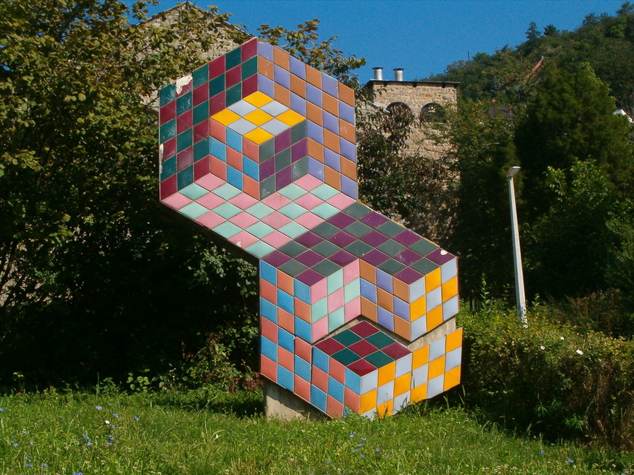
Viktor Vazarely
History of Origin
Op art, or optical art, emerged in the 1950s as a branch of abstract art, specifically geometric abstraction. The term «op art» was officially introduced in 1964 by Time magazine and came to denote art that uses optical illusions to «deceive» visual perception. The foundation of this movement lies in experiments with geometric forms, contrasts, and repeating patterns, which create the illusion of movement and vibration on a flat surface.
Bridget Riley
The origins of Op Art can be traced to the Constructivist and Bauhaus theories of the 1920s, a period when formal design and visual perception held significant importance. One of the earliest influences is the work of Josef Albers, whose «Homage to the Square» series is regarded as a precursor to Op Art.
Viktor Vazareli
Victor Vasarely, a Hungarian kinetic artist, was a key figure who spurred the development of Op Art—experimenting with visual effects and geometric abstractions starting in the 1930s. In the 1950s, British artist Bridget Riley further evolved the style, utilizing contrasting black-and-white lines and forms to create powerful visual vibrations.
In 1965, the exhibition «The Responsive Eye» at the Museum of Modern Art in New York propelled Op Art onto the international stage, making it popular with the general public and expanding its use in design, advertising, and fashion. By the late 1960s, the popularity of Op Art began to wane, but its influence has persisted and continues to evolve as a significant movement in contemporary visual art.
Geometry and Rhythm in Optical Illusions
Op art uses precise geometric shapes, often repeated, to create visual rhythms that evoke an illusion of movement or vibration.
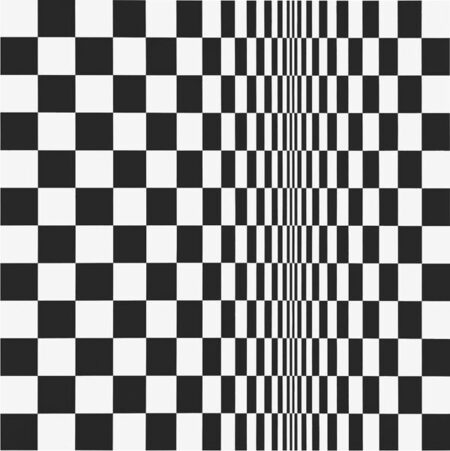
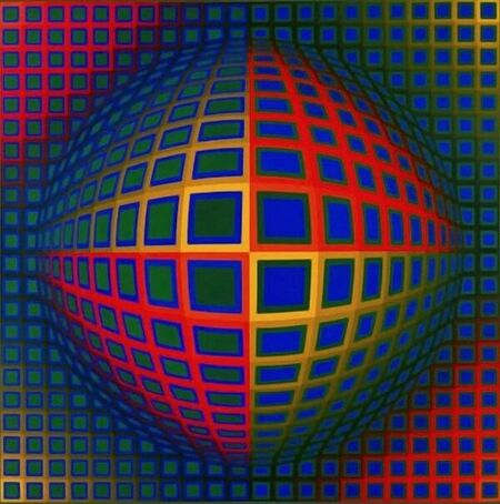
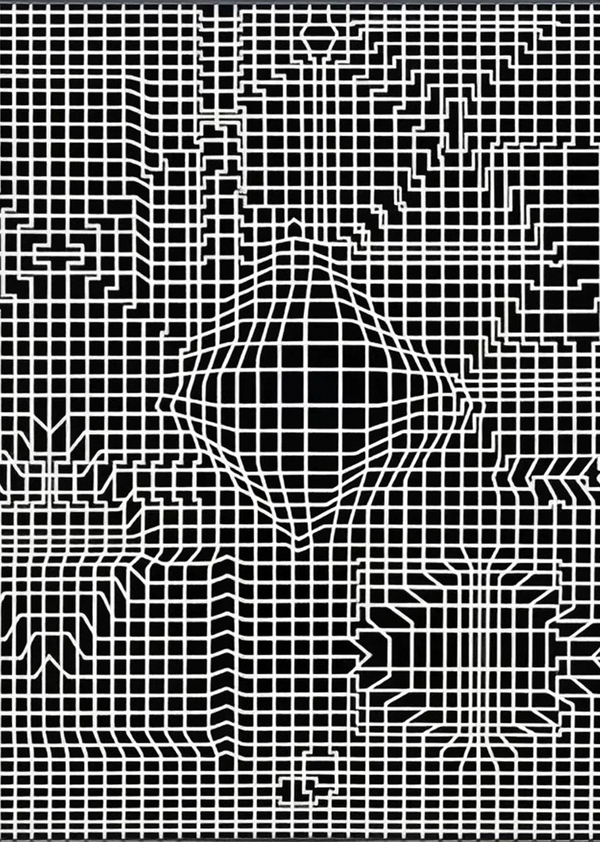
Bridget Riley, Movement in Squares, 1961; Victor Vasarely, Vega-Nor, 1969.
«I couldn’t achieve what I wanted through simple visualization, so I studied squares, triangles, and the sensations they evoke. My works are independent elements, not illustrations.»
Artists such as Bridget Riley and Victor Vasarely utilized parallel lines, grids, and spirals to create powerful visual effects. In Riley’s work, for instance, «Movement in Squares» (1961), the repeating rhythm of rectangular forms generates a sense of pulsation—a visual oscillation of the object. The viewer’s attention becomes engaged in constant motion, activating the perception of space.
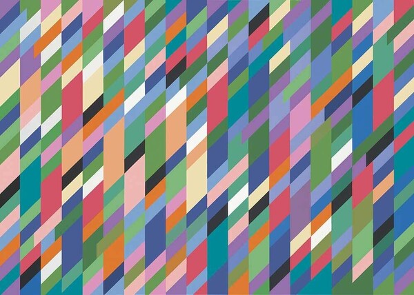
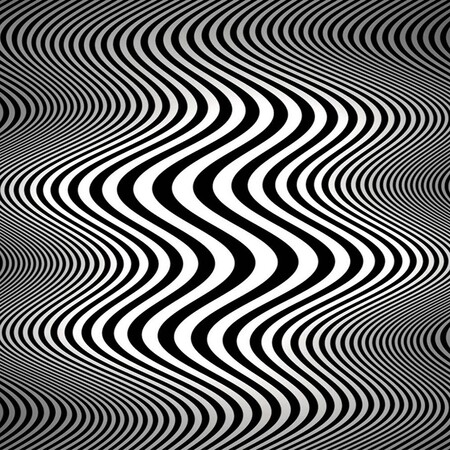
Bridget Riley
Interaction of Color and Form
Yakob Agam, «Geometries»
Yakov Agam, Mirror, 1979
«Geometry, color, and rhythm create emotional vibrations, eliciting visual experiences.»
Viktor Vazareli «Zebra,» 1950
Victor Vasarely — Undefined, 1975.
Op art frequently employs contrasting colors—black and white, as well as vivid pairs—to intensify the effect of movement and depth. Color generates tension in perception by playing on contrasts and spatial relationships. For instance, Yakov Agam, in his silkscreen print «Mirror» (1979), uses color to create light and volumetric effects, amplifying the illusion of motion. Color and form interact in such a way that the viewer perceives vibrating surfaces and distortions, even in a static work.
Victor Vazarely, Zint-MC, 1960–1976
Influence on Emotion and Space
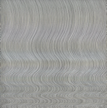
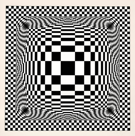
Bridgitte Riley, Waterfall, 1963; Victor Vasarely, Nora-Dell, 1974–1979.