The Task and Motivation
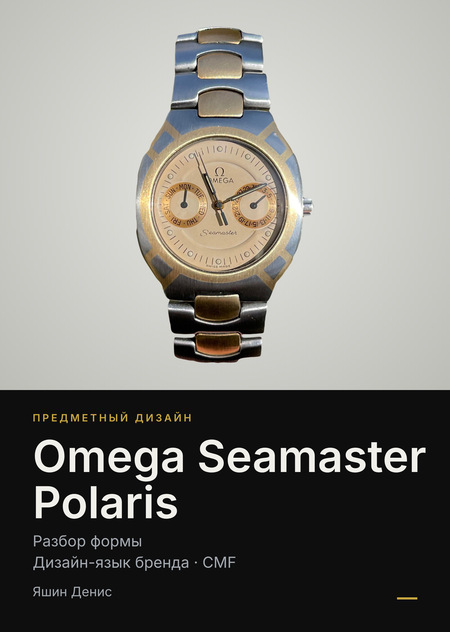
I am analyzing the Omega Seamaster Polaris form and building its 3D model.Why this subject? The Polaris is unlike other conventional Omega watches; it features a unified silhouette and a combination of titanium and gold. These are the first watches in my personal collection, and they hold deep personal significance for me.
Why is it a design icon? The form is attributed to Gérald Genève, the creator of the Royal Oak and Nautilus. For Omega, the Polaris represented a bold attempt to redefine its image during the quartz crisis.
Objective and Creative Brief
Goal: To construct a 3D model of a clock that articulates the object’s form.
Task: — Model the object in Blender for the Product Design course; — Organize nodes and materials based on CMF logic; — Work exclusively from photographs: no blueprints or exact measurements are provided.
Success Criteria: Proportions match the object, materials are distinguishable, and renders are free of artifacts.
Glossary for the reader: — CMF — Color, Material, Finish; — integrated strap — a strap that flows seamlessly from the case, without lugs; — subdial — a small dial situated inside the main dial.
Style Moodboard
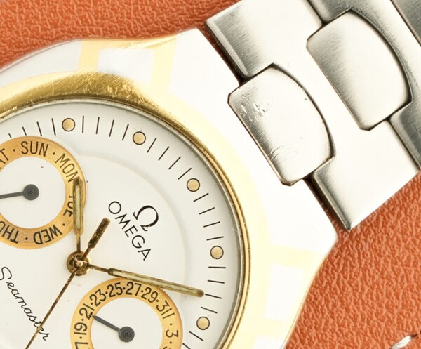
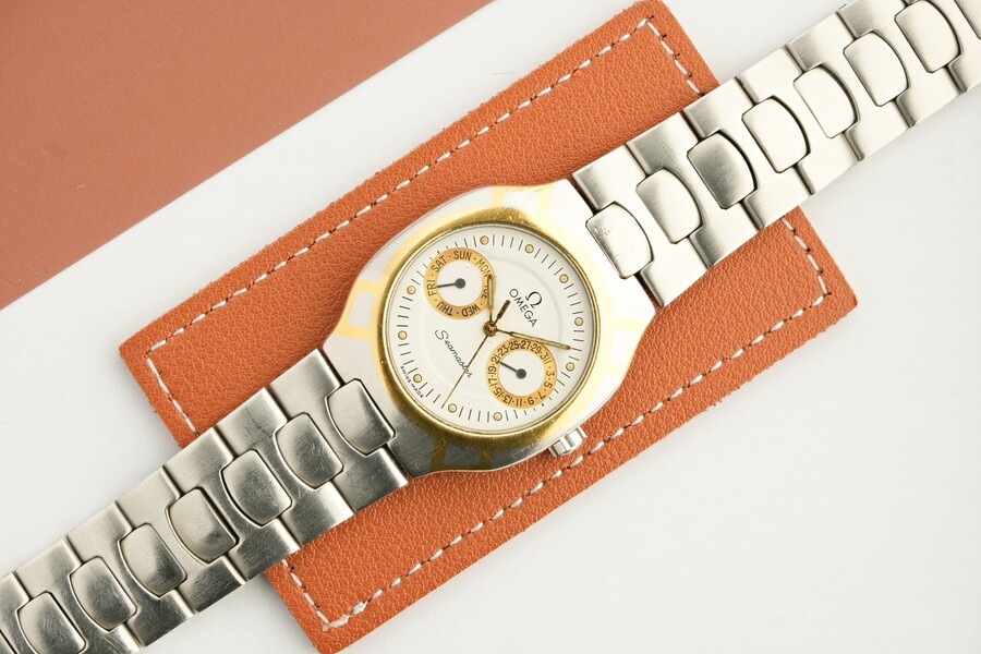
The watch’s aesthetic is defined by five elements: titanium and gold, a lugless case, 1980s aesthetics, dashboard symmetry, and bezel mosaic. I derived the color palette from photographs of the object.
Historical Context
In the early 1980s, mechanical watches were going through a quartz crisis, and Omega sought a new image. The Polaris was introduced in 1982. Throughout the 1980s, the line was expanded with versions featuring hands, digital displays, and chronographs. By the early 1990s, the line concluded, and some of its concepts transitioned into the Seamaster Professional.
Model Features: — 18K gold, approximately 2 mm thick, set in titanium; — Most models are quartz; — Titanium is roughly 43% lighter than steel (density of 4.5 versus 7.9 g/cm³).
Conclusion: The Polaris was a calculated risk by Omega to reinvent its image in the midst of a crisis.
Principles of Form Generation
The form is broken down into six elements:
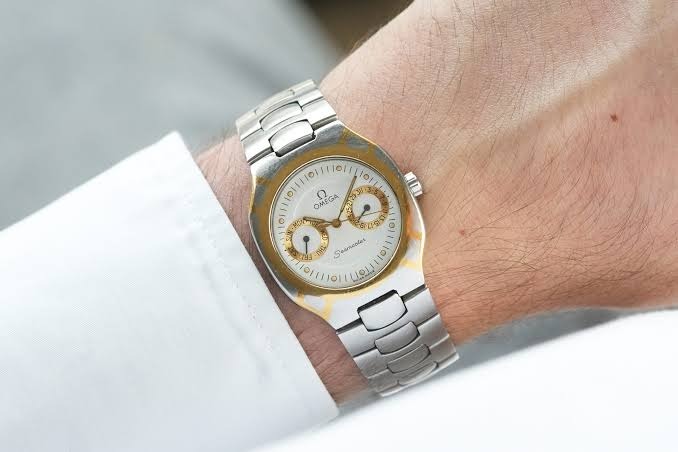
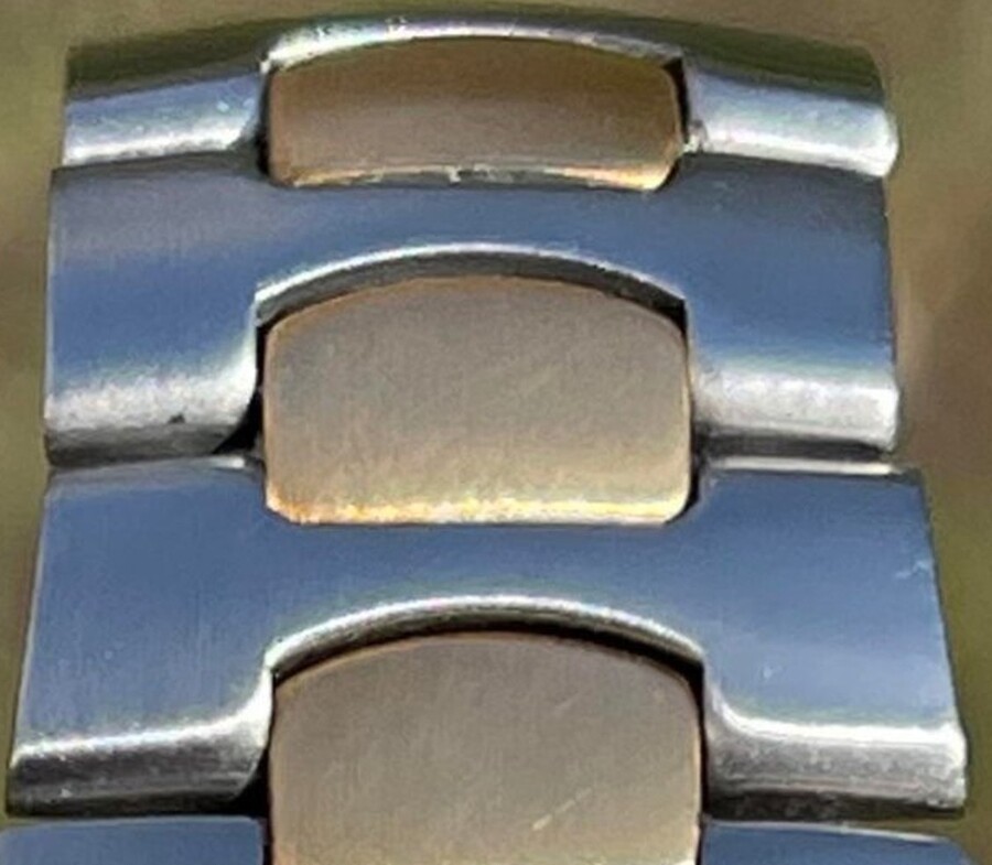
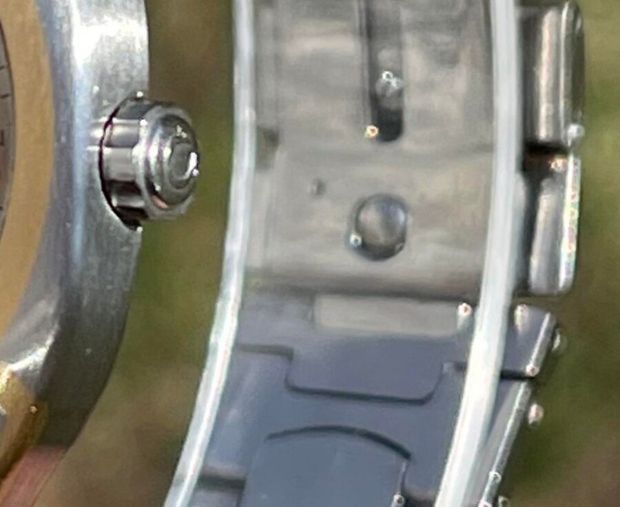
1. Bezel — gold with titanium windows. Technique: inlay and rhythm. 2. Dial — two identical sub-dials. Technique: symmetry. 3. Case transitions into the bracelet without lugs. Technique: smooth transition. 4. Bracelet Links — alternating titanium and gold. Technique: alternation and repetition. 5. Crown — small, without protection. Technique: minimum protrusion. 6. Dial Center is recessed. Technique: relief and level transition.
**Conclusion: ** The six elements function as a single system: the repetition of gold and titanium sustains the form.
Structure and Architecture
From top to bottom, the watch consists of six layers: convex crystal; gold hands with luminous paint; recessed dial with two sub-dials; gold and titanium bezel; titanium case of a complex oval shape (superellipse); and a bracelet made of titanium and gold.
Hierarchy of volumes: — Primary — the case and bracelet as a single body; — Secondary — the bezel; — Tertiary — the dial, sub-dials, level transitions; — Details — hands, indices, inscriptions, crown.
Conclusion: The form is perceived in layers, so the model is conveniently built layer by layer: each layer is a separate object with its own material.
Omega Design Language and Polaris Differences
CMF: Color, Material, Feeling
Colors (taken from photos, approximate values): titanium gray, matte gold, champagne dial, small dial rings, black printing.
Materials: satin-finish titanium, brushed 18K gold, lacquered brass (dial), convex glass.
Feelings: the lightness of titanium, smooth satin, warm contrast, integrity.
Conclusion: the palette is warm and restrained: two metals and one dial color.
Technology: Clock and Model
Clock: Gold inlaid in titanium; matte planes are complemented by glossy facets; the bracelet is assembled using pins; the case head is small.
Model: The model is constructed in six steps: references and measurements → case → bezel and windows → dial → bracelet → materials and render.
Conclusion: The model replicates the logic of the clock: titanium and gold as separate components.
Ergonomics and Scenarios
— Wearability: The clasp is hidden, and the bracelet is smooth.
— Readability: The gold hands on the champagne dial are faintly visible, and the hands overlap the subdials.
— Comfort: The case does not catch the sleeve without lugs.
— Adjustment: The small crown does not press on the wrist but is awkward for the fingers.
Non-standard feature: the date numerals are spaced out (only odd numbers); even numbers are readable between the digits. Gold is softer than titanium, so its wear is more noticeable.
*Caveat: I do not have measurements or weight; these conclusions are based on the construction and photographs.*
Conclusion: The watch is comfortable on the wrist, but it is harder to read than it looks.
Research Findings
1. Form. Without the lugs, the case and bracelet read as a single piece. 2\. Material. Gold is embedded in titanium: the pattern is seamless. 3\. Color. The warm, soft palette diminishes the contrast of the hands. 4\. Ergonomics. Comfortable fit, but reduced legibility. 5\. Brand. Polaris has shifted away from Omega’s language while retaining the brand’s insignia. 6\. For the model. We construct the knots and materials separately, mirroring the watch itself.
3D Model
Project Idea and Value
Concept: A model as a tool for deconstructing form, where each node is a separate object and material.
Utility: Renders and deconstruction into nodes; material for studying a design language.
Trends: 1980s retro design; titanium in watch design.