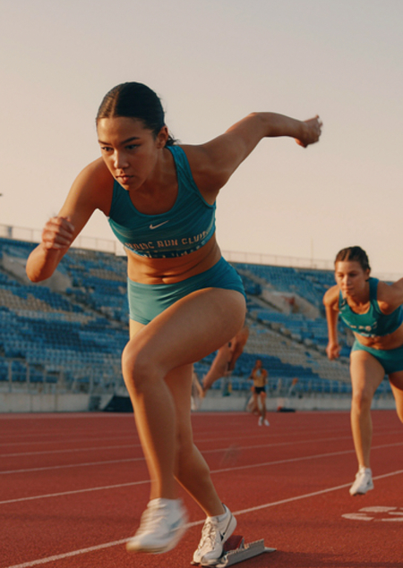
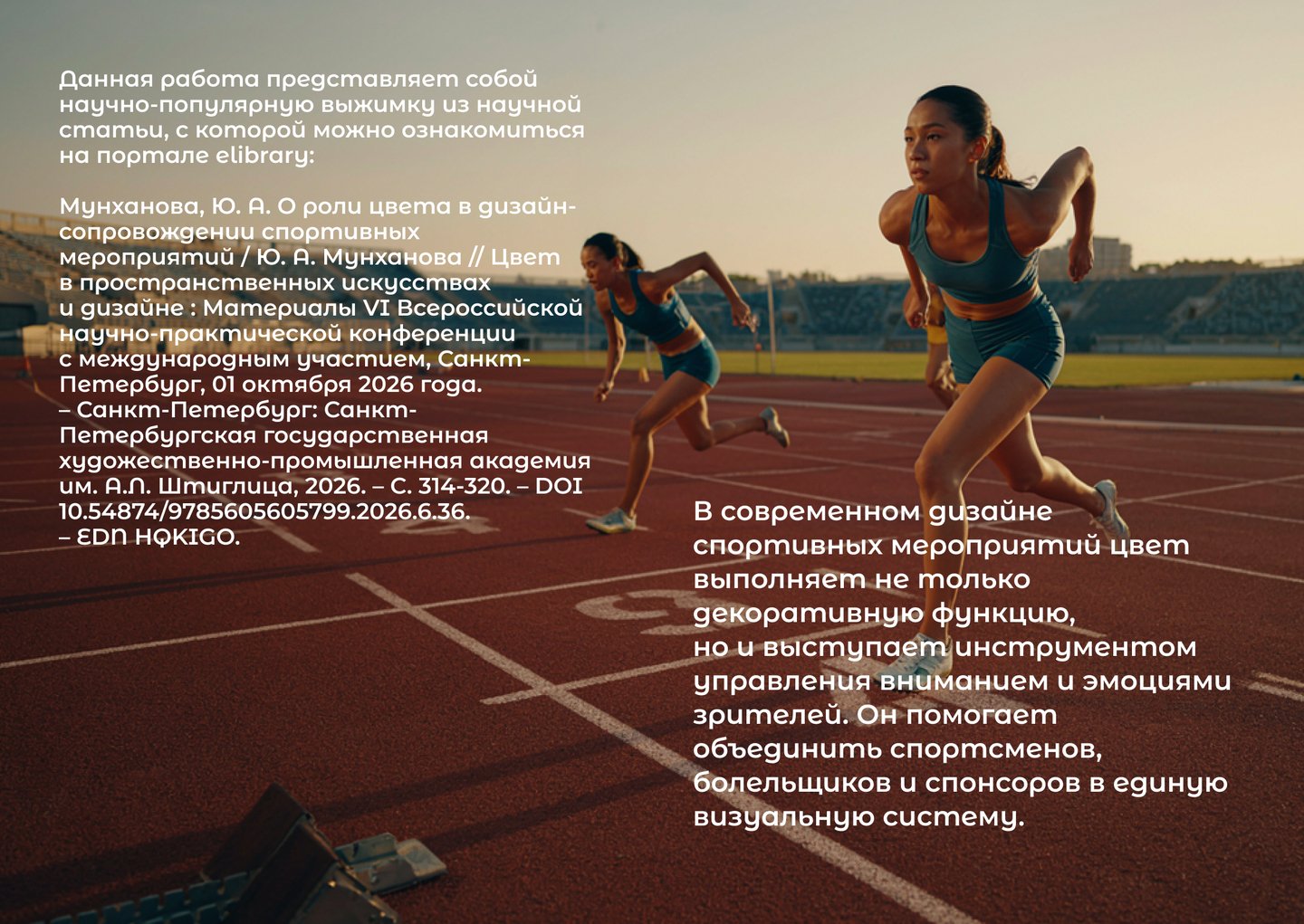
In contemporary sports event design, color serves not only a decorative function but also acts as a tool for managing the attention and emotions of spectators. It helps unify athletes, fans, and sponsors into a singular visual system.
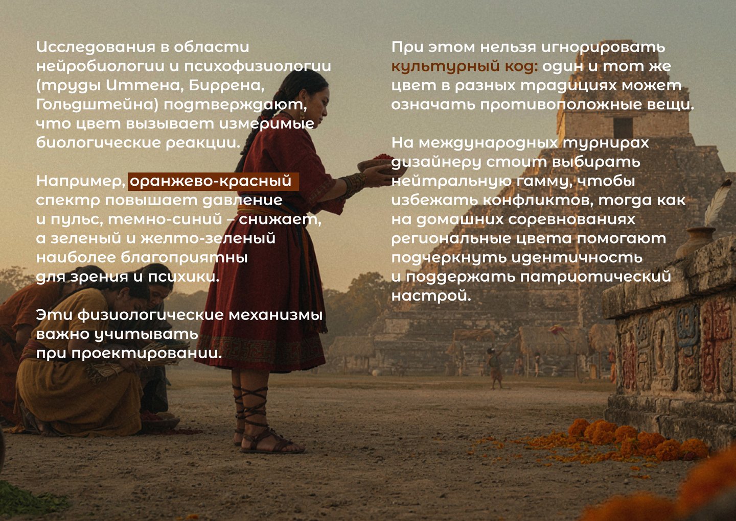
Research in neurobiology and psychophysiology (the works of Itten, Birren, and Goldstein) confirms that color elicits measurable biological responses. For instance, the orange-red spectrum raises blood pressure and heart rate, deep blue lowers them, while green and yellow-green are most favorable for sight and mental well-being. These physiological mechanisms must be taken into account during design.
Furthermore, the cultural code cannot be ignored: the same color can signify opposing things across different traditions. For international tournaments, designers should opt for a neutral palette to avoid conflict, whereas regional colors at home competitions help emphasize identity and foster a patriotic sentiment.
In practice, color fulfills two key functions. The first is navigational: it helps distinguish teams, officials, volunteers, and functional areas. The second is emotional: bright contrasts create a sense of festivity and dynamism, while restrained palettes convey status and order.
The history of major competitions confirms this. At the 1968 Mexico City Olympics, five core colors became a functional code: the color of a ticket or directional sign guided the viewer along the intended route, and the shades of icons referenced Mayan and Aztec culture. In Munich (1972), the palette was used to differentiate staff—from judges to ushers. At the 2008 Australian Open, changing the green court surface to blue improved ball visibility and helped the tournament differentiate itself from the US Open. And at the 2024 Paris Olympics, violet running tracks created maximum contrast with the yellow athlete bib numbers, enhancing the televised imagery.
Therefore, color in sports design is a strategic asset that requires a balance between physiological perception, psychology, and cultural meaning.