
It can be difficult for a large dog to find a bed where they can truly settle in comfortably. This observation led to the concept for MESTO—a brand of pet beds and supplies. The question, «Isn’t there enough space?» became not only a message to the owner but also a foundational principle for building the brand identity.
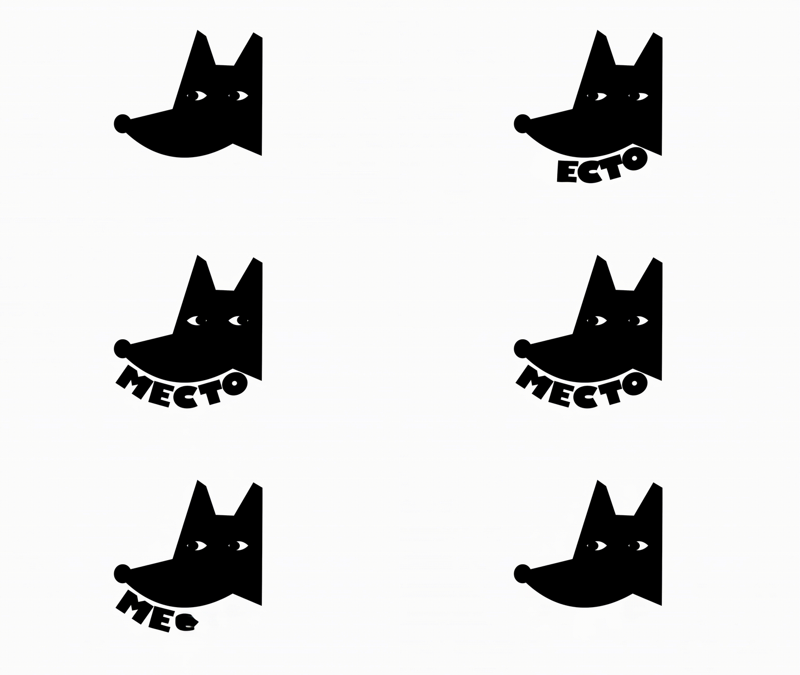
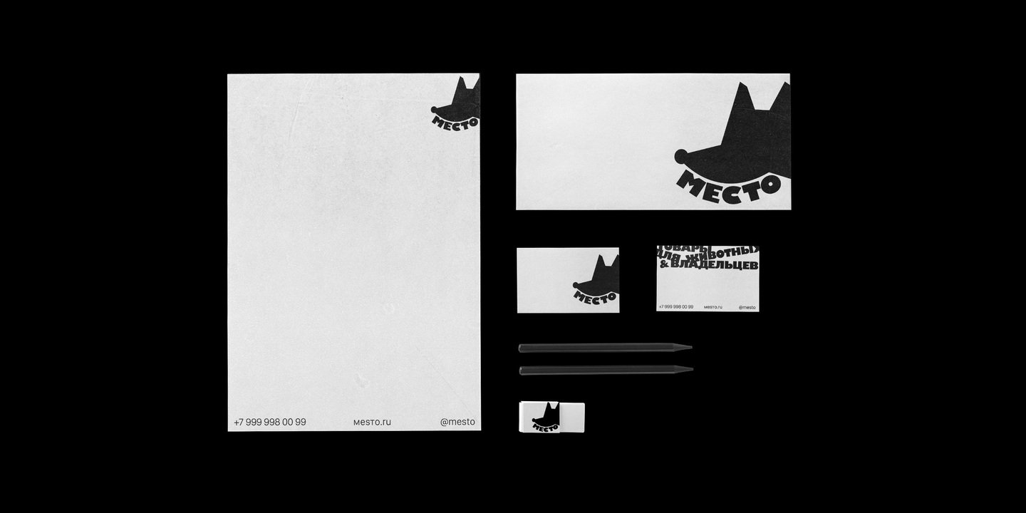
The basis of the identity is a dense, emphasized typeface. Large letters fill the format almost to the brim, as if they feel slightly cramped. The idea is built upon this contrast: the large letters barely have enough room in the format, while the dog comfortably fits right among them.
Supplementary text is placed loosely, sometimes deliberately inconsistently. It disrupts the strict rhythm of the large letters, adding vitality to the composition—like a dog in motion that doesn’t have to be positioned «correctly» to feel like it belongs.