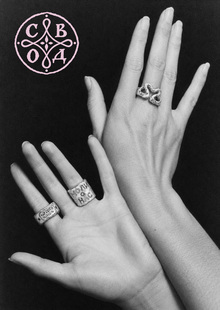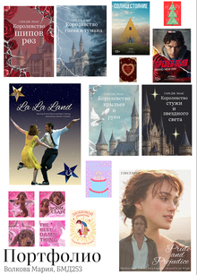
The portfolio includes 16 academic works completed within the «Fundamentals of Visual Communication» program. The project spans several disciplines of graphic design, including greeting cards, music album covers, movie posters, and a series of book covers. The author is Milana Meneylyuk, BMD 252. For nearly every piece, detailed creation notes are provided to clearly delineate the application of neural networks versus original design work.
Postcards

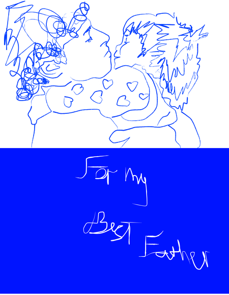
Card #2.
Styled after a child’s drawing. The intentional simplicity of the forms and the chaotic lines convey sentimentality and the connection between father and child.
The illustration, composition, and typography were created by the author.

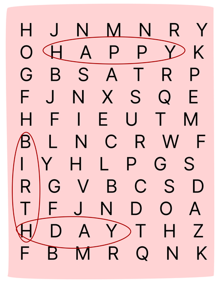
Card #3.
Swans serve as a classic symbol of fidelity, and the pink palette and delicate calligraphy reinforce the romantic aesthetic.
The illustration, composition, and typography were created by the author.
Album Covers
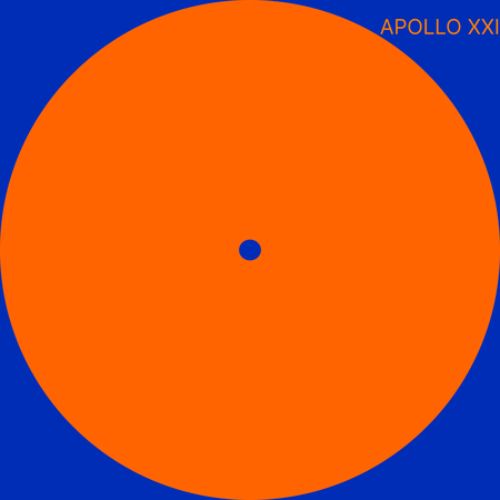
Cover #1.
Steve Lacy — Apollo XXI
Designed around the motif of a vinyl record. The title Apollo XXI references the ancient Greek sun god and the NASA space program. Steve Lacy himself referred to this release as his first solo journey into space; therefore, the orange circle functions both as the sun and as a symbol of this large-scale creative voyage.
All graphics were created by the artist.
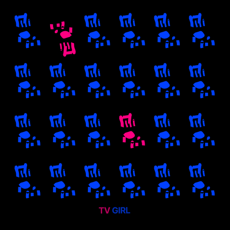
Cover No. 2.
TV Girl — Who Really Cares
The cover is structured on a grid of identical blue chairs. The rhythmic repetition conveys the atmosphere of an empty waiting room and universal apathy, resonating with the title, «Who Really Cares.» The pink chairs disrupt this monotony, representing those who do care.
All graphics were created by the artist.
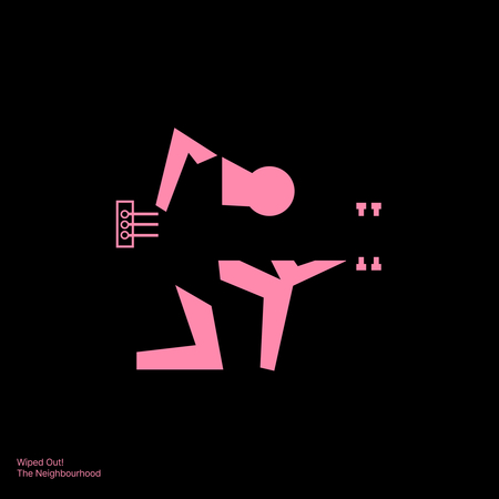
Cover #3.
The Neighbourhood — Wiped Out!
The title, «Wiped Out,» signifies complete exhaustion and burnout. The cover conveys this through pink, geometric shapes that are fracturing against a black background. At the center of the composition, a faint silhouette of a person with a guitar is discernible—symbolizing the musician himself struggling with internal anxiety and loss through creativity. Since the album addresses mental health, isolation, and the loss of youthful innocence, the figure appears as if dissolving into the void.
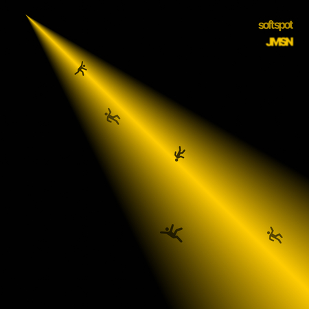
Cover No. 4.
JMSN — soft spot
The contrast between the black background and the bright yellow beam creates an ironic dissonance; yellow is usually associated with joy and positivity, but here it accentuates the heavy atmosphere of the album, which deals with painful attachment and deception. The falling figures symbolize a loss of control and vulnerability, directly linked to the title, «soft spot.»
All graphics were created by the author.
Movie Posters
Poster #1.
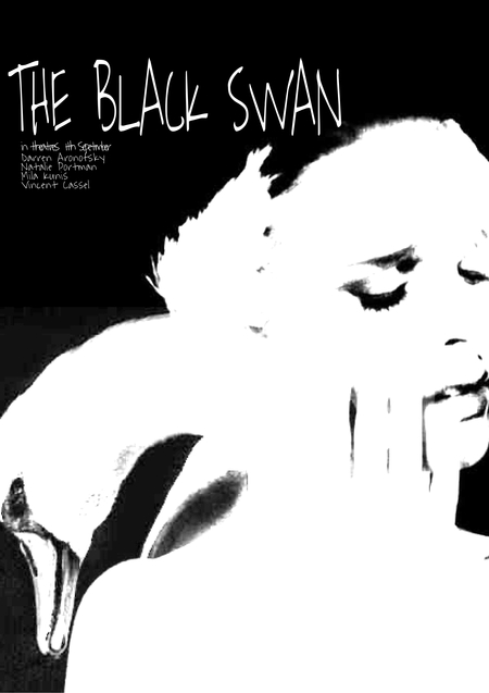
«Black Swan»
The poster is built on a stark contrast of black and white. The black color conveys the darkness that gradually envelops the heroine. Her face merges with the swan, depicting an internal struggle and transformation. The torn, handwritten font adds a sense of anxiety and psychological breakdown.
All graphics were created by the artist.
Poster No. 2.
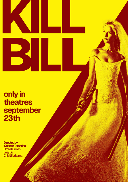
Kill Bill
The poster is built on the vibrant contrast of yellow and red. The yellow alludes to the main image of the heroine, while the red refers to the themes of revenge and blood. The large typography and diagonal composition convey the film’s dynamism and aggression.
All graphics were created by the artist.

Poster No. 3.
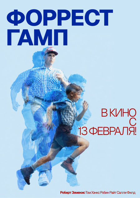
«Forrest Gump»
The poster uses a layered frame effect. A young Forrest and an adult Forrest merge in a single run, illustrating his life journey. The blue color palette emphasizes the calmness and innocence he maintained despite everything.
The collage was AI-generated; the composition and typography were executed by the author.
Poster No. 4.
«Obsession»
The poster is built upon the contrast between the mentor’s immense face in the background and the small figure of the drummer at the bottom. This scale conveys the psychological pressure and the obsession with music that underlies their confrontation. The orange-yellow palette creates an atmosphere of tension and the heat of the stage lights.
The collage was generated using AI, while the composition and typography were executed by the artist.
Book Covers
Cover #1.
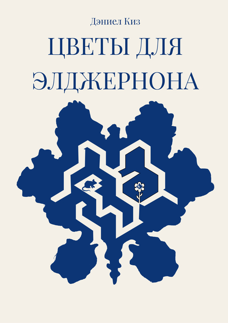
«Flowers for Algernon»
The cover is built around the image of a labyrinth. It symbolizes not only the complex paths of the human mind but also references to the real trials the mouse endured in the laboratory. Inside, the figurine of Algernon and a flower are hidden, all referencing the scientific experiment’s plot.
All graphics were created by the student.
Cover No. 2.
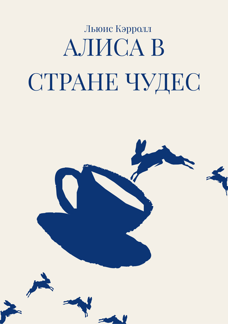
«Alice in Wonderland»
A giant teacup references the famous Mad Tea Party, while the multitude of falling rabbits symbolizes the White Rabbit and Alice’s descent down the hole.
All graphics were created by the author.

Cover #3.
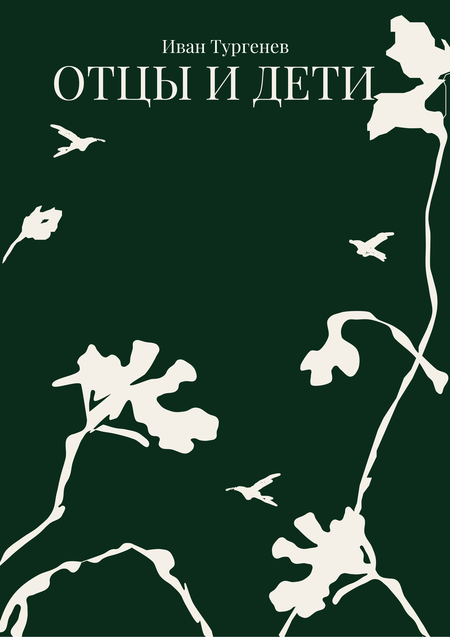
«Fathers and Sons»
Large plant leaves symbolize the older generation, which has taken deep root, while small birds represent the younger generation striving for freedom and change. The green color references nature and rural life—the backdrop against which the conflict unfolds.
All graphics were created by the artist.
Cover #4.
«Little Red Riding Hood»
A massive black silhouette of a wolf looms over the tiny red figure of a girl. This conveys the heroine’s vulnerability and the threat emanating from the predator. The black color symbolizes danger and darkness, while the red highlights the main subject.
All graphics were created by the author.