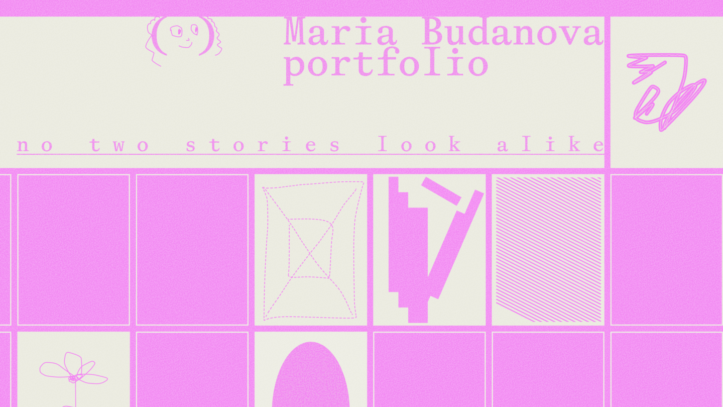
Every brand has its own way of telling a story

Hi, I’m Masha!I’m a graphic designer who loves finding the unexpected in familiar things.What excites me most about branding is discovering what makes each project special — its personality, little details, and hidden connections.I turn these discoveries into visual identities that reflect each brand’s character and work together as cohesive systems.
MY APPROACH
From curiosity to a cohesive visual identity
01 / EXPLORE
I get to know the brand — its context, audience, and character.02 / DISCOVER
I find the idea and emotional direction that bring its personality to life.03 / CREATE
I develop the concept into a cohesive visual system across different touchpoints.
case 1
VASILY FADEEV

CONTEXT & CHALLENGE
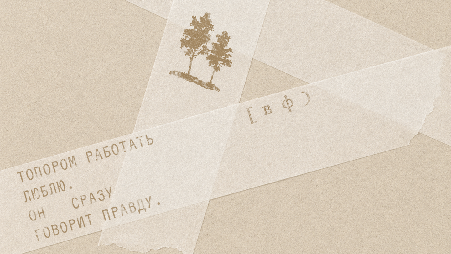
Vasily Fadeev is a Russian wood sculptor from Orlovka. The challenge was to create a visual identity that reflects his relationship with his material.CONCEPT
Wood is more than a material. It is part of the dialogue.
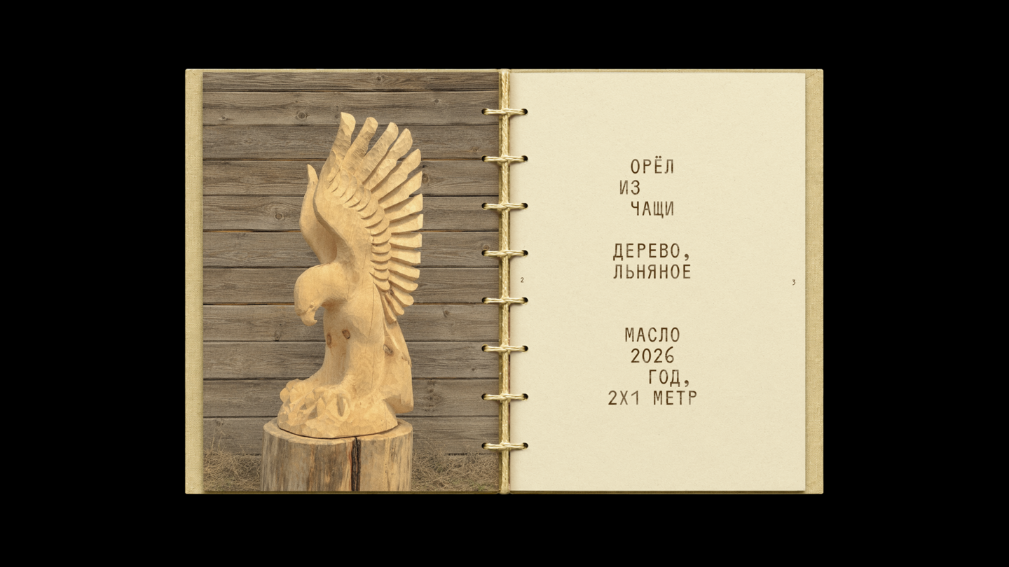
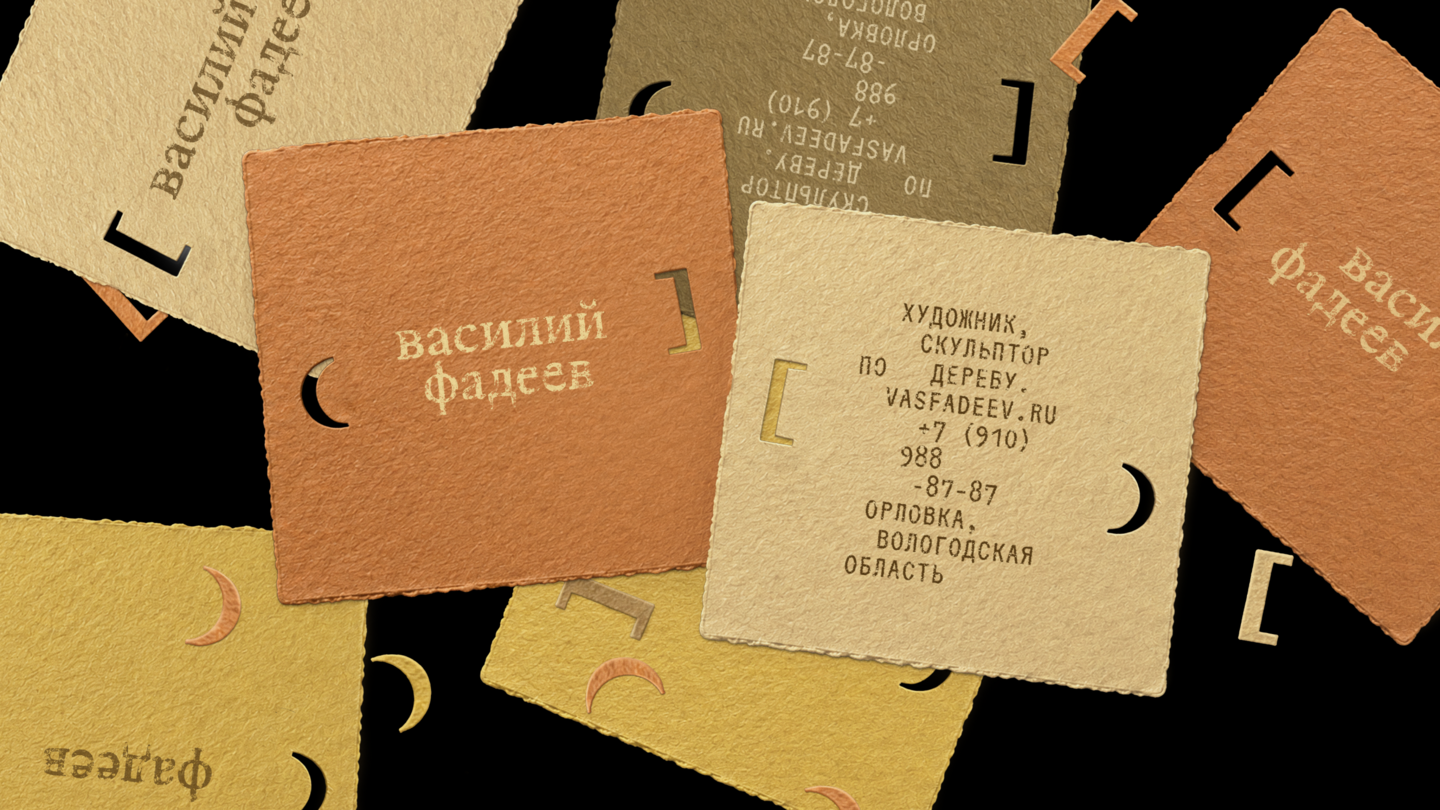
Inspired by Fadeev’s approach to carving, the concept explores the connection between the artist, his tools, and wood itself. Interrupted spacing between words and lines echoes the sharp, direct movement of an axe.
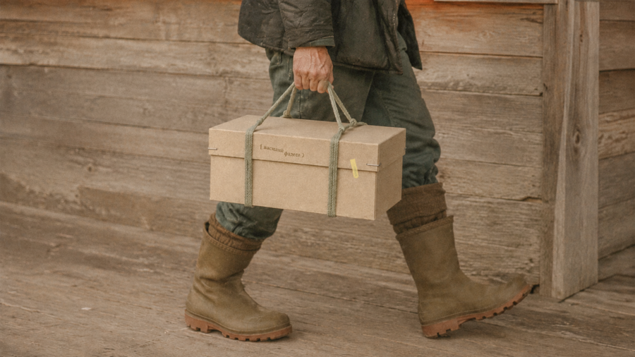
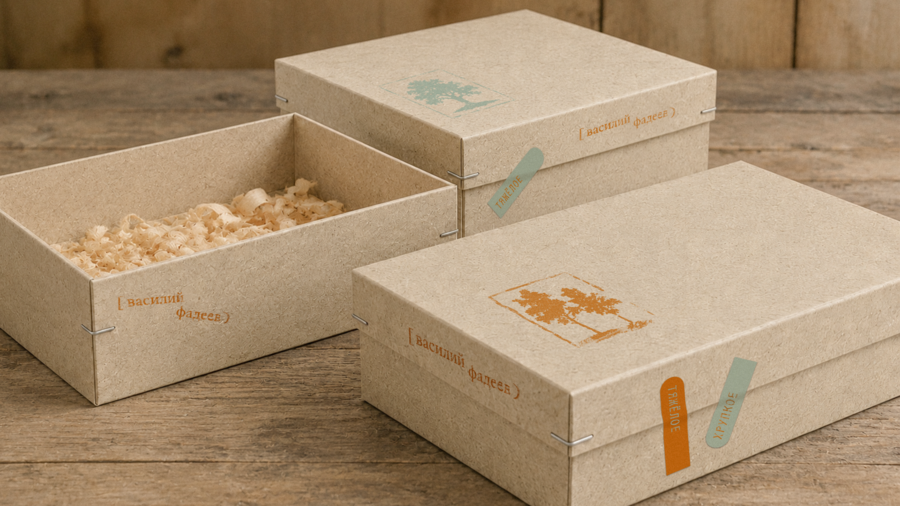
APPLICATIONS & OUTCOMEExpressive typography, color, and graphic composition bring the concept together across different applications.
case 2
CE PROJET
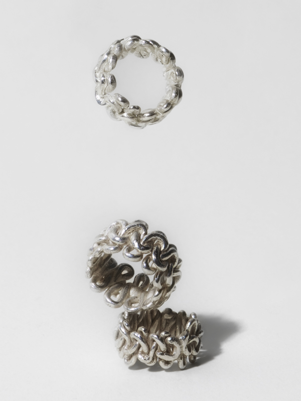
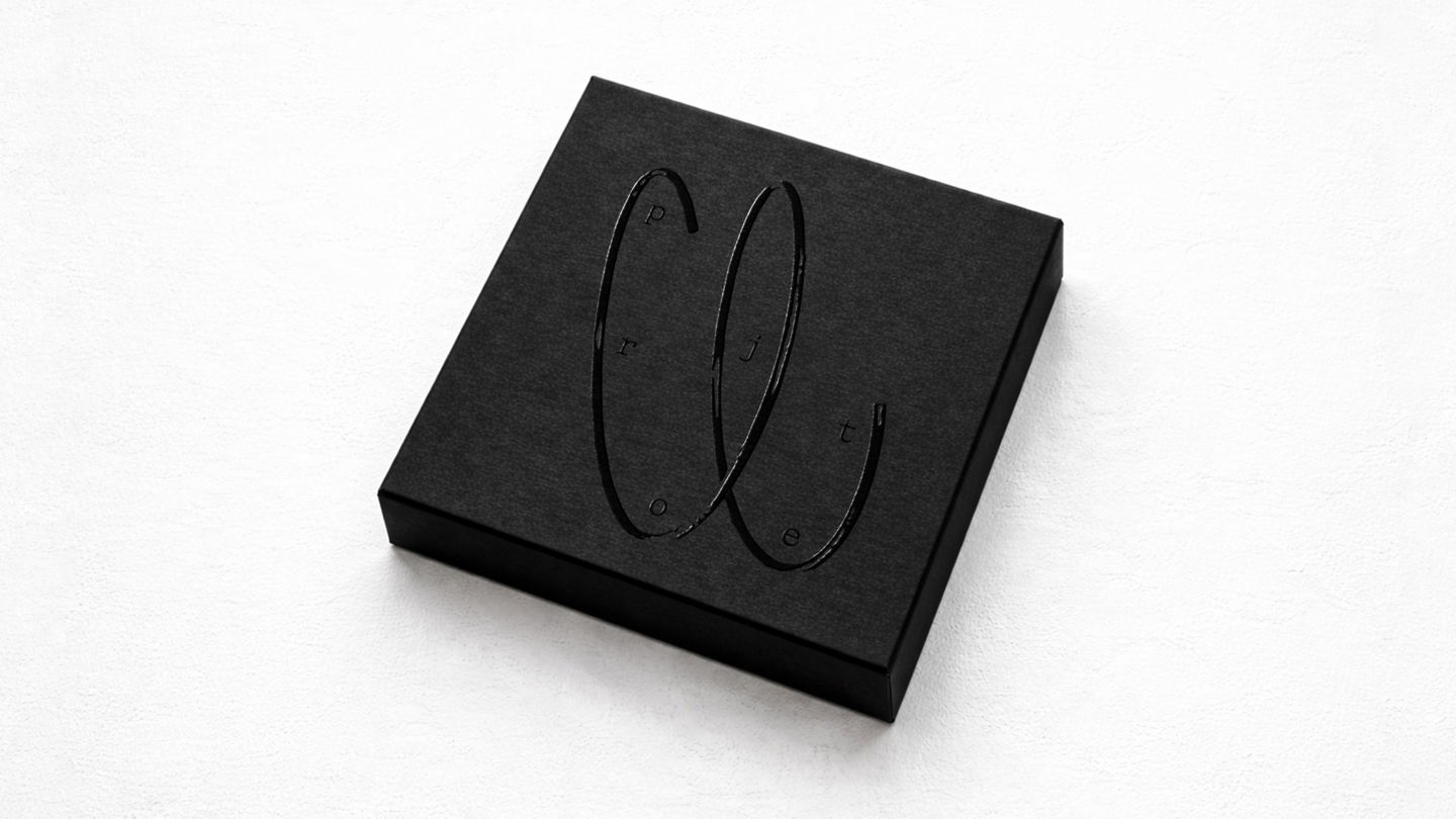
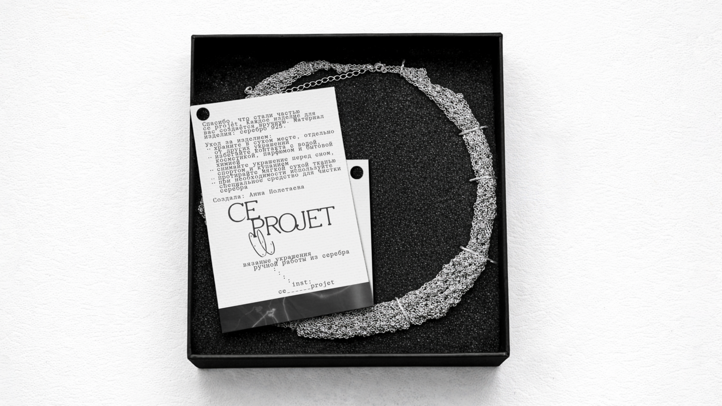
CONTEXT & CHALLENGECe projet is a handmade jewelry brand concept inspired by knitting and intertwined forms. The challenge was to translate the character of handmade jewelry into a distinctive visual identity.CONCEPT
The identity is built around knots and connections — simple elements that reflect the process of making jewelry by hand. These forms become a recurring graphic motif, connecting the elements of the visual identity.
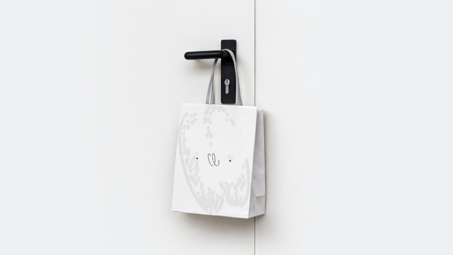
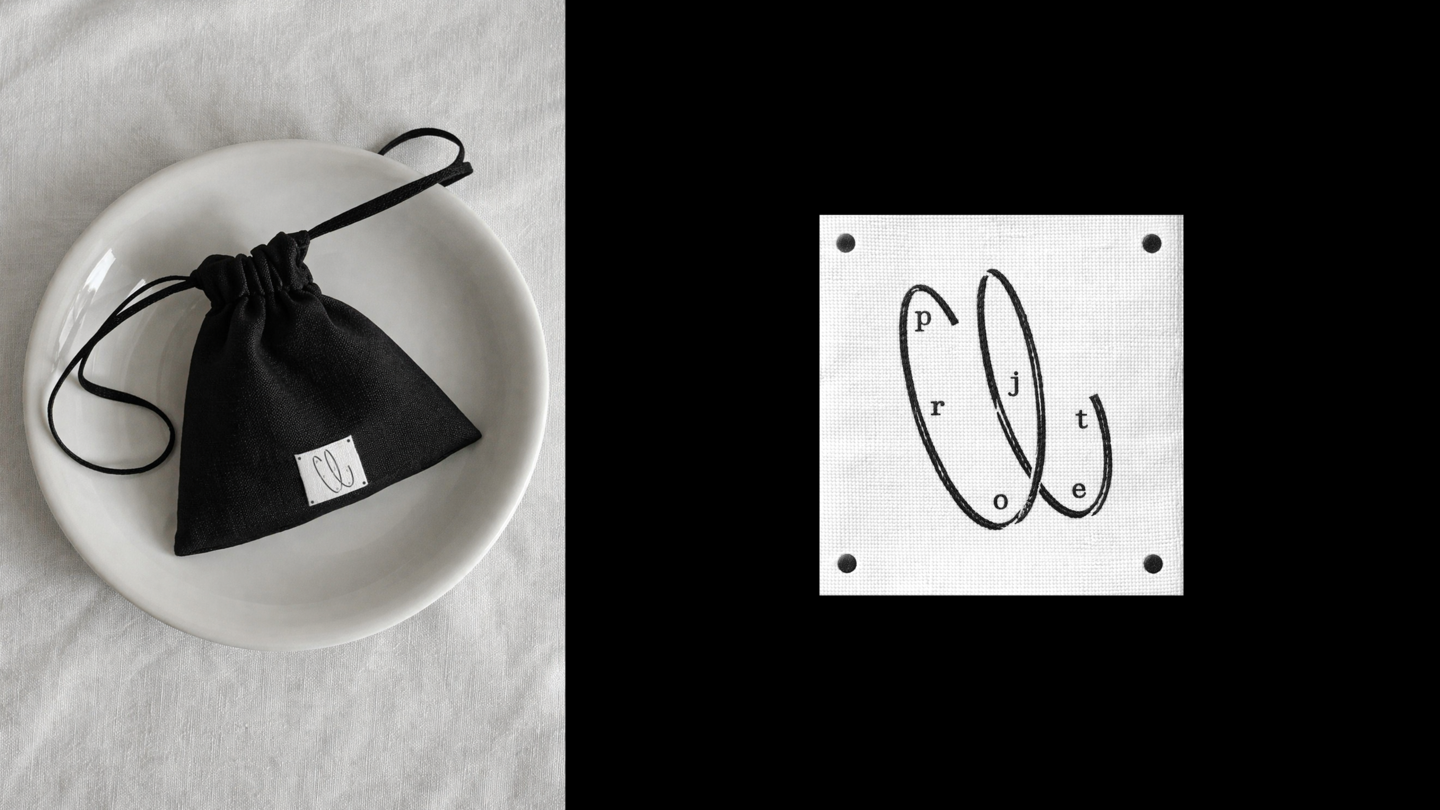
APPLICATIONS & OUTCOME
The knot motif, typography, and monochromatic palette create a cohesive identity across different brand applications.
case 3
ACRO CAMP
CONTEXT & CHALLENGE
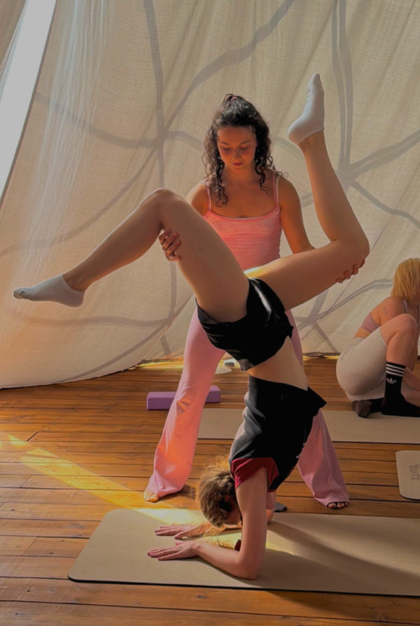
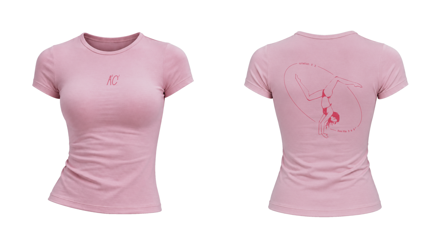
Acro Camp is a sports and travel camp for women, combining acrobatics, movement, and new experiences. The challenge was to create a distinctive and adaptable visual identity.CONCEPT
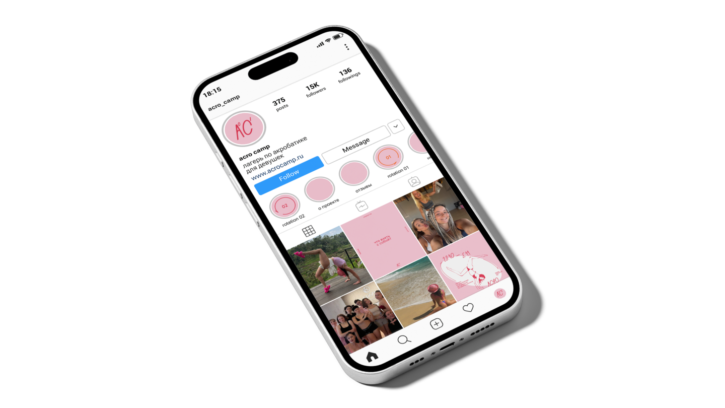
The 360° concept connects travel and acrobatics through the idea of changing perspectives. This became the foundation for a dynamic graphic language that reflects the spirit of the camp.
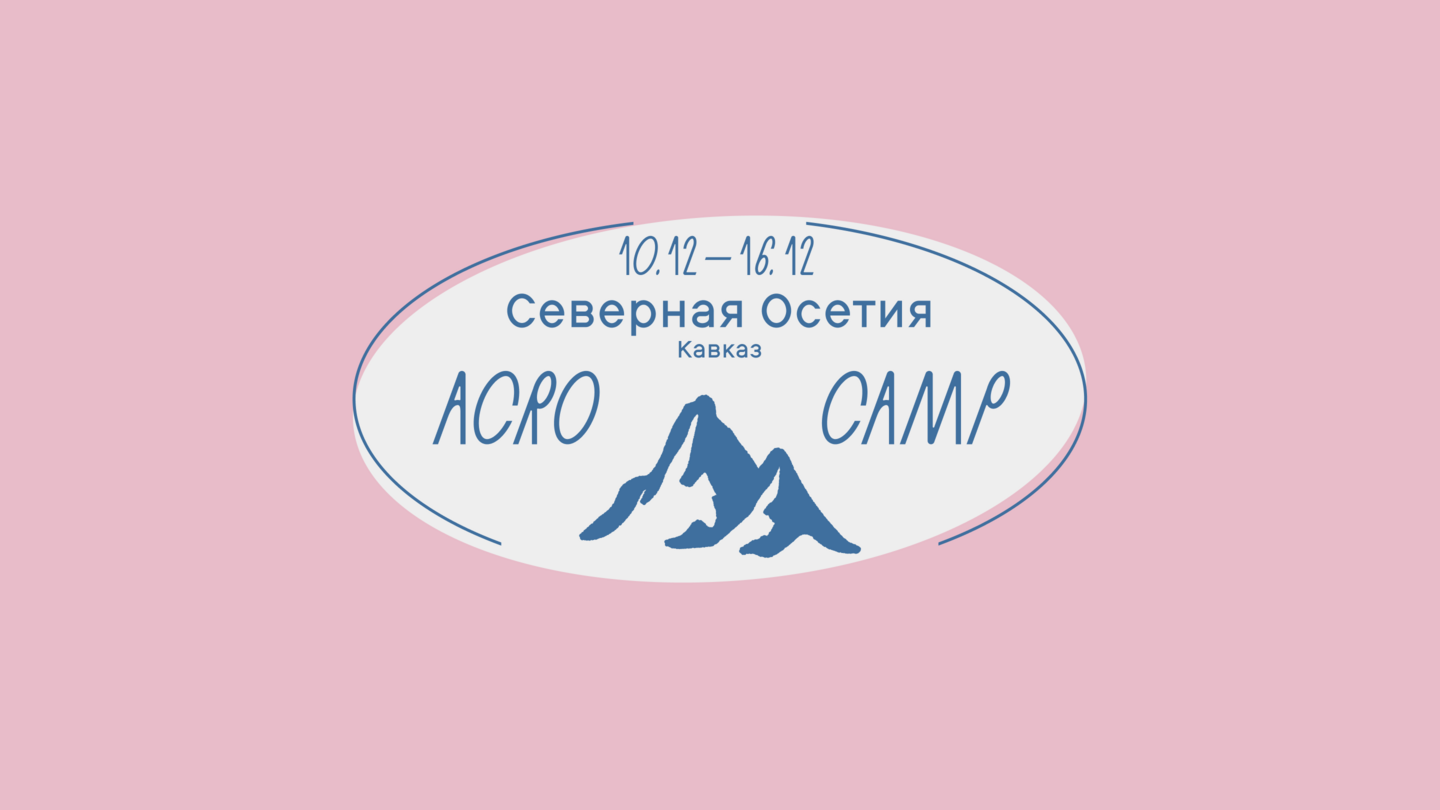
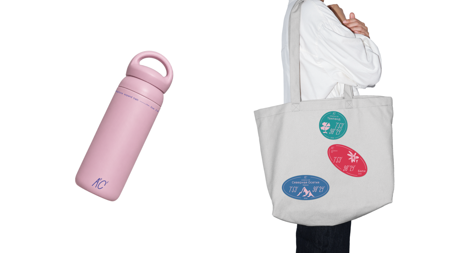
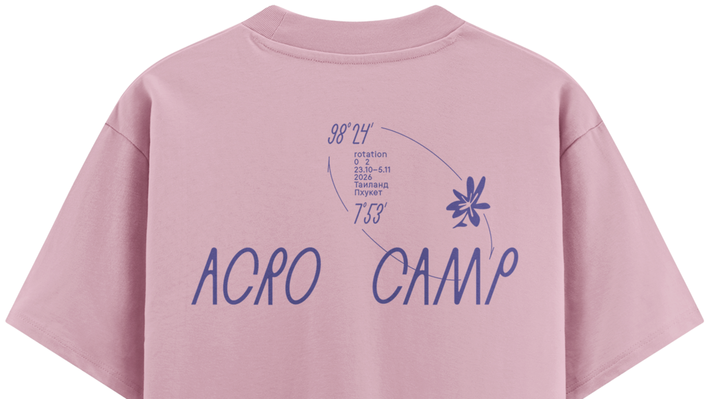
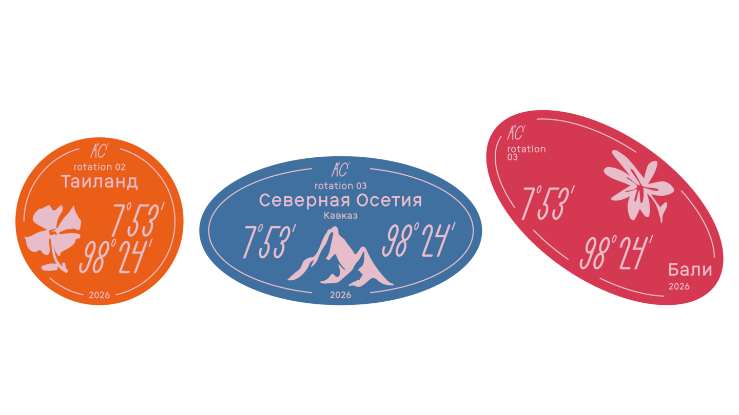
APPLICATIONS & OUTCOME
The concept was developed into a cohesive visual identity and applied across different brand materials for a real client.
case 4
KARANDASH FEST
CONTEXT & CHALLENGE
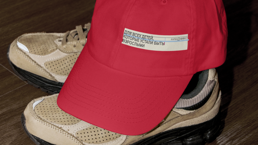
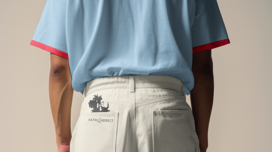
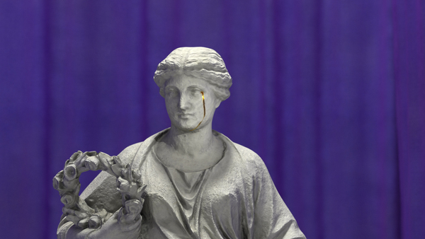
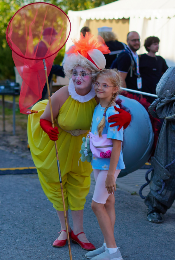
Karandash Fest is an annual summer festival in Staritsa, where the famous Soviet clown Karandash began his creative career. The task was to create a poster series that reflects the festival’s circus heritage.CONCEPTInspired by Soviet circus posters, the concept reinterprets the theatrical curtain through bold compositions and expressive graphics, connecting the festival’s history with a contemporary visual language.