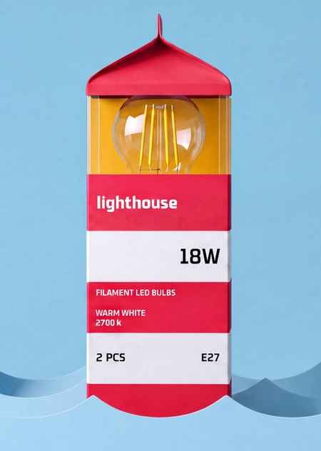
The core concept is based on the image of a lighthouse as a guiding beacon in the darkness. A light in a window is a familiar sign that helps you find your way to where you are expected—home. This idea has been translated into the very form of the packaging. Its silhouette evokes lighthouse architecture, and the lamp becomes the main element. It is situated inside the packaging while simultaneously forming its visual identity.
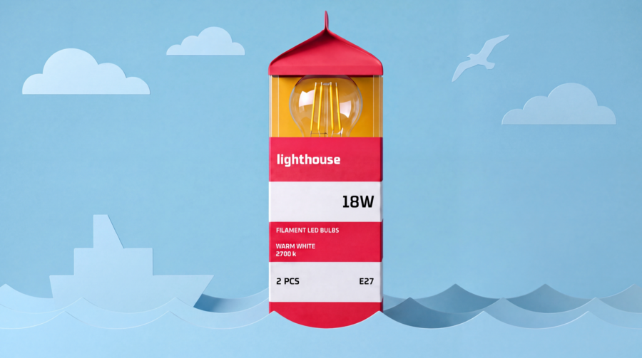

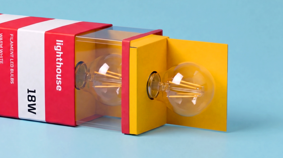
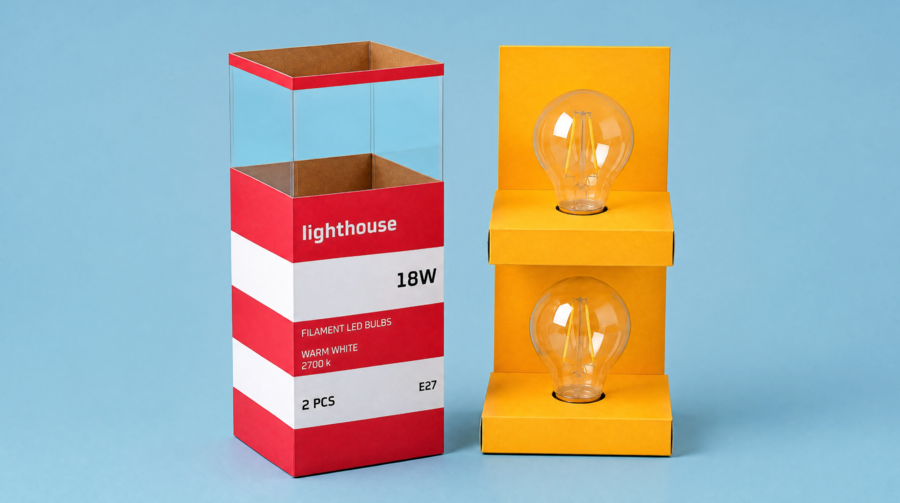
Color transforms into a navigational system. Warm light is denoted by the red series, while cool light is blue. This logic extends into the packaging, where color evokes the feeling of a corresponding light glow and helps users quickly orient themselves within the product line. Patterns and varied packaging formats unify different SKUs into a single system, preserving the series' recognizability and character.
Lighthouse transforms ordinary lamp packaging into a carrier of ideas. Light is needed not only to illuminate a space; it helps you find your way home.