As part of the work to update the visual language of the «Accond» brand, I developed three unique concepts, each of which reveals the history and product of the factory from a new perspective.
Concept #1
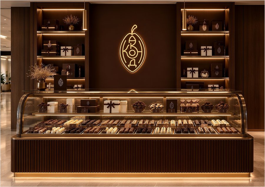
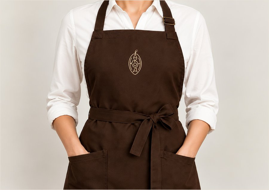
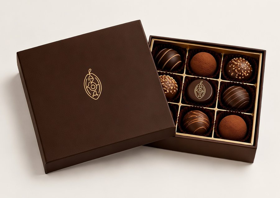
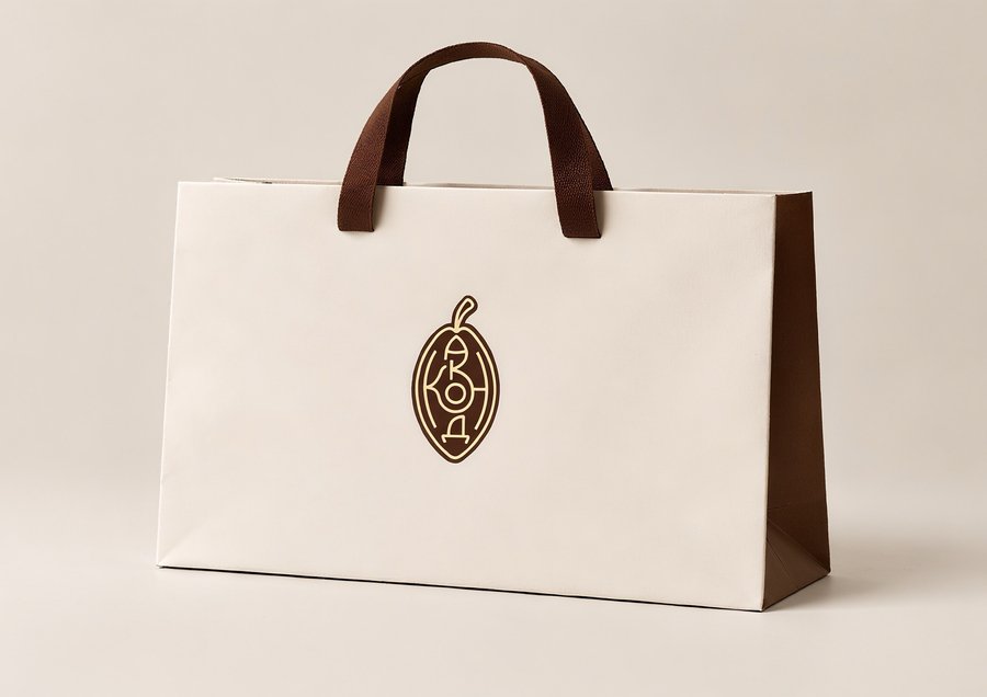
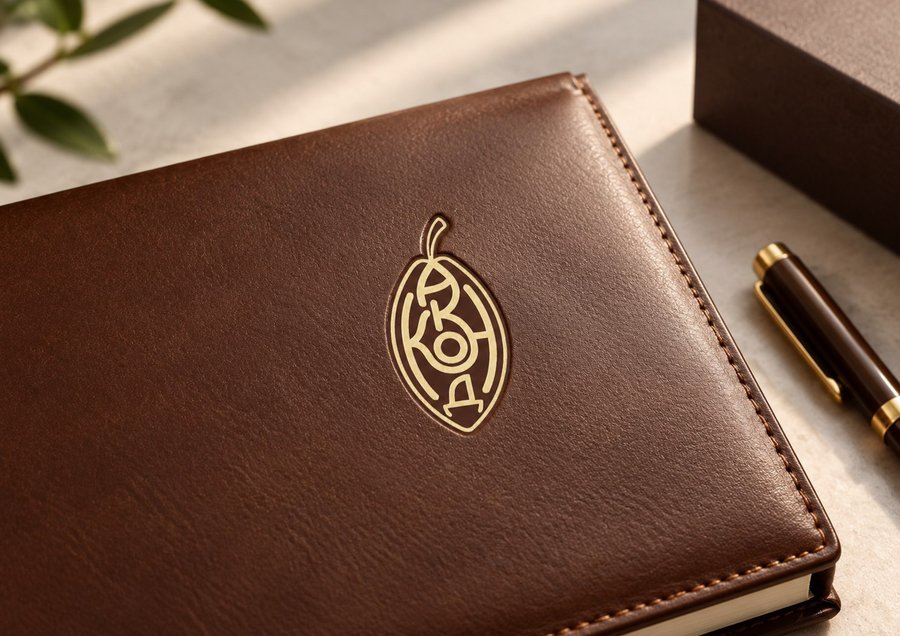
The «Nature of Taste» Concept
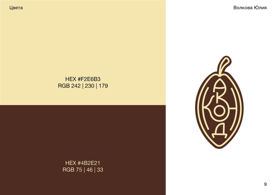
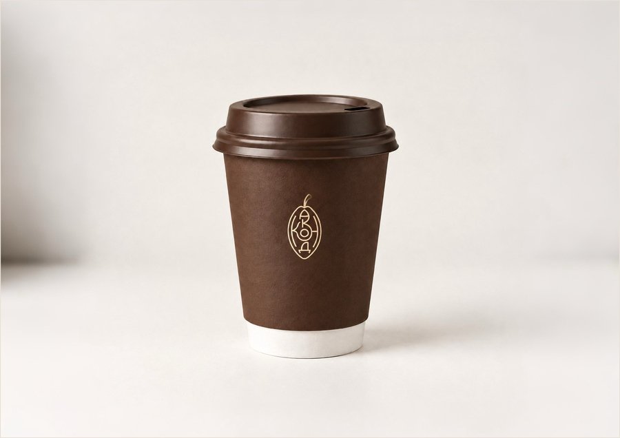
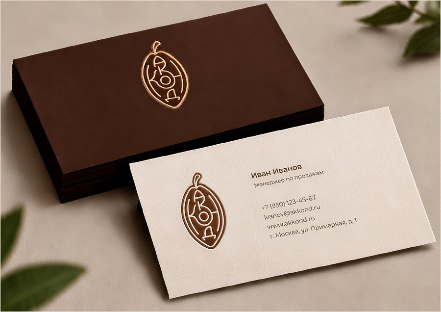
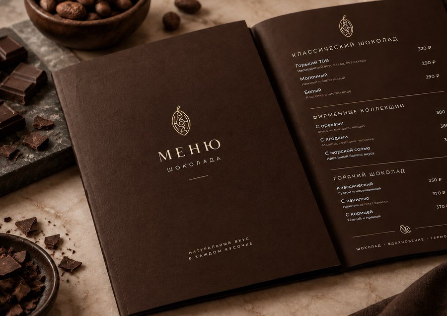
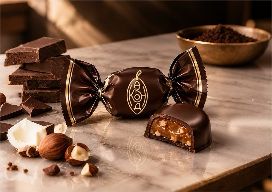
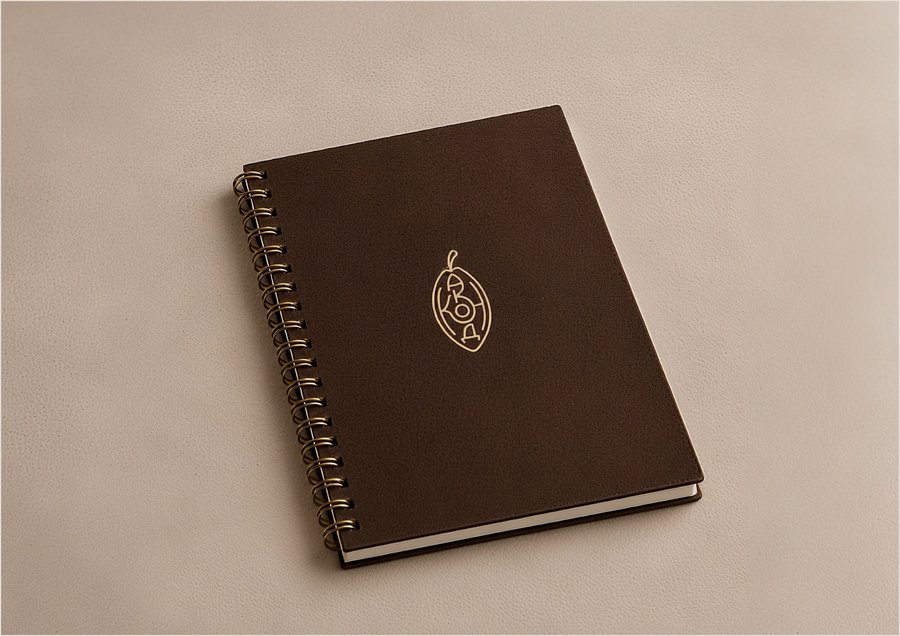
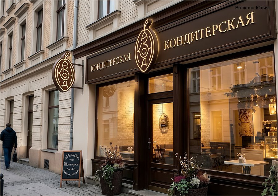
The initial concept is based on the fundamental origin of chocolate—cacao beans. The visual narrative is built around the textures and shapes of the cacao beans, emphasizing the naturalness and quality of the raw materials. This concept focuses on the product’s provenance, demonstrating that the journey to sweetness begins with a simple, natural ingredient.





Concept No. 2
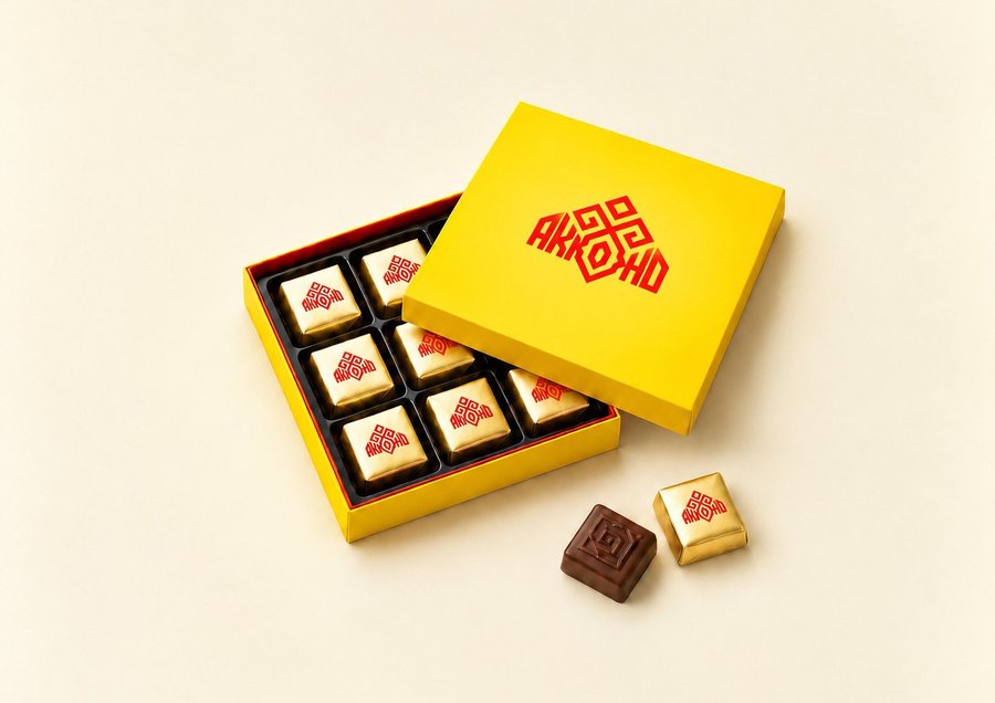
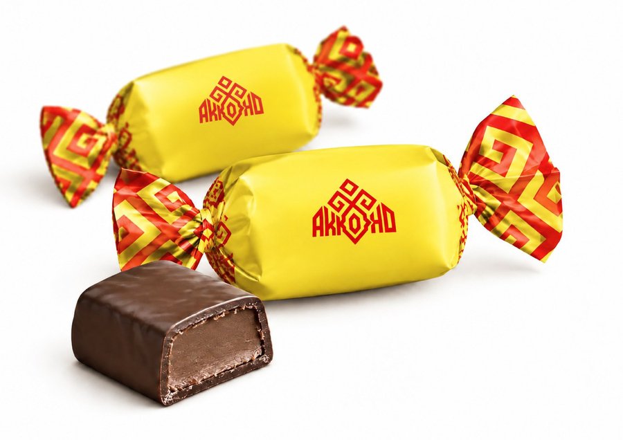
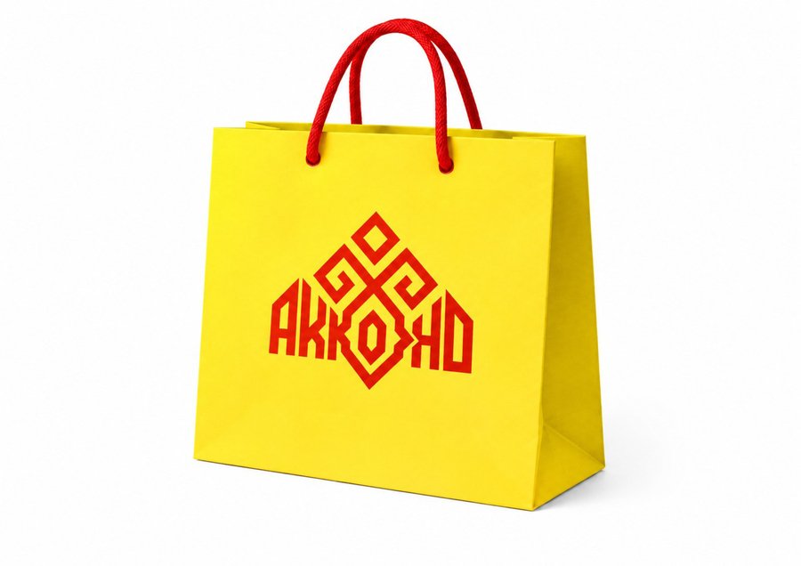
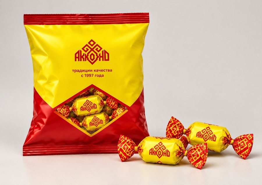
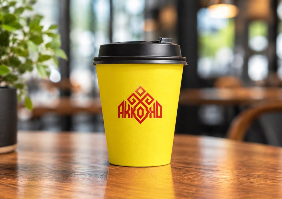
The «Cultural Code» Concept
The second concept grew from an in-depth study of traditional Chuvash ornaments and symbols, as well as the color palette of the Cheboksary city flag. Here, I integrated ethnic motifs into contemporary packaging, creating a link between the region’s historical heritage and a modern brand. This is not just decoration; it is a visual expression of love for the factory’s small hometown.

Concept No. 3
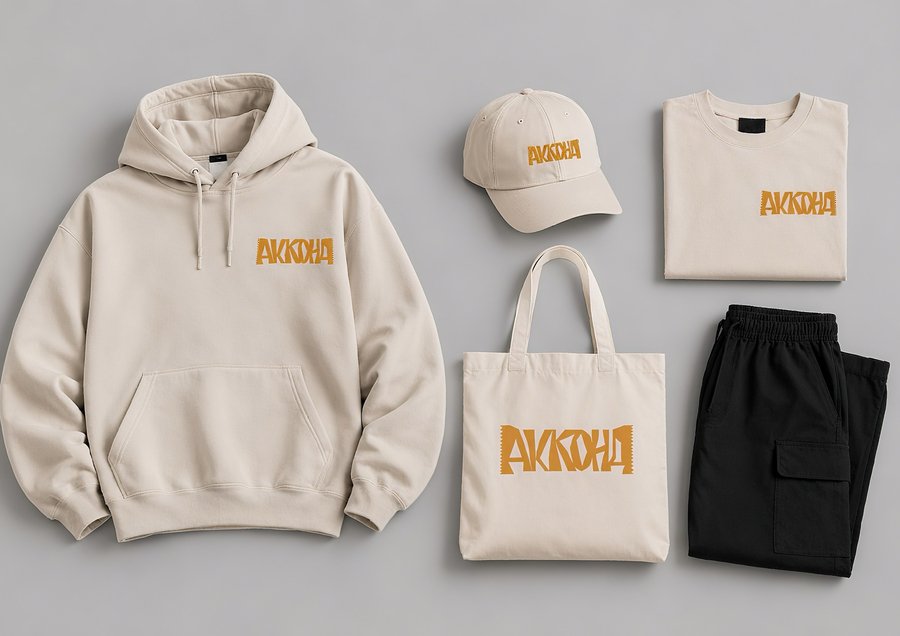
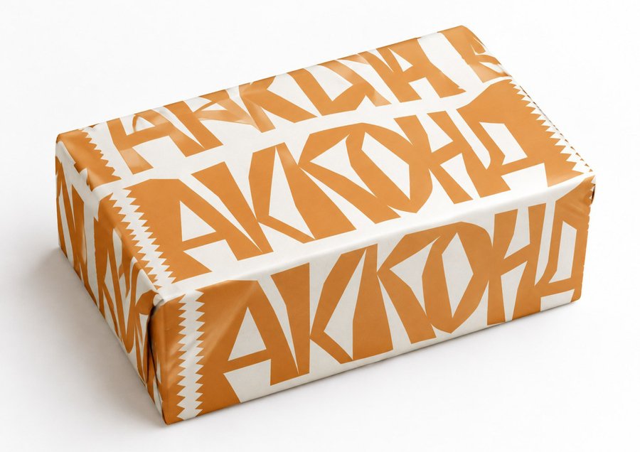
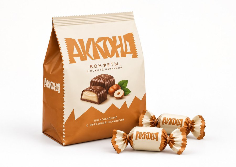
The «Geometry of Form» Concept
The third concept draws inspiration from the plasticity of the confectionery products themselves. The design is based on the shape of the candies and the characteristic «chiseled» edges of the packaging. This idea translates the physical properties of the product into a graphic language: sharp angles, dynamic lines, and rhythmic patterns that make the brand vibrant and memorable on the shelf.