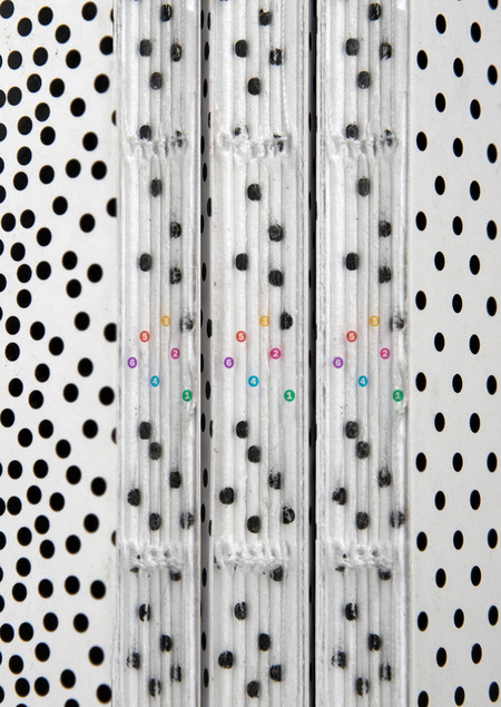
A publication that will help a young designer understand different printing methods and color models. It explains in simple language what moiré and stochastic raster are, assists in choosing the correct shade of gray, paper, binding, and much more.

From simple to complex
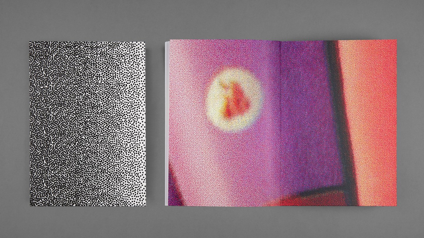
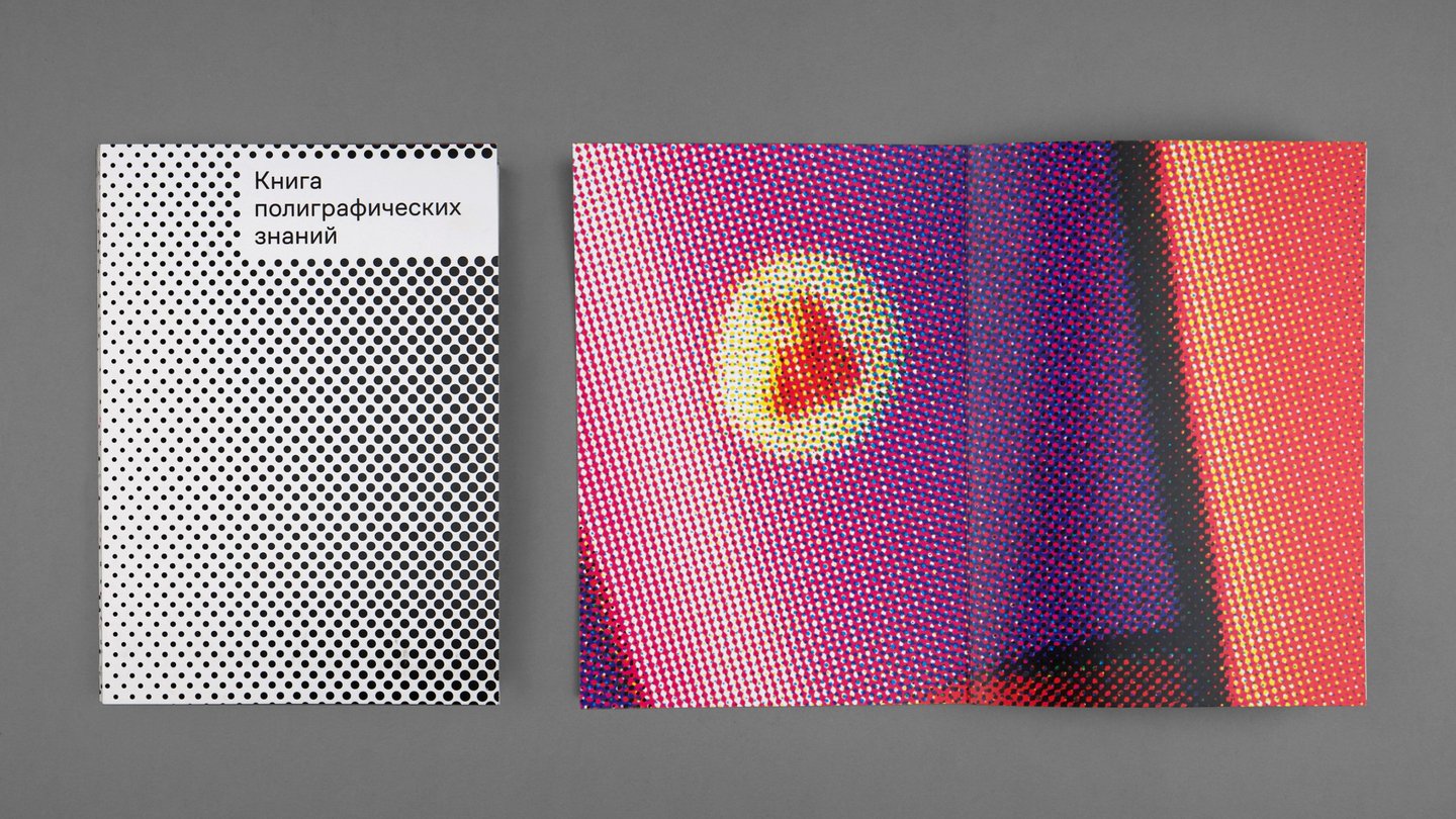
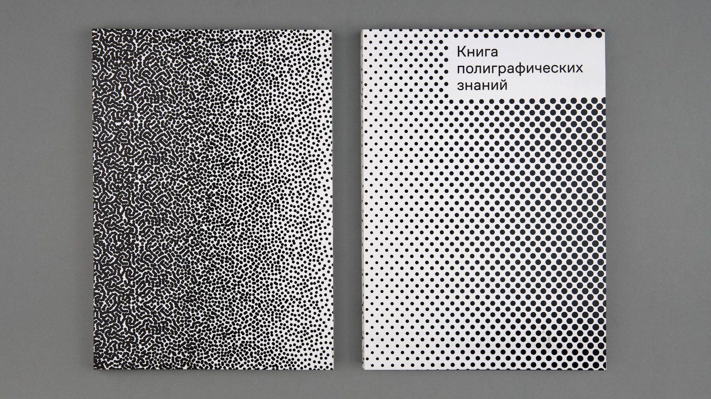
A regular raster is placed on the title page, and a stochastic one is on the back page.
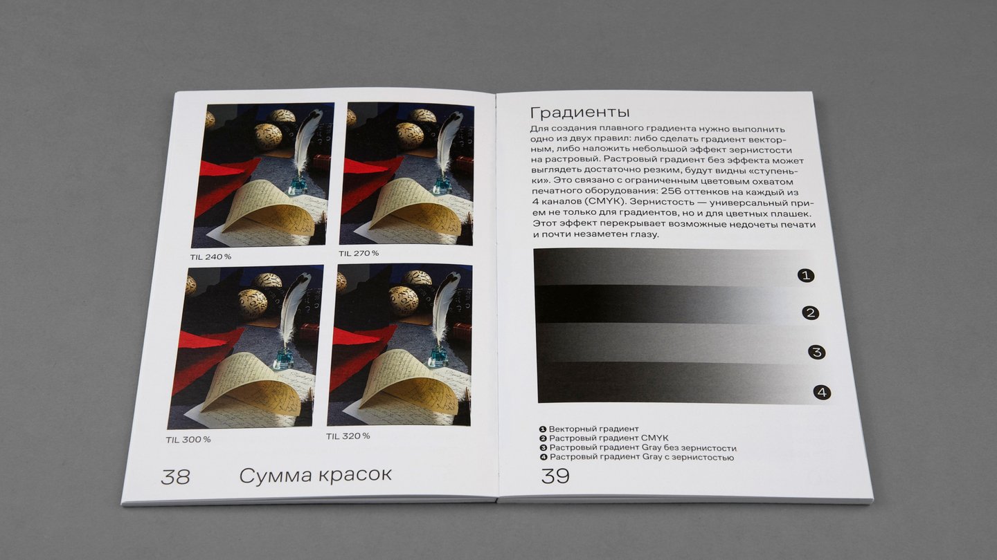
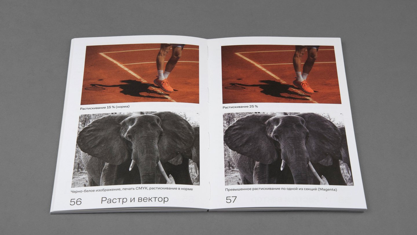
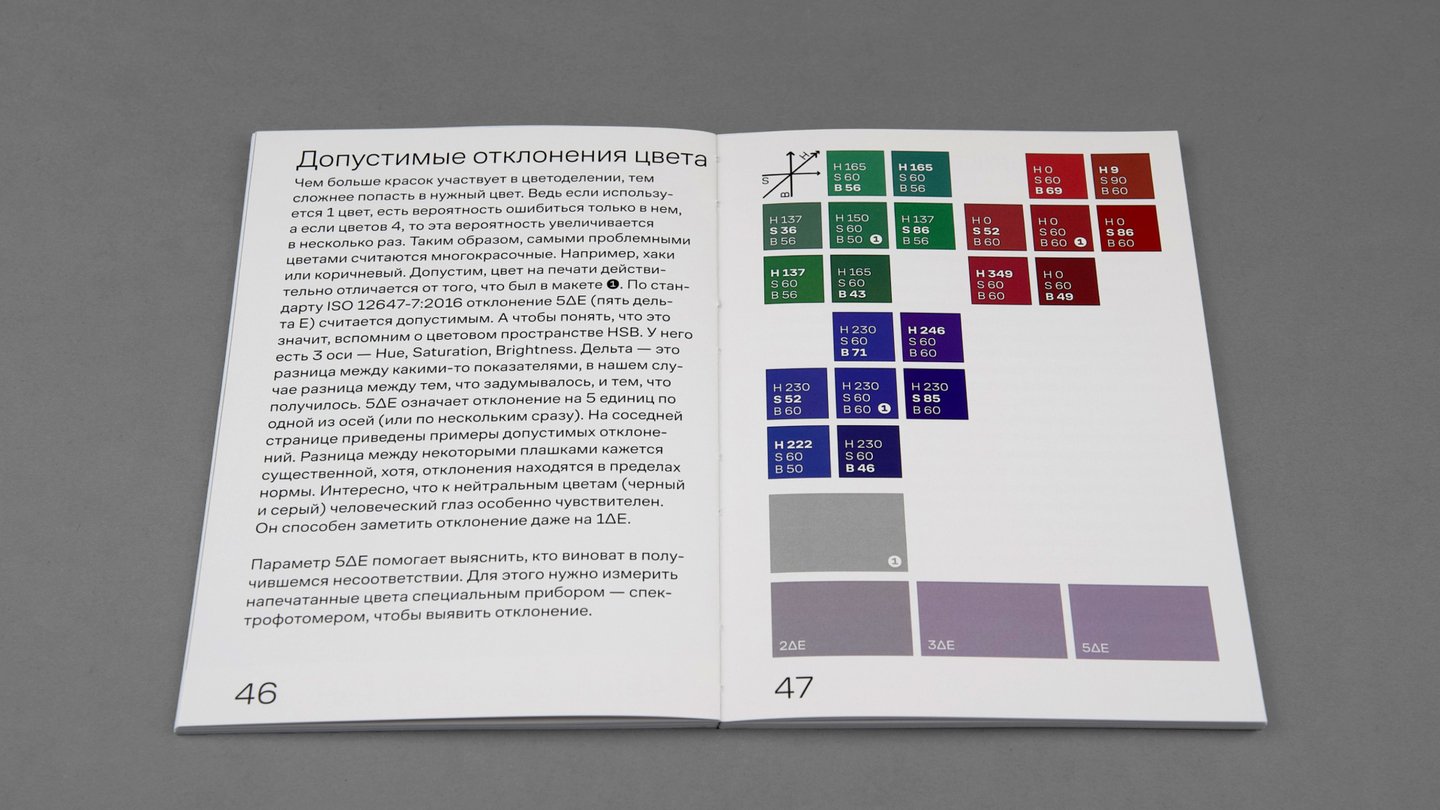
The book’s uniqueness lies in its visual clarity—every case is illustrated through practical examples. For instance, one spread in the book compares images using different line weights and various raster types.
Furthermore, the book is printed using different papers and printing technologies: most of it is printed on a digital machine, while selected chapters are printed using offset printing with Pantone colors.
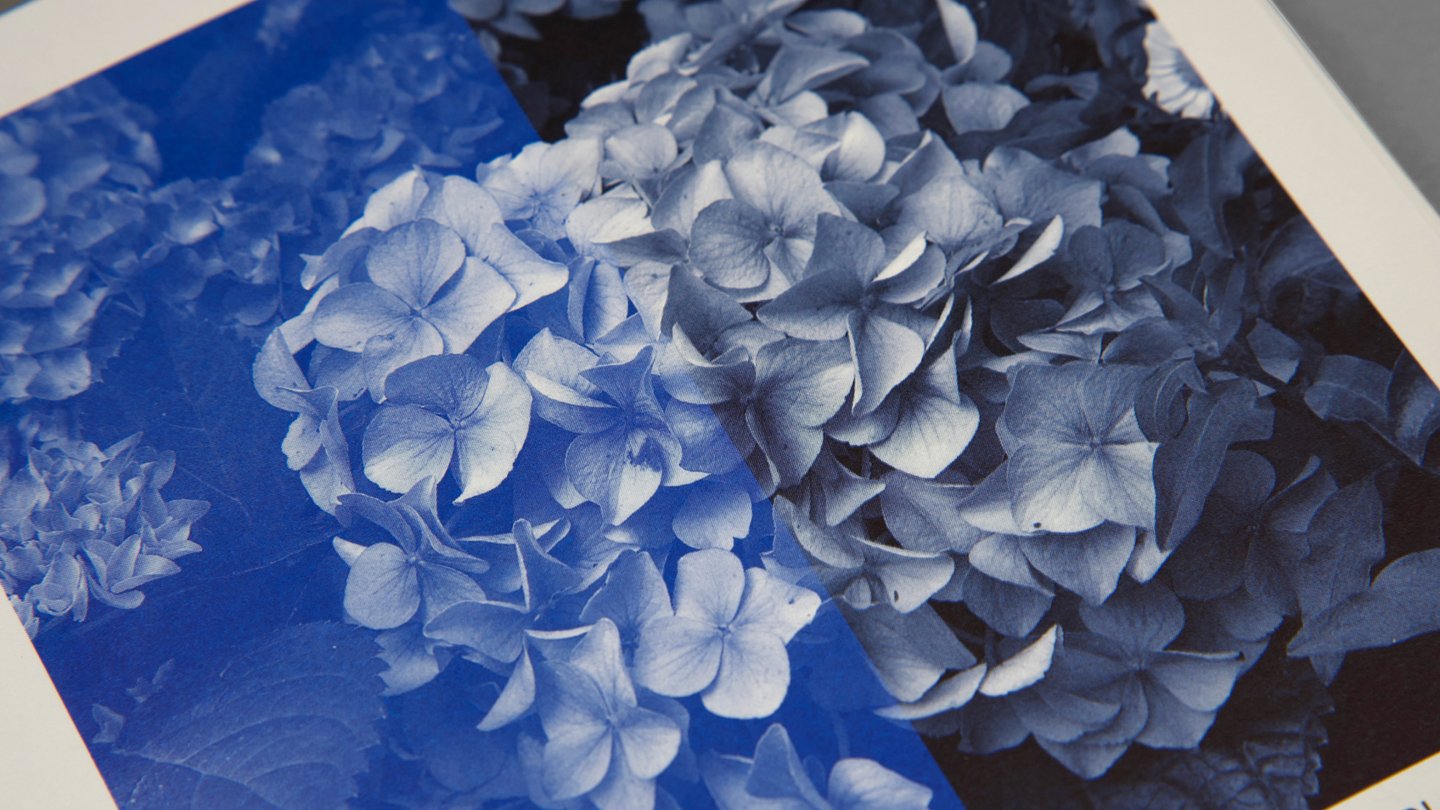
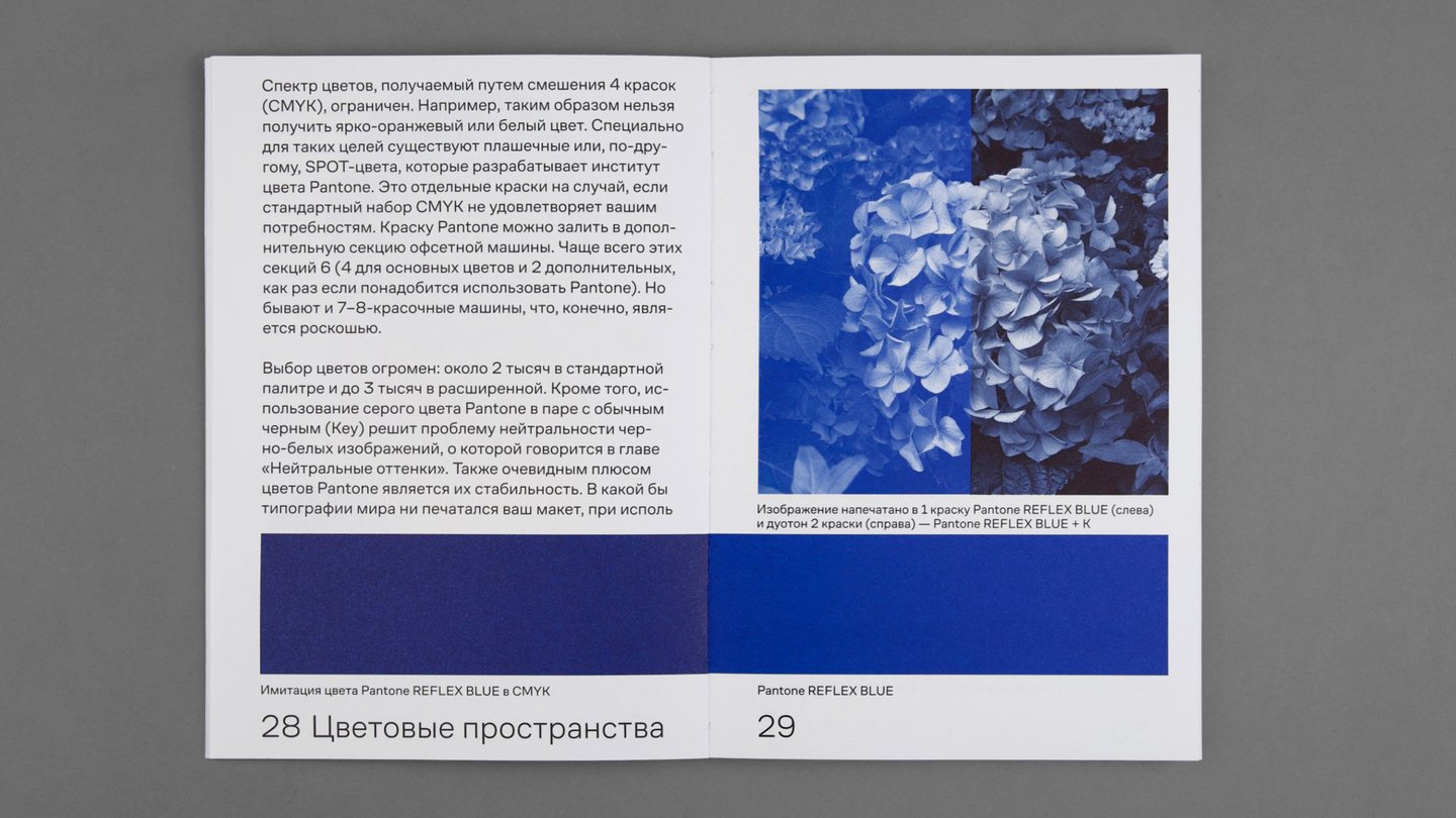
Offset Printing / Digital Printing
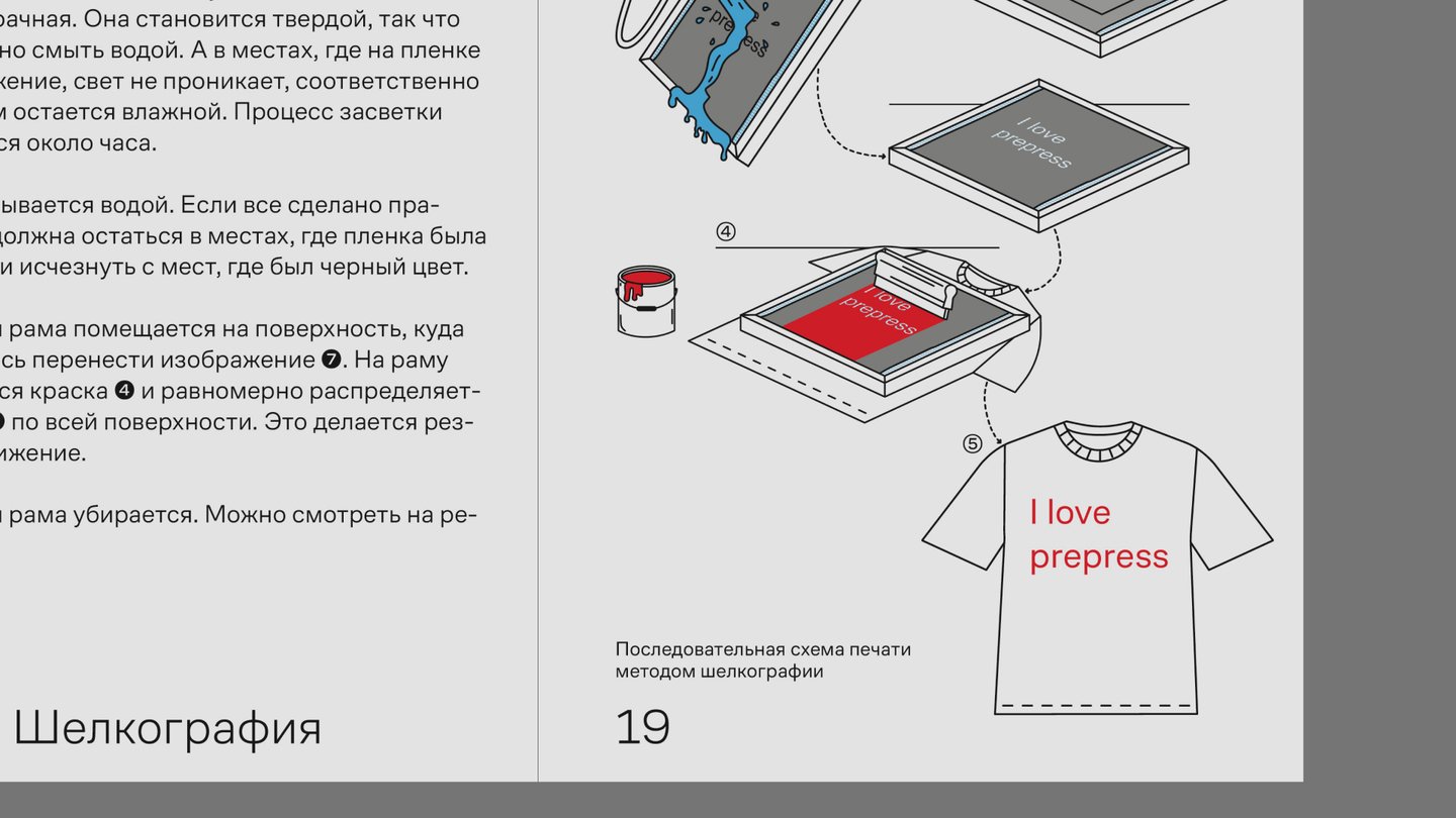
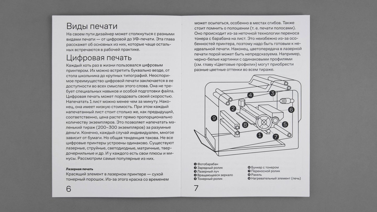
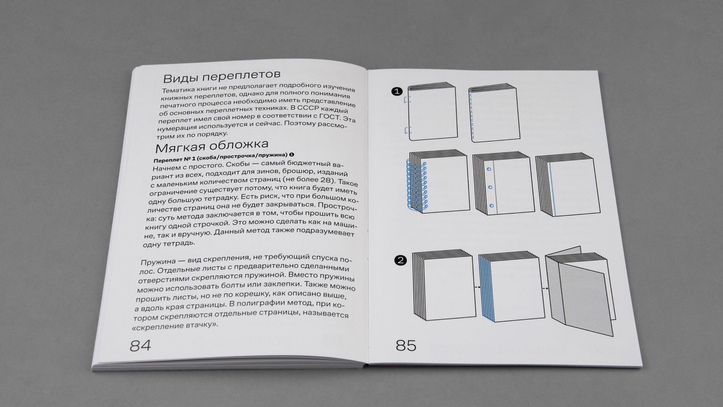
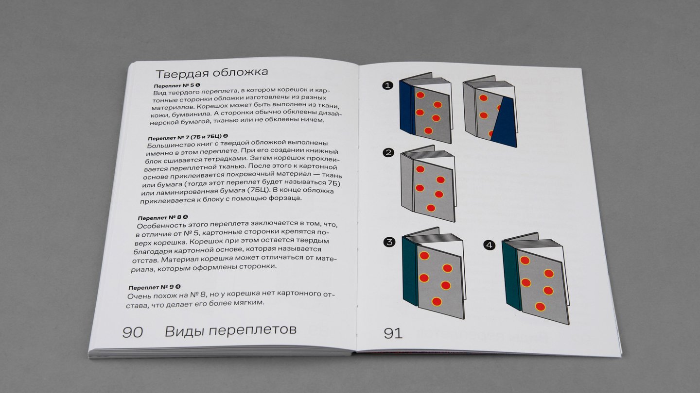
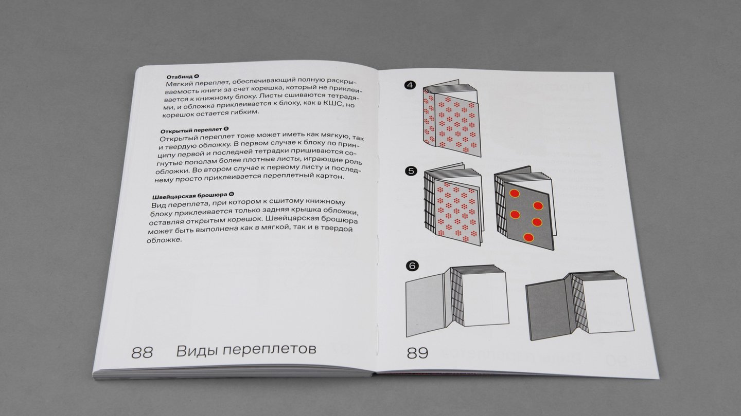
All illustrations and schematics of printing processes were hand-drawn specifically for the book.
All illustrations and printing process diagrams were hand-drawn specifically for the book.
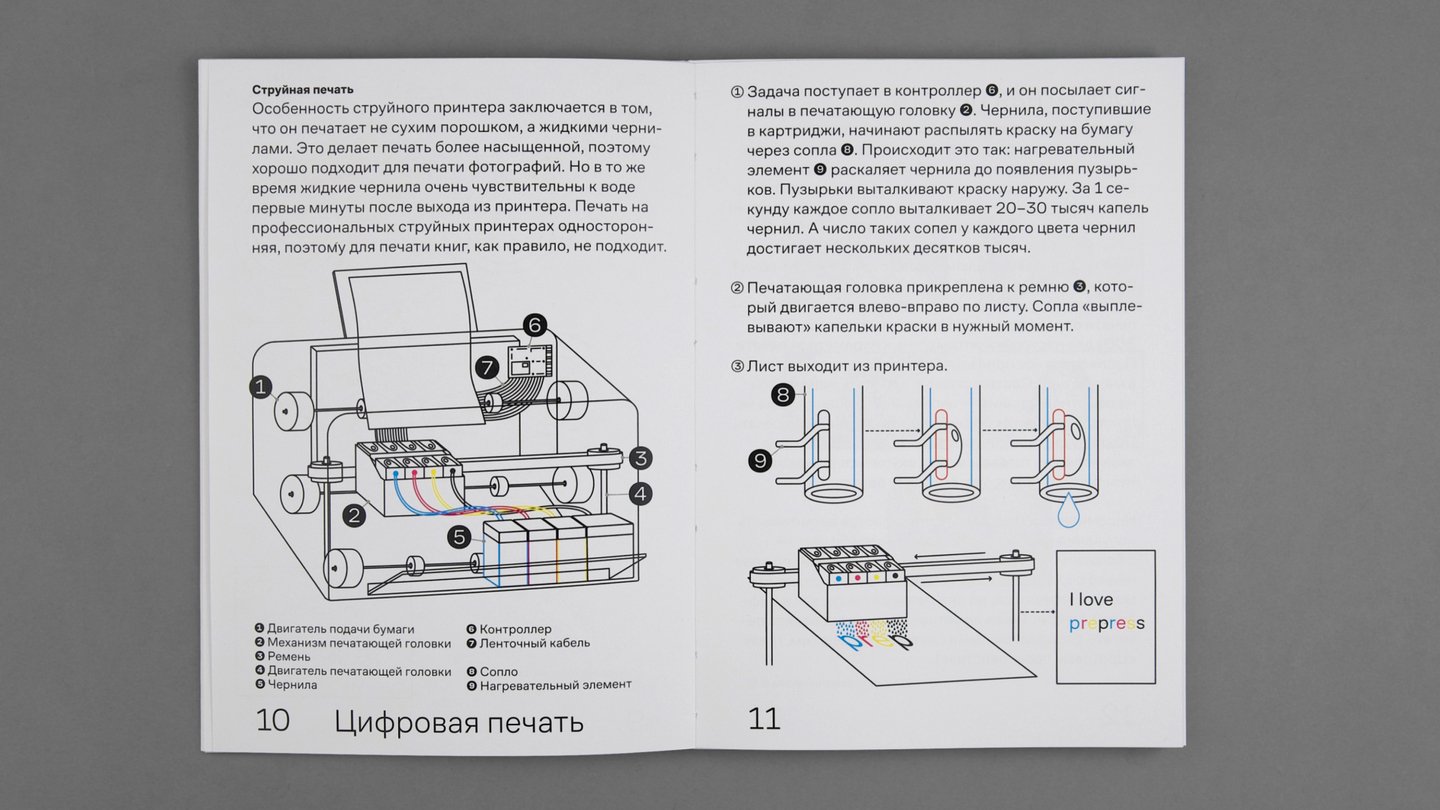
To showcase a broader range of printmaking techniques, the book includes postcards featuring silkscreen, inkjet, risograph, and specialty paper printing.
The insert designs were created by other designers in a freeform style to support the visual research format, presenting illustrative material as seemingly random snippets from unknown mockups.
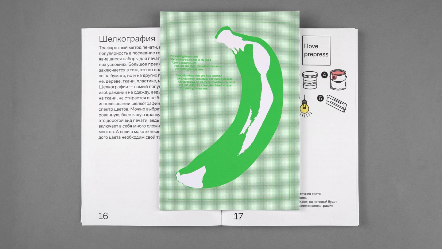
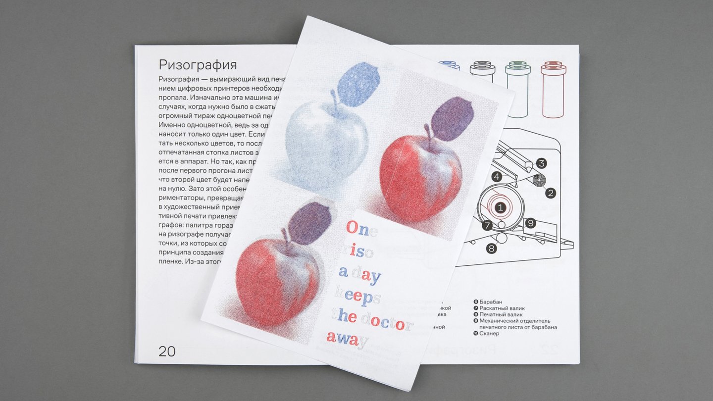
Rizography: Snezhana Gireva Silkscreen Printing: Lyosha Yelshin
Inkjet printing, photo by Pavel Khazanov
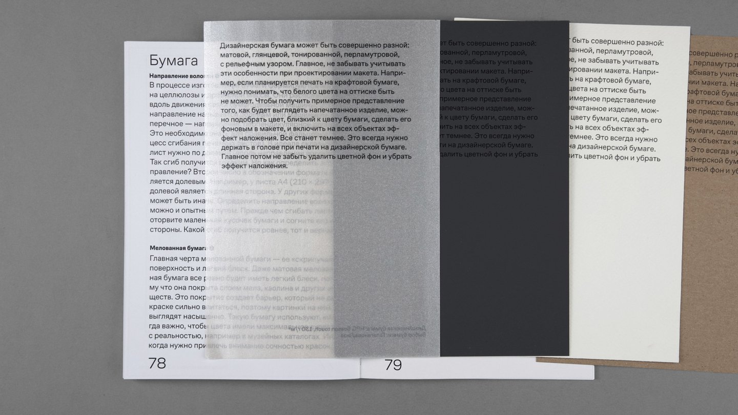
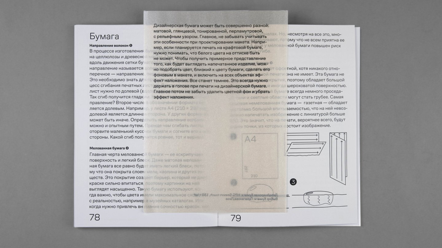
Design Paper, Paper Selection: Liza Galaganova
I would like to express my deep gratitude to Paul Khazanov, Igor Mozheiko, and Evgeny Grigoriev for the time and effort you invested in this book;
Snezana Gireva and Lyosha Yelshin, my favorite designers, for developing the layout design;
Gleb Kulik, my favorite programmer, for realizing my ideas into the website format, as well as for checking the texts for common sense at any hour of the day or night;
Alexandra Sukhorukova for assistance with the book photoshoot;
To all friends and loved ones for their moral support during the difficult period of working on this project.
I would also like to thank the Contrast Foundry typeface studio for providing a beautiful font for the project, and the printing houses «NP-Print» and «Gallery of Print» for their help in realizing the project.