Navigation
1. Visual Research Concept 2. Typeface Usage — Motter Tektura — Apple Garamond — Myriad — San Francisco 3. Conclusion
The history of typography in Apple’s identity is a crucial part of shaping the brand’s identity and its underlying philosophy of design. Typography has helped forge a unique visual language that sets the company apart from its competitors. The use of various typefaces and experimentation with them have been instrumental in creating an instantly recognizable corporate image—a face associated with quality and innovation, and one that builds consumer trust.
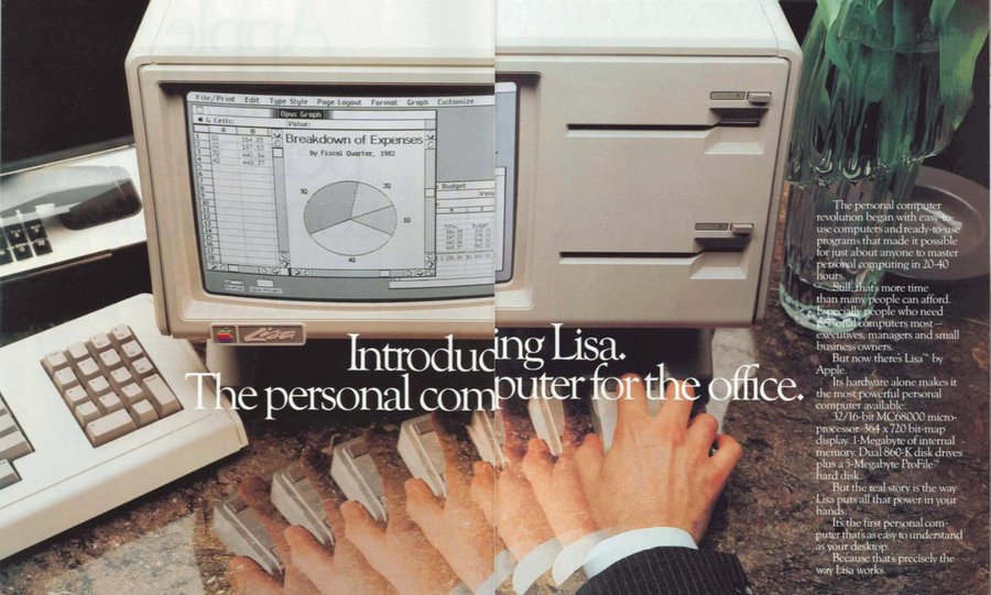
Brochure «Apple Invents the Personal Computer,» 1983
Due to changes in typography, the company’s language of communication evolved. In this research, I will examine the formation of Apple and why the company has used the San Francisco typeface for the past 11 years—specifically, why it became the foundation and remained unchanged for such a long period.
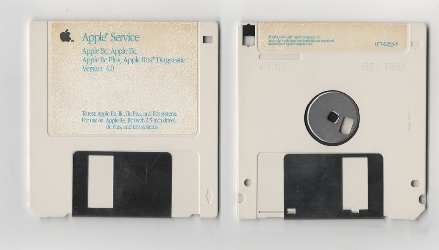
Apple Service — Apple IIe, IIc, IIc Plus, IIgs Diagnostic Version 4.0 (1989)
Apple became an example of the philosophy of minimalism and purity in design. What was especially important was showing the consumer the product’s clarity and accessibility. I will take a specific aspect—how typography was used in the identity, on advertising materials, packaging, brochures, posters, and typographic logos. It is important for me to study the typefaces, their placement, and size on the various media. Is it a serif or a grotesque, is the text barely noticeable, or does it «speak loudly»? Do they look high-contrast, or do they fail to draw attention?
Ken Cosienda, a lead software development specialist at Apple, noted in his book, «We felt that applying a strict methodology could stifle the very innovation we aim for. Our approach stems from the work itself. It moves top-down, originating from the unquestionable authority and uncompromising vision of Steve Jobs.»
Imac Advertisement, 2000
This is important to note because the evolution of brand design has never stopped and has always been changing. The lead specialist also highlighted seven elements that aid in developing new discoveries and which the Apple team used to guide their font selection: Inspiration—thinking big. Collaboration. Professional Mastery—applying skills to achieve high-quality results. Diligence. Decisiveness. Taste—sensitively perceiving nuances and striving for balance. And Empathy—creating what others need. I believe this is important to point out because these values will guide the selection of the company’s primary typeface.
In the visual research, I will examine which typefaces the company used, where they appeared across various media, and how the typography reflected the company’s values.
Why precisely typography—I want to examine it within Apple’s visual language. As Alexandra Korolkova noted in her book on typography, «Typography is not a mechanical arrangement of elements, but a living synthesis. It absolutely requires the involvement of a human and their aesthetic sensibility.» We will begin the history of typefaces in 1975 and extend it up to the present day, 2025. I hope this visual exploration will help the reader consider the visuals and understand the brand’s character and values from the perspective of different typefaces.
2. Typography
Motter Texture 1975–1984
Before the first Macintosh was created, Apple used the Motter Tektura typeface in its company logo and advertising materials. It was designed by Austrian designer Otmar Motter in 1975 and was applied not only in Apple’s advertising but also for Reebok. It suited the clear image of technology and innovation.
Apple Magazine, Volume 1, 1979
Apple Computer Inc. Logo, 1979
Interestingly, the apple bite in the logo was originally designed specifically for the Motter Tektura typeface. However, a consistent typography was not yet established; sometimes the font would disappear and be replaced by completely different ones that were not corporate standards, such as in Apple V1N1 magazine from 1979, though it occasionally appeared in brochures and instructions. It was primarily used for headlines. The focus was placed on visual technologicality.
Apple V1N1, 1979
Apple V1N1, 1979
Apple II Diskware, 1982
Apple Garamond 1984–2002
Apple Website, 1997
In 1984, Apple introduced a new proprietary typeface. This was connected to the launch of the first Macintosh 128K. The font was named Apple Garamond. In reality, it was a reinterpretation of the classic Garamond, but it featured a narrower form and a tall crossbar. The famous tagline, «Think different, ” was set using this very font.
Journal Introducing The Apple IIGS, 1986
iMac Brochure, 1998
Initially, ITC Garamond, designed by Tony Stone in 1977, was reduced to 80% of its standard size. The American typeface development company Bitstream narrowed the font width and made subtle adjustments to the outline. The typeface became recognizable and was used by the company for a long period—about 18 years—until the introduction of Myriad Pro.
iMac Snow Advertisement, 2000
Macintosh Advertisement, 1984