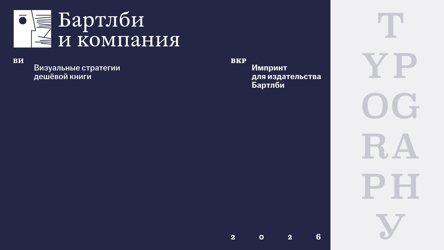
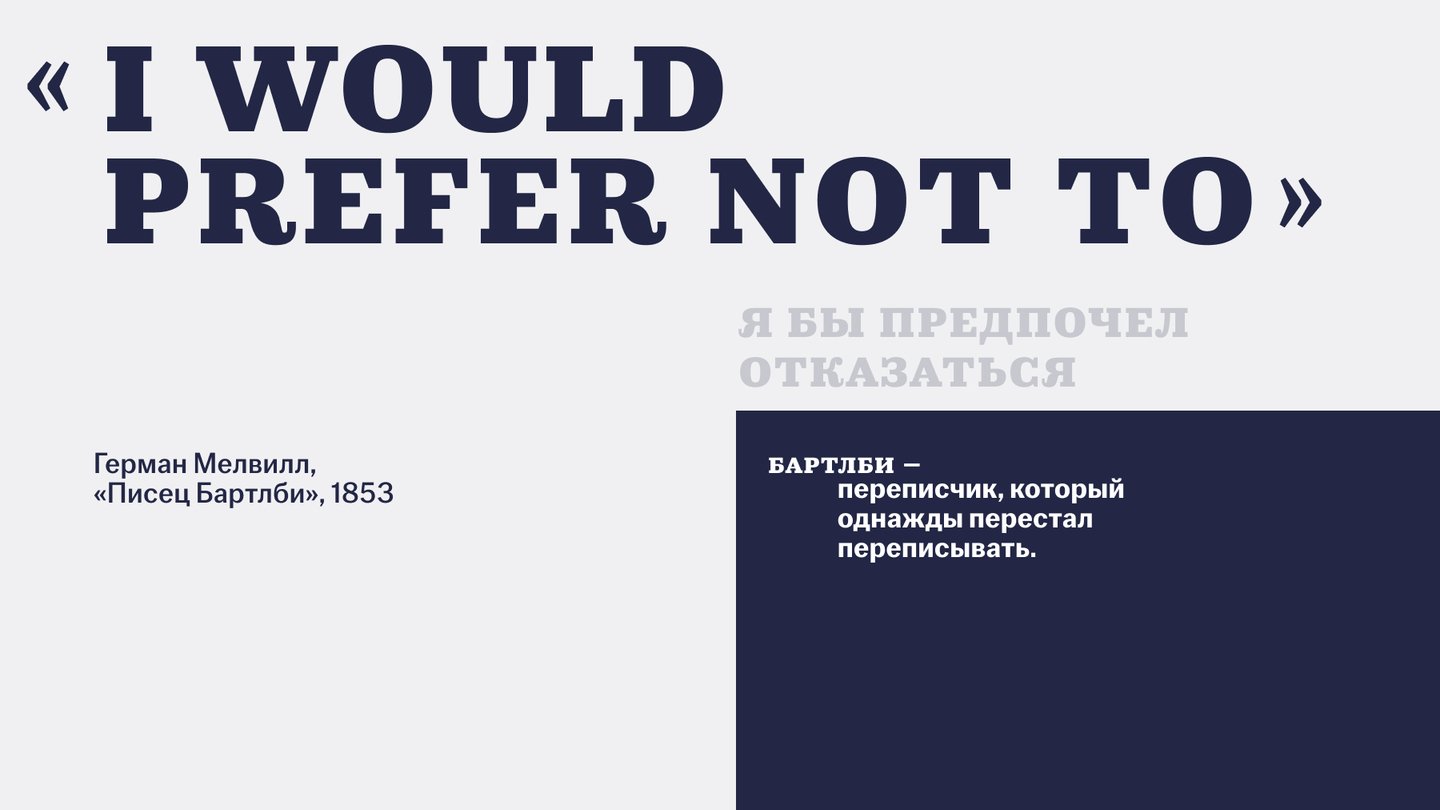
The company name is a tribute to Melville’s enduring novel, «Bartleby, the Scrivener,» and its numerous interpretations.
Concept
Imprint for «Bartleby & Co.» Books by peripheral authors. Extremely inexpensive. This means my job is literally to choose not to.

Each interpretation of Bartleby found something unique in his refusal. Imprint is another interpretation.
How does the design of a cheap book work with its low cost? What paper, printing, binding, and typographic solutions are employed? And why are some choices perceived as poverty while others read as style?
Cheapness, by itself, does not determine how a book will be perceived. It determines how the designer handled that cheapness. That is the main point.
World Literature — an Uneven Space
Authors from the periphery have the hardest time reaching readers: they are less translated, published less often, and when they are published, it is in small print runs.
For these books to reach the reader, they must be affordable. Therefore, cost-saving here is not a limitation—it is part of the concept: accessibility is the imprint’s core stance.
A book appears poor not when it lacks resources, but when it conceals their shortage. Frugality, elevated to a rule or displayed as it is, becomes a statement.