Аs an alternative musician and designer, i’ve noticed that a strong, distinctive sound often goes unnoticed simply due to a lack of precise visuals.
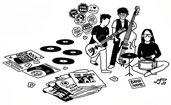
We tend to think that people evaluate only the tracks themselves, but in reality, their introduction to a project begins with its cover art and merchandise.
In my experience, music and its visual identity should form a cohesive whole.
To confirm this and gain a better understanding of the barriers within our local scene, I conducted a survey among musicians, creatives, and the audience.
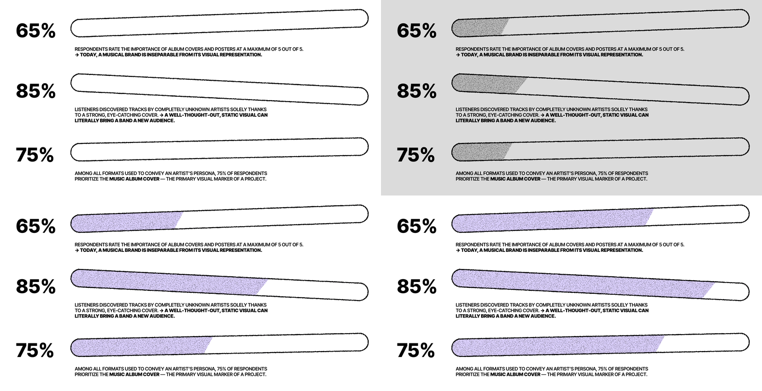
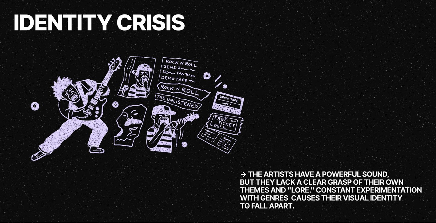
An analysis of the detailed responses revealed that independent artists experience two opposing states that hinder them from building a strong brand:
My approach begins with an audio analysis.
I break down a track into its sonic structure,
frequency vibe, rhythm, and the lyrical meanings
embedded within it.
→ Synesthesia allows me to translate abstract sound waves into concrete visual parameters: shape, contrast, typographic principles, and color palette.
Nowadays, there’s an abundance of disposable visuals all around. My choice is to build a strong foundation: logos, covers, and merchandise.
→ Key elements of the brand identity work effectively on physical media, evolve into iconic merchandise, and establish a visual «anchor» that remains intact even when the band shifts its musical direction.
The process of working on the project:
To show how this method works in practice, let’s look at two examples. In the first case, I acted as a brand strategist and developed a style from scratch, while in the second, I helped bring an existing concept from a group of experienced musicians to life.
01
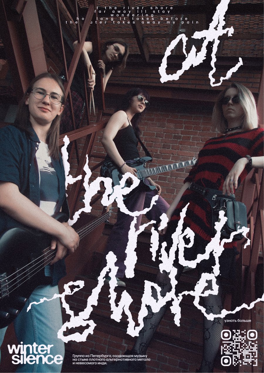
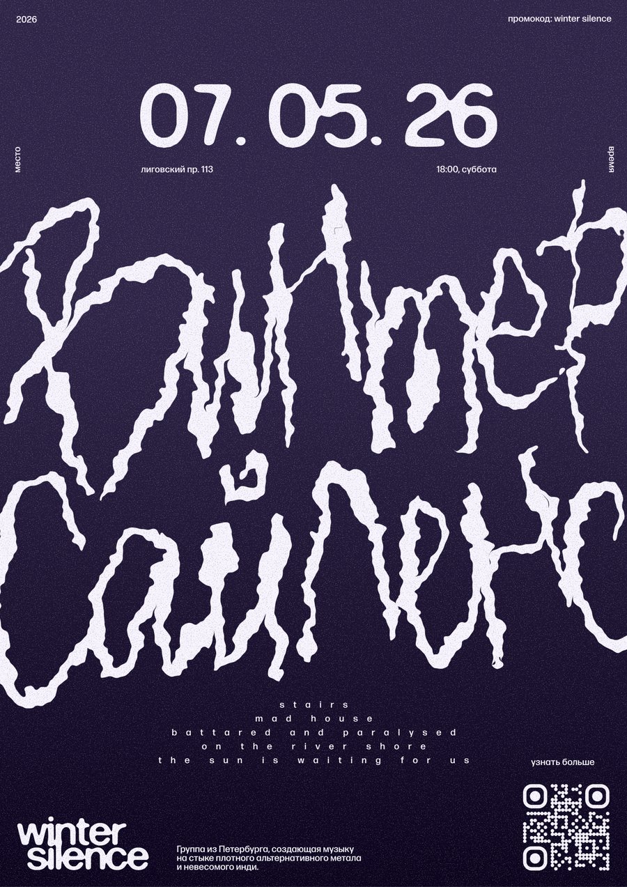
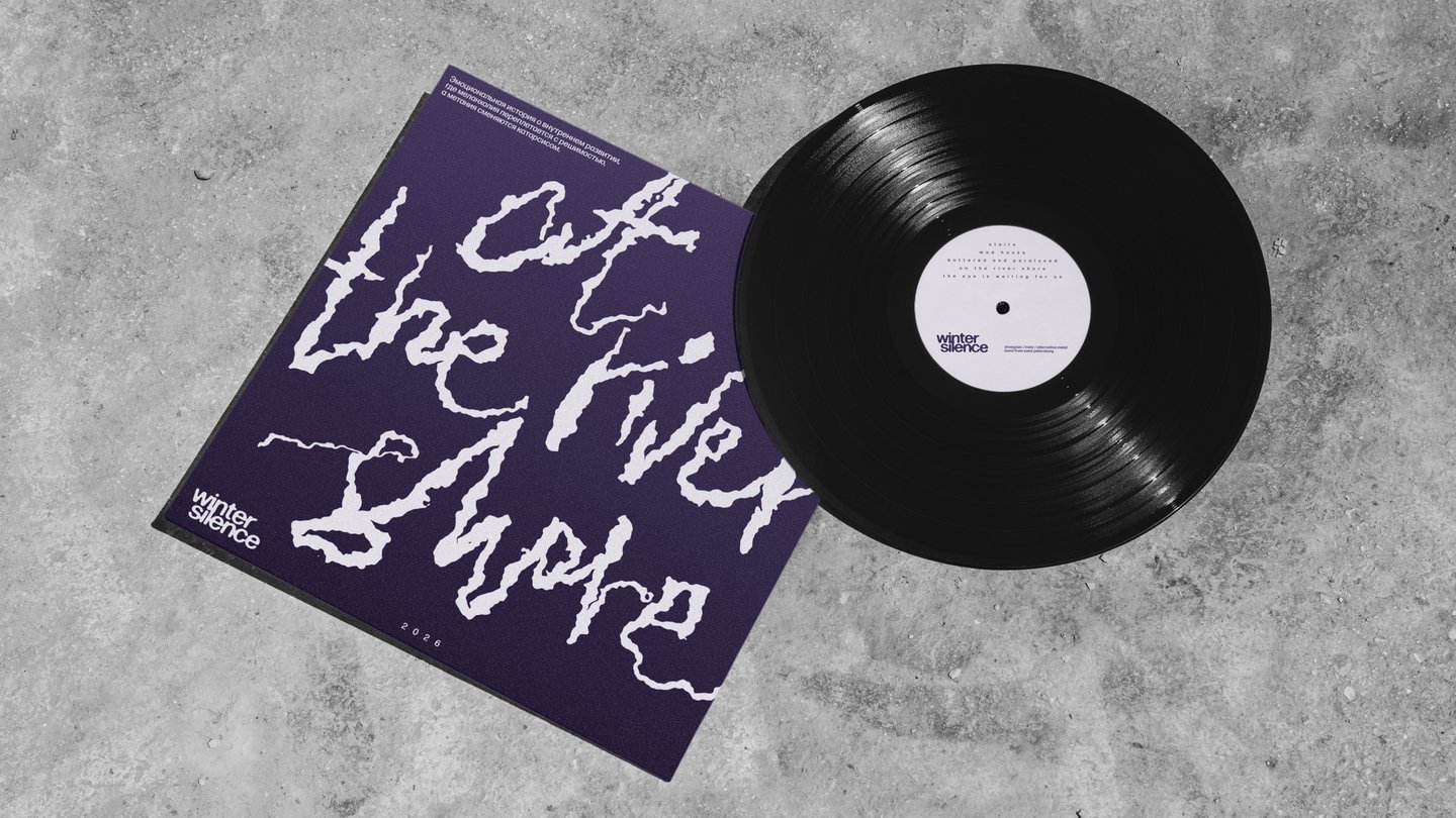
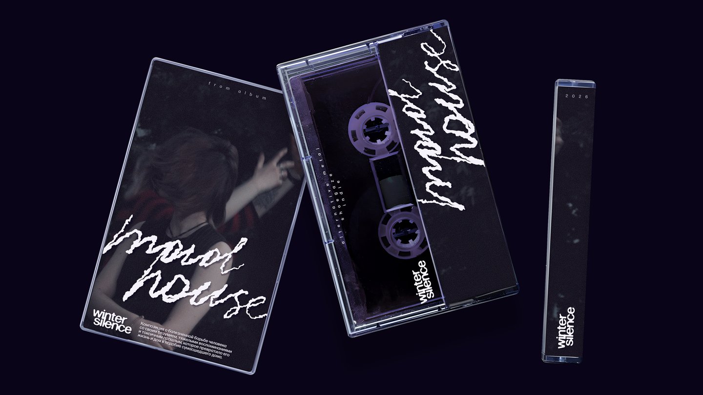
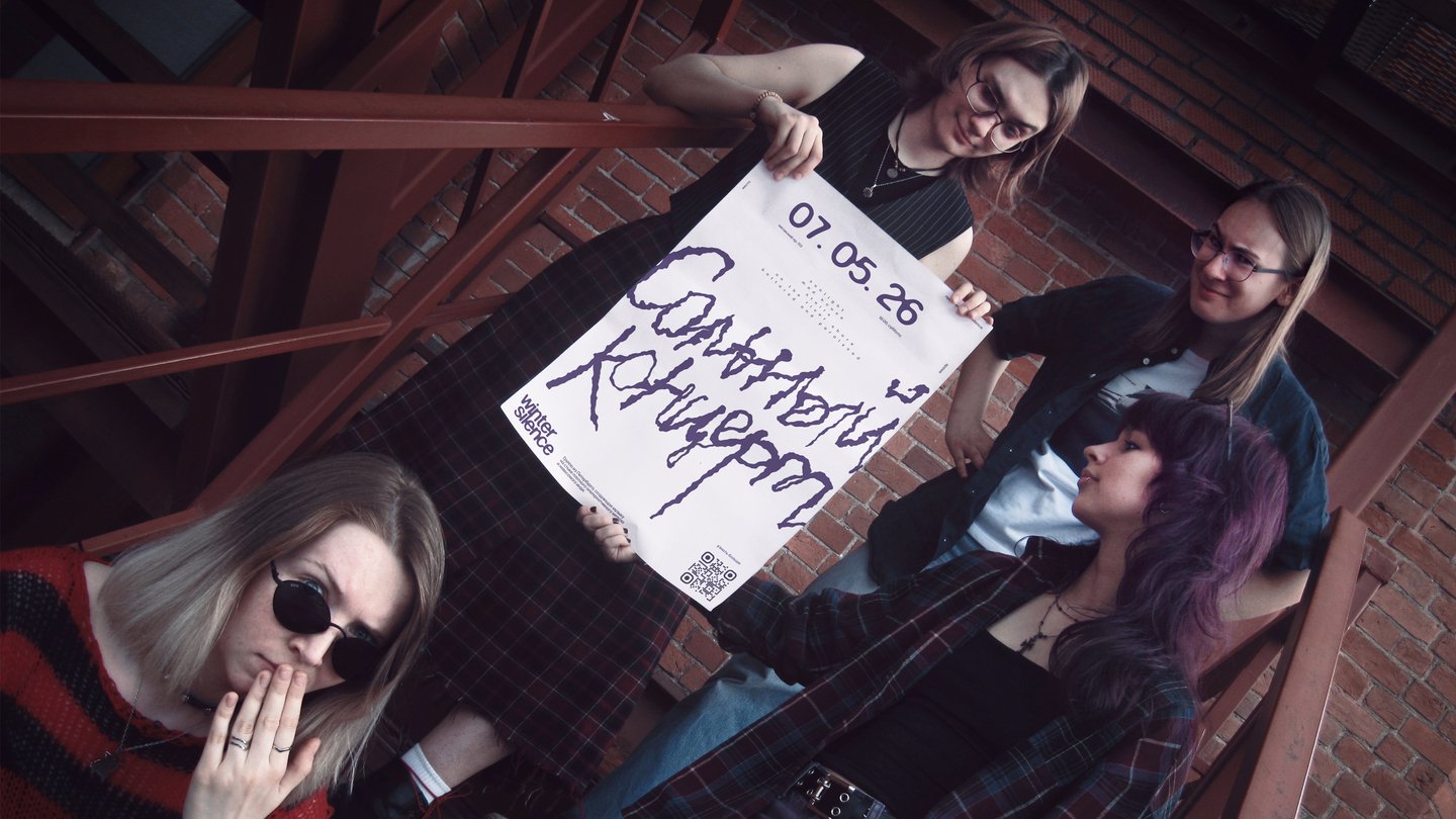
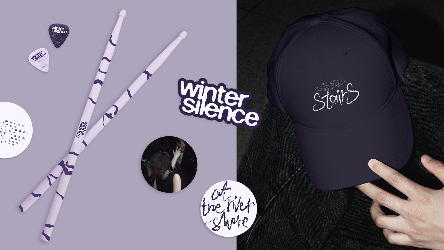
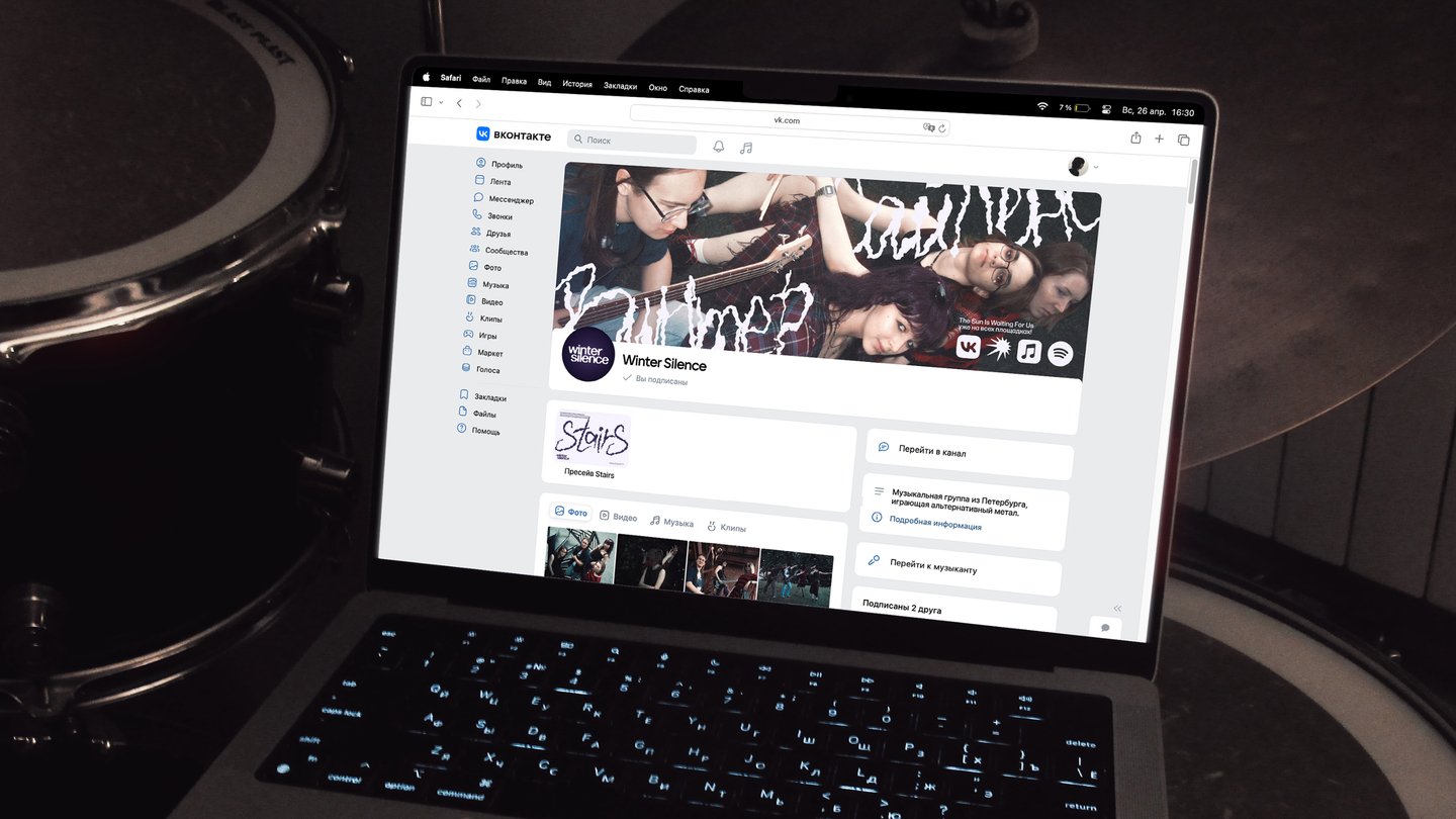
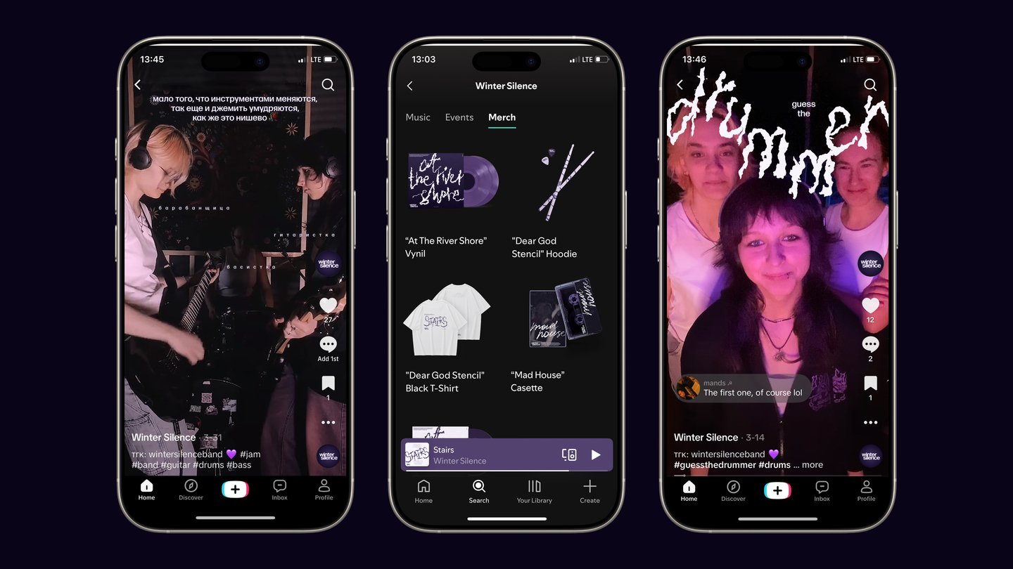
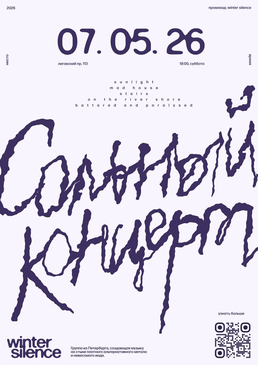
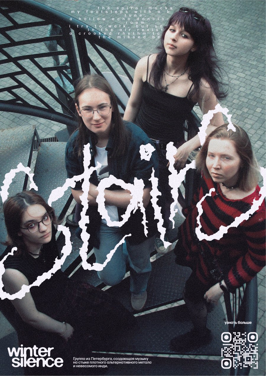
winter silence is an all-female band that plays indie alternative music with an atmospheric and melancholic sound.
The Problem The artists had a strong musical concept and finished material, but a complete lack of visual positioning. Due to a chaotic approach to ideas, their releases risked getting lost on streaming platforms, and the project failed to come across as a cohesive brand.The Process I stepped in as a strategist. We held an audio-focused briefing, analyzing the project’s lore and the structure of its sound. Using a synesthesia-based method, I translated the group’s melancholic sound into specific visual constants: a cool-toned color palette and delicate, emotive typography.The Solution I developed a comprehensive static visual system — including a logo, single cover art, and merchandise concepts — all unified by a consistent visual code. The group now has a distinct, recognizable identity, ready for promotion.
02
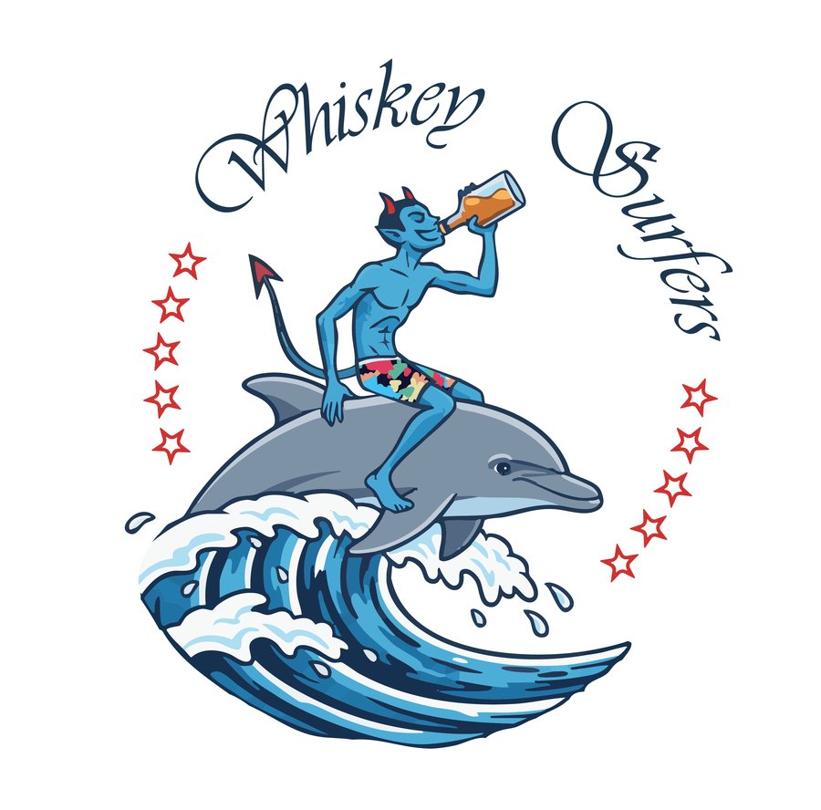
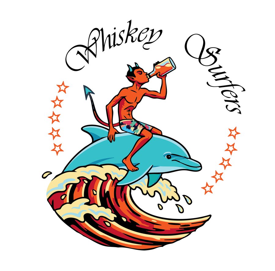
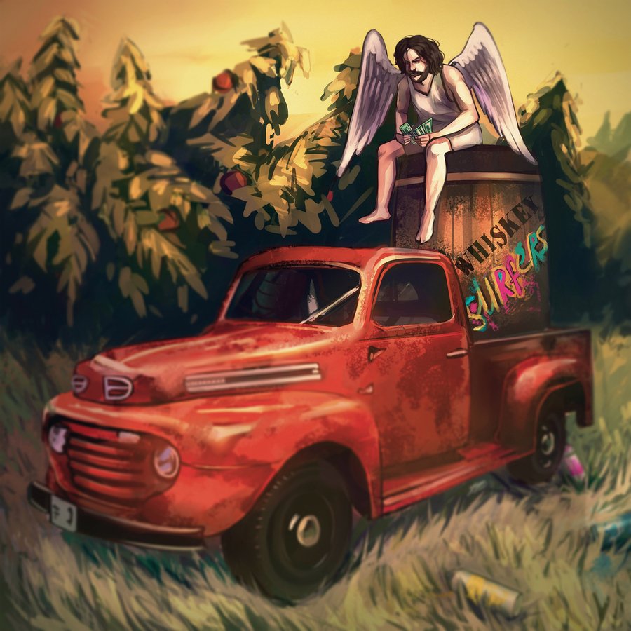
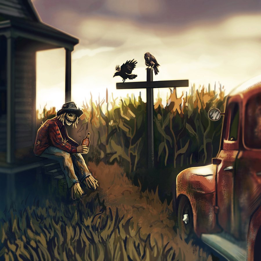
Whiskey Surfers are an experienced musical group that plays gritty whiskey-country-blues-rock.
The Problem Established artists with a clear grasp of their own aesthetic. The musicians knew exactly what they wanted, but they lacked the professional design tools — and the extra pair of hands — needed to translate their vision into high-quality visuals.The Process In this case, my approach served as both a filter and a collaborative tool. I treated their existing concept with great care, analyzing their dense, heavy sound and translating their ideas into the language of professional graphic design — bringing their vision to life while stripping away anything unnecessary.The Solution I developed a distinctive, authentic visual style, including a unique and striking logo, as well as cover art for their albums and singles. The final result perfectly aligned with the band’s expectations and reinforced their status.
The Angel Share / Who Shot John?