Introduction
Yusaku Kamekura (亀倉雄策, 1915–1997) occupies a pivotal place in the history of 20th-century Japanese graphic design. He is often referred to as the «father» of post-war Japanese graphic design, emphasizing not only the significance of his individual works but also his role in shaping Japan’s professional visual language (Livingston, Livingston, p. 109, 1992). Kamekura was the first president of the Japan Association of Graphic Designers (JAGDA), and an award bearing his name was established in recognition of his contributions to the development of the design community (JAGDA, n.d.).
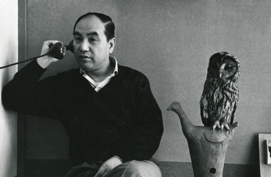
Artist unknown, portrait of Yusaku Kamakura, date unknown.
Because the research material pertains to Japanese visual culture, the work utilizes Russian transcriptions of Japanese names and terms based on the Polivanov system. When Japanese names, terms, and titles are mentioned for the first time, their original spelling and Romaji are also provided.
Kamemura’s visual language is often described as a confluence of Japanese tradition and Western modernism. However, this study aims not to examine the fact of this convergence, but rather how it manifests at the level of form—in the circle, the plane, empty space, photography, typography, and the sign.
The influence of the Bauhaus and Constructivism on Kamekura is supported by a clear educational context: he studied at the Institute of New Architecture and Industrial Arts in Tokyo, founded by Renshichirō Kawakita (川喜田煉七郎, Kawakita Renshichirō, 1902–1975), who actively integrated Bauhaus principles into the Japanese architectural and design environment. In Kamekura’s mature works, this manifested as a fusion of postwar modernism with the classical elegance of Japanese aesthetics (Parsons, 2014).
The Japanese element of his method is viewed here not as a direct application of traditional motifs, but as a principle of working with concise form. The Japanese art critic Masataka Ogawa (小川正隆, Ogawa Masataka, 1925–2005) characterized Kamekura’s method as «the audacity to eliminate everything superfluous, ” merging simplification—derived from traditional Japanese family crests—with Western intellectual mechanisms of form-making (Ogawa, cited in: Design Reviewed, 2023b). Consequently, the kamon (家紋) tradition is utilized in his work as an analytical parallel: it allows one to perceive the logic of the compressed sign, the purification of form, circular organization, and active void within Kamekura’s design.
The central question of this study is how Kamakura’s simple geometric form acquires multilayered meaning: it simultaneously becomes a language of international modernism, an icon of postwar Japan’s reinvention, and an extension of deeper Japanese semiotic culture.
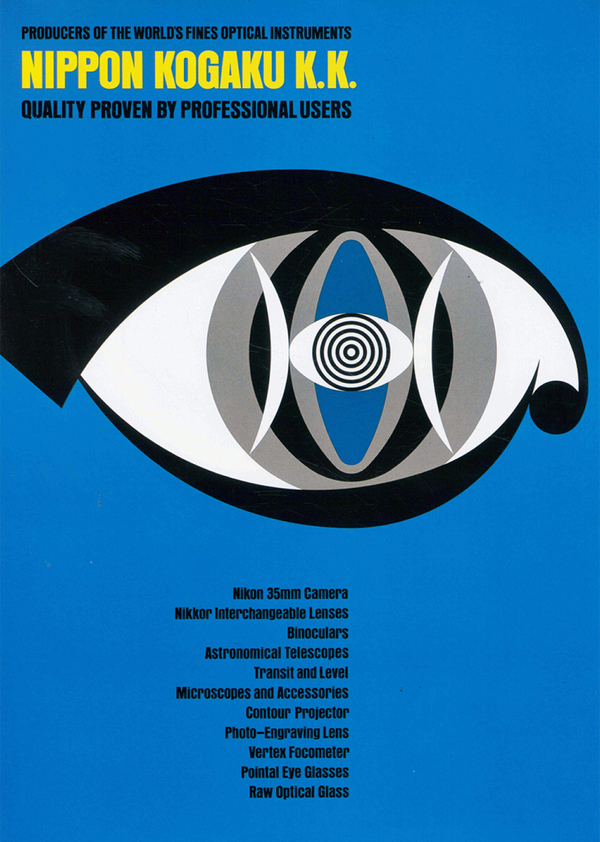
The research material consists of the designer’s key works: the Tokyo 1964 Olympic poster, a series of Olympic photographic posters, Nikon and Nikkor posters, the NTT logo, as well as exhibition, social, and political posters from 1954–1971, where the circular composition, radiality, and symmetry are particularly evident.
This approach suggests that Kamekura is not creating an eclectic mix of Japanese and Western elements, but rather an independent graphic system where modernist discipline of the plane merges with the Japanese sense of pause, compactness, and symbolic concentration.
Tokyo 1964 Olympic Poster: The Circle as a National and Modernist Sign
One of Kamekura’s most renowned projects is the first official Olympic poster, «The Rising Sun and the Olympic Emblem» (1961), created for the 1964 Tokyo Olympics. The British Museum describes this poster as an image of a red rising sun, the five Olympic rings, and the inscription «Tokyo 1964» in gold on a white background (British Museum, n.d.).
Yusaku Kamekura, poster «Rising Sun and Olympic Emblem, ” 1961.
The poster’s composition is built on extreme reduction: a red circle, the Olympic rings, text, and a white field. Kamekura does not depict Japan through landscape, architecture, costume, or ornament; instead, he leaves one large circle. The designer himself specified that his intention was to represent the sun, although viewers might interpret this shape as the hinomaru (日の丸), the red disc of the Japanese flag. Kamekura also spoke of striving to create a fresh and vibrant image through the balance between the large red circle and the Olympic rings (Kamekura, cited in: The Olympians, 2017). Therefore, the circle in the poster functions not as a direct depiction of the flag, but as a multilayered sign: the sun, a modernist plane, and a form that maintains a cultural proximity to the national symbol.
Artist unknown, flag of Japan (Hinomaru), no date.
From the perspective of the Bauhaus and modernism, this circle can be read as an elementary geometric form presented on a pure plane. It lacks volume, texture, shadow, or decorative detail. It operates through scale, color, and precise placement on the page. The complex task—representing the Tokyo Olympics as an international event connected to the new image of postwar Japan—is resolved using a minimal set of elements. The image is stripped down to a form intelligible to an international audience.
For a more specific visual comparison, one can look at posters associated with the Bauhaus tradition, where composition is built upon basic shapes—the circle, square, and triangle. This comparison demonstrates that Kamemura’s red circle is closer to a pure graphic plane than to a picturesque depiction of the sun. It does not «narrate» an image; rather, it contains it within a single form.
1. Herbert Bayer, poster for the «50 Years of Bauhaus» exhibition, 1968. 2. Heinz Walter Allner, poster «Exhibition in the New Building,» 1979.
Comparing it to kamon reveals another facet of this solution. For instance, the sixteen-petaled chrysanthemum crest (kiku no gomon) transforms the natural motif into a rigid radial emblem: the flower is no longer depicted naturalistically but becomes a symbol. Kamekura does not borrow this form literally, but operates on a similar principle of reduction. His sun is also not presented as a landscape object—it is reduced to a circle that becomes a stable and memorable emblem. The very logic of kamon is built upon high legibility, motif simplification, and geometric organization of form (Kamekura, pp. 316–317, 1968; Tabing, pp. 463–466, 2018).
Author unknown, sixteen-petaled chrysanthemum crest of Japan, undated.
White space plays a distinctive role in the poster. In a modernist interpretation, it functions as an active plane that gives the circle scale and weight. Logically, in the grammar of the sign, emptiness also participates in the construction of the sign: the voids and unfilled areas make the form legible. In Kamekyu’s work, the white field fulfills both functions. It separates the red circle from the Olympic rings, creating a pause and amplifying the composition’s solemnity.
Yusaku Kamekura, design guidelines for the 1964 Tokyo Olympics, 1961.
Thus, Kamekura’s Olympic poster is built upon the intersection of two principles. Bauhaus helps us read the red circle as a pure geometric form on a plane; kamon as a condensed symbol where minimal detail conveys maximum meaning. This is precisely why the poster functions not as an illustration of Japan, but as an icon of a new visual Japan—concise, modern, and culturally recognizable.
Olympic Posters: Photography as a Sign of Movement
Kamemura’s Olympic series extends beyond the poster featuring the red circle. The British Museum notes that the next official poster was «The Start of the Sprinters’ Dash» (1962), which depicts the runners at the moment they leave the starting blocks. Among the creators, Kamemura is credited as the designer, Osamu Hayasaki (早崎治, Hayasaki Osamu, 1933–1993) as the photographer, and Jō Murakoshi (村越襄, Murakoshi Jō, 1925–1996) as the photo director (British Museum, n.d.-b). The series of official posters also included «A Butterfly-Swimmer» (1963) and «An Olympic Torch Runner» (1964) (British Museum, n.d.-c; British Museum, n.d.-d).
In these three posters, Kamemura transitions from pure emblem to photography, yet the photography does not devolve into simple sports documentation. It adheres to a graphic logic: the body becomes a line, movement becomes rhythm, and the background becomes an active plane.
Yusaku Kamekura, posters for the 1964 Tokyo Olympics, 1961–1963.
In the poster «Sprinter Start, ” athletes are depicted against a dark background, almost devoid of surroundings. The stadium space vanishes, leaving only the moment of extreme concentration before movement. The leaned bodies form a diagonal rhythm, and the stretched arms and legs transform into graphic lines. Kameruk chooses not to tell the story of the competition, but one visual gesture—the start as a clot of energy.
Yusaku Kamekura, poster «Sprinter Start,» 1962.
In the «Butterfly Stroke,» movement takes on a different form. Water, body, and spray form an almost abstract structure. The water’s surface ceases to be a background and becomes part of the composition—it cleaves the image, establishes rhythm, and intensifies the sense of exertion. The swimmer is perceived not as a portrait of a specific athlete, but as a symbol of resistance, breath, and motion within the water.
Yusaku Kamekura, poster «Butterfly Swimmer,» 1963.
Finally, in the poster «Runner with the Olympic Torch,» the photograph approaches the symbol. The figure of the running person and the raised torch create a vertical gesture connecting sport, ceremony, and the idea of the Olympics. Here, the movement is not broken down into many details; it is consolidated into one clear sign—the body, the arm, the fire, and the direction of the run work as a unified form. In the logic of Modernism and Bauhaus, the photograph is subjected to geometric construction: the figure is read as a diagonal and a vertical, while the typography and negative space balance its movement on the plane.
Yusaku Kamekura, poster «Runner with Olympic Torch,» 1964.
Author unknown, Mitsudomoe, date unknown.