Perfume is built around the concept of exclusivity: every fragrance, like its wearer, possesses a unique identity and character. I am interested in this sphere, which led me to wonder: how unique is the uniqueness that is constantly marketed to us? I wanted to find out what creates the character of popular fragrances—is it the overall impression or its individual elements. The project’s goal is to visually demonstrate the underlying patterns within popular scents and determine how unique their compositions truly are. Infographics allow for a shift in how we perceive perfumery—it is not a list of individual notes, but a system of combinations.
Perfume → Note → Level
ANALYSIS
15 / 30 PERFUMES
Contain sandalwood
13 / 30 PERFUMES
Use sandalwood in base notes
8 / 30 PERFUMES
Combine sandalwood and tonka beans
THE ANATOMY OF PERFUME
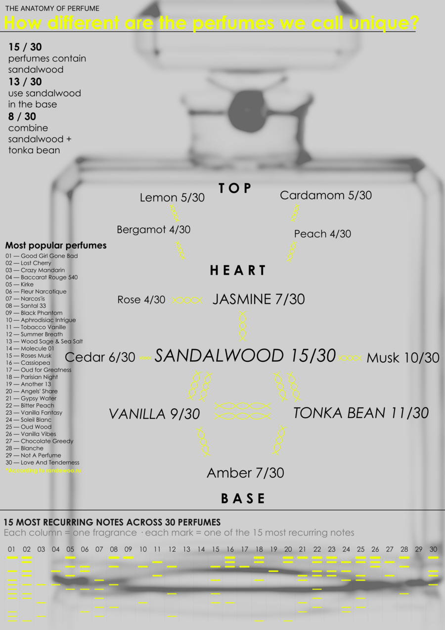
} 01 — FREQUENCY
The size and values of x/30 show in how many fragrances a note appears} 02 — STRUCTURE
Notes are arranged relative to the levels: Top / Heart / Base} 03 — REPETITION
The lower matrix correlates 30 fragrances with the 15 most frequently recurring notes
Poster on carriers
PROCESS
Randewoo → Excel → Python / Pandas → Data analysis → Figma → A1 poster → Mockups
— pipeline
} 01. During the preparation phase, I compiled a dataset based on the website data—the 30 best-selling perfumes. I structured the obtained data in Excel and later processed and organized it in Google Colab using the Pandas library. } 02. I normalized the scent notes and then calculated their frequency of appearance in the sample. I also analyzed the levels of the perfume pyramid and the most common note combinations separately. } 03. The analysis results formed the visual foundation for the poster that I created in Figma.